 Hi!
Hi! 
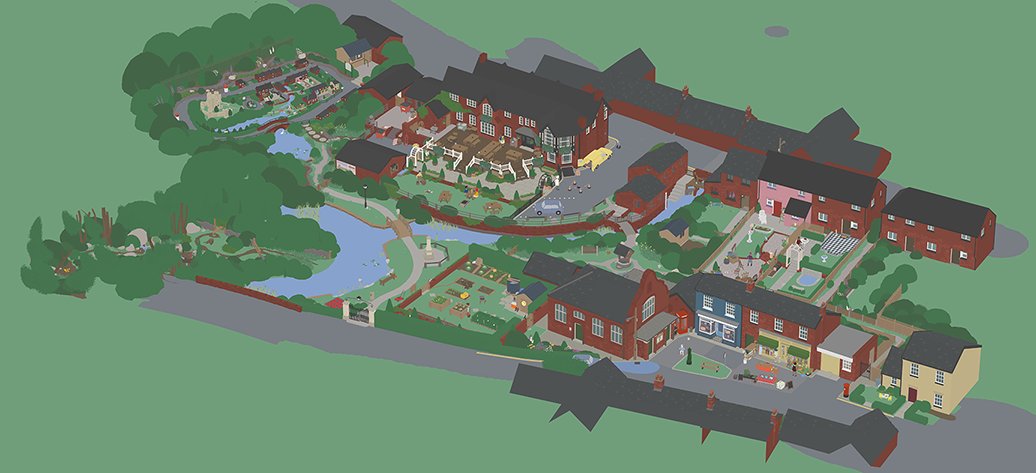
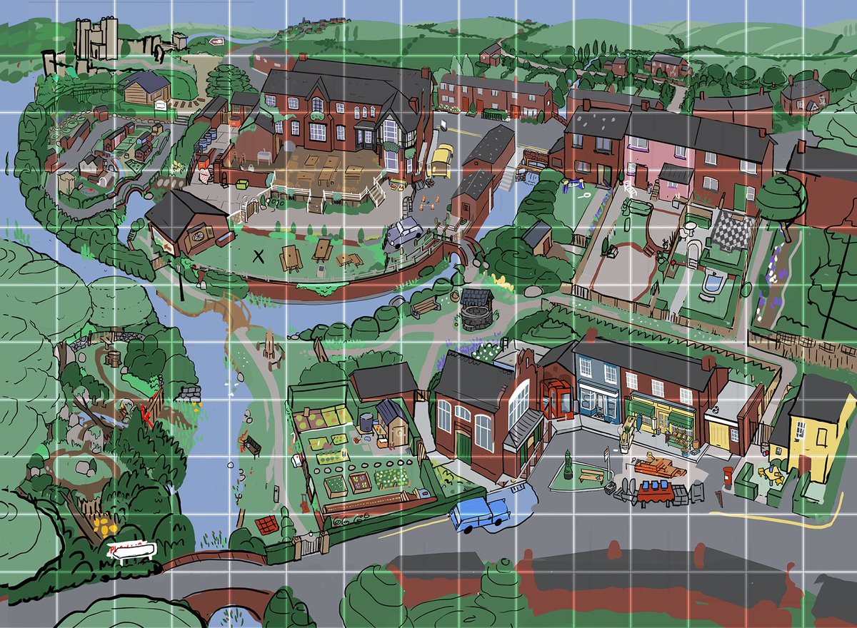
Here is a ~process~ thread all about how we made the special Untitled Goose Game map.
I’ve been planning to write it for a while, in preparation for this:
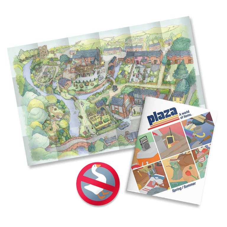
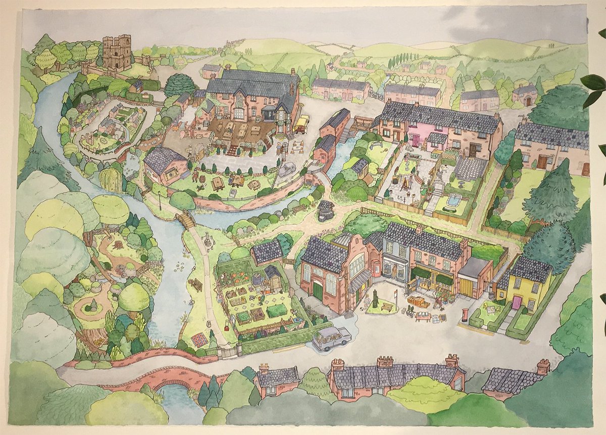
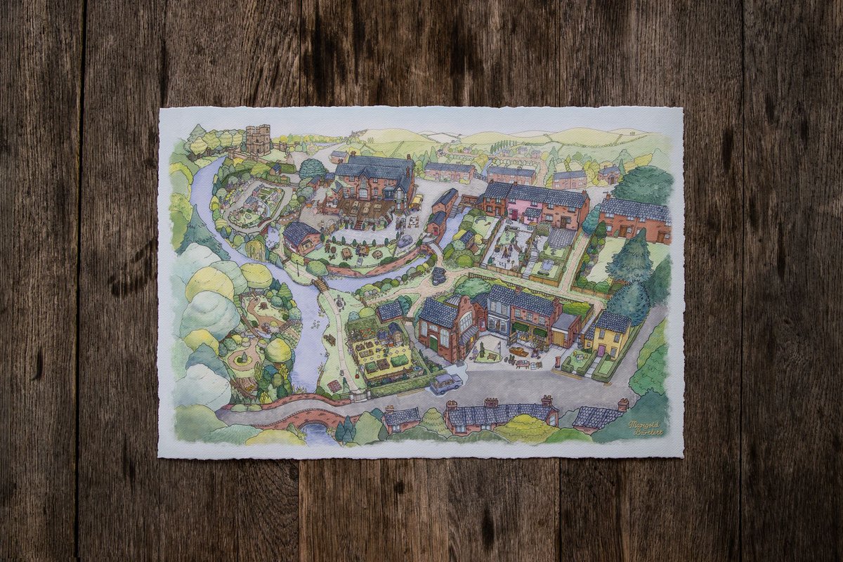
A very lovely HQ 16x24” PRINT of the map is for sale TODAY at https://www.iam8bit.com/collections/untitled-goose-game/products/village-map-fine-art-print-untitled-goose-game !
#untitledgoosegame
/48
Earlier this year, my friends at @house_house , @panic & @iam8bit asked me if I’d like to illustrate a massive map of the 'Untitled Goose Game' village for the upcoming physical release. Of COURSE I would love to! And guess what! I’m very proud (!) of the result!
The opportunity and challenge to make something tangible, memorable and RIPPABLE* for kids and adults all over the world? Yes!!!
(*I do not condone ripping the HQ print version, ya big silly billy)
(*I do not condone ripping the HQ print version, ya big silly billy)
I was excited to tackle the project because it was the perfect task for me & my particular skills: I like to make h i g h l y detailed illustrations, and sometimes my work has a slightly childlike flavour; it’s relaxed, colourful & expressive.
Sometimes kinda wobbly too!
Sometimes kinda wobbly too!
The brief :
:
+ A detailed illustration inspired by classic Pictorial Maps.
+ 34x22in so it can hang in the office, though the final map will be printed differently
+ It should /look/ like it’s made with traditional media
+ Playful interpretation; not 1:1
+ other minor constraints
 :
:+ A detailed illustration inspired by classic Pictorial Maps.
+ 34x22in so it can hang in the office, though the final map will be printed differently
+ It should /look/ like it’s made with traditional media
+ Playful interpretation; not 1:1
+ other minor constraints
I quoted for 18 days. Breakdown:
-Prep, research & scribbles
-Sketching & tweaks to nail the layout, style & core drawing
-Drawing it
-Inking, which I wanted to do by hand
-Scanning (it’s huge!)
-Test cycle for colour: real paint vs digital
-HQ Art Scan
-Post prod. tweaks & edits
-Prep, research & scribbles
-Sketching & tweaks to nail the layout, style & core drawing
-Drawing it
-Inking, which I wanted to do by hand
-Scanning (it’s huge!)
-Test cycle for colour: real paint vs digital
-HQ Art Scan
-Post prod. tweaks & edits
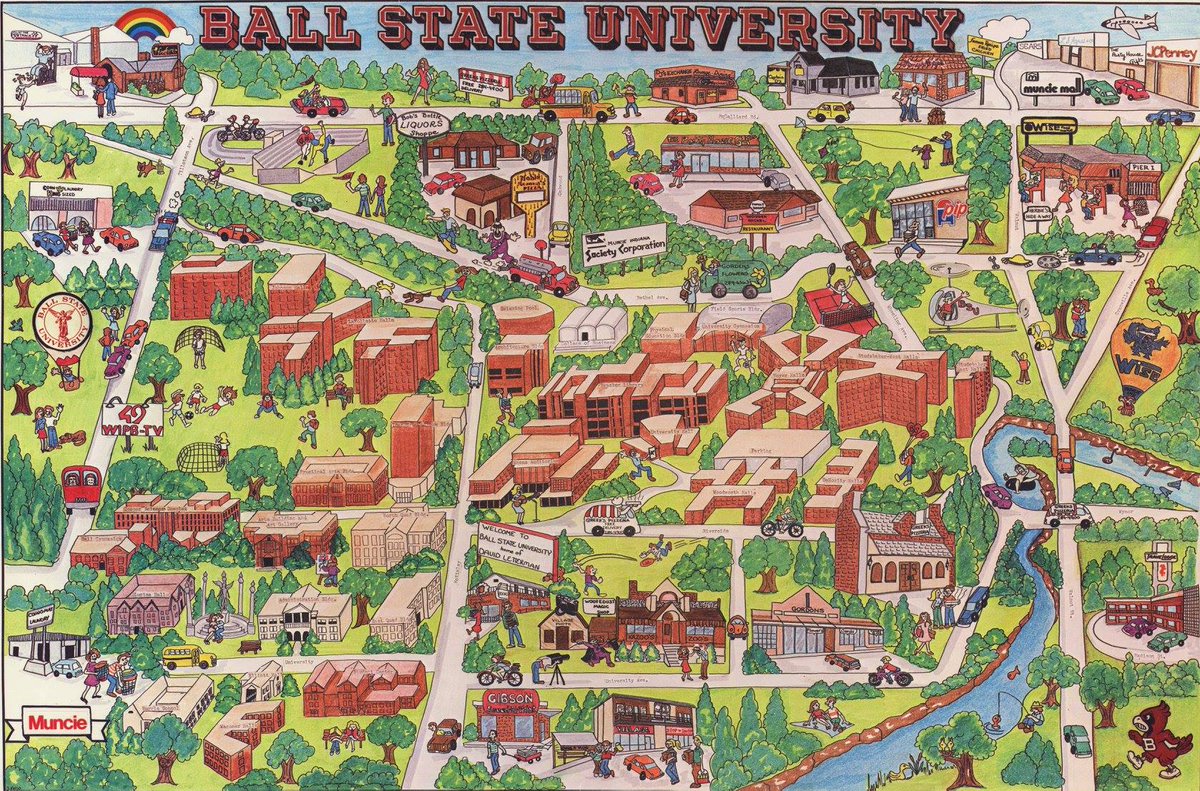
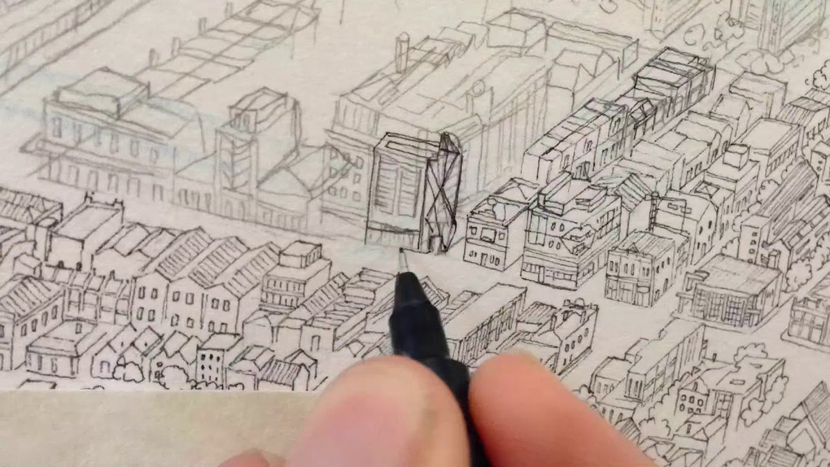
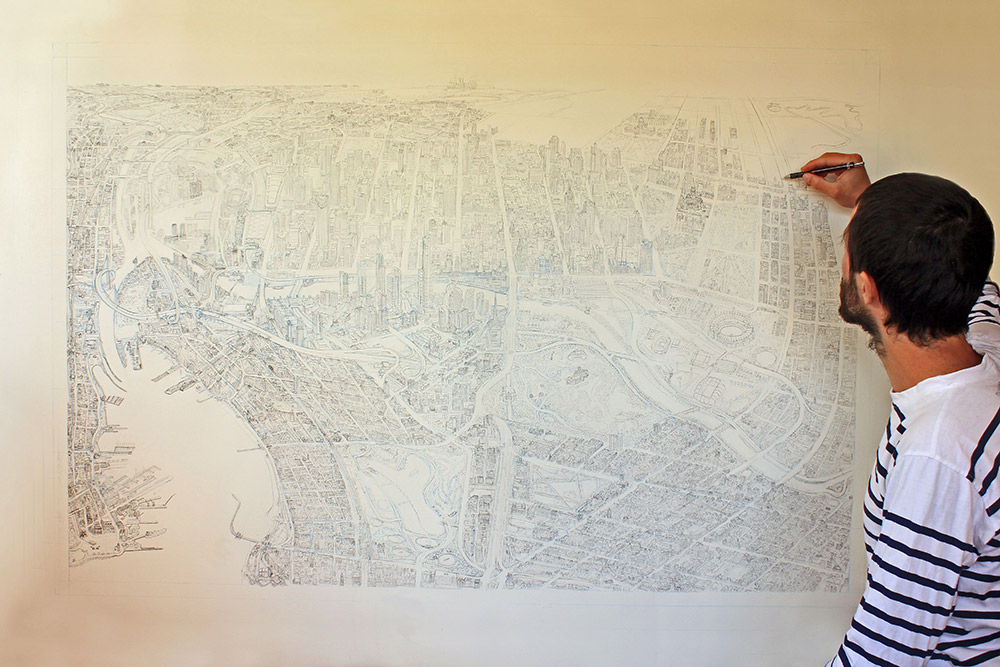
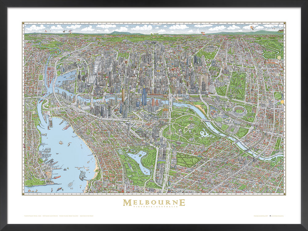
My favourite pictorial maps in the world are the iconic Melbourne maps - the vintage edition, as well as the 2015 edition. These are so incredible, I think there's so much potential in these styles. They’re 4 TIMES LARGER than this map (and only a few more buildings than mine..!)
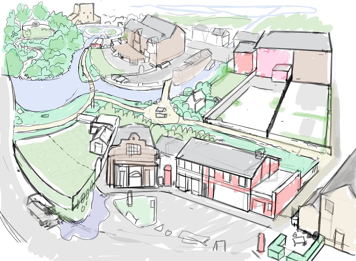
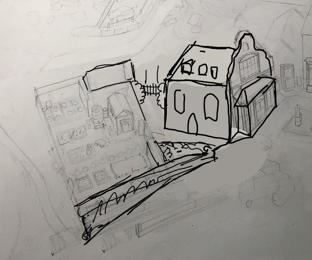
. @JKSTRSSR Jake had also roughly drawn the layout he was imagining for the finished illustration - this drawing was GREAT as both a brief & permission to visualise the game differently.
Jake did most of the level design & layout in the game, so knew it best. It was SUPER handy.
Jake did most of the level design & layout in the game, so knew it best. It was SUPER handy.
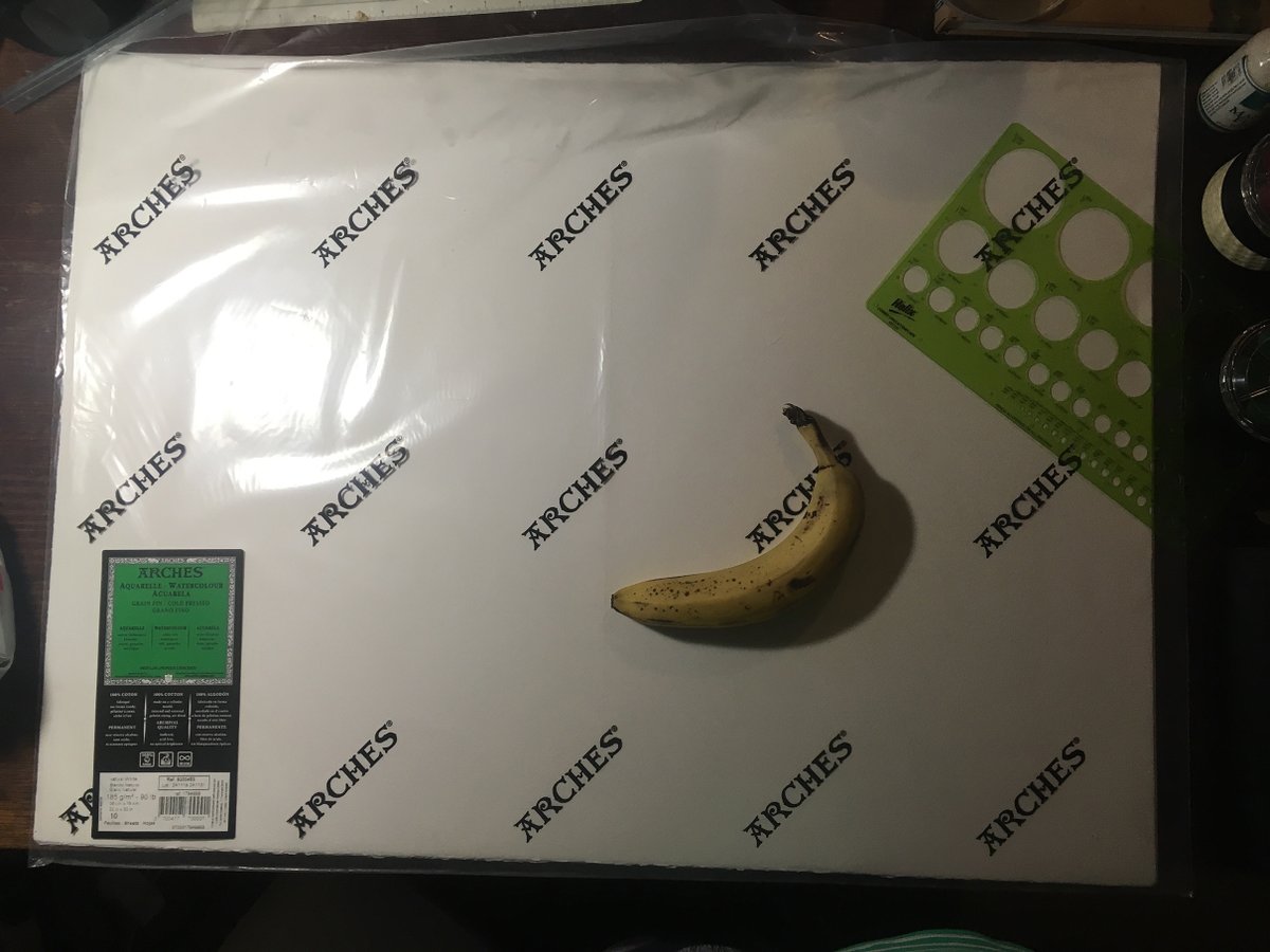
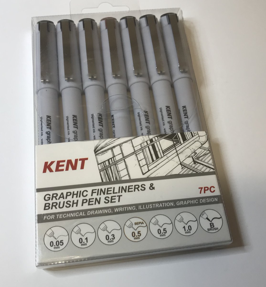
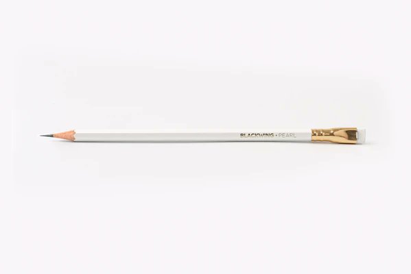
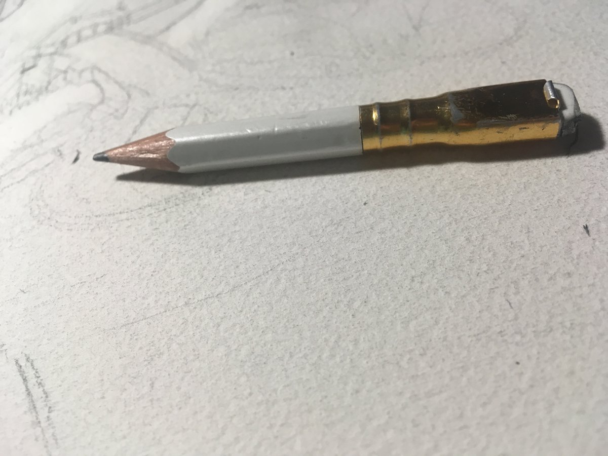
When it was time, I went to this great art shop to buy some artist quality cold pressed Arches watercolour paper. The closest I could find was 22x30in, so I needed to work out the dimension maths. I also bought some new fineliners, & a new Blackwing pencil, my favourite pencil.
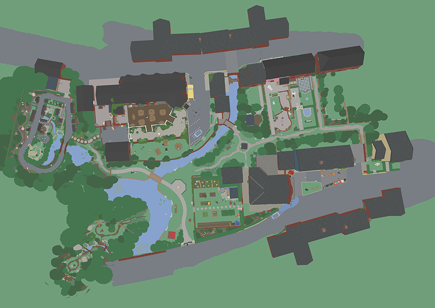
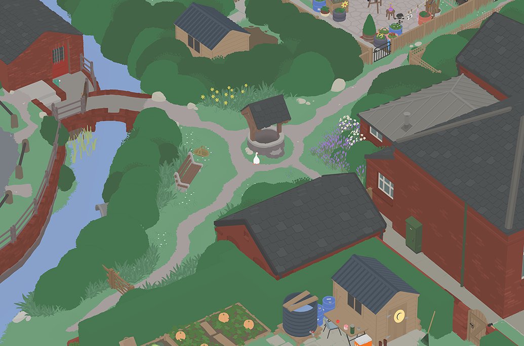
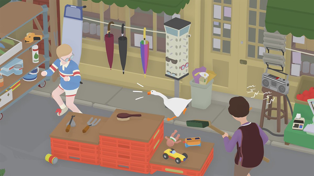
I was given a custom build of the game which I could jump around in. I looked at pictorial maps, & even toured Google Maps, taking notes. House House also had a folder full of incredible aerial screenshots of the game, which was exciting. Here are some of them! Rad images, folks!
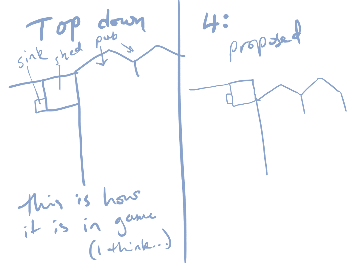
The screenshots are lovely, but for a few reasons I couldn’t just do a 1:1 translation. Some areas are shown at the wrong angle, some things are obscured. We wanted the map to feel like you could see EVERYTHING as you see it in the game, so we needed to riff(raff) on perspective.
The perspective was manipulated to match as close to the game’s sophisticated camera angles as much as possible, rather than strictly with how the town was literally laid out. It was such a trip to bend my brain around it, in a playful way, with constraints.
That's design, baby!
That's design, baby!
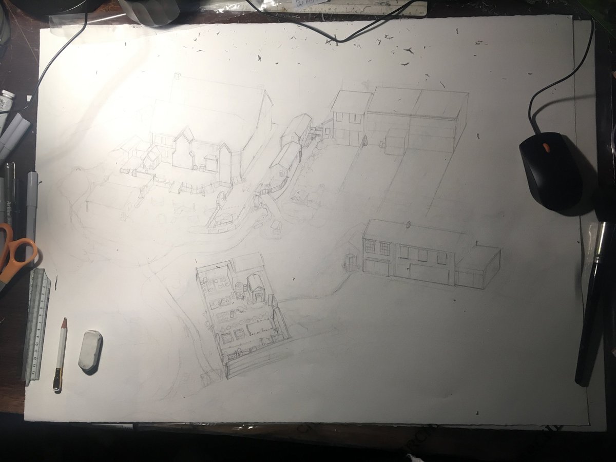
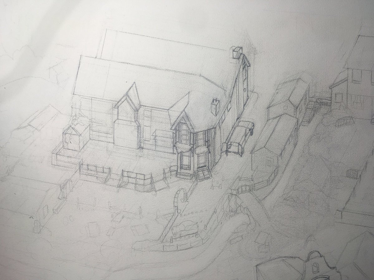
Eager, I jumped to pencils before the layout was locked down. It was very helpful for scale + /feel/ but we quickly decided to move to digital for sketching. Pencil is fun but SLOW! Shoutout to Jake for being great to work with in the early nervy stages: thorough & enthusiastic.
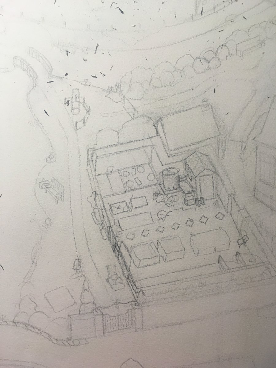
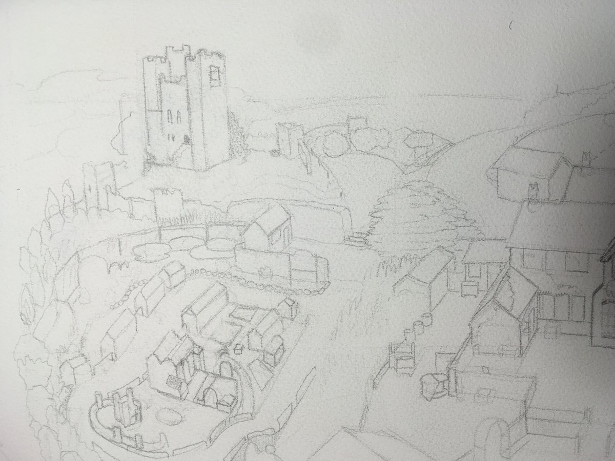
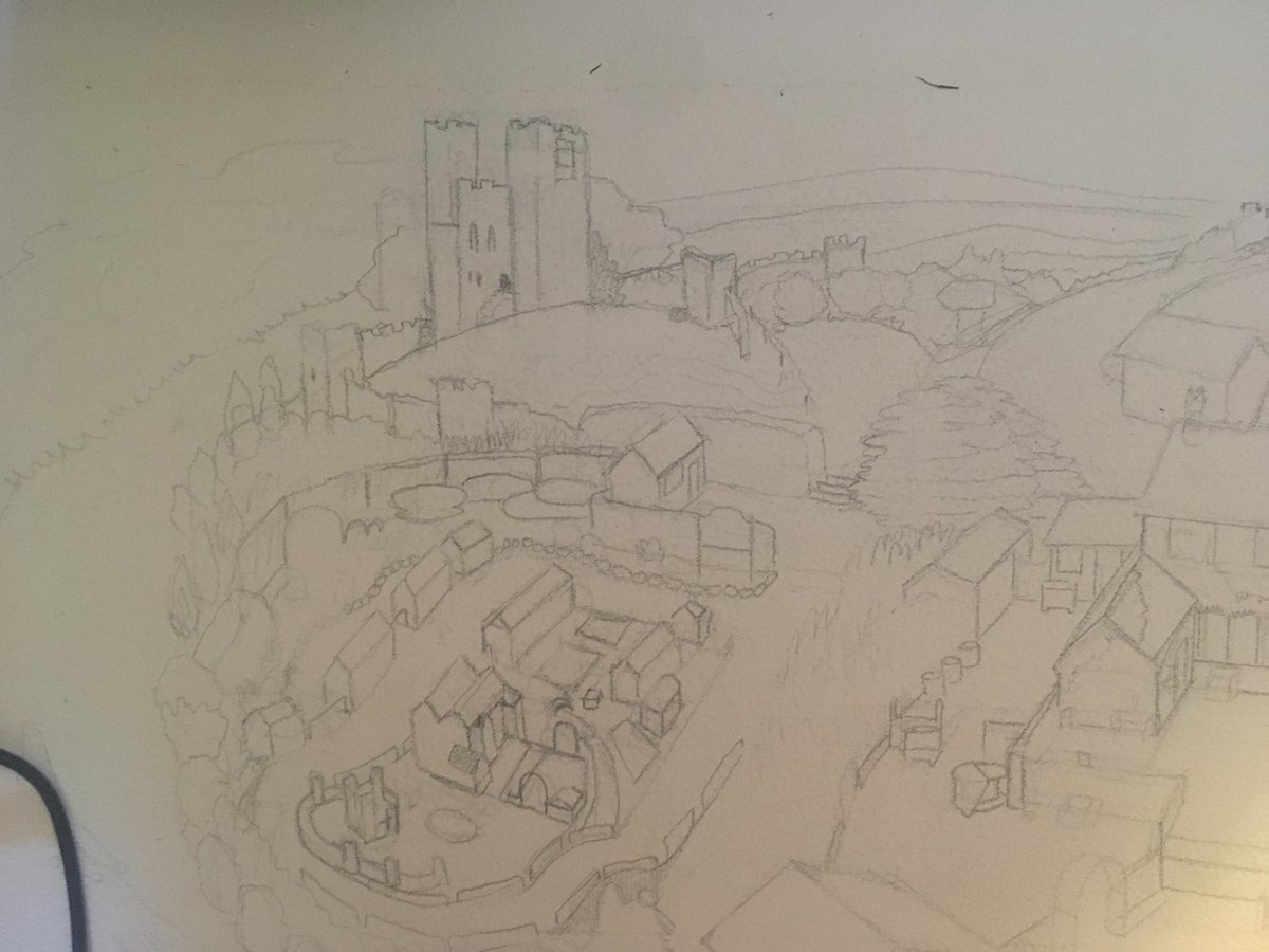
The pencils I had first done were very stiff and, generally just sorta 'off'. I was leaning into a bunch of drawing lessons & thoughts I have picked up throughout my life, and it’s not like those were bad, but it wasn’t feeling relaxed enough. Some more examples of the stiffness:
The first digi sketch I tried was a HUGE departure from the plan. I was stretching the concept very hard, trying things out. I got a lot out of doing it, but it was unevenly skewed to give the shops a lot of detail, and it pushed other equally important spaces into the background
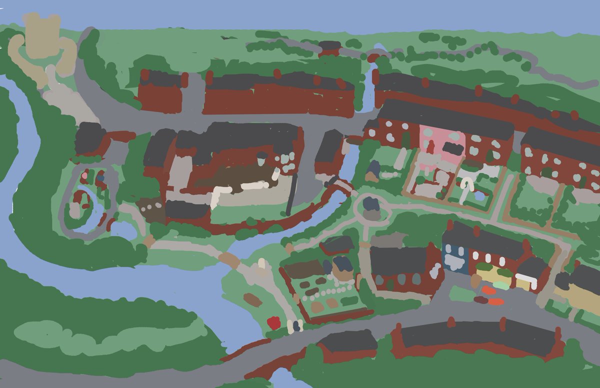
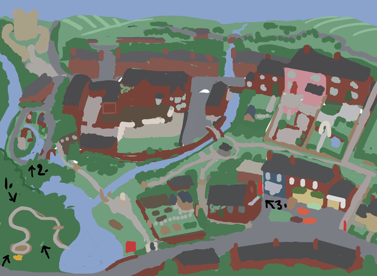
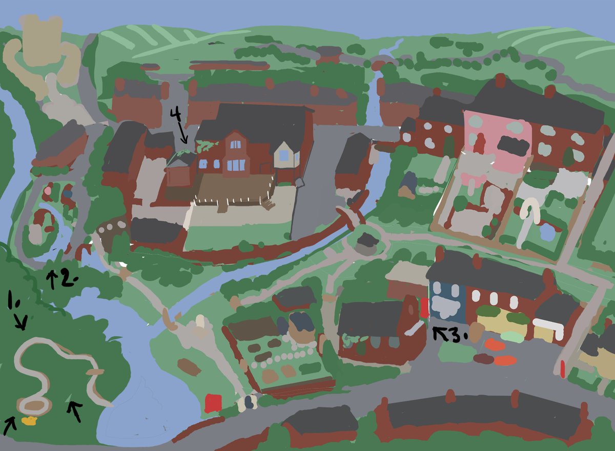
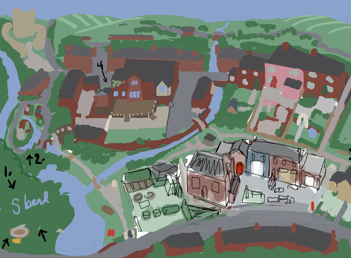
Heading back to the computer & Jake’s sketch, I tweaked, reshaped & edited it with some level of detail for a few days.
Taking the time to add the little details in, even as BLOBS, helps me file that info away for later.
The numbers show where I was asking questions of minutiae.
Taking the time to add the little details in, even as BLOBS, helps me file that info away for later.
The numbers show where I was asking questions of minutiae.
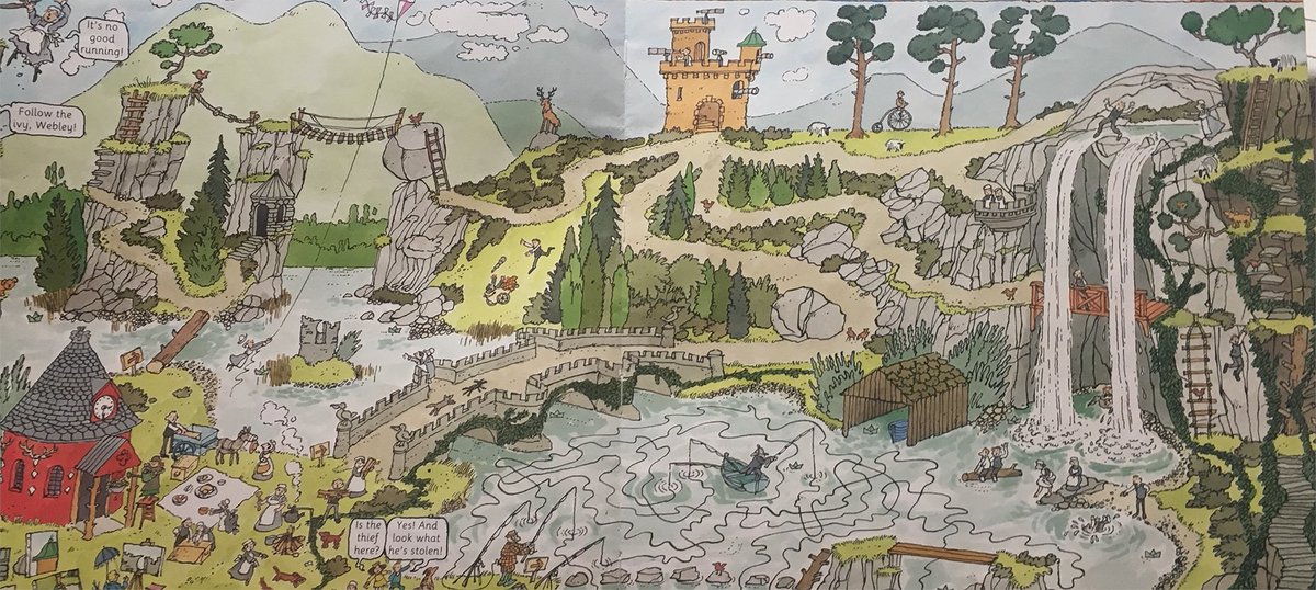
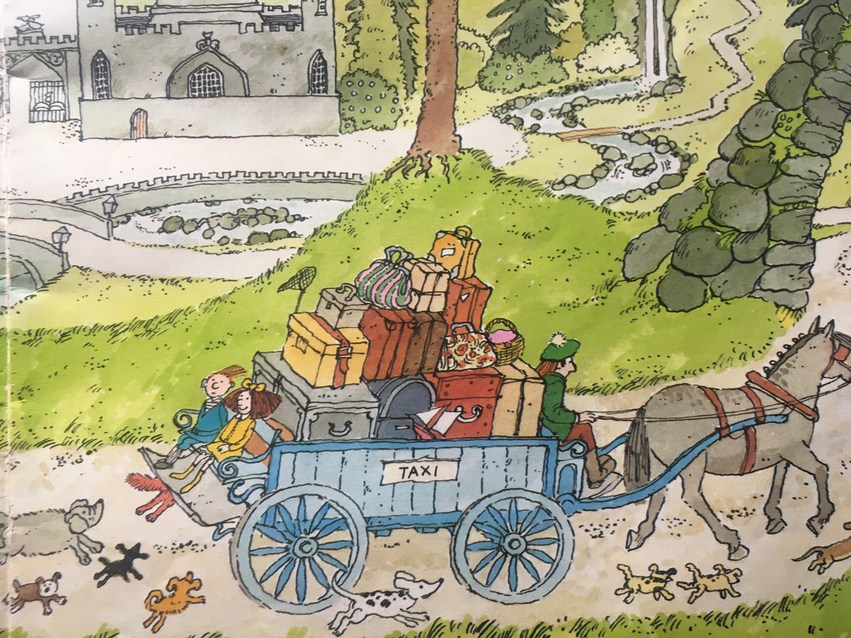
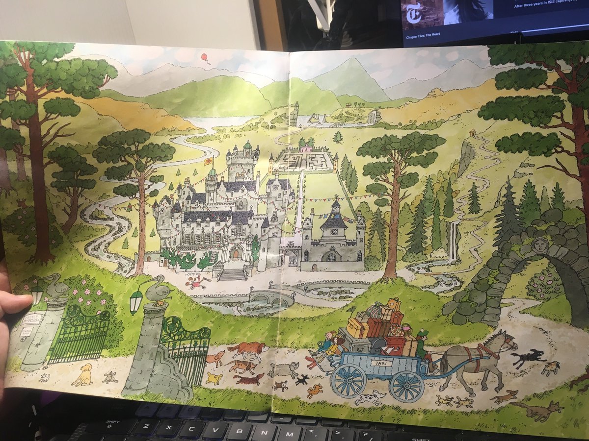
I was also collecting references for the style I was influenced by. Luckily, it’s work which has been inspiring me for many years, (especially for my work on the game I’m art directing, @WaywardStrand )
Scoular Anderson has been one of my favourite artists since I was 7 or so :^)
Scoular Anderson has been one of my favourite artists since I was 7 or so :^)
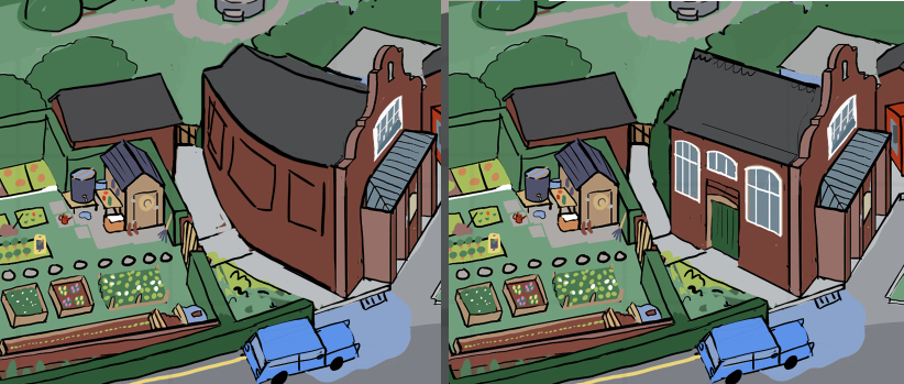
Getting the hall to read harmoniously from 2 angles at once was tricky. I think I redrew it about 6 or 7 times. It’s sort of the point where the whole lower half of the illustration pitches from, and it's an extreme angle in game too: the camera does a big, wide, lovely swing.
We knew that the town well was significant. It should sit towards the middle of the map comfortably, but not be a monument.
We also wanted all of the paths to be visible so that someone could potentially enjoy tracing the Path of Goosely Chaos with their fingertip...
We also wanted all of the paths to be visible so that someone could potentially enjoy tracing the Path of Goosely Chaos with their fingertip...
(Here are some screenshots of goose game, just to remind you of the lovely details in this special little world before I continue) 

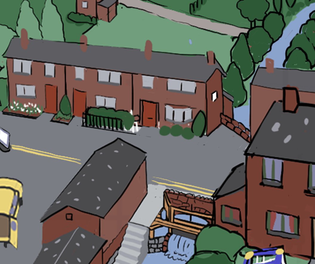
It's a detailed village! We tweaked the TINIEST details. Eventually everything was placed comfortably. Here are some of those rough details, and the final digital roughs.
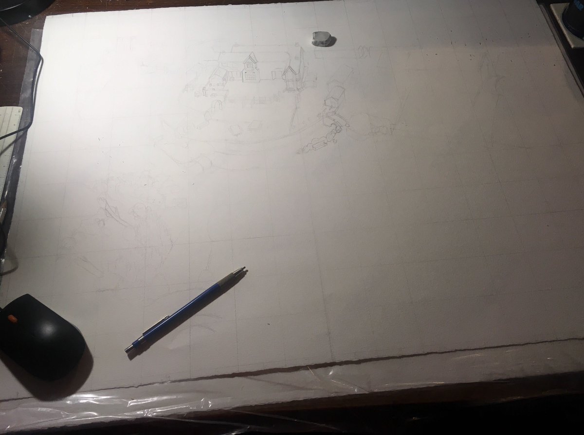
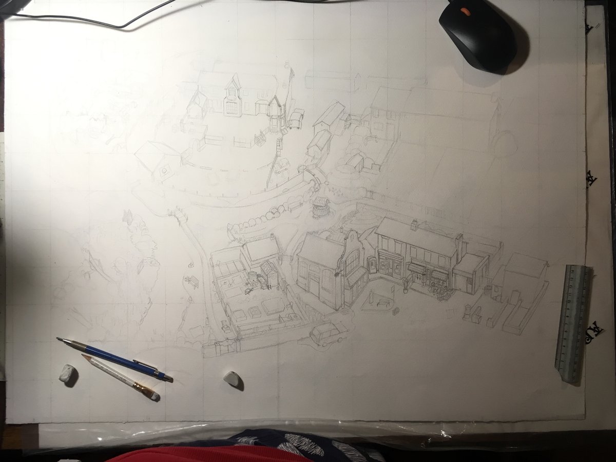
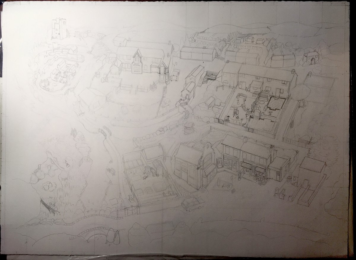
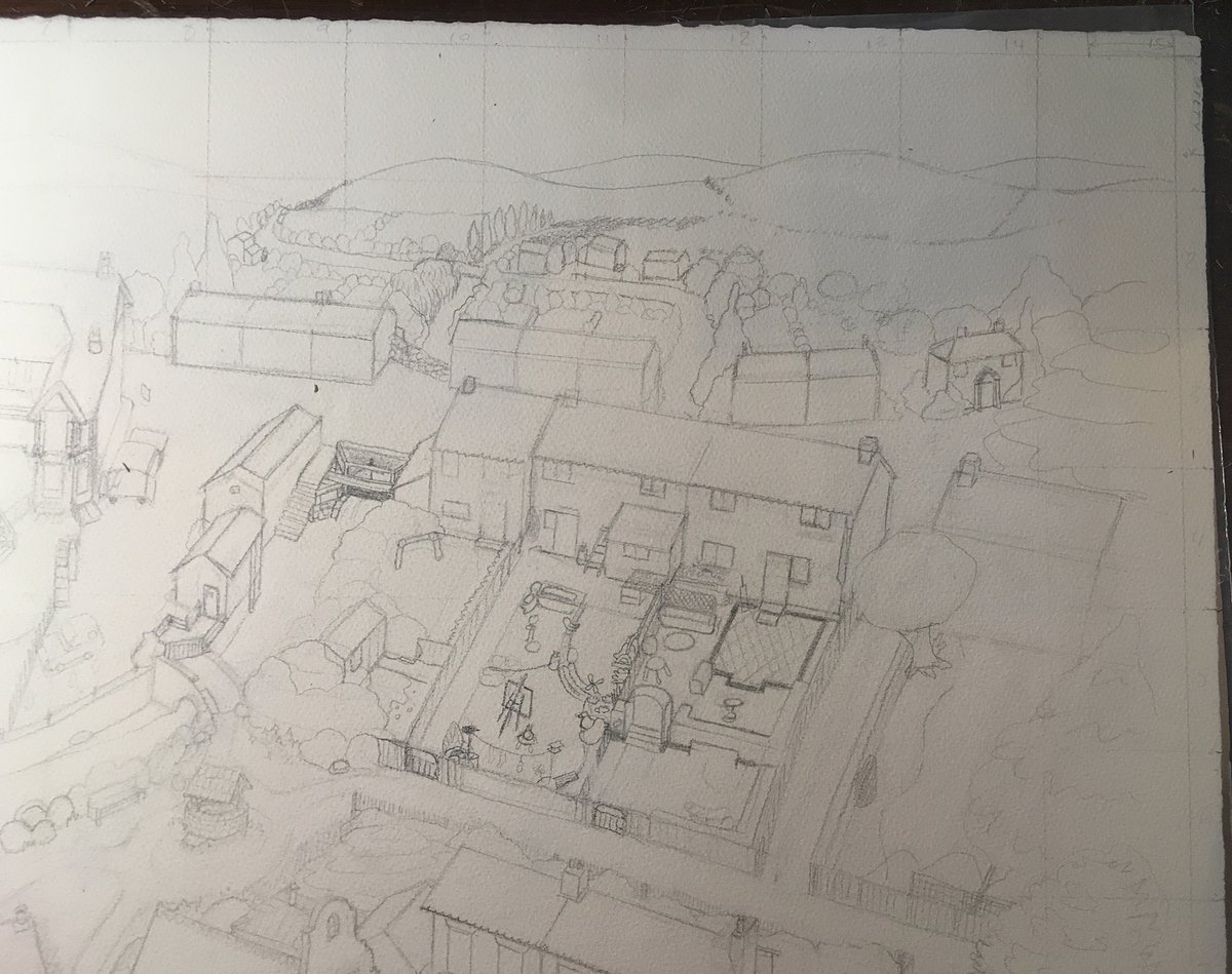
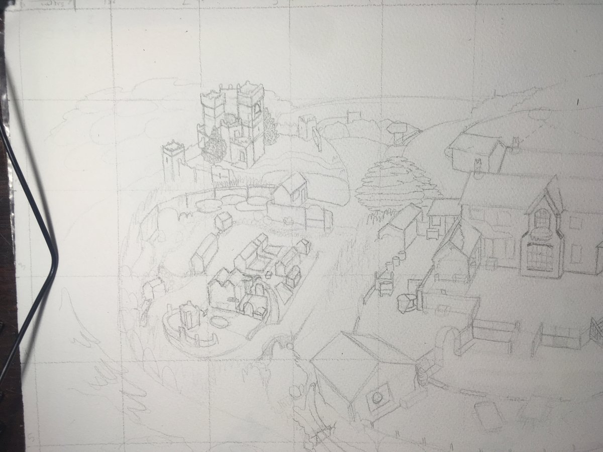
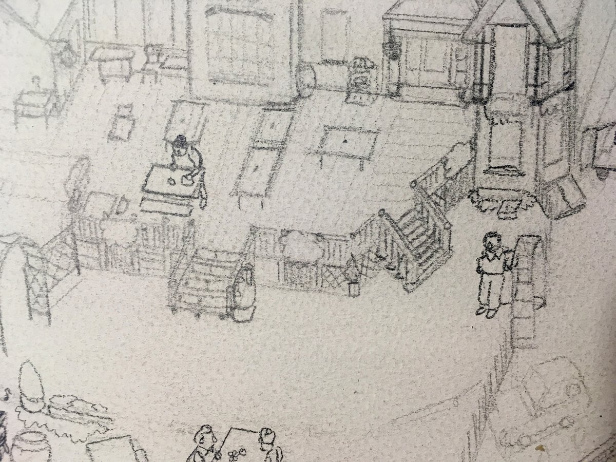
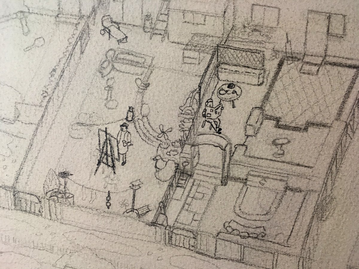
Using this general composition, I was able to block out the first pencils of what would become the final map.
Using this general composition, I was able to block out the first pencils of what would become the final map.
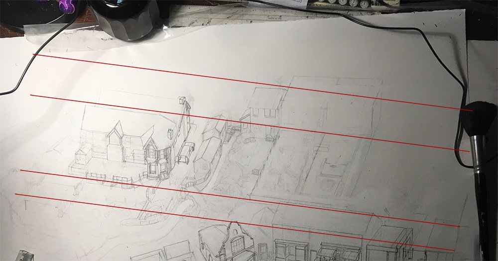
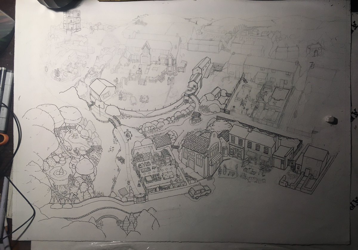
When I moved to paper, the first thing I did was find something 30in long + straight (I think I used a shelf from my bookshelf?) & ruled up a grid which was made of 1.8in squares.
In Photoshop I recreated the grid and then roughly sketched in the main angles & corners on paper.
In Photoshop I recreated the grid and then roughly sketched in the main angles & corners on paper.
Countless tweaks.
It felt good!
I didn’t mind getting into the details with Jake, he was noticing tiny things which I was missing, which makes sense seeing as he BUILT most of it himself.
Details emerging...
Squashing and squishing and stretching the shapes...
It felt good!
I didn’t mind getting into the details with Jake, he was noticing tiny things which I was missing, which makes sense seeing as he BUILT most of it himself.
Details emerging...
Squashing and squishing and stretching the shapes...
SO...The castle was giving me a lot of grief for a while!
It made me feel a lot better when Jake said that the castle was also the object that had taken him the most time when he was making the game. It was sooo tricky to get it to sit up there - but we got there in the end!
It made me feel a lot better when Jake said that the castle was also the object that had taken him the most time when he was making the game. It was sooo tricky to get it to sit up there - but we got there in the end!
The hardest areas which took most redraws were the hall, the trestle tables, the castle & the area behind the pub.
We also needed to start thinking about the edges of the map, which aren’t in the game.
What would look natural? Answer: Lots of trees.
We also needed to start thinking about the edges of the map, which aren’t in the game.
What would look natural? Answer: Lots of trees.
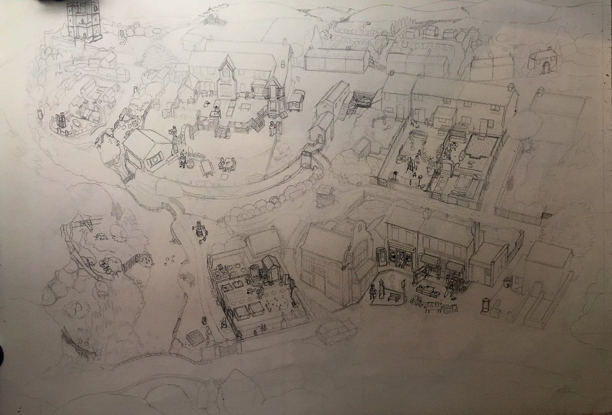
Nearly finished.
Popped the villagers all in without issue, other than the wimp who was surprisingly difficult to portray at 1x2cm, Get in there, wimp!
Popped the villagers all in without issue, other than the wimp who was surprisingly difficult to portray at 1x2cm, Get in there, wimp!
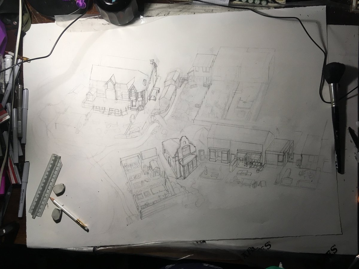
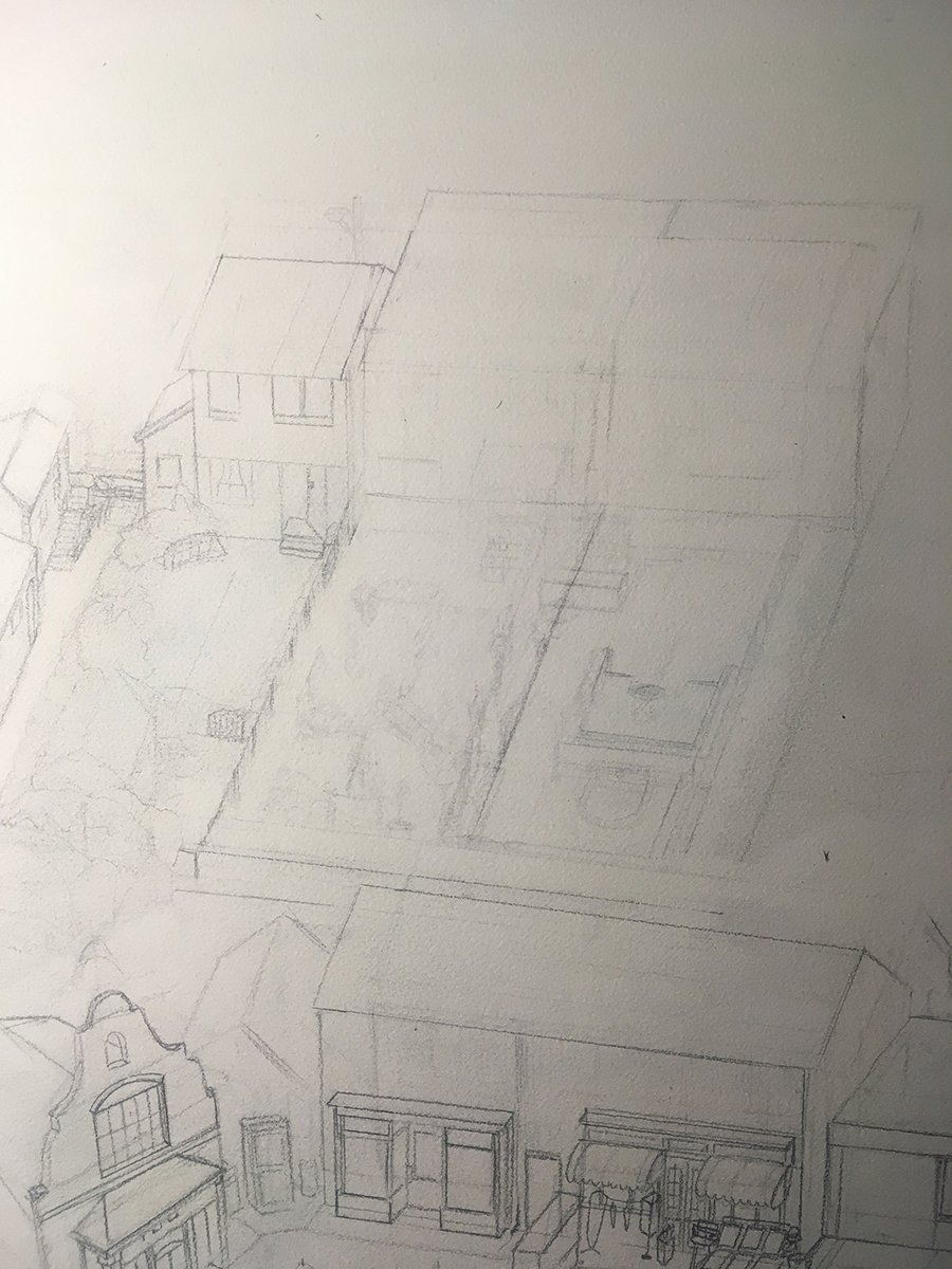
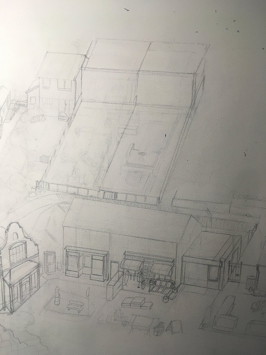
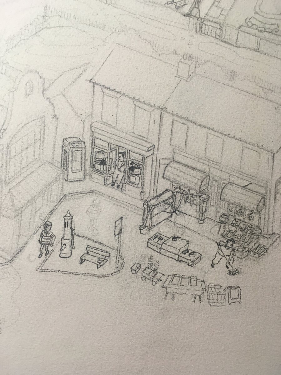
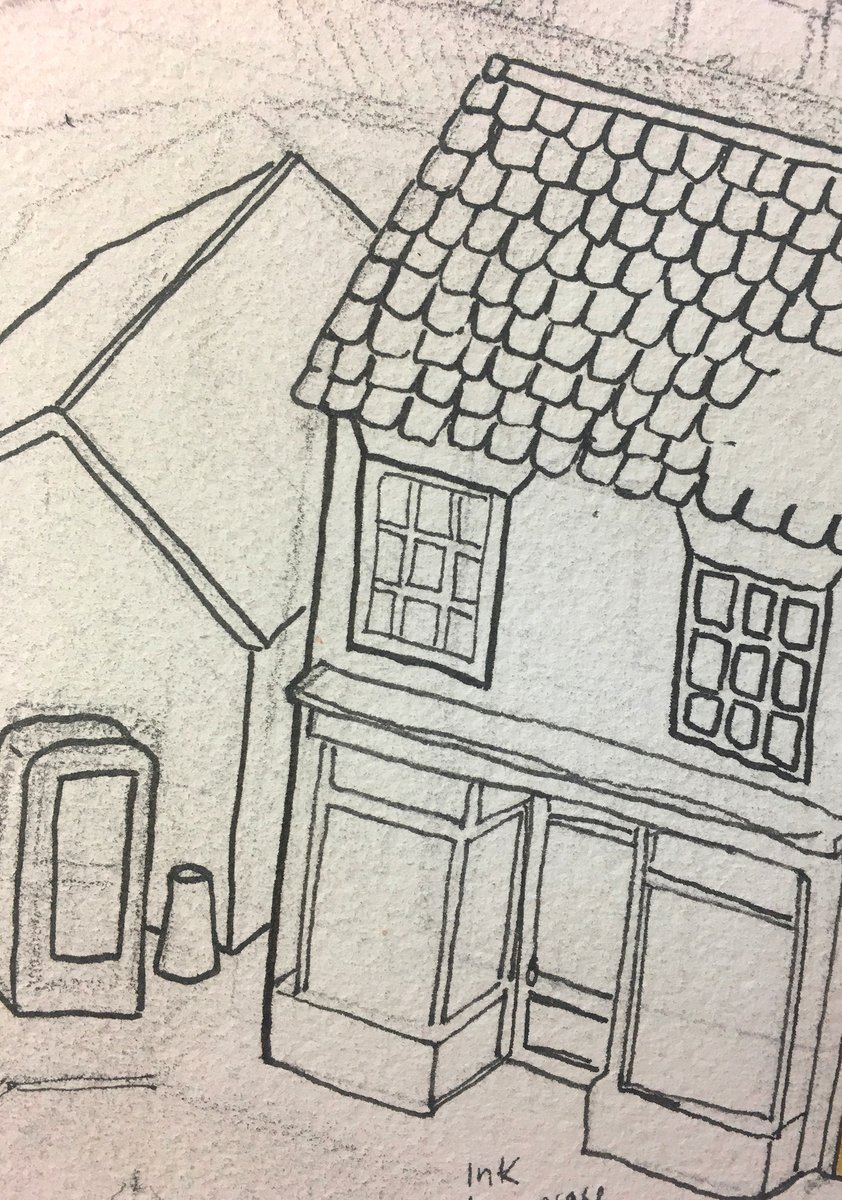
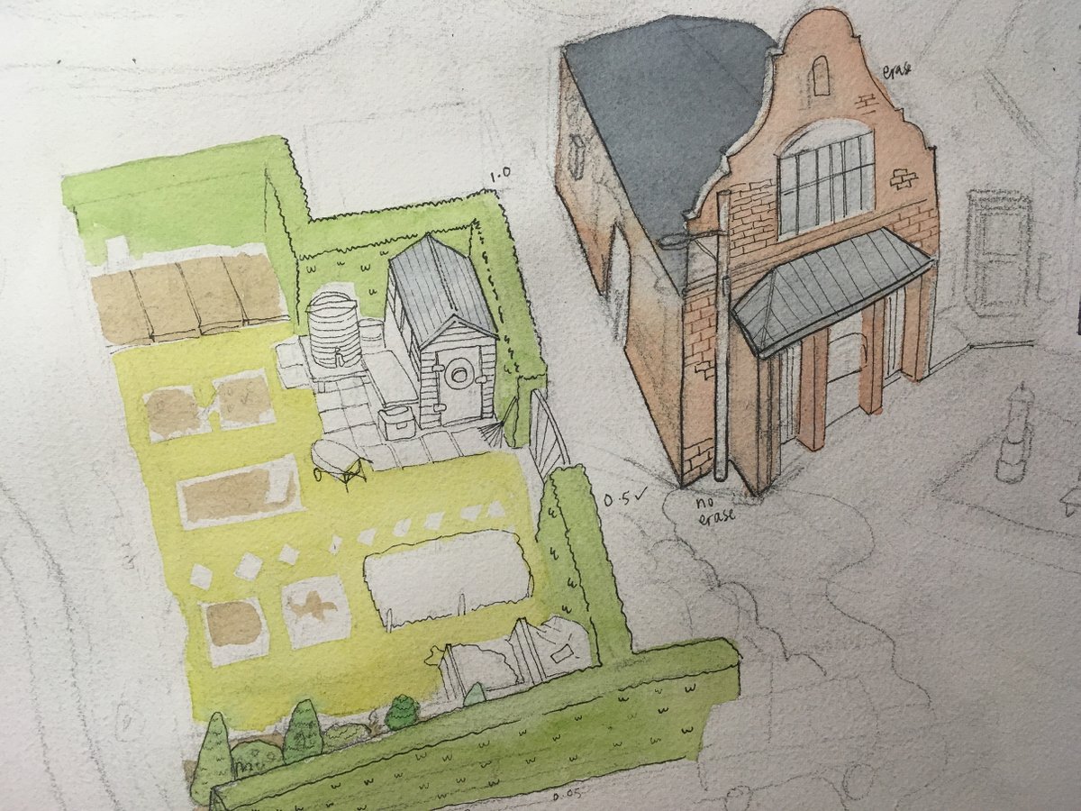
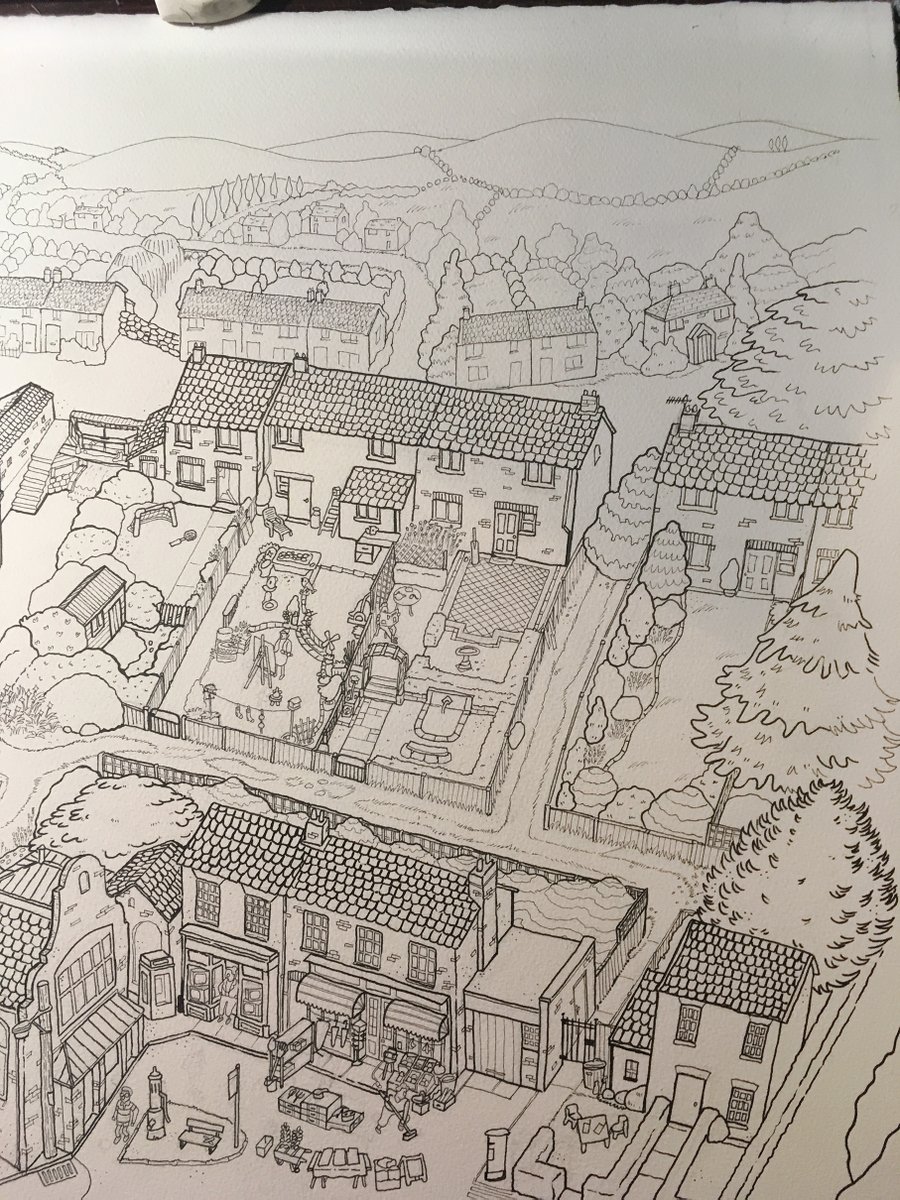
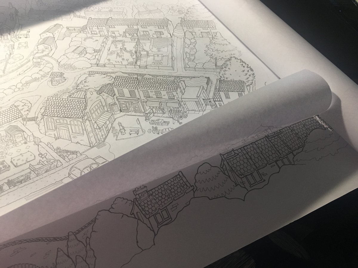
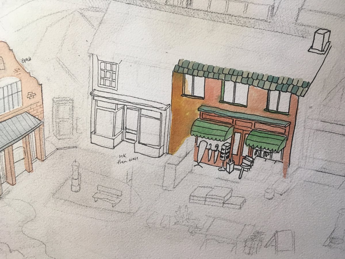
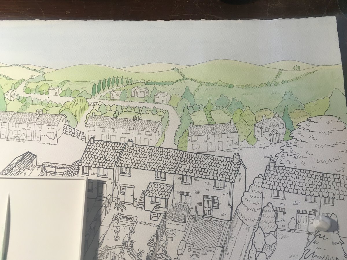
Finally it was time to do the linework! I used those early (stiff) pencil sketches to run a few tests, mostly which pens to use. We liked the bold, confident but wobbly lines of the brush pen, which I used on the shop shown here, rather than the smaller pen shown on the garden.
Everyone suddenly got this incredible second wave of excitement after those tests. I had known that the final would be much looser than the digital image, and as I inked into the night with my confident, wobbly lines it just kept feeling goofier and lovelier.
Here are the final inks as they developed, I thiiink it was maybe 2 or 3 nights? Maybe a little longer?
I was excited & nervous to colour it in.
I admit I also got pretty excited by the idea of making a colouring-in book at this point too.
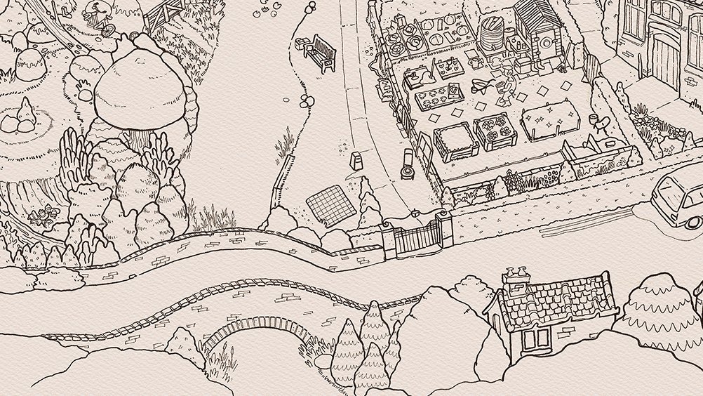
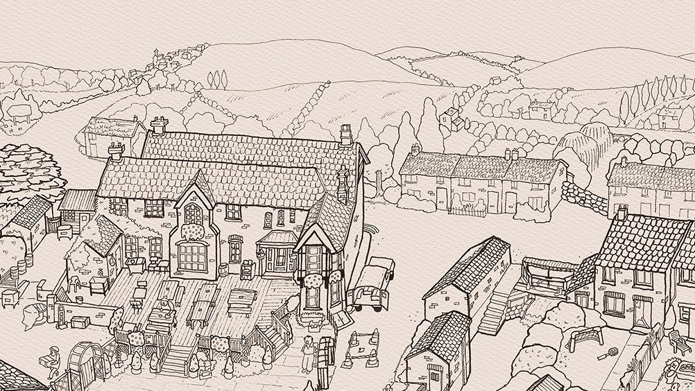
(If you’re an artist reading this thread feel free to colour the closeup photos in yourself, just tag me! I would LOVE to see your version!)
I admit I also got pretty excited by the idea of making a colouring-in book at this point too.
(If you’re an artist reading this thread feel free to colour the closeup photos in yourself, just tag me! I would LOVE to see your version!)
I took it to the scanners* for a cheap and dirty preliminary scan. See what I mean about colouring books? Anyway~ it was time to colour. No more putting it off!
(*Officeworks, like Kinkos I guess? Big office supplies and scanning chain store for a cheap scan)
(*Officeworks, like Kinkos I guess? Big office supplies and scanning chain store for a cheap scan)
The deadline was about 6 days away, so I was feeling a bit nervous about whether to do colours digitally, or with paint. I decided to take a little time gamble, & do a test to see how digital painting would look. We suspected paint would be nicer, even if slower, and were right.
Still feeling anxious that the Need for Speed may cause accidents. Spilling paint on art is terrible! It happens to the best of us, so I just had to have faith in my skills & focus. When I'm focused & working with a brush, there's an energy plane I go to where anxiety is banished
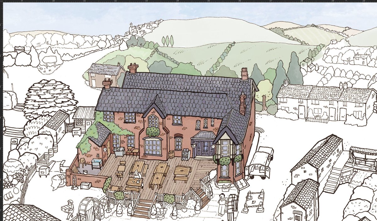
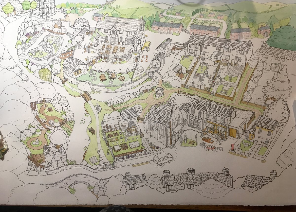
Eventually I took a deep breath, and decided to start with a wash of the sky and hills, and...it looked good! I guess it’s like most intimidating tasks: Once you start, it becomes a lot easier. I blocked in my core greens & browns. I was also working MUCH faster than anticipated!
Filling it all in.
I painted larger areas first like walls, grass, roofs, and then got into the nitty gritty...Of which there was plenty. During this whole thing I was pounding through 20 seasons of Grey’s Anatomy, in my lane, blissed out, meditating the whole time.
I painted larger areas first like walls, grass, roofs, and then got into the nitty gritty...Of which there was plenty. During this whole thing I was pounding through 20 seasons of Grey’s Anatomy, in my lane, blissed out, meditating the whole time.


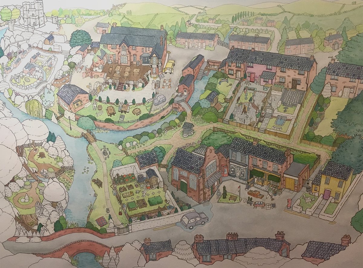
40 days and 40 nights passed by in the space of just 6 days.
...I love painting...


We had fun picking out TINY things I had missed painting (the bristles of the hairbrush, wimps shoelaces) before I took the final_final_v2_ActuallyDone version of the real (!) painting to @SMLXLprint to do a "Professional Quality" scan.
The technician there was a huge Goose Fan!
The technician there was a huge Goose Fan!
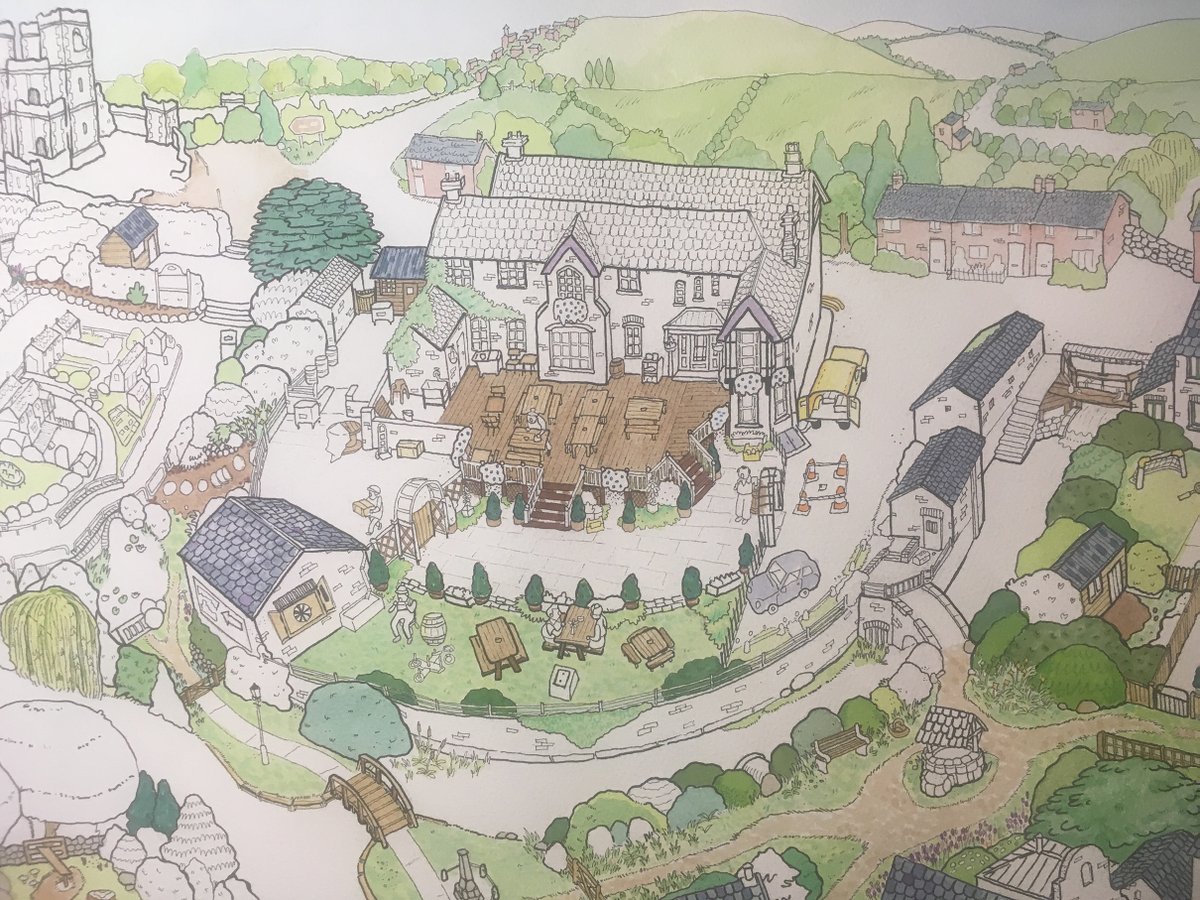
In the end, I used watercolour paints, copics, coloured pencils and ink pens to render. Possibly a tiny bit of crayon too? I sorta use them as if they’re ink anyway, with lots of pigment on the brush and quite precise, detailed application.
(Plus digital edits, to come)
(Plus digital edits, to come)
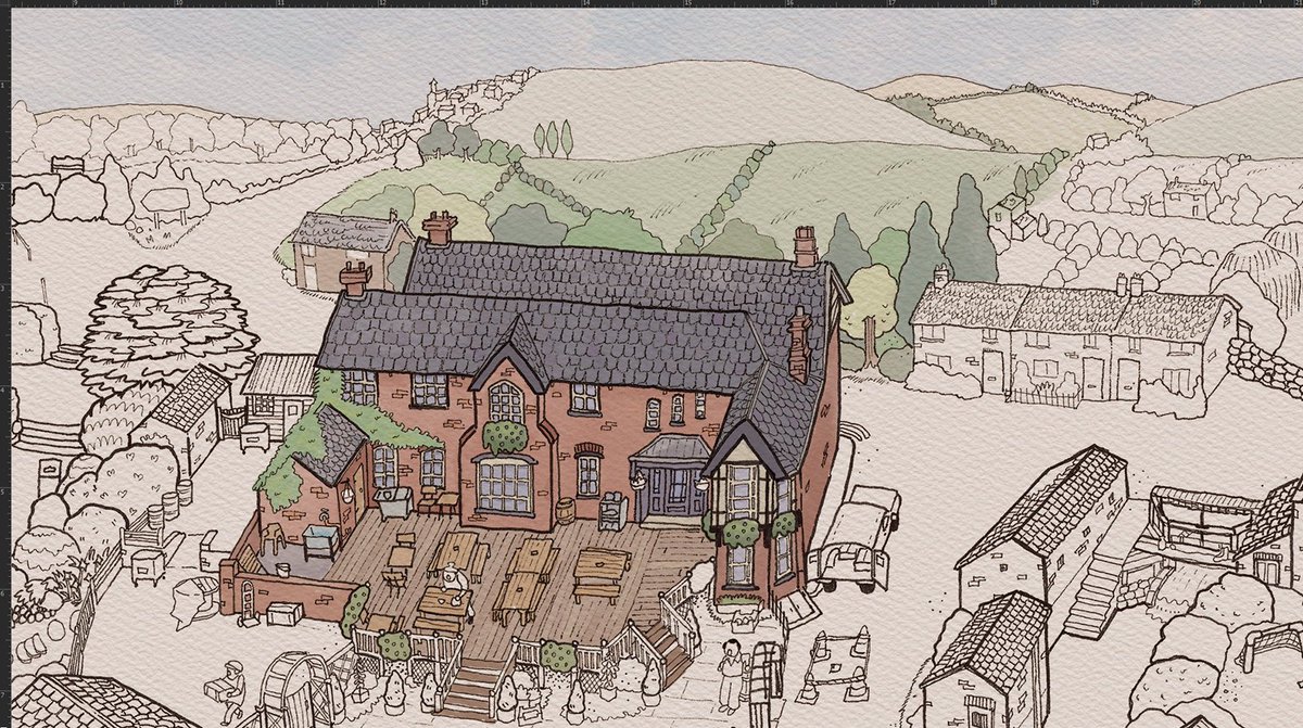
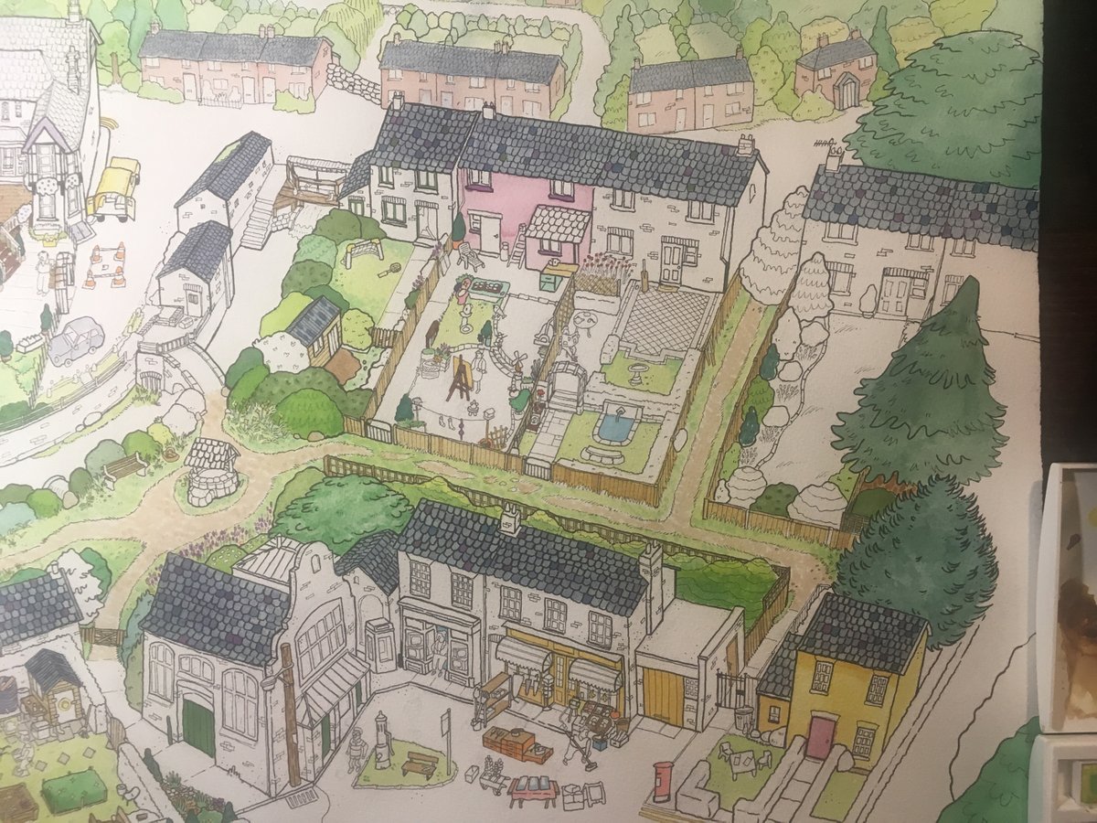
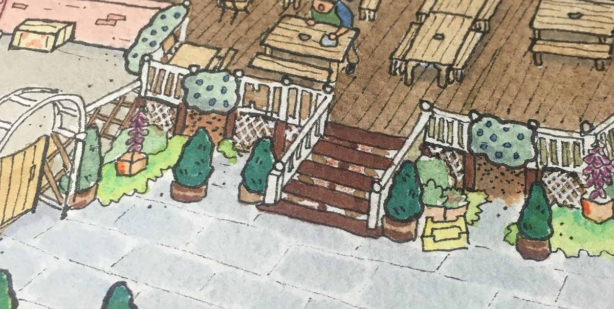
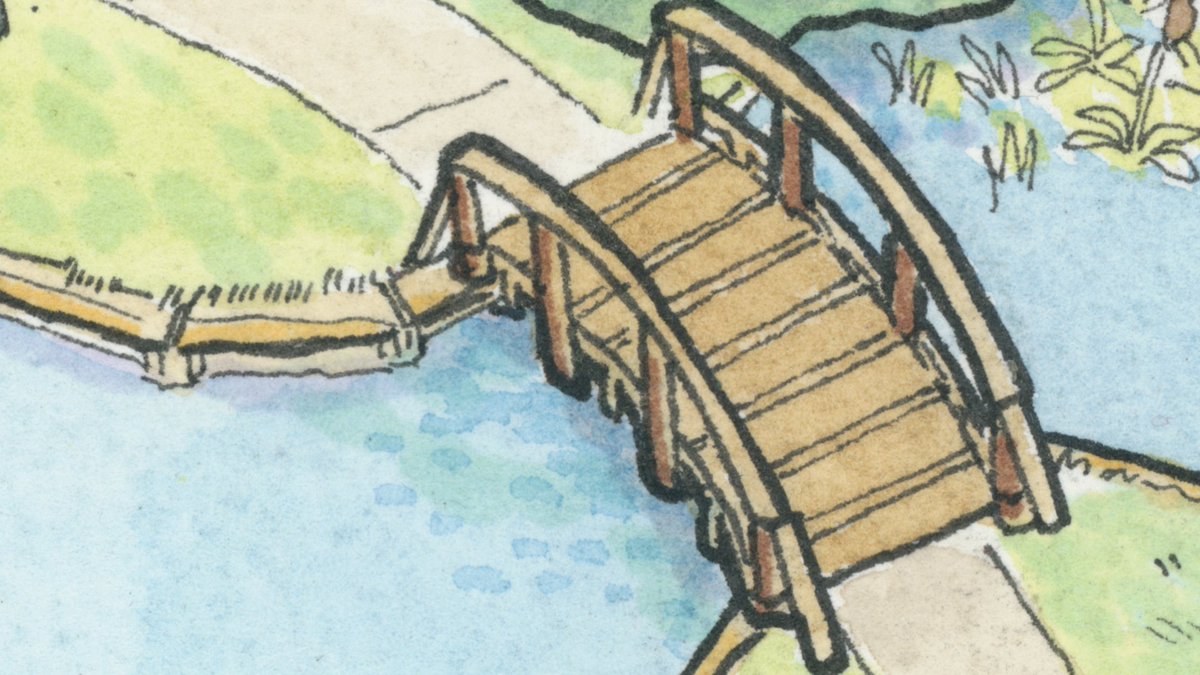
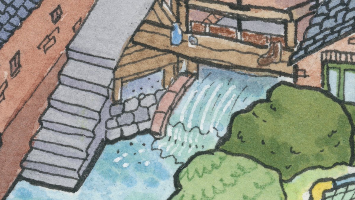
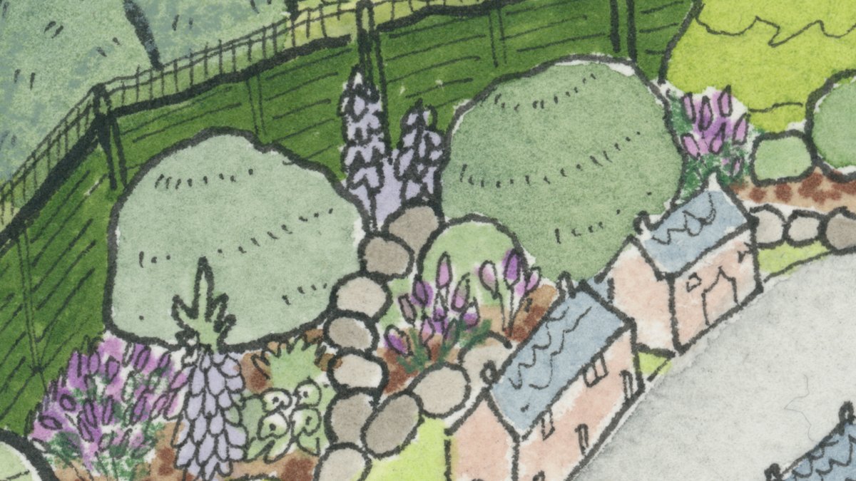
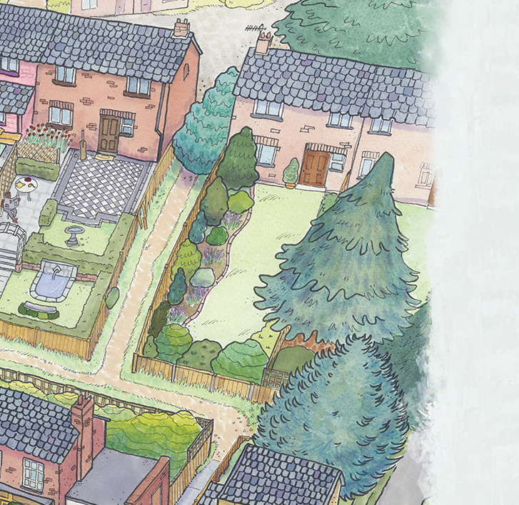
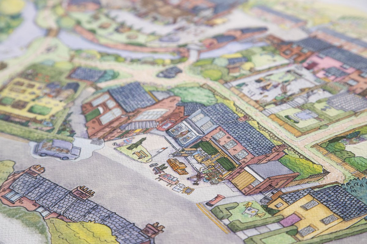
Here are some close ups of the scan quality, before my digital colour tweaks and cleanup. It makes a big difference to scan in at proper scanning places and is worth the extra cost if you can afford it! So much zoom.
Some of these ink strokes are 0.1pt!
Some of these ink strokes are 0.1pt!
Because I’d been so quick, we had a fair bit of time left for digital edits. I tweaked a bunch of colours (radioactive river no more! Washed out walls begone! Roof tiles: uniform!) and made the characters outlines & shapes sharper.
I also hid at least one goose, very fun
I also hid at least one goose, very fun

I also added in a ‘fade out’ edge around the whole thing so that we could make room for bleed and trim which wouldn’t step on the map’s toes. If you’re curious about printing tech, I’m not the girl to talk to about it, but I know having edges which have room to be cut is useful.
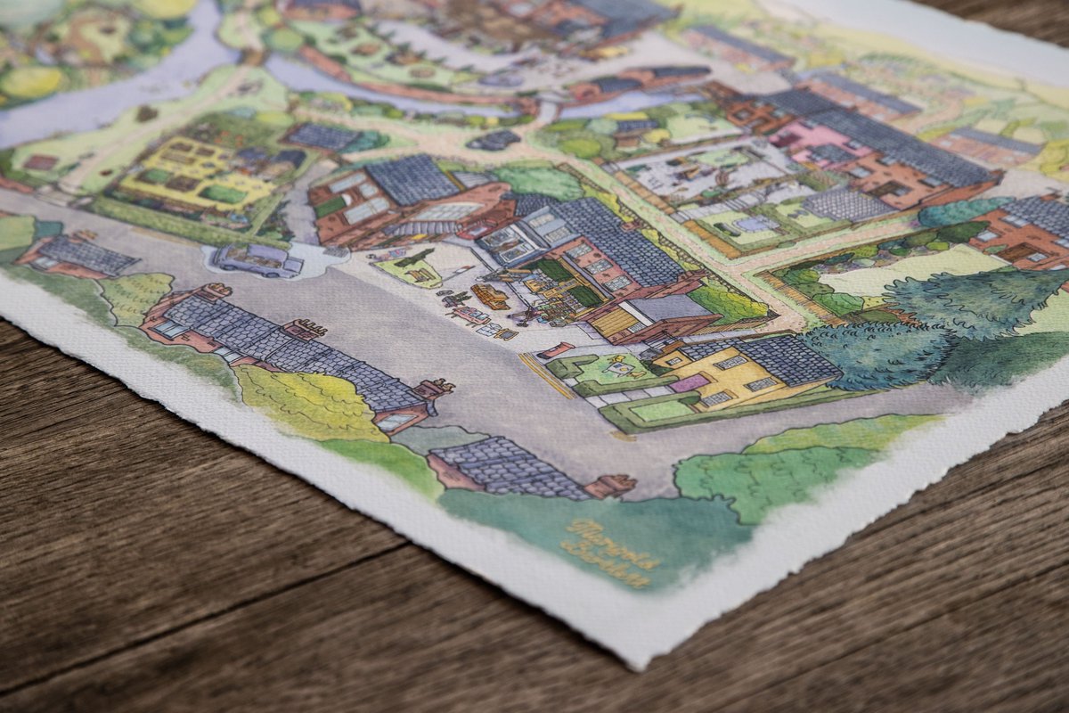
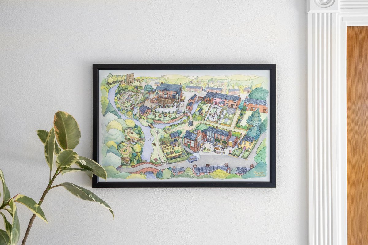
And now it’s a 16x24” Frameable Giclée Print. It’s Museum & Archival Quality. It’s got hand-deckled vintage-style edging, and it’s a fair dinkum piece of officially licensed Untitled Goose Game loveliness! <3
Check out other great Goose merch here too:
https://www.iam8bit.com/collections/untitled-goose-game
Check out other great Goose merch here too:
https://www.iam8bit.com/collections/untitled-goose-game
All I’ve wanted since making this map is to make another one! You can drop me a DM if you’d like to commission me to make something for your game? I would love to do a project this ambitious again.
 Or, you can support me by slipping something in here: http://paypal.me/ghosttowngoldie
 Or, you can support me by slipping something in here: http://paypal.me/ghosttowngoldie
(If you buy the PHYSICAL edition of Untitled Goose Game, there’s a map in there too!)
Available at your local games retailer WORLDWIDE!
(But whilst it is lovely, and rippable, it isn’t /quite/ as luxurious, detailed or as BIG as the archival quality print!)
Available at your local games retailer
 WORLDWIDE!
(But whilst it is lovely, and rippable, it isn’t /quite/ as luxurious, detailed or as BIG as the archival quality print!)
Thanks House House! Our world was starting to clench down when this was commissioned. Sinking my teeth into it was wonderful. It was truly just what I needed to focus on at the time: a hand drawn, intricate, challenging beast of a drawing.
That's the end of my map thread!
Thanks!
That's the end of my map thread!
Thanks!

 Read on Twitter


