STRONG OPINION: There are very very few cases where log scales should be used in communicating data to the general public.
This is not one of them. https://twitter.com/newscientist/status/1332274550617288704
This is not one of them. https://twitter.com/newscientist/status/1332274550617288704
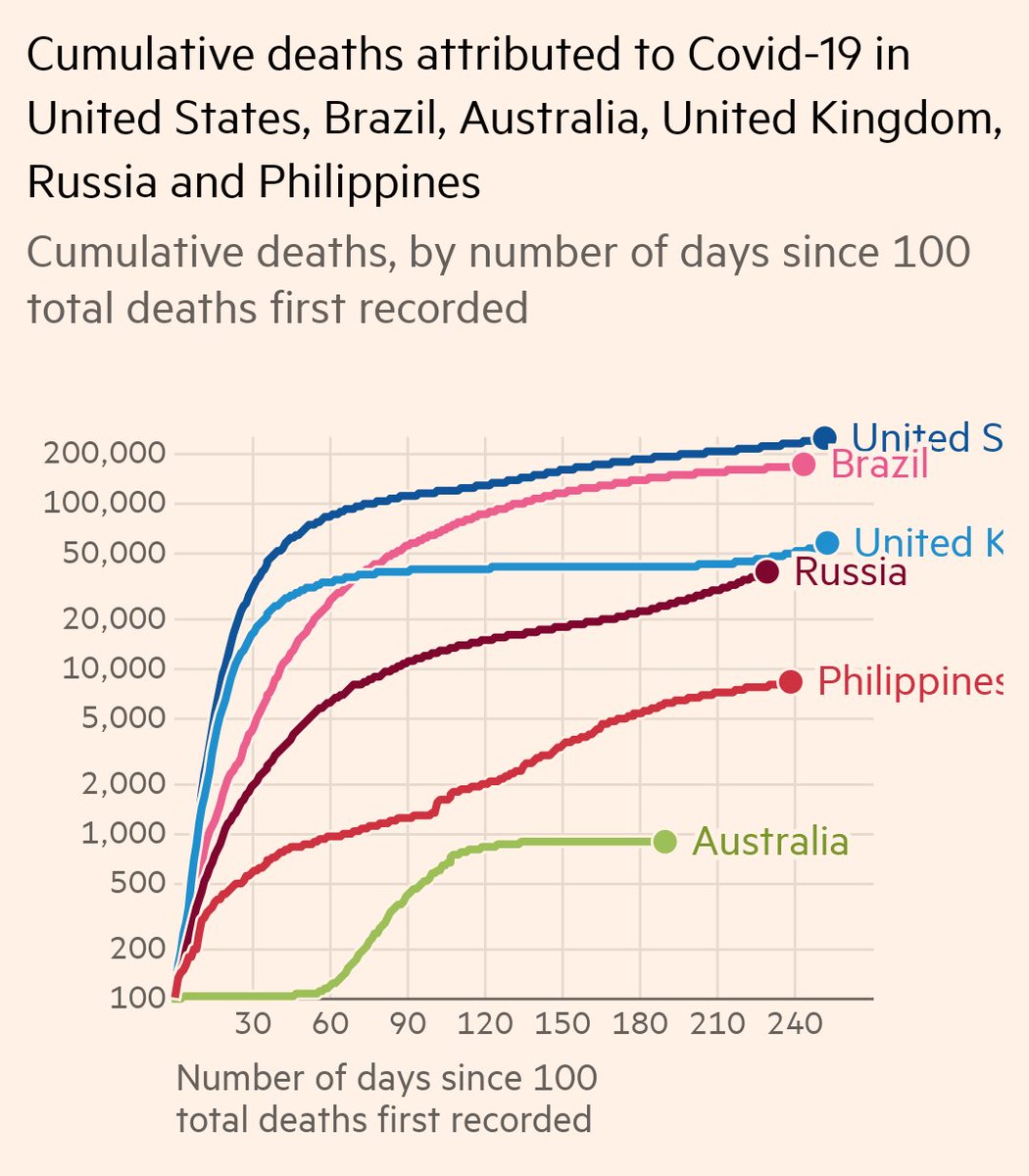
On a log scale, the USA is faring worst, but it's not on its own at the top.
Except it's about 10x worse than Spain/UK/Russia. I can't actually tell how much worse it is than Brazil.
Except it's about 10x worse than Spain/UK/Russia. I can't actually tell how much worse it is than Brazil.
On a log scale: Why did Austria have just a huge increase when everyone else is flat?
It didn't. That's actually a tiny increase. The increase in those 'flat' lines is orders of magnitude bigger.
It didn't. That's actually a tiny increase. The increase in those 'flat' lines is orders of magnitude bigger.
On a log scale: Russia and the Philippines have been increasingly steadily over the course of the pandemic.
Except a straight line on a log scale is actually exponential growth, and their deaths have been increasing exponentially.
Except a straight line on a log scale is actually exponential growth, and their deaths have been increasing exponentially.
I am a highly trained scientist with years of experience in data visualisation AND still I find log scales incredibly difficult to interpret.
How on Earth can we expect the general public to get the correct message from this at a glance???
STOP USING LOG SCALES.
How on Earth can we expect the general public to get the correct message from this at a glance???
STOP USING LOG SCALES.
This seems to have struck a chord, so here's so more comparisons to show how bad humans are at interpreting log scales.
I'm using FT's fantastic graphing tool for all of these: https://ig.ft.com/coronavirus-chart/
I'm using FT's fantastic graphing tool for all of these: https://ig.ft.com/coronavirus-chart/
I've replicated the log scale graph. I should point out that it's not only New Scientist showing it this way; I've seen it all over the place.
Remember that the data is the exact same data in every graph. This is about how data visualisation affects the message we get.
Remember that the data is the exact same data in every graph. This is about how data visualisation affects the message we get.
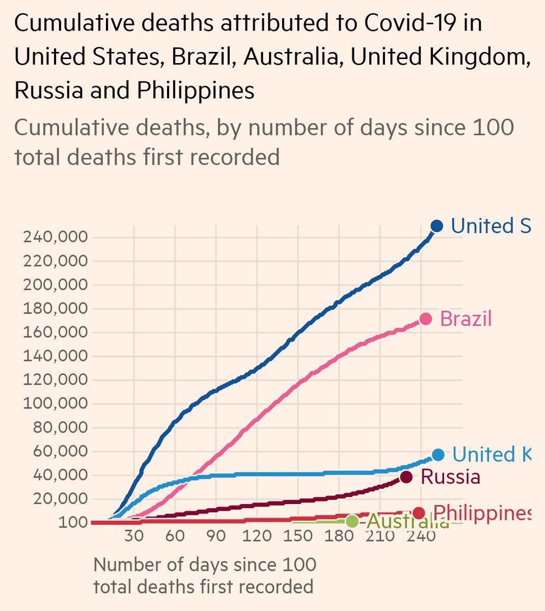
First, let's scrap the log scale and have a normal linear scale instead.
Instantly we see how bad the USA and Brazil are compared to places like Russia and the UK. Australia and the Philippines barely even register any more.
Instantly we see how bad the USA and Brazil are compared to places like Russia and the UK. Australia and the Philippines barely even register any more.
Log scales exaggerate changes at the small end and minimise changes at the big end.
But in terms of how we think about a metric like death rate, adding one death to 100 is the same as adding one death to 100,000. Deaths should be shown as linear, not log.
But in terms of how we think about a metric like death rate, adding one death to 100 is the same as adding one death to 100,000. Deaths should be shown as linear, not log.
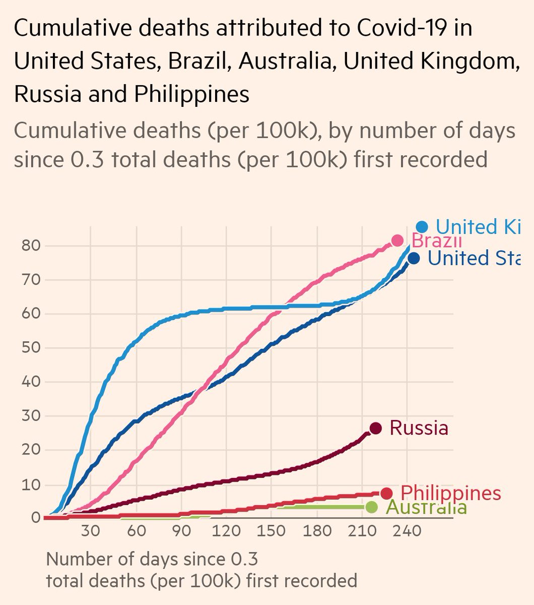
Now let's keep a linear scale, but adjust it according to the size of the population. After all, big populations are always going to have more deaths even if everything else is equal.
As a Brit, this gets a bit depressing:
As a Brit, this gets a bit depressing:
We hear so much about how bad the USA (and Brazil) have had it.
"Quarter of a million deaths!"
"25% of all global cases!"
But the USA is huge.
Per capita, the UK has seen more deaths from Covid than the USA has *at every point in the pandemic*. WHY DO BRITS NOT KNOW THIS???
"Quarter of a million deaths!"
"25% of all global cases!"
But the USA is huge.
Per capita, the UK has seen more deaths from Covid than the USA has *at every point in the pandemic*. WHY DO BRITS NOT KNOW THIS???
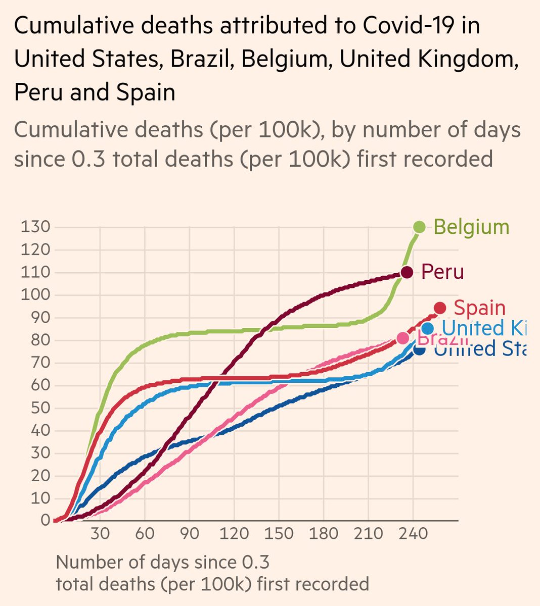
Selecting a different roster of countries, we now see that the USA is far from the worst hit.
Poor Belgium has been having a really tough time of it, and it seems to be only getting worse.
Poor Belgium has been having a really tough time of it, and it seems to be only getting worse.
In conclusion what do each of these graphs make you think about the pandemic?
Data visualisation is so important, particularly at a time of global crisis. People making graphs can choose what message they want to tell you.
It's a responsibility they should not take so lightly.
Data visualisation is so important, particularly at a time of global crisis. People making graphs can choose what message they want to tell you.
It's a responsibility they should not take so lightly.
IMHO, for comparing countries, it should be shown as deaths per capita on a linear scale.
That way we are comparing like for like in a way our brains can easily process.
Any deviation from this should be only for a very specific purpose and must be clearly explained.
That way we are comparing like for like in a way our brains can easily process.
Any deviation from this should be only for a very specific purpose and must be clearly explained.
Well look at all these stats lovers!
I don't have a SoundCloud but I do make YouTube videos all about science, and here is one about bananas and maths:
I don't have a SoundCloud but I do make YouTube videos all about science, and here is one about bananas and maths:

 Read on Twitter


