Alright it’s go time: let’s talk about dot density maps and why they’re a better tool for displaying election data than what we usually see. https://twitter.com/lyzidiamond/status/1329471916558536706
First things first: I believe that maps are tools for sharing information. The primary goal of a map is to clearly display data so the person reading the map understands the story the data is telling. An election map, you might imagine, is no exception.
Quick primer on how presidential elections work in our weirdo country: each state votes as a unit. The winner of the popular vote (50% +1) determines if the state’s electoral votes will go to one candidate or another. (Electoral politics can stay out of this example fortunately)
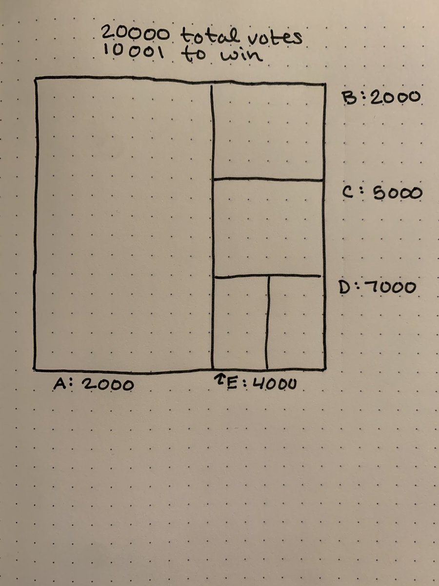
So! Let’s talk about our little state. (Open to name suggestions!) Our state has 5 counties (A, B, C, D, and E) and a total population of 20,000. 50%+1 = 10,001 votes to win the state.
The population of each county:
- A: 2000
- B: 2000
- C: 5000
- D: 7000
- E: 4000
The population of each county:
- A: 2000
- B: 2000
- C: 5000
- D: 7000
- E: 4000
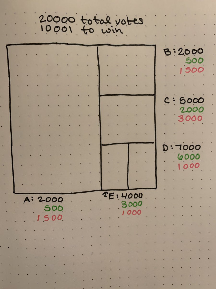
Congrats everyone, today is Election Day! It was a tough race between Green and Pink but ultimately Green came out victorious. Let’s look at how the data breaks down county by county:
What can we learn from this information? I see a few things:
- D is one of the smallest counties, but has the highest number of people
- the vast majority of voters in D voted for Green
- E and C also have a lot of Green voters (and people)
- D is one of the smallest counties, but has the highest number of people
- the vast majority of voters in D voted for Green
- E and C also have a lot of Green voters (and people)
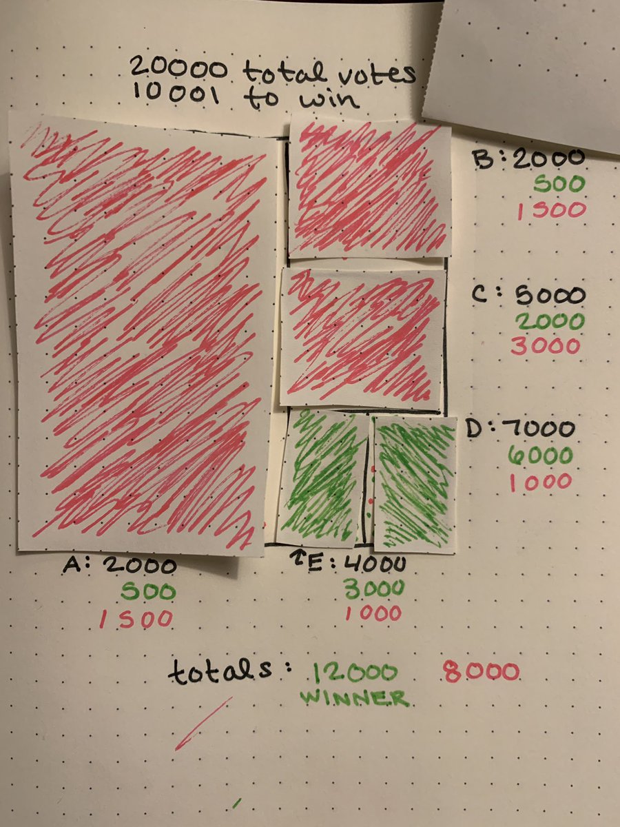
Now this is what you might see John King or Steve Kornacki playing with on a big board during our fake election. This is a choropleth map — the majority value in an area determines the fill color for the whole area.
Why is this the most popular way to display voter data? A few reasons:
- voter data is usually reported by county in small trickles over time. This technique means they can quickly and easily change the color based on new data.
- it mimics the way we view national data
However:
- voter data is usually reported by county in small trickles over time. This technique means they can quickly and easily change the color based on new data.
- it mimics the way we view national data
However:
You do not win a state based on winning a majority of counties nor the majority of land area. I mean our fake election is proof of that: 3/5 counties went for Pink and still Green won. Looking at this map does not help you understand the data at all. In fact, it’s harmful.
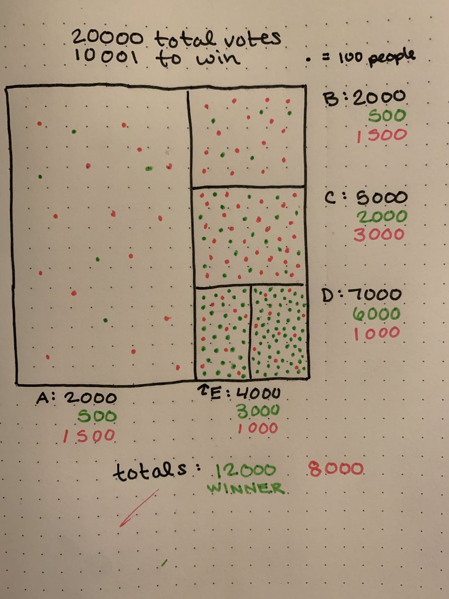
Another way to display aggregate data is called a dot-density map. In a dot-density map, each dot represents a number of data points and those points are randomly distributed throughout an area. Here is our fake election map, dot-density style:
Why is this better? You win a state by getting the majority of the votes, and the data is displayed based on the number of votes. Each county’s party division is clearer, as this approach doesn’t abstract away the non-majority votes when displaying info.
Also, it shows relative density of people in each geographic area. The land area doesn’t matter — the number of people absolutely does.
If the popular vote was more important nationally I’d say this approach makes sense for national data, but states really are all-or-nothing
If the popular vote was more important nationally I’d say this approach makes sense for national data, but states really are all-or-nothing

In conclusion: this is one of my favorite hand drawn maps / I really did draw the right number of dots you can count them thank you 


 Read on Twitter


