not enough people are making noise about visual variables
it's single-handedly the best framework i’ve come across in visual design
if you ever wondered what are all the ways to visually represent info and how to reason about which to use given data, meet visual variables!
it's single-handedly the best framework i’ve come across in visual design
if you ever wondered what are all the ways to visually represent info and how to reason about which to use given data, meet visual variables!
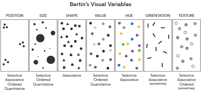
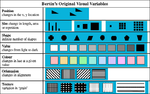
let's start off by defining all the variables:
1. position: an object’s spatial context
2. size: relative extent of an object
3. shape: geometric quality of an object
4. value: degree of lightness of an object
5. hue: object's color
6. orientation: object’s relative rotation
1. position: an object’s spatial context
2. size: relative extent of an object
3. shape: geometric quality of an object
4. value: degree of lightness of an object
5. hue: object's color
6. orientation: object’s relative rotation
let’s go ahead and list the types of relations you might want to represent using these variables:
1. nominal: categorical information.
e.g. is this object part of “x” group?
e.g. is this object part of “x” group?
2. ordinal: sequential information.
e.g. how can visually represent these in a way that an observer can line them up to fit a predictive pattern of magnitude?
e.g. how can visually represent these in a way that an observer can line them up to fit a predictive pattern of magnitude?
3. quantitative: measured difference
this is a step above ordinal, where we don't want to just know which objects come before or after, but exact variances
e.g. how much does object “a” differ from object “b” on this particular characteristic?
this is a step above ordinal, where we don't want to just know which objects come before or after, but exact variances
e.g. how much does object “a” differ from object “b” on this particular characteristic?
so here’s the thing: visual variables are not built the same. they differ in their effectiveness as communicating nominal, ordered, and quantitative information.
given visual variable, there is a ceiling on the “length” or “scale” of the variable
this is the number of distinguishable levels that can be perceived efficiently.
this is the number of distinguishable levels that can be perceived efficiently.
e.g. if we take hue, it’s easy to tell blue and red apart (two levels), but when we’re dealing with 50 hues, humans struggle to differentiate cobalt blue from cerulean blue
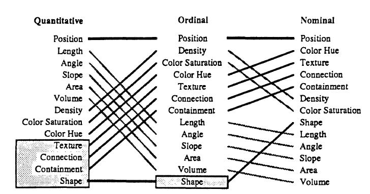
here's a look at the effectiveness of an expanded (ranked top to bottom in descending order) list of visual variables at communicating nominal, ordinal, and quantitative information:
let’s drive the message home with a few examples:
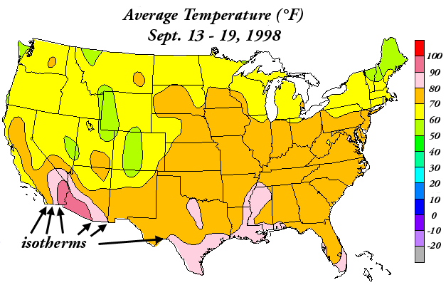
hue is NOT ordered or quantitative, so it’s a terrible visual variable for communicating that type of data. avoid this pls
hue is NOT ordered or quantitative, so it’s a terrible visual variable for communicating that type of data. avoid this pls
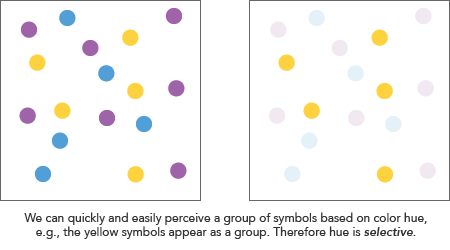
find me all the yellow circles
our eyes can instantaneously do so, which is the goal of communicating nominal information. this is also described as ‘selectivity’: the ability to isolate a group of objects based on a common level.
our eyes can instantaneously do so, which is the goal of communicating nominal information. this is also described as ‘selectivity’: the ability to isolate a group of objects based on a common level.
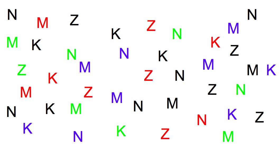
most variables are selective. the outlier is shape which is hard to utilize as a means of isolation. try to do all the following and track how long to takes takes you:
- position: find all the letter on the left
- hue: find all the red letters
- shape: find all the K’s
- position: find all the letter on the left
- hue: find all the red letters
- shape: find all the K’s
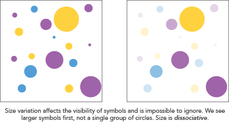
related to ‘selectivity’ is the concept of ‘associativity’: this is how easy it is to ignore a variable — essentially collapse all the distinctions along it.
variables with poor associativity interfere with the perception of other visual dimensions.
variables with poor associativity interfere with the perception of other visual dimensions.
e.g. it’s easy to ignore hue in the letters image above and focus on shape (letter geometry), however it is very hard to ignore size.
so if we take the example of a progress bar, it is often a simple rectangle with another rectangle within it because we seek to represent quantitative information, i.e. how much has loaded and how much is left?
position is hands down the best way to represent this information
position is hands down the best way to represent this information
i really hope to have blown a few minds with this, because i went batshit crazy when i first internalized the power of this framework
it demystified data visualization and made it super easy to make deterministic decisions of how best to visually map information
it demystified data visualization and made it super easy to make deterministic decisions of how best to visually map information

 Read on Twitter