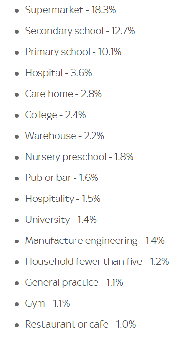
FFS. This is massively misleading, and has already been seized upon by "lockdown skeptics" and "mask truthers". /1 https://twitter.com/SkyNews/status/1329438701689204739
First, it only asked where people who were infected had been to recently, not where they (thought they) were infected. Guess what? A lot of people go to supermarkets. /2
Second, any split of locations into categories is arbitrary. Why the distinction between "Pub or bar", "Hospitality", and "Restaurant or café"? Why are there five categories for education? /3
Third, "most common setting" doesn't mean where you spend the most time, or even a lot of time. People who go to school spend 6 hours a day there. People who go to supermarkets spend perhaps 30-60 minutes, twice a week. The numbers are not weighted by time. /4
Fourth, even if the risk of each visit was identical (which, again, it isn't, not even remotely), the top category in any list of this kind only has value for story-telling. But it seems that everything has to be turned into a tournament of some kind. /5
Potentially, millions of people will now be scared to go shopping, which --- with distancing and a mask --- is not an especially risky activity. Maybe they will buy double loads of everything to save half their trips, leading to shortages. /6
They will see "Pub or bar 1.6%" and think "great, let's go for a drink", even though the reason they hardly figure is that most of the pubs and bars in the country were closed when the data were collected. /7
If you wanted a textbook example of how not to present data, Public Health England and Sky News have done you proud here. If you want responsible science or journalism, or an accurate picture of where the risk of infection lies... not so much. /8 /end
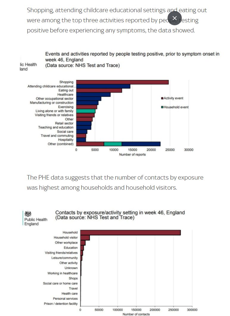
PS: The answer to where the risk lies is right there in the report, in the second of these figures. You get infected by contacts, not by visiting places. But the headline and the article basically report the first. I despair.

 Read on Twitter


