Right. Let's talk about this for a sec. I'm gonna put politics aside for a bit and address this as a designer. I invite fellow creatives to chip in, as well.
We have a textbook example of a poorly-designed logo, probably from an underpaid (or pissed off) designer.
We have a textbook example of a poorly-designed logo, probably from an underpaid (or pissed off) designer.
1. Colors
Let's not be pretentious about this. I'm sure the client feedback was something like "MAKE IT POP!"
You know what kind of logo has this kind of colors for multi-layer outline/strokes?
Let's not be pretentious about this. I'm sure the client feedback was something like "MAKE IT POP!"
You know what kind of logo has this kind of colors for multi-layer outline/strokes?
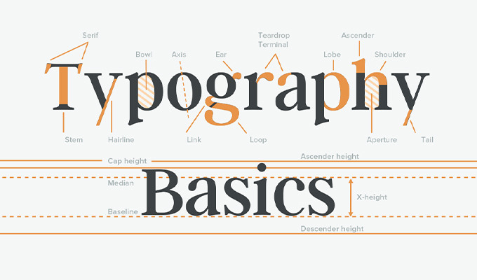
2. Typography
There's nothing modern about the fonts here. What's used here is called 'illustrated type' or 'script type'.
'Modern' typefaces are visually engineered solutions. The letters are designed for consistency and versatility.
There's nothing modern about the fonts here. What's used here is called 'illustrated type' or 'script type'.
'Modern' typefaces are visually engineered solutions. The letters are designed for consistency and versatility.
3. Visual Motifs
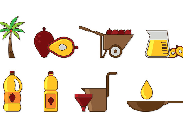
Using DETAILED ILLUSTRATIONS in a logo design is a failure in the design process. Suppose the logo aims to connect the idea of a 'gift/blessing' with 'oil palm', one would use STYLISED illustrations, usually silhouettes.
Using DETAILED ILLUSTRATIONS in a logo design is a failure in the design process. Suppose the logo aims to connect the idea of a 'gift/blessing' with 'oil palm', one would use STYLISED illustrations, usually silhouettes.
4. Use cases
Can this logo be shifted to pure Black and White without losing elements that give it meaning? Nope. The layered strokes and the palm seed is gone
Can this logo be shrunk down to put in the corner of a letterhead and be functional? Nope. The text is illegible.
Can this logo be shifted to pure Black and White without losing elements that give it meaning? Nope. The layered strokes and the palm seed is gone
Can this logo be shrunk down to put in the corner of a letterhead and be functional? Nope. The text is illegible.
5. Context
This is a campaign logo. It's a short-term presence for a campaign with (expected) long-term impact.
Functionally, a campaign logo should visually (not verbally) communicate the 'spirit' of the campaign. In this case, it SHOULD communicate a 'divine blessing', right?
This is a campaign logo. It's a short-term presence for a campaign with (expected) long-term impact.
Functionally, a campaign logo should visually (not verbally) communicate the 'spirit' of the campaign. In this case, it SHOULD communicate a 'divine blessing', right?
Unfortunately, there's no visual cue for divinity in this logo.
This design brings no spiritual metaphors, no sense of divinity, let alone any graphical sign of holiness. Visually, the logo has failed to communicate the intent of the campaign it represents.
This design brings no spiritual metaphors, no sense of divinity, let alone any graphical sign of holiness. Visually, the logo has failed to communicate the intent of the campaign it represents.
TLDR; Hire me for design jobs. I can do much better than this snack pack logo that you paid (pocketed some yourself) for.

 Read on Twitter


