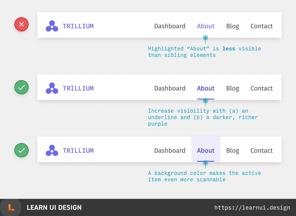
Color is a great way to show which element is selected, but if your brand color is lighter than the default text color, you need to attract attention in other ways.
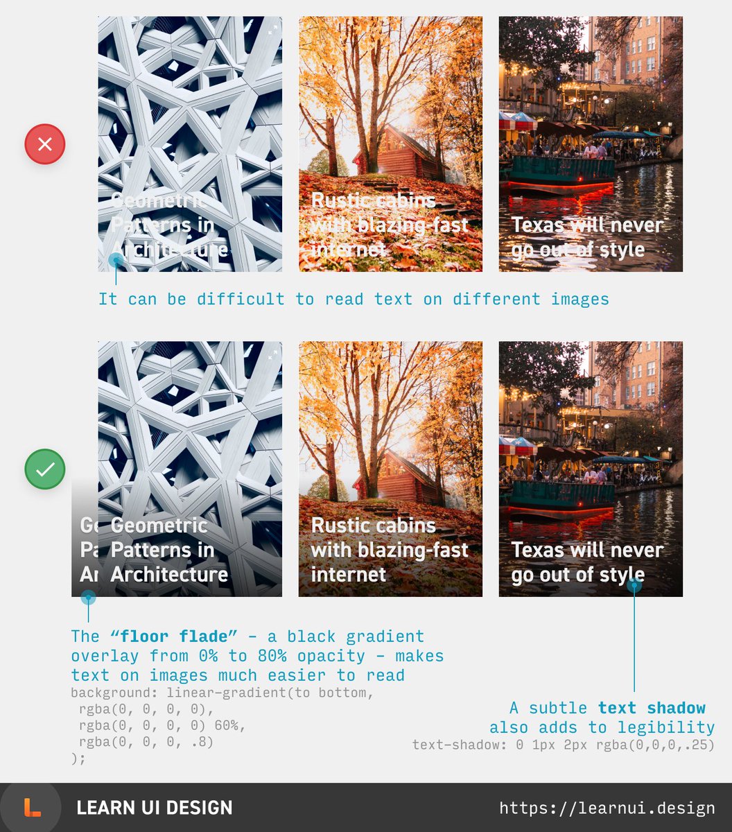
Text on images can be hard to read! Try using a floor fade – a gradient overlay from 0% to ~70% opacity black at the bottom of the image. Then use white text, and add a subtle shadow for extra readability.
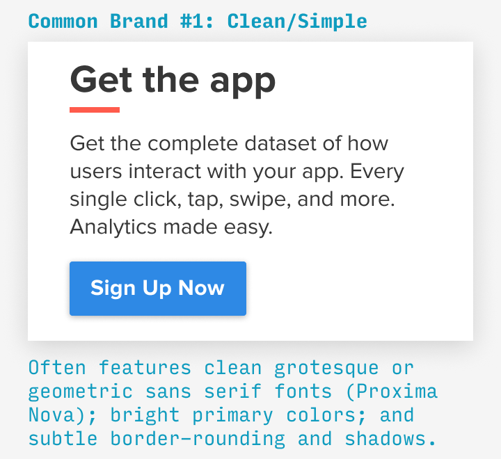
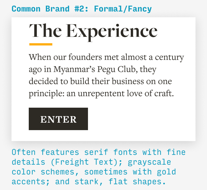
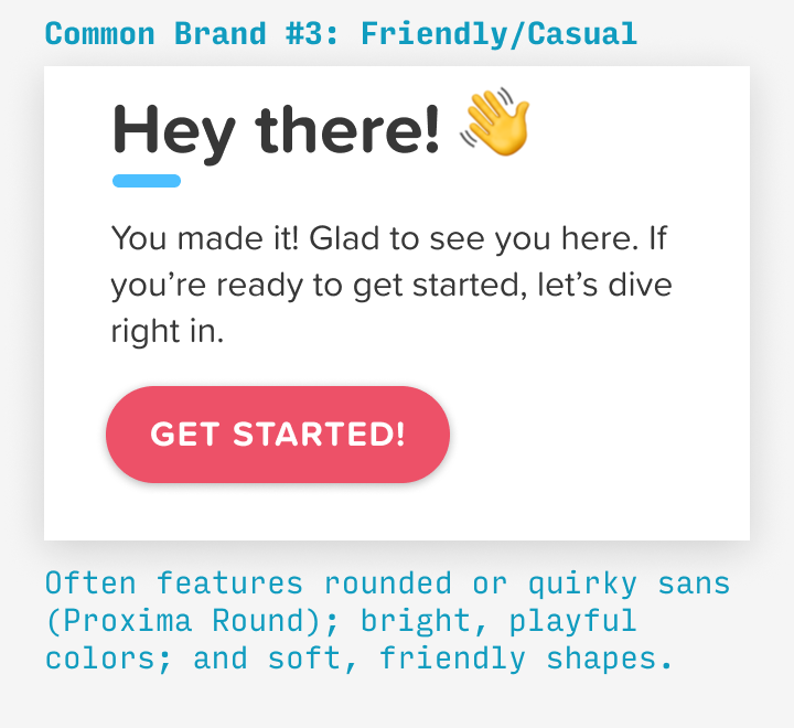
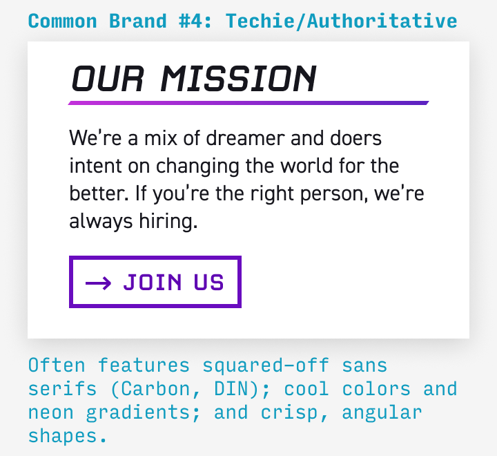
 The 80/20 of branding is to know the 4 most common brand types. Compare the images to understand how they’re communicated with fonts, colors, copy, and more. (4/50)
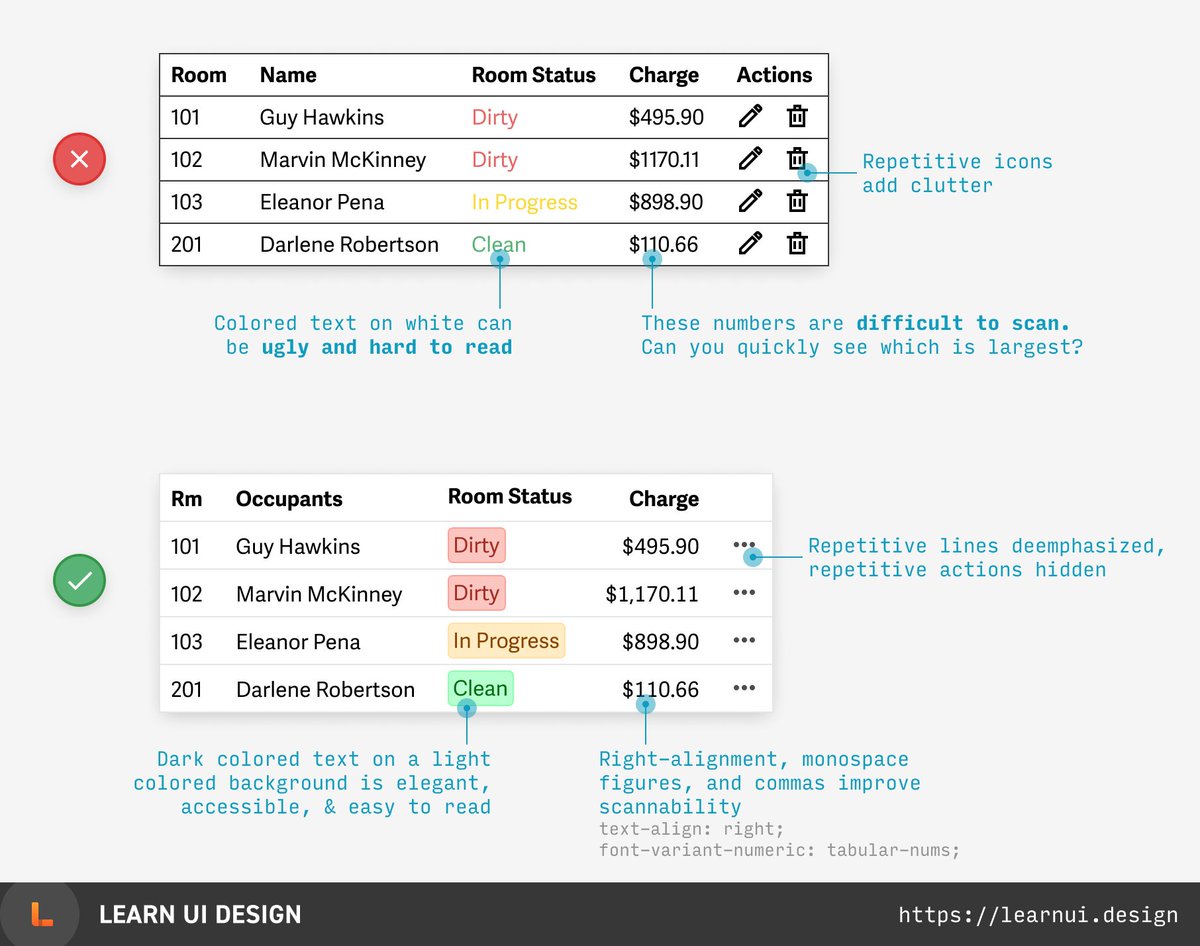
 Tips for designing tables:
(1) Lighten or remove repeating elements to reduce clutter
(2) Right-align numbers that are digit-for-digit comparable (using monospace figures)
(3) Avoid ugly, inaccessible colored text
(5/50)
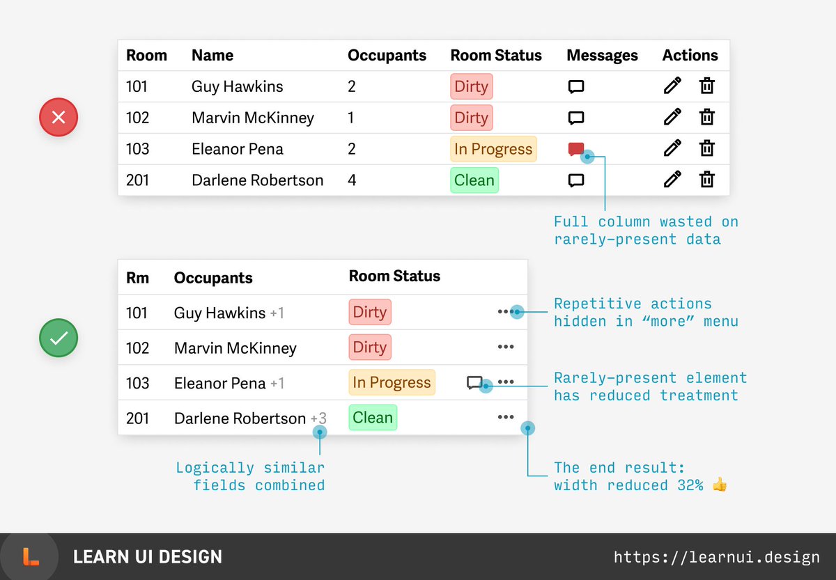
 Is your table too wide? Here are 3 non-obvious tips:
(1) Consolidate similar columns
(2) Don’t waste a full column on rarely-present data
(3) Hide repetitive actions behind a “more” button
(6/50)
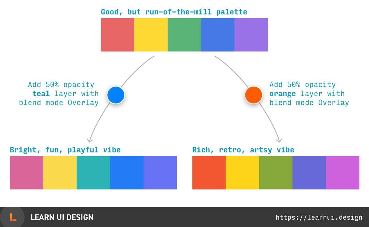
 Easy hack to generate color palette ideas:
1. Take an existing palette
2. Add a new layer on top in a blend mode like Soft Light or Overlay
3. Experiment with the top layer's color and opacity
(7/50)
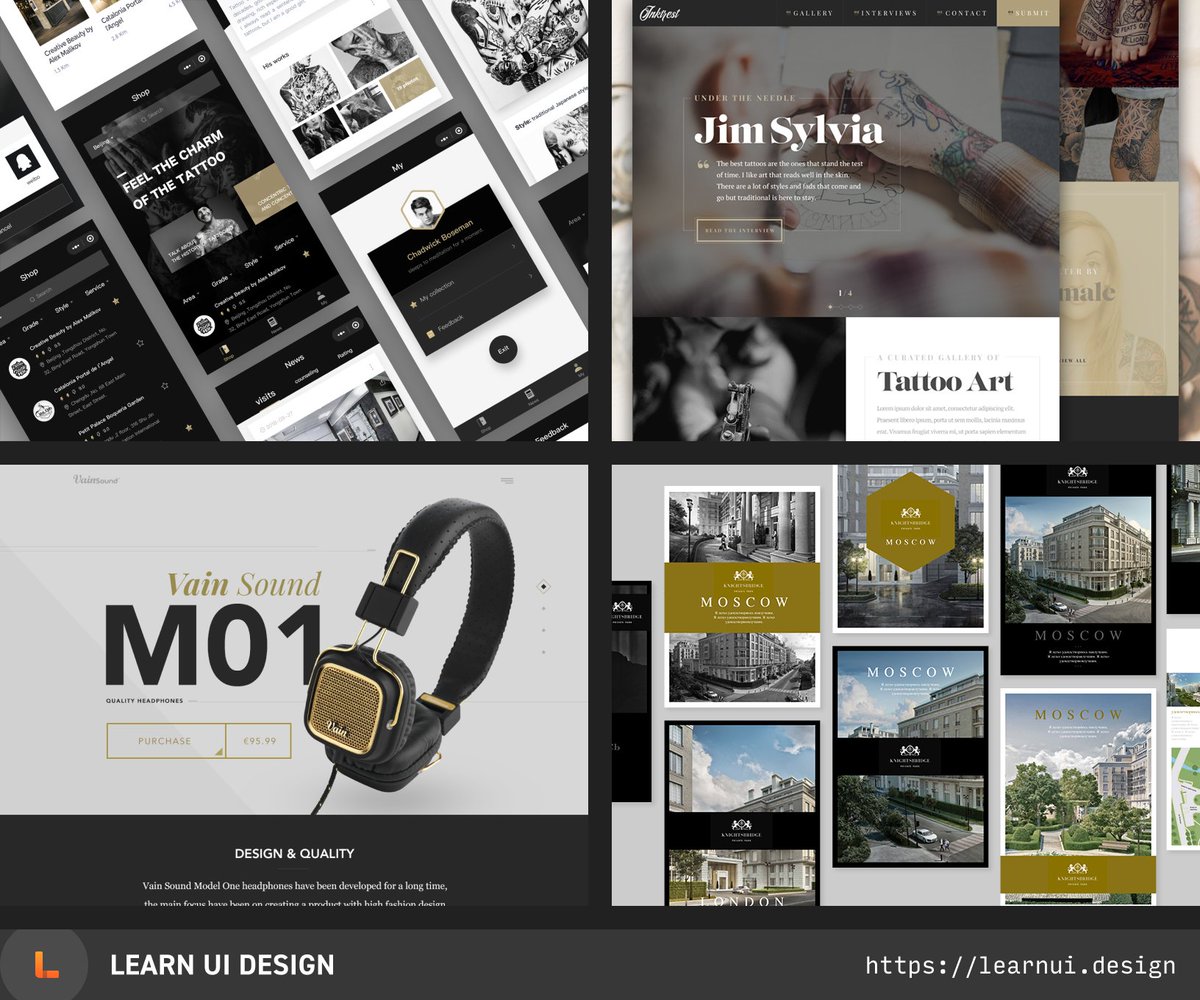
 Easily design a classy brand with GRAYSCALE + GOLD. Once you notice it, you’ll see it everywhere. (8/50)
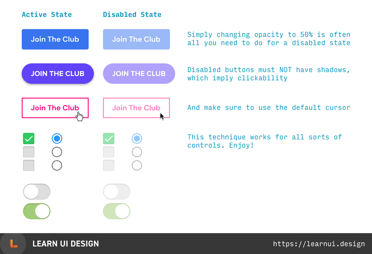
 To design a disabled state for a control (button, input, checkbox, etc), simply make it 50-60% opacity.
That’s it. That’s the tip.
(9/50)
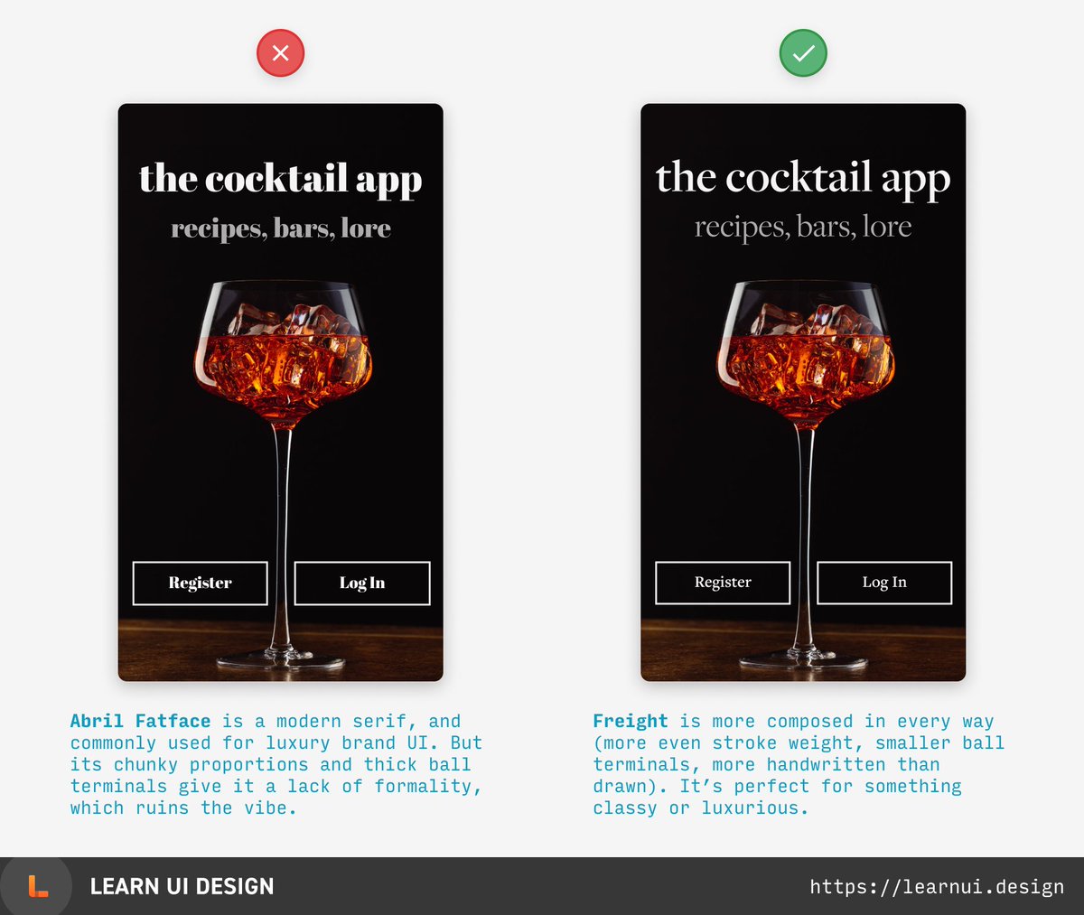
 There are only two "cheatcodes" in UI design. The first is: USE GOOD FONTS. Here, the popular but slightly too goofy Abril Fatface pales in comparison to stately Freight.
(10/50)
PS. More font recs here: https://learnui.design/blog/7-rules-for-creating-gorgeous-ui-part-2.html#rule-6-use-only-good-fonts
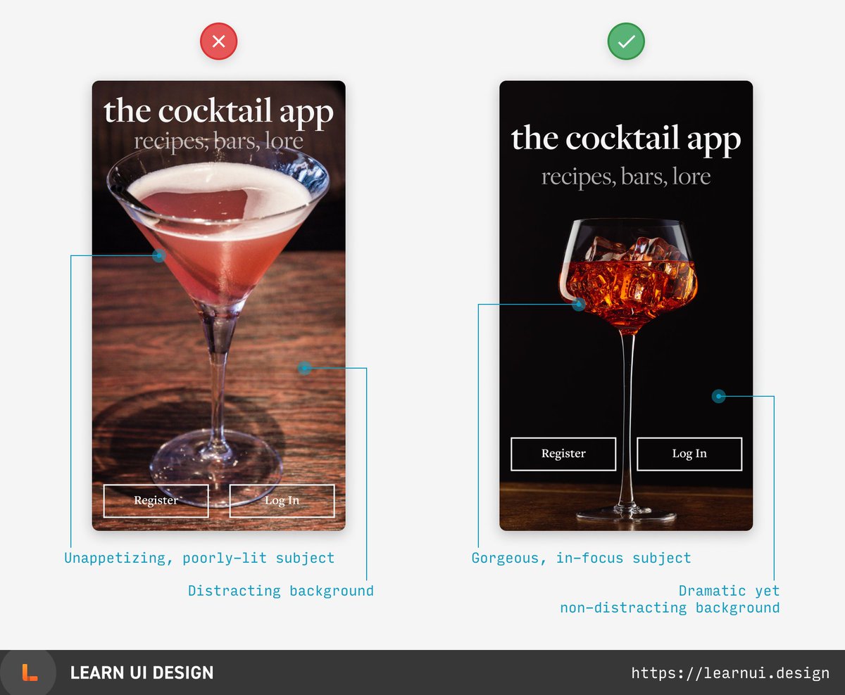
 There are only two “cheatcodes” in UI design. The second is: USE GOOD IMAGERY. If your design relates to something photogenic, you *must* take advantage of it. (11/50)
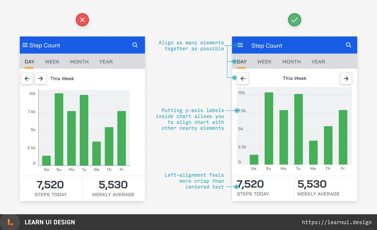
 Need to display some numbers on a dashboard? Try making them big and bold, with a smaller, lighter uppercase label. An easy, clear, and stylish treatment! (12/50)
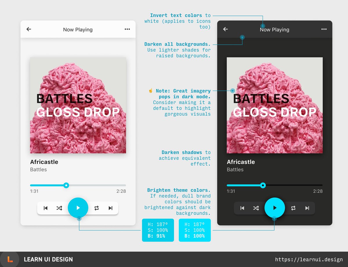
 Dark mode in 4 steps: (1) invert text colors, (2) darken (but don’t invert) backgrounds, (3) darken shadows, and (4) brighten theme colors that appear too dull. (13/50)
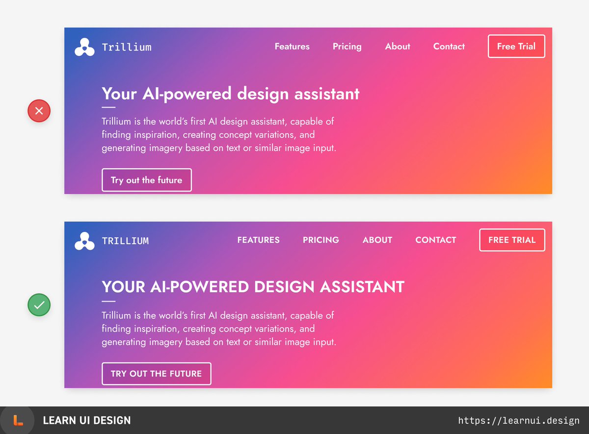
 Tip for beginning designers: you’re probably not using enough uppercase. It feels crisp and subtly attracts attention, without adding size or color. (14/50)
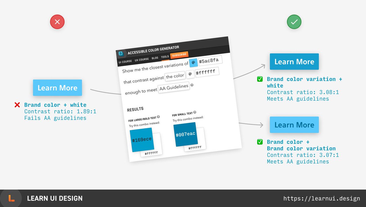
 Trying to find an accessible text color? Enter your brand color in this tool and get the nearest shades that meet contrast guidelines. https://learnui.design/tools/accessible-color-generator.html (16/50)

 Read on Twitter



 (15/50)
