Nobody asked for this, but here is my all time #Canucks jersey rankings. Left out all the white jerseys because they're boring, but did include the alternates.
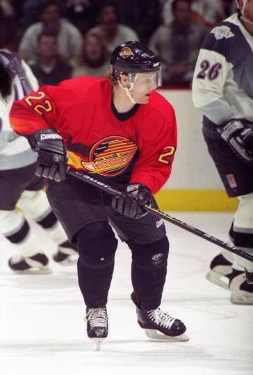
16. Salmon flying skate
It's just confusing. What's with the gradient stripes? And the bright red is just wayyyy too much. Also, all black bottom half? No stripes down there? Bad choice.
It's just confusing. What's with the gradient stripes? And the bright red is just wayyyy too much. Also, all black bottom half? No stripes down there? Bad choice.
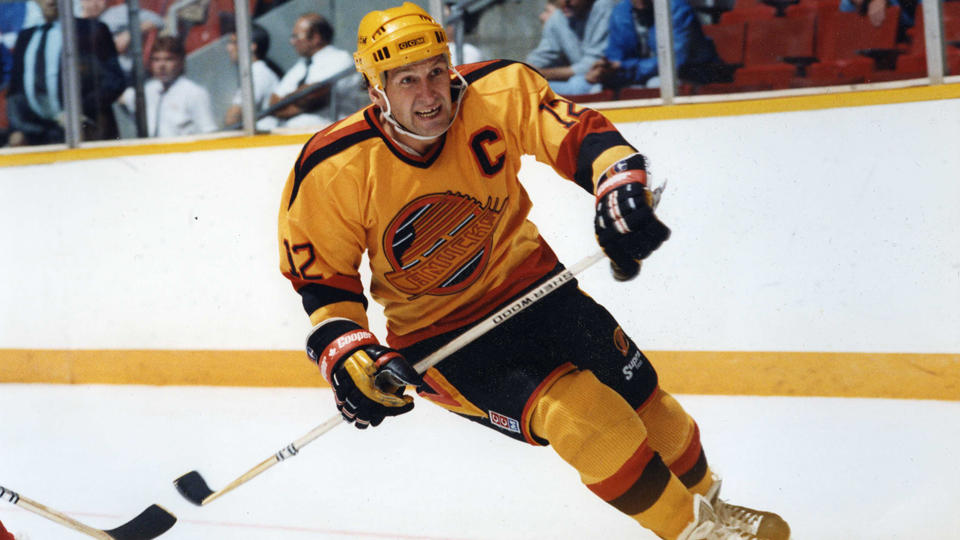
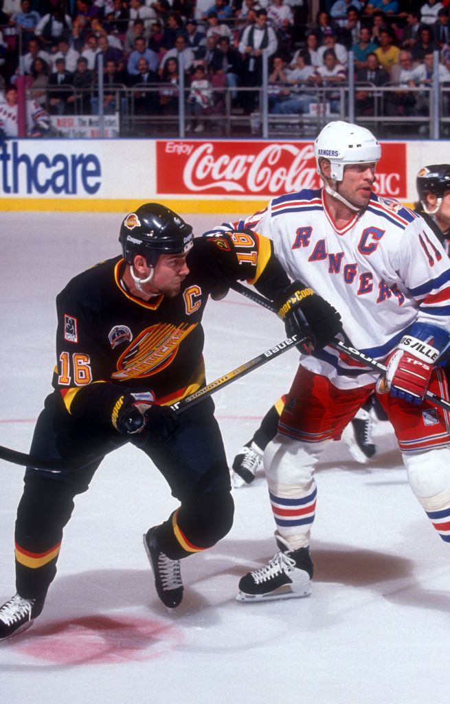
15. Yellow Flying skate.
Yellow should never be the base colour of a jersey. Yellow helmets too? At least they committed I guess. I do like the shoulder V's tho.
Yellow should never be the base colour of a jersey. Yellow helmets too? At least they committed I guess. I do like the shoulder V's tho.
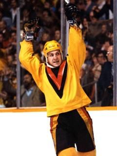
14. Yellow Flying V.
Maybe it'd be higher than the black one if the inside V was also yellow? Idk. I don't think this generation of jerseys is exceptionally ugly but there's not a lot of redeeming qualities.
Maybe it'd be higher than the black one if the inside V was also yellow? Idk. I don't think this generation of jerseys is exceptionally ugly but there's not a lot of redeeming qualities.
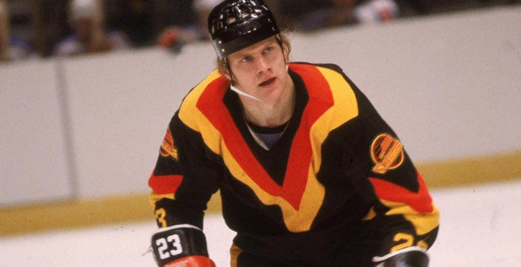
13. Black Flying V.
I don't like the Halloween vibes from this, seems unnecessarily intimidating. The wrist numbers and arm logos are pretty cool tho.
I don't like the Halloween vibes from this, seems unnecessarily intimidating. The wrist numbers and arm logos are pretty cool tho.
12. Wordmark Orca.
These lasted wayyyyy longer than they should've. I understand capitalizing on the Olympics but after a few years it made no sense. Also, the white stick in rink on the shoulder looks way better than these blue ones.
These lasted wayyyyy longer than they should've. I understand capitalizing on the Olympics but after a few years it made no sense. Also, the white stick in rink on the shoulder looks way better than these blue ones.
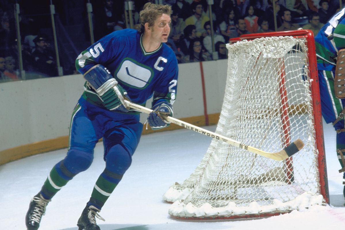
11. Original stick in rink.
Blue and Green will always be solid, it's just way too boring. Understandable in the 70's tho. The green socks are fun too. Bringing them back in the mid 2000's was the bigger mistake.
Blue and Green will always be solid, it's just way too boring. Understandable in the 70's tho. The green socks are fun too. Bringing them back in the mid 2000's was the bigger mistake.
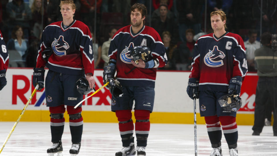
10. Original Orca.
It's just meh. The colours are weird. silver and burgundy was a bad choice, though I do like the sparkly numbers. From the weird era where every team that a super dark jersey would look sick.
It's just meh. The colours are weird. silver and burgundy was a bad choice, though I do like the sparkly numbers. From the weird era where every team that a super dark jersey would look sick.
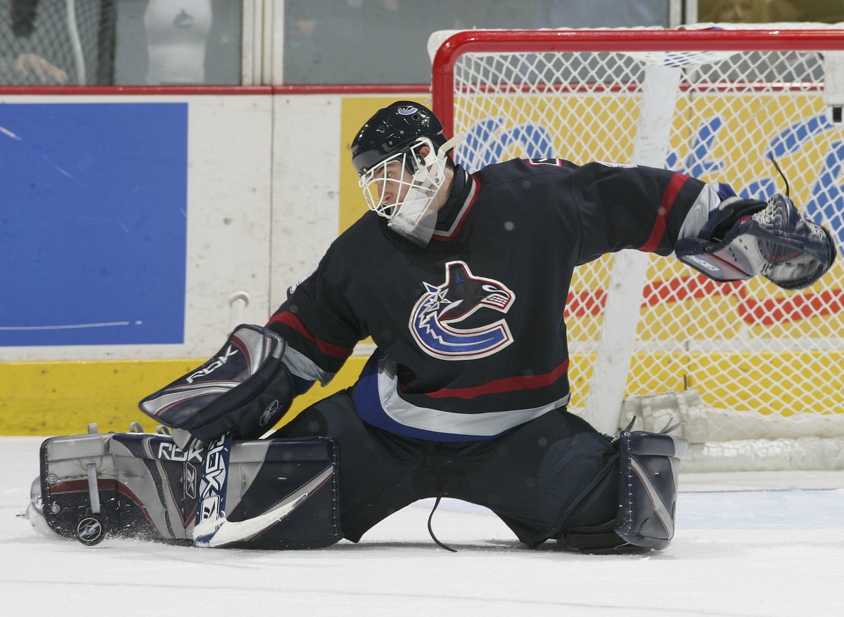
9. Reebok stick in rink.
Better than the original but not by much. My issue with it at the time was that it was way too similar to the primary jerseys. At least the current stick in rink has different striping.
Better than the original but not by much. My issue with it at the time was that it was way too similar to the primary jerseys. At least the current stick in rink has different striping.
8. Original black Flying skate.
Idk what my main issue with this is. I can see the appeal but the colours don't work for me and the spaghetti skate is not a solid logo. It's a mess.
Idk what my main issue with this is. I can see the appeal but the colours don't work for me and the spaghetti skate is not a solid logo. It's a mess.
7. Original Gradient Orca.
This was the first jersey I owned so maybe that plays a part, but it just works for me. The colours are meh but the sparkly numbers are fun and the sleeves are a cool callback. They also used red on the socks which helps a lot.
This was the first jersey I owned so maybe that plays a part, but it just works for me. The colours are meh but the sparkly numbers are fun and the sleeves are a cool callback. They also used red on the socks which helps a lot.
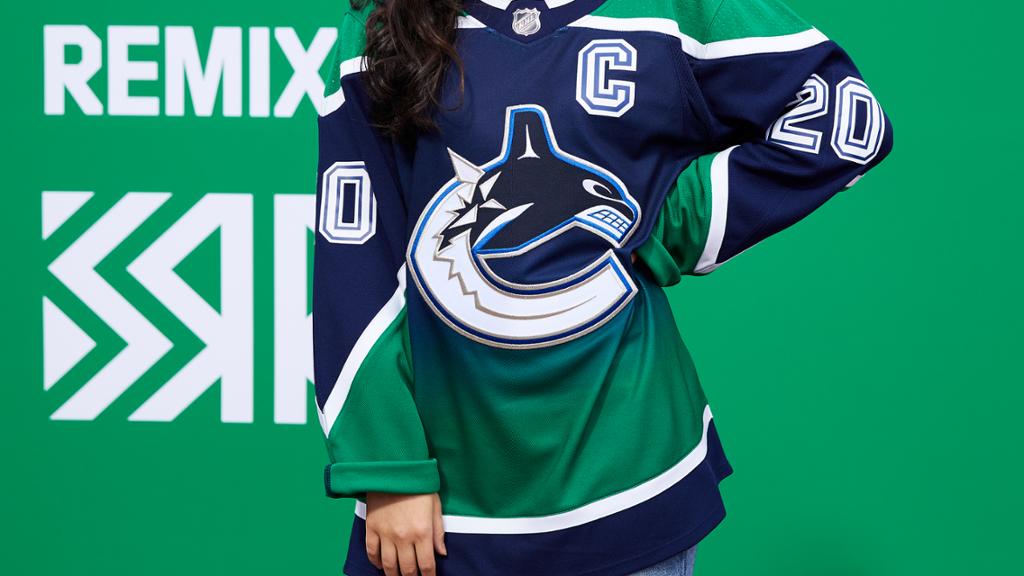
6. Reverse Retro Gradient.
Definitely better than the red gradient. It being the Adidas cut probably helps a bit but also the green and blue works a lot better.
Definitely better than the red gradient. It being the Adidas cut probably helps a bit but also the green and blue works a lot better.
5. Adidas Flying Skate.
Same things going on as the original flying skate, just looks better because it's updated. Still don't like the Halloween colours and should never be the primary jersey. I wouldn't be opposed to the team using it more tho.
Same things going on as the original flying skate, just looks better because it's updated. Still don't like the Halloween colours and should never be the primary jersey. I wouldn't be opposed to the team using it more tho.
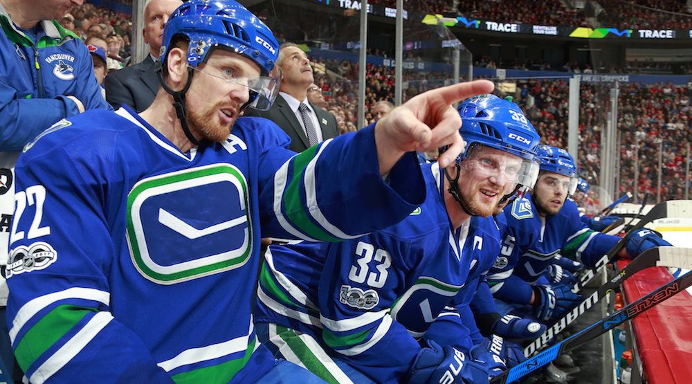
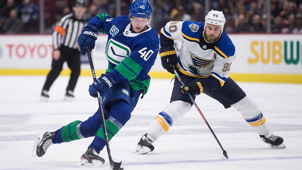
4. Adidas Stick in Rink.
The white stick in rink looks better than the blue Reebok one. The collar is a bit weird but it grew on me, I do wish there were white stripes either on the sleeves or waist.
Green and Blue is better than Halloween colours.
The white stick in rink looks better than the blue Reebok one. The collar is a bit weird but it grew on me, I do wish there were white stripes either on the sleeves or waist.
Green and Blue is better than Halloween colours.
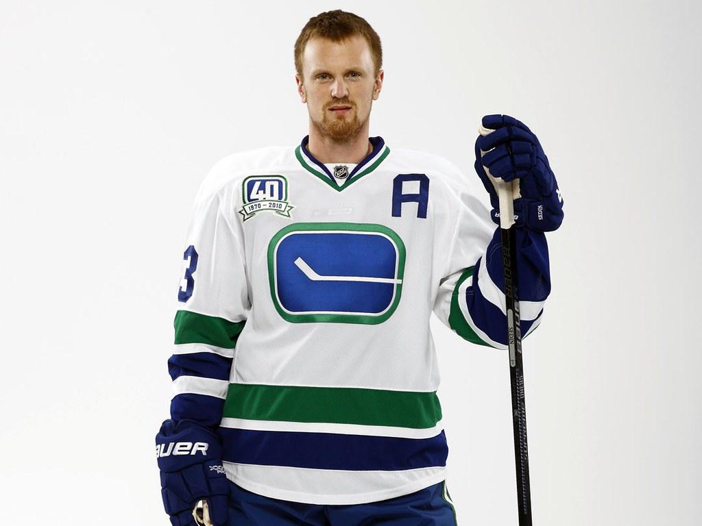
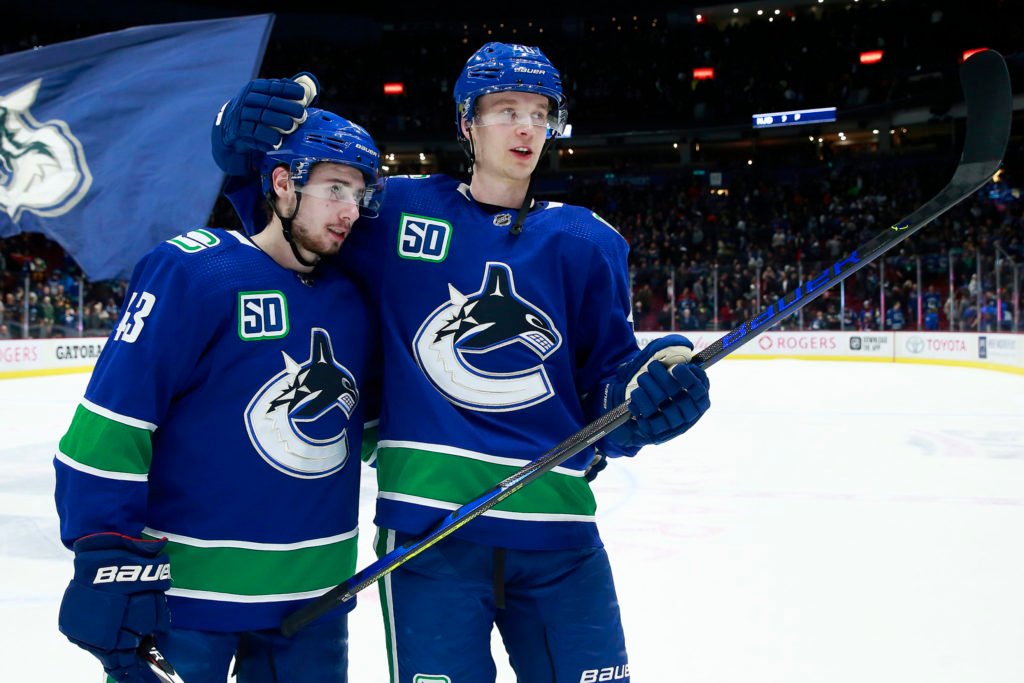
3. 40th anniversary stick in Rink.
These are really cool. I like that they had no name on the back and the block numbers look great. The striping is solid and the collar works really well too.
These are really cool. I like that they had no name on the back and the block numbers look great. The striping is solid and the collar works really well too.
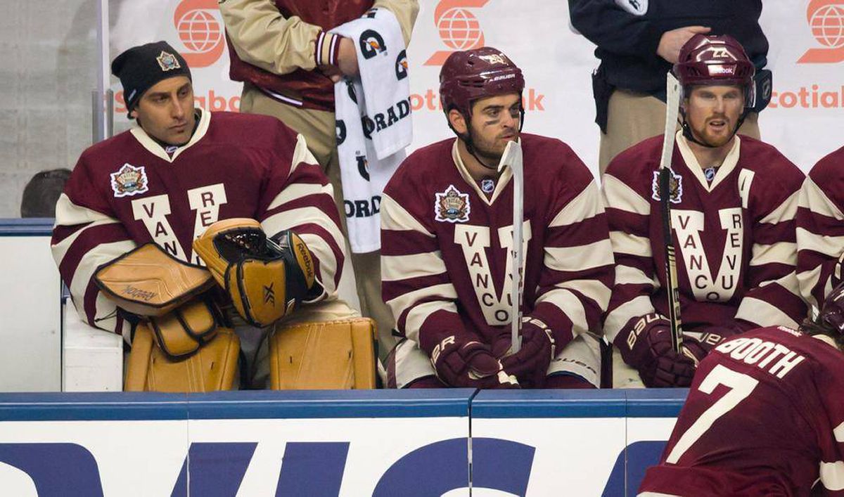
2. Millionaires throwback.
Maybe it only works in an outdoor game but the felt numbers were solid and it looked very classy overall. This jersey also only works in these colours, blue and green would look super dumb.
Maybe it only works in an outdoor game but the felt numbers were solid and it looked very classy overall. This jersey also only works in these colours, blue and green would look super dumb.
1. Current primary jerseys.
I understand people hate the logo but this just feels so northwest to me. The colours are great, getting rid of the wordmark was a great choice, and the white shoulder logo looks a lot better.
I understand people hate the logo but this just feels so northwest to me. The colours are great, getting rid of the wordmark was a great choice, and the white shoulder logo looks a lot better.

 Read on Twitter