Using the same data underpinning the TfL Travel in London Report 12, I've made a couple more graphs to give more context.
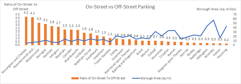
First, the ratio of on-street to off-street parking, per borough. As you'd expect, inner-city councils score highly here.
First, the ratio of on-street to off-street parking, per borough. As you'd expect, inner-city councils score highly here.
I would argue the councils to the left have more policy control over car ownership, so it is more incumbent on them to use policy to act to reduce car ownership & analyse their own car ownership use.
However, this doesn't tell us about their level of car-impact contribution. 2/
However, this doesn't tell us about their level of car-impact contribution. 2/
For that, you need a graph of #CarDensity - the number of cars owned per square mile. This tells us about the level of car impact each borough is contributing, proportionate to its size.
We can also infer a kind of index of inequity for non-car-owners, from the same figure. /
We can also infer a kind of index of inequity for non-car-owners, from the same figure. /

 Read on Twitter


