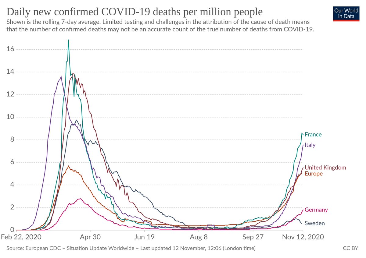
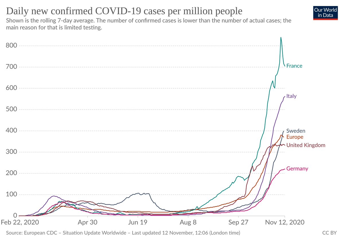
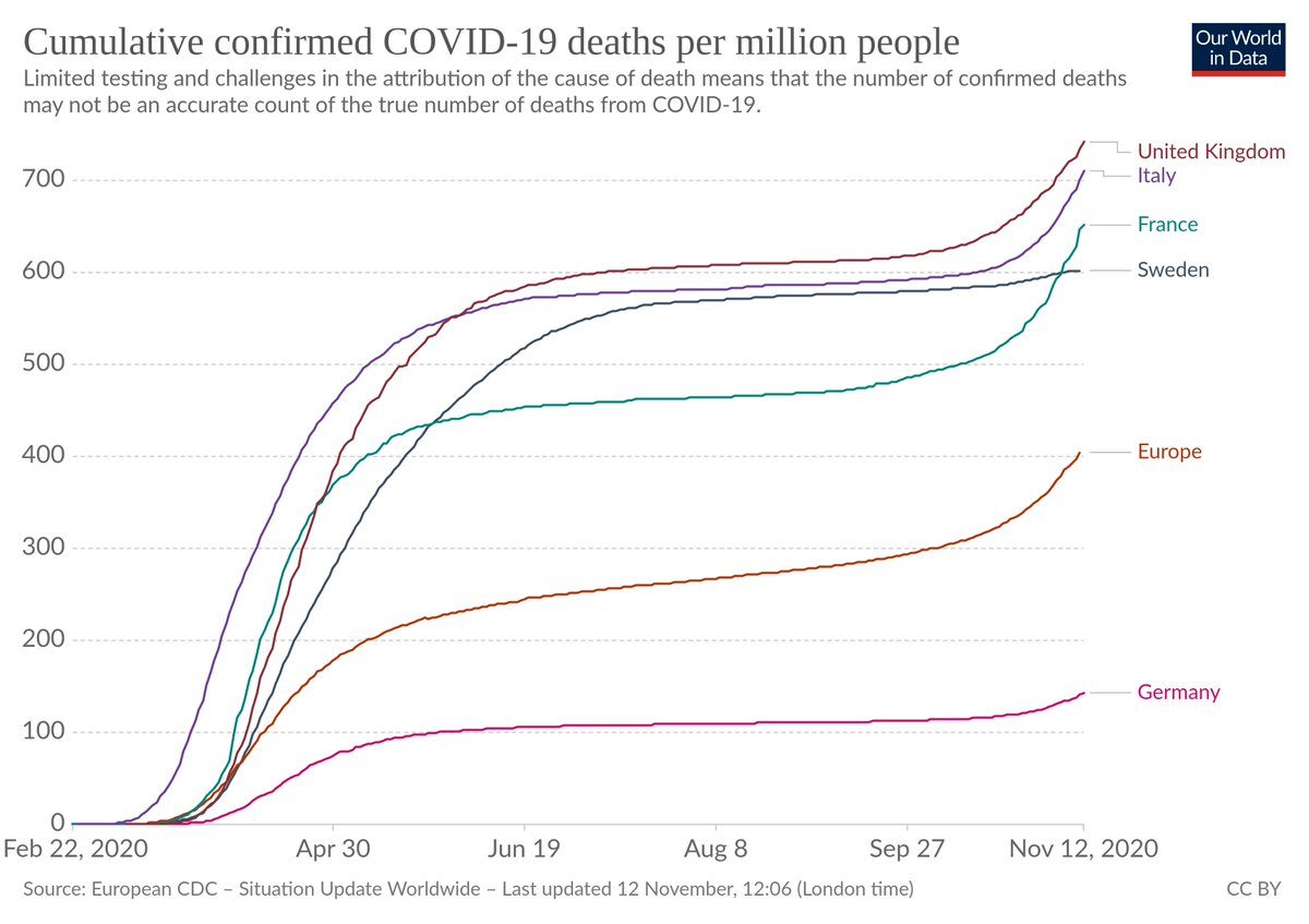
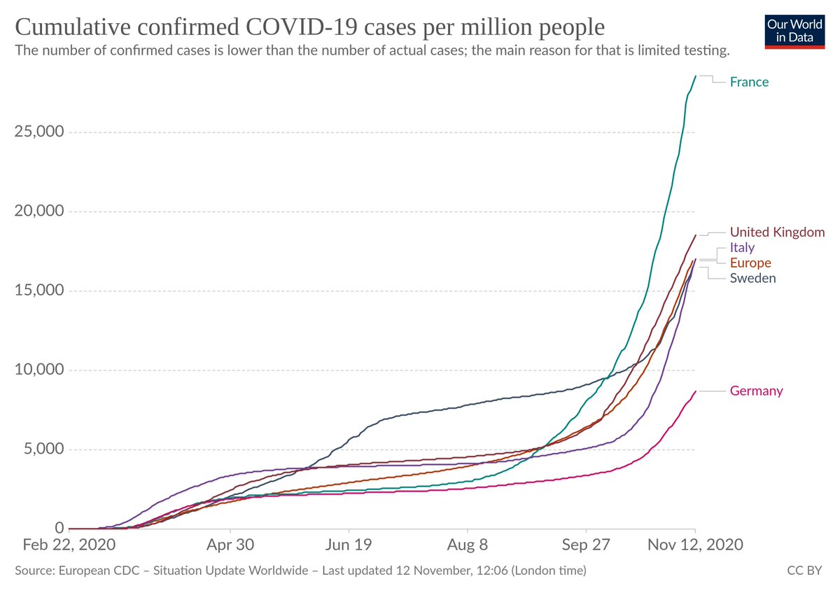
Here's the per-capita graphs for Sweden and the EU. Both 7-day average and cumulative, reported cases and deaths.
EU's lockdown has just shifted deaths later, at enormous expense. Sweden appears to have less "dry tinder", going into flu season (weather definitely influences R). https://twitter.com/clairlemon/status/1326977228446449664
EU's lockdown has just shifted deaths later, at enormous expense. Sweden appears to have less "dry tinder", going into flu season (weather definitely influences R). https://twitter.com/clairlemon/status/1326977228446449664
If there's a site with good graphs for *within* Sweden, Frence, Italy, UK, etc. I'd love to know. All these graphs averages over whole countries, which definitely doesn't tell the full story. "2nd waves" are often "1st waves" in different places...
Source: https://ourworldindata.org/coronavirus-data-explorer?zoomToSelection=true&time=earliest..2020-11-12&country=SWE~Europe®ion=World&casesMetric=true&interval=total&perCapita=true&smoothing=0&pickerMetric=new_cases_per_million&pickerSort=desc
Remember that a "confirmed death" does _not_ necessarily mean the person died with COVID-19. Lots of jurisdictions consider anyone who dies and recently tested positive to be a COVID-19 death, apparently including Sweden: https://www.contagionlive.com/view/how-sweden-calculates-covid19-deaths
Remember that a "confirmed death" does _not_ necessarily mean the person died with COVID-19. Lots of jurisdictions consider anyone who dies and recently tested positive to be a COVID-19 death, apparently including Sweden: https://www.contagionlive.com/view/how-sweden-calculates-covid19-deaths

 Read on Twitter


