Momentum Charts 101
Purpose: measures the momentum of the 28d moving avg
It answers the question "Was the past week better or worse than the past 28d and by how much?"
This is a useful way of identifying the direction and amplitude of changes in the 28d average
Purpose: measures the momentum of the 28d moving avg
It answers the question "Was the past week better or worse than the past 28d and by how much?"
This is a useful way of identifying the direction and amplitude of changes in the 28d average
The Math:
Momentum = 7d AVG - 28d AVG
for example:
7d is 1,250
28d is 1,000
Momentum is +250
Momentum = 7d AVG - 28d AVG
for example:
7d is 1,250
28d is 1,000
Momentum is +250
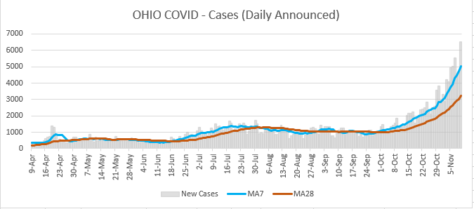
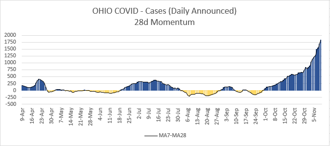
Visually, this is merely a representation of the divergence of the 7d and 28d average. When looking at the top chart, imagine if you were to straighten out the 28d average but keep the 7d AVG's relative position above or below it. When 7d is higher, it's positive momentum
By looking at only the relative change in the averages, it also allows us to use a scale that shows minor peaks and valleys that are not always visible on the first chart - especially when the 7d and 28d are very close together.
Consider those Cases charts again. In the top chart,m the gap between the 7d and 28d on Oct 22 looks about the same as Oct 15, maybe a little larger. When you compare them on the Momentum Chart, it's much easier to see that the gap increased from ~450 to ~550
Remember, the Momentum Charts are a helpful way to see if the past 7 days are better or worse than the past 28 days and by how much.
It's called a momentum chart, b/c just like in physics, you can expect the 28d avg to continue this change unless something interferes
It's called a momentum chart, b/c just like in physics, you can expect the 28d avg to continue this change unless something interferes
Because all of the Announced Date metrics are backwards looking (tests already taken, hosp admits that already happened, people who have already died), the change that causes the momentum to increase or decrease may have already happened. (lockdown, opening back up, schools, etc)
PS: I should add in that Momentum Charts are widely used in the stock market! Investors look for plateaus in the momentum as a signal for whether any recent increases or decreases are likely to continue or if it’s time to get out of or cover a position.

 Read on Twitter


