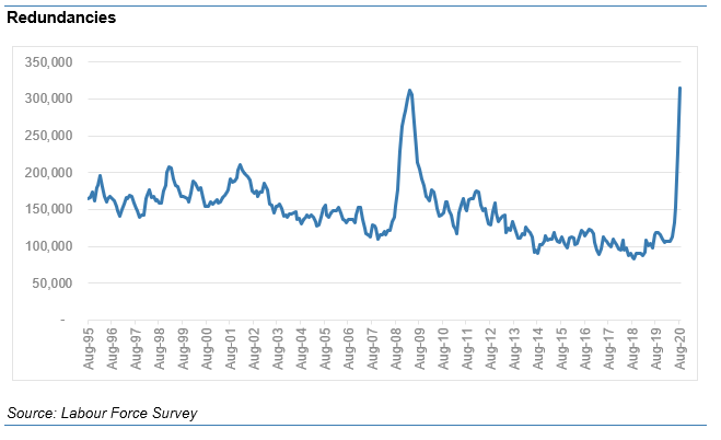
So record rise in redundancies, to a new record level, will take headlines this morning. Now above 2009 peak.
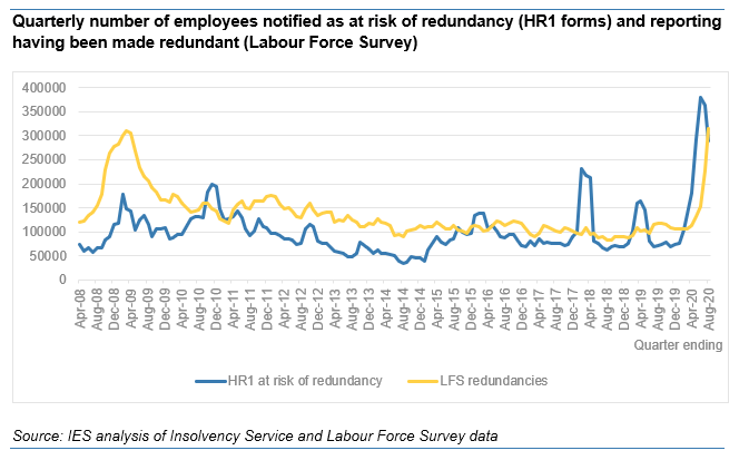
Now in line with HR1 notifications (as right graph shows) but it will pass this in next few months, likely to ~450-500k a quarter.
Now in line with HR1 notifications (as right graph shows) but it will pass this in next few months, likely to ~450-500k a quarter.
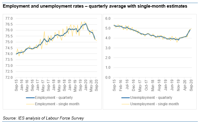
This is awful for those losing jobs, but worth remembering it reflects fallout of first lockdown. The rise in redunds is a fraction of the 9m furloughed, and today's figs reiterate that large maj are back at work. Headline changes in emp and u/e are worrying, but not catastrophic
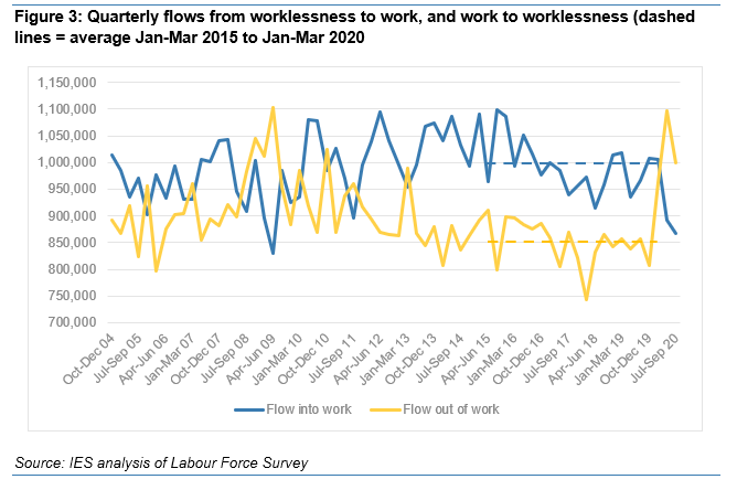
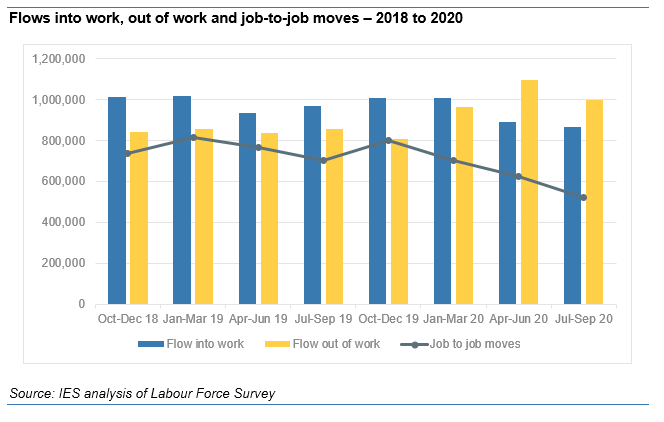
Today's data include 'flows' into and out of work. This is REALLY important. Graph shows how big falls in employment driven BOTH by more people leaving and fewer finding work. Had either returned to pre-crisis levels in July-Sept, empl would have been flat. Instead, fell by 160k.
Here's a closer look, with a line for job changers.
In all 1.4m started a new job in Jul-Sep. But this was even lower than the 1.5m in lockdown(!) Pre-crisis, running at 1.7m.
Total job leavers, when including changers, actually fell to 1.5m (cf 1.7m last qtr and 1.6m pre-crisis)
In all 1.4m started a new job in Jul-Sep. But this was even lower than the 1.5m in lockdown(!) Pre-crisis, running at 1.7m.
Total job leavers, when including changers, actually fell to 1.5m (cf 1.7m last qtr and 1.6m pre-crisis)
All of this shows why it's so so important we get hiring going (safely). Can't preserve the labour market as it was in March, nor should we. Every recovery is built on a rebound in hiring but it didn't happen in the summer.
Means cutting hiring costs and boosting public spending.
Means cutting hiring costs and boosting public spending.
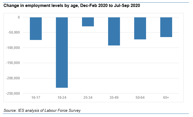
This matters most for young people - when hiring slows, they suffer. Below shows employment changes by age since crisis. Under-25s seen largest falls, and are more than half of total.
Youth employment fig today was lowest EVER.
But, signs of deterioration at other ages now too.
Youth employment fig today was lowest EVER.
But, signs of deterioration at other ages now too.
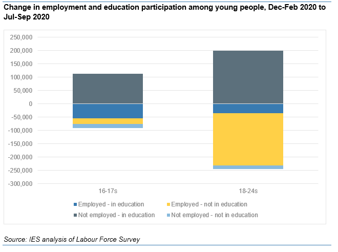
Digging into the youth data a bit more, this graph is more positive! So far, thankfully, the huge falls in youth employment have been soaked up by equally huge rises in education. Look at the tiny light blue bar - numbers neither in education nor work have actually fallen.
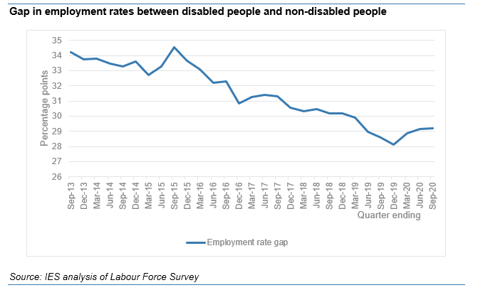
Today also sees quarterly data on disability employment, which has some signs for concern. Employment has fallen by more (1.9%) than for non-disabled people (1.1%) during crisis. Means huge 'gap' in empl rates has stopped narrowing (below). But caution needed on sample sizes etc.
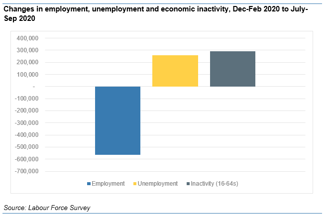
Back on the headline data. Below shows fall in empl since crisis began. To repeat: >4m have come back from furlough, so this is bad but could have been worse.
This is now breaking pretty evenly between unemp and inactivity, and as time passes shifting more to unempl.
This is now breaking pretty evenly between unemp and inactivity, and as time passes shifting more to unempl.
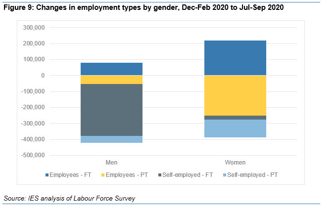
The fall in empl is driven by big falls in full-time self-empl among men; and part-time work among women. Slightly bigger impacts on women this month.
An offsetting rise in full-time employees esp women, perh in couple households or where firms shift hours betw furloughed staff.
An offsetting rise in full-time employees esp women, perh in couple households or where firms shift hours betw furloughed staff.
(... and thanks to @MikeBrewerEcon and @resfoundation for above graph - they did this last month, it's a better version of one that we put in our briefing but that didn't include the employee/ self-employed split.)
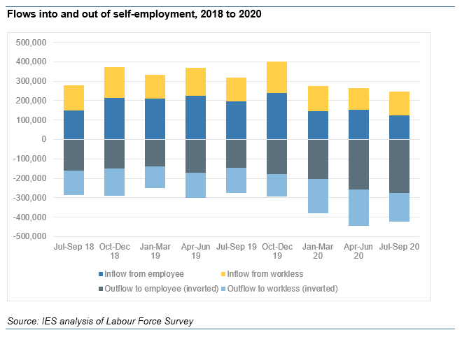
Self-empl now down by 500k. Huge fall, to 2015 levels.
But look at the flows data (last two bars is crisis): big rise in flows to workless, but two thirds is s/e becoming employees. Flows the other way, FROM employee status, have halved.
So mostly this is s/e getting other work.
But look at the flows data (last two bars is crisis): big rise in flows to workless, but two thirds is s/e becoming employees. Flows the other way, FROM employee status, have halved.
So mostly this is s/e getting other work.
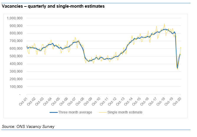
Finally for now. Vacs for Sept were good. Light yellow line is single month estimate, above 600k so firmly in recovery.
Shame too though, as real-time data tells us this is likely to fall back thru Oct and into lockdown.
But shows (safe) hiring will return with right measures...
Shame too though, as real-time data tells us this is likely to fall back thru Oct and into lockdown.
But shows (safe) hiring will return with right measures...
Right time for a cup of tea I think, then we can check what we missed and then write up the briefing! Should be on website around lunchtime.
Spoiler: it'll mainly be all of the above charts with added words.
Spoiler: it'll mainly be all of the above charts with added words.

 Read on Twitter