DEBUNKING THREAD:
I'm an actuary (which is basically just a pretentious, worse data scientist), and I'm here to tell you why this thread is both deliberate misinformation and the most idiotic data analysis I've ever seen https://twitter.com/APhilosophae/status/1325592112428163072
I'm an actuary (which is basically just a pretentious, worse data scientist), and I'm here to tell you why this thread is both deliberate misinformation and the most idiotic data analysis I've ever seen https://twitter.com/APhilosophae/status/1325592112428163072
Basically, the thread author takes incredibly high-level NYT election data and claims that spikes like this are "evidence of ballot backdating, manufacturing of software tampering," which is laughable because it's based entirely on number ROUNDING in the source data
The problem with this is that the data behind this is really high-level. The only data that is used in the "analysis" are the number of votes and the % share of all CUMULATIVE votes that are Dem or Rep. The columns that represent vote shares are rounded to the 0.0% place
How did the thread author get from these basic columns to those fancy looking graphs? By making dumb mistakes. Because the NYT source doesn't give exact Dem and Rep votes, the thread author backs into them (ex. by taking % Dem times total votes)
This would be fine if the % Dem and % Rep figures were exact, but instead, they are rounded to the 0.0% place (which is way too few decimal places to try for this sake). The author takes these calculated fields and backs into another field - marginal Dem/Rep votes in each batch
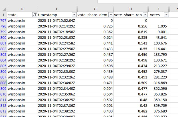
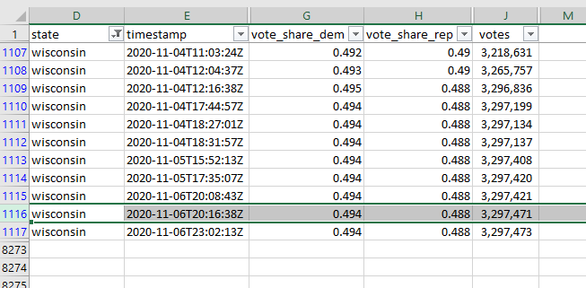
This is, erm, a problem. Take this highlighted row for example: this is a batch of 50 new votes in Wisconsin, and it didn't change the CUMULATIVE Dem vote share from 49.4%. How can we figure out what % of THIS BATCH was for Biden?
The (hopefully obvious) answer is that we can't. It could have been 50-0 for Biden, 50-0 for Trump, or 25-25: no matter what, the % Dem would stay the same at 49.4% because it's rounded and a batch of 50 votes is obviously far too small to change that CUMULATIVE figure.
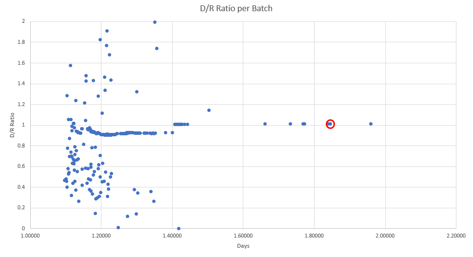
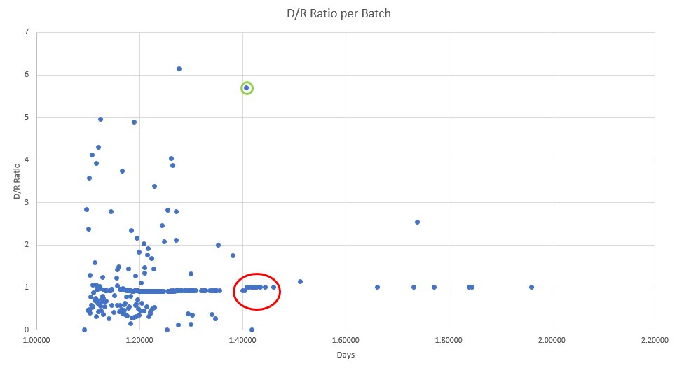
The mistake that the author makes is implicitly assuming that this batch will be 49.4% for Biden. This batch is circled in red here. Again, WE HAVE NO WAY OF KNOWING FROM THE SOURCE DATA HOW MANY VOTES BIDEN OR TRUMP GOT IN THIS BATCH. Yet, the author assumes it to be 49.4%.
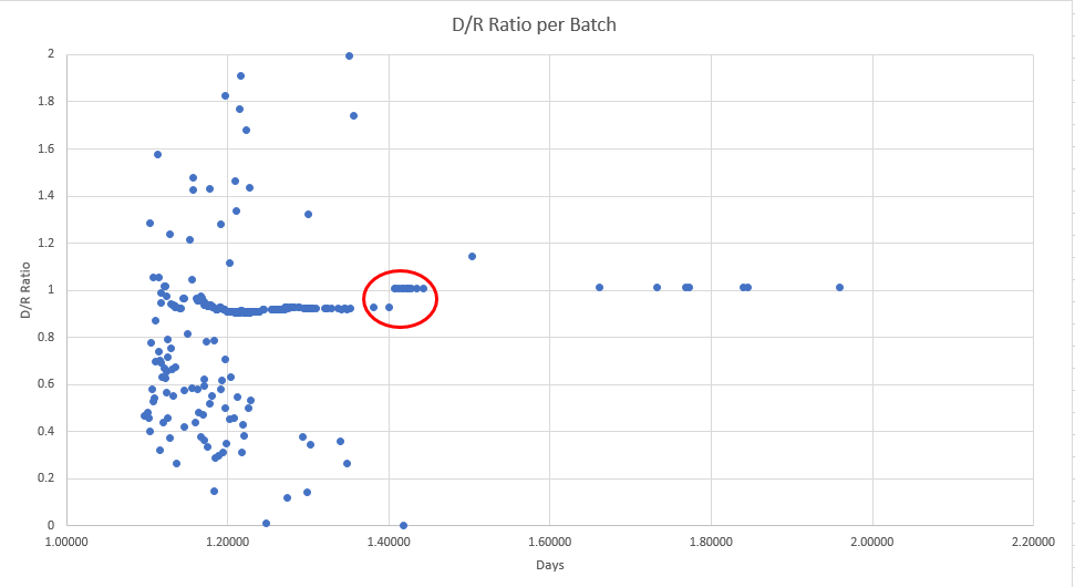
So how do we explain this spike the author harps on (red circle, 1st pic)? Well for STARTERS, we could expand the axis to look beyond just 0 to 2. When we do this, note the green circle (pic 2). This represents the famous 4am cache of 170k ballots that broke for Biden by 120k.
This HUGE Biden batch (highlighted below) unsurprisingly pushes the cumulative Biden % way up from 47.3% to 49.3%. The clusters in the above red circle each represent SMALL batches (like the example of the 50 vote batch)...
Remember the author implicitly assumes each small batch breaks exactly equal to the CUMULATIVE vote share. So, each of the batches in the red circle did not ACTUALLY have D/R ratios around 1 - they could have been anything (and were likely mostly >1, bc they were mostly mail in)
In fact, the line of dots that always hovers around 1 - these are each just small batches that were too tiny to move the cumulative vote share. I have a hard time believing the author didn't realize that - they are either an idiot or nefarious (probably both).
This is what explains each of the "anomalies" that the author sees: a big pro-biden batch fell in the middle of the tiny batches and drove up the cumulative Biden vote share. If this sounds profoundly silly, it's because it is. It was asinine to perform a data "analysis" this way
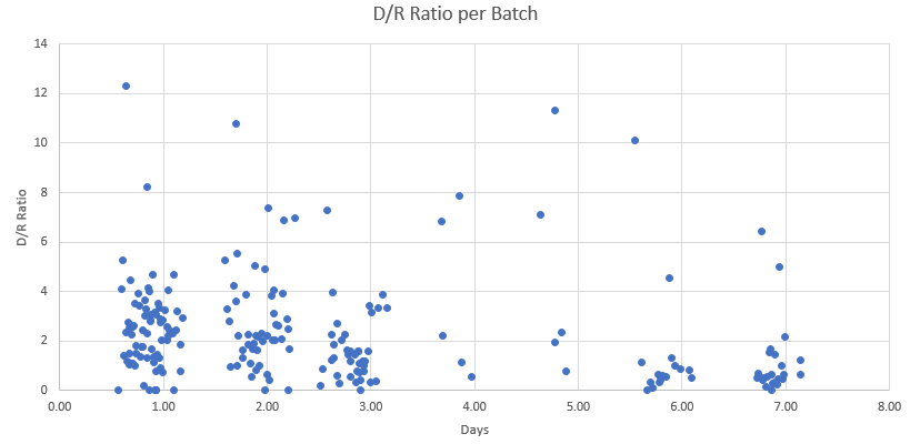
Just to be thorough, here's the same thing for PA. In red is the "anomaly", in green is the rational, obviously-not-fraud explanation. For PA it was a bunch of somewhat-large mail in batches (rather than the one big WI batch).
TLDR: the author had to back into the data he uses, and the way he does so is stupid and pointless because of how the data is rounded.
Here's the source data I used (I didn't run the program myself, I just downloaded the .csv file) https://twitter.com/datafox21/status/1325620144215891968?s=20
Here's the source data I used (I didn't run the program myself, I just downloaded the .csv file) https://twitter.com/datafox21/status/1325620144215891968?s=20
I haven't seen anything debunking this yet, so please share this to combat the spread of misinformation. I don't care if you copy or co-opt my thread here without crediting me - I just want to help debunk this constant stream of conspiratorial BS
It’s hard to explain via text the effect of the glaring data issues, but hopefully this helps https://twitter.com/cb_miller_/status/1325789218489184262
Hopefully another example will help clear things up (apologies for not being clear originally at 3am lol) https://twitter.com/cb_miller_/status/1325799039288348672?s=20
Maybe this one will help too, but i'm agnostic at this point. It's hard to explain over text. The bottom line is that the author used crap data and tried to basically create his own data with shoddy calculations. https://twitter.com/cb_miller_/status/1325807291518554113?s=20
To clear up another point of confusion - there are plenty of data analyses that are technically correct but deeply misleading. This is not one of those - this “analysis” is simply incorrect
And to those trying to dismiss my rebuttal because of my leftist views - there is a difference between facts and opinions/views. I have leftist beliefs, but everything I listed here is factual. As many of you like to say, facts don’t care about your feelings
Sigh, apparently the point is still lost on some. Maybe this will help https://twitter.com/cb_miller_/status/1325873103331790848?s=20
Get @BretWeinstein to take down his tweets! Or admit he was wrong https://twitter.com/cb_miller_/status/1326314262659280897
ALSO apparently there are other conspiracy theories revolving around votes being suddenly “stolen” from Trump and given to Biden. This is directly related to the Edison source data (apparently this NYT source data is the same data ALL the networks used). https://twitter.com/gwb45/status/1326011402675494912
So link the above tweet/this whole thread to wherever you see that pop up about networks “stealing” votes onscreen - it’s because the networks are doing the same thing as the original thread author: backing into/calculating votes on their own.
This is less consequential because the networks were only showing results at a snapshot in time, whereas the thread author was trying to break down by batch. Either way, I’ve seen it going around, so use this thread to debunk it
@BretWeinstein still hasn’t taken his posts down; I’m very disappointed. He has to have seen my debunking by now, he seems to be refusing to admit he was wrong. Fine, whatever, but he’s being a massive megaphone for misinformation, and he needs to stop immediately
Great addition here by @alex_kerchner here. If anyone else has useful stuff to add, just @ me and I’ll probably include it in this thread https://twitter.com/alex_kerchner/status/1326329249800785920
@brettjrob does a great job of coming to the same conclusion independently, check out this brief thread and comments https://twitter.com/brettjrob/status/1326296731609419776
Alright this chump tweeted something else out without addressing the misinformation he spread. I’ve always wanted to call for ratio’ing someone, so go ratio this tweet with me  https://twitter.com/BretWeinstein/status/1326371785709768705
 https://twitter.com/BretWeinstein/status/1326371785709768705
Alright we might have ACTUAL vote data: it looks like some saint (shoutout to whoever Alex is, and to @mn_trades) scraped data that had exact vote data from NYT. I tried replicating the graph of @mn_trades and came close but not exactly. https://twitter.com/mn_trades/status/1326394585136902145?s=20
Regardless, if this is truly accurate exact voting data by batch, then this is the REAL data that the thread author was trying to replicate. And of course, there's no "anomaly" that the thread author harps on (because that only came from rounding cutoffs).
This graph is great for showing to people that didn't understand my thread, because it's visual proof of what the actuals look like.
But, the code behind this requires Python experience to understand, which I lack. If someone else wants to vet, go ahead https://github.com/alex/nyt-2020-election-scraper
But, the code behind this requires Python experience to understand, which I lack. If someone else wants to vet, go ahead https://github.com/alex/nyt-2020-election-scraper
Added context:
Looks legit as far as I can tell. But if someone points out it’s not, I will tweet an update (unlike our dear friend Bret) https://twitter.com/mn_trades/status/1326419202090135553
Looks legit as far as I can tell. But if someone points out it’s not, I will tweet an update (unlike our dear friend Bret) https://twitter.com/mn_trades/status/1326419202090135553
Didn't get very far this morning through my notifications until I ran into this. This person tried "debunking" my debunking, but ended up just exactly recycling the original thread. Sigh. Here's why it's wrong: https://twitter.com/projectvirginia/status/1326509556059566081?s=21
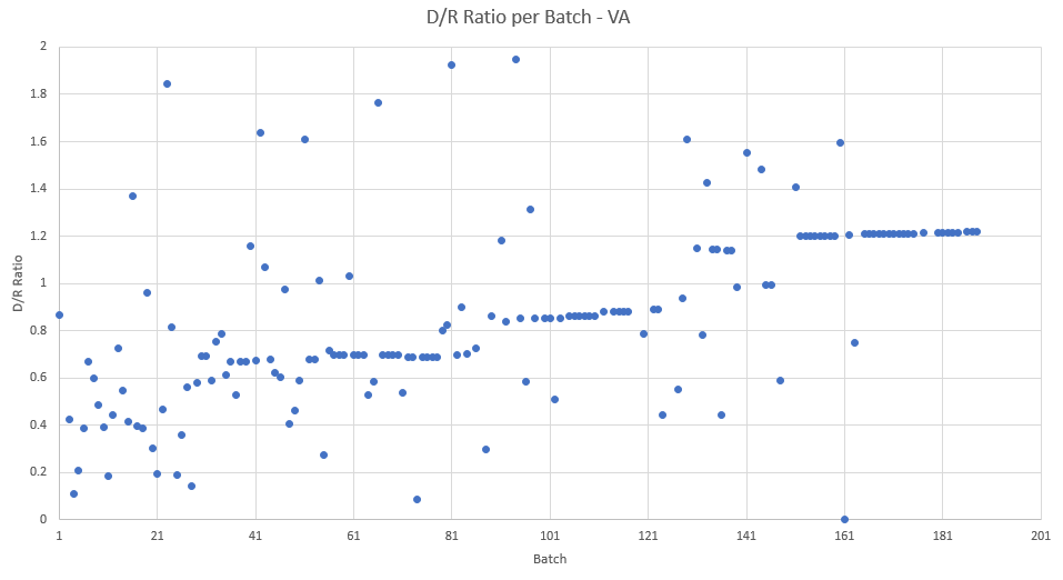
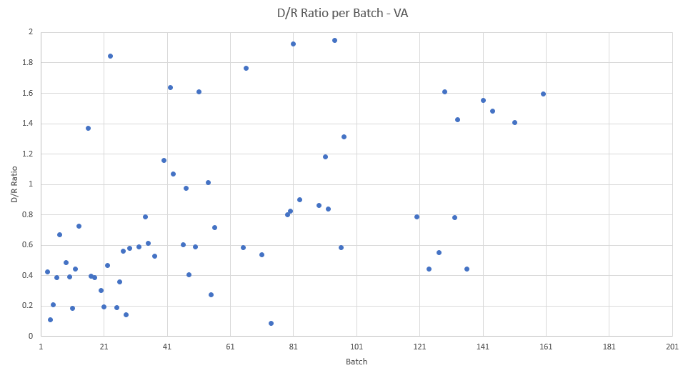
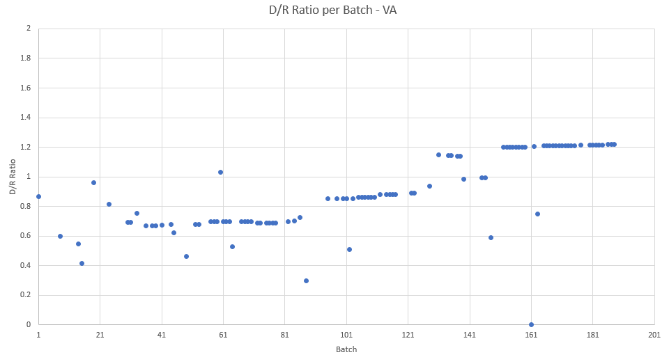
First of all, this person is being highly misleading by plotting the x axis as batch number instead of time. I still haven't formatted my time variable because I'm lazy, but this is how the batches are actually spread out over time
But whatever, I'll indulge this person and graph by batch instead of time on the x axis. The first pic is what this person harped on. However, when you FILTER the graph to only look at large batches/where the cumulative ratio actually changes, you get this (second pic)
ALL OF THE "SUSPICIOUS" ONES ARE THE SMALL BATCH ONES. Here is the graph filtered just for small batches, and it is entirely responsible for the trend this Virginia Project person observes. If this person read and understood the thread, he/she would have known that already.
This person blocked me so I can't further respond to it (very classy), so please link my above mini-thread addressing it on my behalf.
https://twitter.com/projectvirginia/status/1326509556059566081?s=21
https://twitter.com/projectvirginia/status/1326509556059566081?s=21
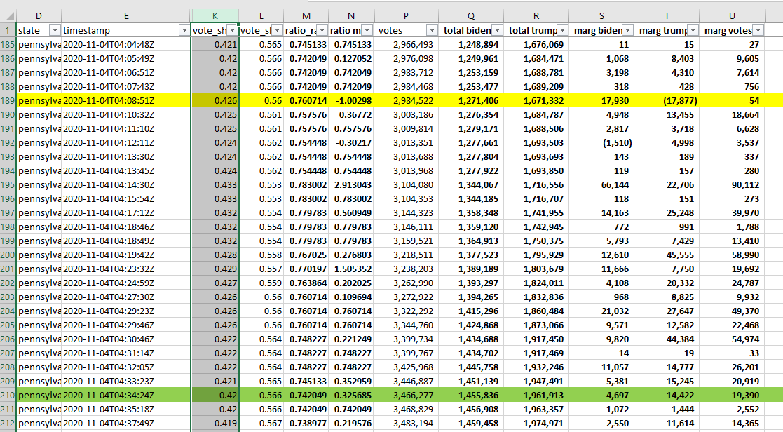
Alright, here's a great question someone posed: why does the PA vote share jump from 42.0% to 42.6% on the back of a mere ~18k batch? The result looks like Biden is downright stealing 18k votes (highlighted row). Never fear, there's an explanation.
https://twitter.com/doctorspin4/status/1326613234523250689?s=20
https://twitter.com/doctorspin4/status/1326613234523250689?s=20
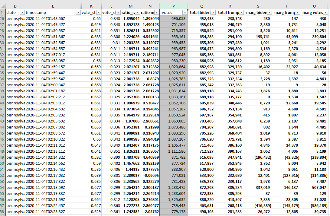
It looks like the Edison data might just be sloppy. Below is the PA data sorted by TIMESTAMP. Note that the total votes (selected) jump all over the place. It goes from 715k to 955k, then drops from 1112k to 872k, etc. Idk why this is, but it "benefits" both Trump and Biden.
It is hopefully intuitive that the cumulative ratios for Trump and Biden are jumpy too. See the selected cells in the highlighted row: the cumulative ratio for Biden drops from 66.4% to 62.7% (total votes also drop)! Did Trump steal these votes? No, the source data is just yucky.
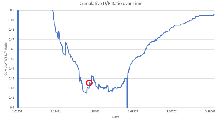
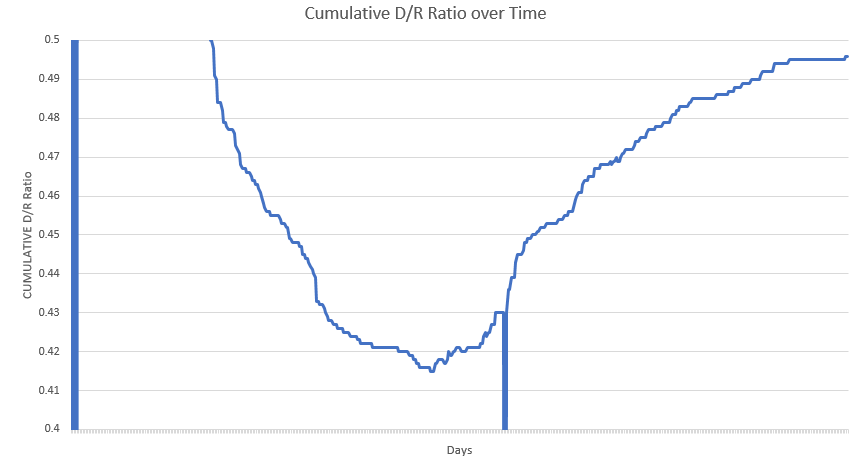
Let's look at that jump for Biden from .420 to .426, circled in red in this graph below. The first thing you should note is that this graph is wonky, because the PA timestamp data is weird here. Notice that very shortly after the increase to .426, it rapidly returns to .420.
In the data, it looks like this: the spike (yellow) returns to .420 (green). By this point in the data, the total votes are at least monotonically increasing, but the data is clearly wonky still. So, the issue causing this "suspicious" point seems to be poorly arranged data
So, this is how I am GUESSING the data SHOULD have been arranged (by smoothing that weird region to monotonically decrease). If this is indeed the case, there was probably no weird blip. Of course, this is just my speculation.
This phenomenon of seemingly misarranged data was repeated and "benefited" both sides. Ex the Biden decrease from 66.4% to 62.7%. And every time there was such a jump, it was met with an equal counter-jump by the other side. This seems pretty clearly to just be wacky data.
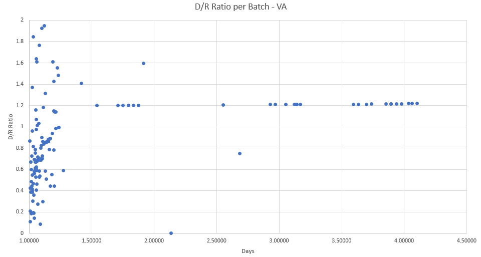
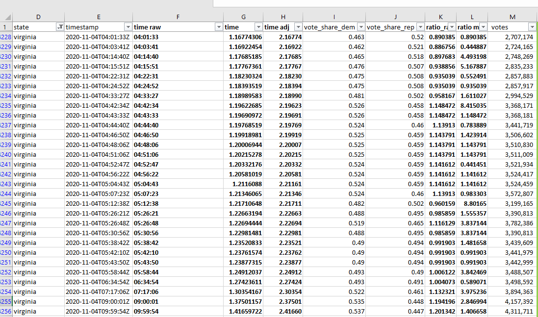
It's fair for people to ask why the Edison data seems misarranged, but it's a very different issue than alleging Biden "stole" 18k votes from Trump in a batch. It looks like TX has a toothless version (1st pic), and VA has its own similar issues (2nd pic)
Perhaps this is something that someone could look into the .json actuals file for, linked here. The only problem is that the .csv output seems to only show updates well after the timestamps where this wacky stuff happens, idk enough Python to dig further https://twitter.com/cb_miller_/status/1326412786340126721?s=20
Oops made a typo here - meant to say 54 vote batch instead of 18,000 batch. I was looking at the wrong row :/ https://twitter.com/cb_miller_/status/1326738608984895490?s=20
Added context on the data oddities from someone more qualified than me: https://twitter.com/tbloncar/status/1326765719460192259?s=20
Many people have asked me to address Dr. Shiva Ayyadurai's claims. I haven't really looked into them myself, but this article seemed simple and convincing to me. Let me know if this article is flawed https://kabir-naim.medium.com/dr-shiva-ayyadurai-the-danger-of-data-charlatans-4f675ffe793c
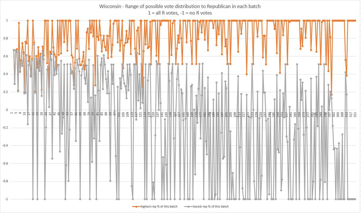
Here’s a fantastic visual by @ArchiProj with a brief thread (and here’s a pic of the chart with a more understandable title). He shows there is a HUGE range in what the true values for each of these batches could be, making it even clearer the author’s calculations were bogus https://twitter.com/archiproj/status/1326887297267228675
Something I didn’t feel the need to harp on before: you’ll note in the above graph that there is still a big range for many “large” batches that move the cumulative ratios. This is because all the author’s calculations are highly sensitive to rounding cutoffs, even large batches
Another visualization of the same thing https://twitter.com/archiproj/status/1326911404218216448
Here’s a brief thread reiterating that while there was exact data in the JSON file the author used, the author only scraped the rounded, summary data instead of exact data https://twitter.com/mn_trades/status/1326922258837803009
A lot of people were linking this thread in response to Trump's BS about "data analysis" proving fraud. So I split off a separate thread that is hopefully more directly applicable to what Trump relies on: https://twitter.com/cb_miller_/status/1326958395128156160?s=20
Oh golly, here's another "data analysis" one that took about 2 min to debunk. Shoutout to @RespectMrMarket for pointing this out. https://twitter.com/cb_miller_/status/1327088970790998016?s=20
(If anyone still reads this thread lol) here’s a good thread on very similar data issues to what I’ve discussed already, and he actually knows what he’s talking about https://twitter.com/harrisj/status/1327082399440756736
People still keep asking me about Dr. Shiva’s claims, here’s a very succinct graph that reinforces the article I shared earlier. It’s silly to expect that all counties will show equal amounts of %Trump support among Republicans, but that’s the assumption Dr. Shiva makes anyways https://twitter.com/matt_hill/status/1327048130198724613
PS if anyone has something to add on this thread, I won’t respond bc I won’t see it. Tweet instead in this mini-thread.
I’ve had enough Twitter for a lifetime this week and it was exhausting. https://twitter.com/cb_miller_/status/1327341381854040064
I’ve had enough Twitter for a lifetime this week and it was exhausting. https://twitter.com/cb_miller_/status/1327341381854040064

 Read on Twitter

