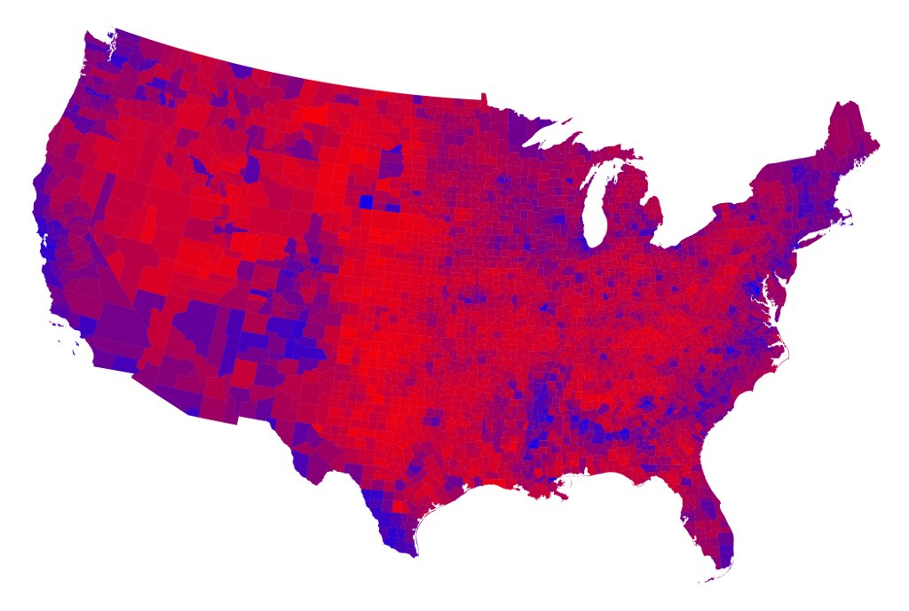
I was inspired to build the Purple States project after reading this graphic opinion piece by @betsymason https://www.nytimes.com/interactive/2020/10/30/opinion/election-results-maps.html
It included an electoral map in shades of purple, that stems from a terrific study by @aberutchick, Joshua M. Smyth, and @SaraKonrath. The study looked at the (as it turns out) negative effects of red/blue map coloring on people's perceptions of U.S. polarization.
“Seeing Red (and Blue): Effects of Electoral College Depictions on Political Group Perception” 
 https://doi.org/10.1111/j.1530-2415.2009.01183.x

 https://doi.org/10.1111/j.1530-2415.2009.01183.x
As a slight aside, the paper opens by saying that it was only in 2000 that the use of “red” and “blue” was popularized. Done so, apparently, by the late pollster Tim Russert and @Letterman.
Anyway, I started building the site the day after the election with historical data pulled from Wikipedia. To do it properly I should have used @d3js_org, but I instead hacked it together with style sheets created in Google Sheets. https://docs.google.com/spreadsheets/d/1srbBVuDko3WbCrl9WTTkYJUX5OUKACsDY4t1S95inVk/edit?usp=sharing
While I liked seeing a single year in shades of purple in the original study and the NYT piece, I find it really fascinating to click through each election year, from 1980 to 2020, and watch the shifts. Some subtle, some dramatic.
Some of the really helpful early feedback I got on the site from @danamuses @DarrenMilligan @MeaganEstep @margienchargie @MuseumofEmily and @sarahwambold -- 

 -- included the idea of animating those shifts over time, and that's something I may try to do in the future.


 -- included the idea of animating those shifts over time, and that's something I may try to do in the future.
They also suggested looking county-by-county would be cool. This is a out of my technical capacity, but I did come across some cool visualizations by Mark Newman that include purple counties.
http://www-personal.umich.edu/~mejn/election/2016/
http://www-personal.umich.edu/~mejn/election/2016/
In the last stages of wrapping up this 36-hour web project, I stumbled across a really interesting open font, Redaction. It was developed a released as part of a @MoMAPS1 show by Titus Kaphar and @dwaynebetts.  https://www.redaction.us/
 https://www.redaction.us/
And that's it. A speculative web project that I hope might spark some ideas, some conversation, and some further exploration. Thanks! https://purplestatesofamerica.org/

 Read on Twitter


