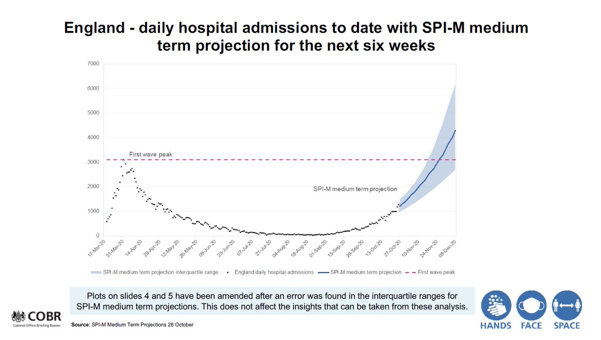
The updated SPI-M slides - a short thread on what's changed.
On 31 September, in a hastily arranged press conference, the Chief Scientific Adviser presented these two slides, showing projections for hospital admissions and deaths.
These were subsequently revised
On 31 September, in a hastily arranged press conference, the Chief Scientific Adviser presented these two slides, showing projections for hospital admissions and deaths.
These were subsequently revised
The first slide shows a *projection* for hopsital admissions. On the left, the oringial slide, on the right, the amended slide.
These slides present a *range* of the projection (the shaded blue area), and a central projection (the dark blue line).
These slides present a *range* of the projection (the shaded blue area), and a central projection (the dark blue line).
The upper level for the range of the projection has changed but *the central projection* (the dark blue line) *has not changed*
Same thing for deaths. On the left, the original slide, on the right, the revised slide. Similarly, the upper range has narrowed but *the central projection has not changed*
And remember, sadly deaths lag hospitalizations.
And remember, sadly deaths lag hospitalizations.
Here's a link to the story in the papers - it's bright yellow, so shows up more than the graphs used in the press conference.
Also, the headline 'Covid charts were wrong and death toll *will not* surpass first wave' is a strong statement. https://www.telegraph.co.uk/news/2020/11/05/covid-graphs-wrong-death-toll-will-not-surpass-first-wave/
Also, the headline 'Covid charts were wrong and death toll *will not* surpass first wave' is a strong statement. https://www.telegraph.co.uk/news/2020/11/05/covid-graphs-wrong-death-toll-will-not-surpass-first-wave/
(* the press conference was on 31 October, not 31 September(!))
Slides here: https://www.gov.uk/government/publications/slides-to-accompany-coronavirus-press-conference-31-october-2020
Slides here: https://www.gov.uk/government/publications/slides-to-accompany-coronavirus-press-conference-31-october-2020

 Read on Twitter


