Whatever the political outcome, cartography has been a real winner this election.
For the first time I feel that interactive maps have become as seamless as reading print.
As the last votes are counted, here's my highlights. 1/6
For the first time I feel that interactive maps have become as seamless as reading print.
As the last votes are counted, here's my highlights. 1/6
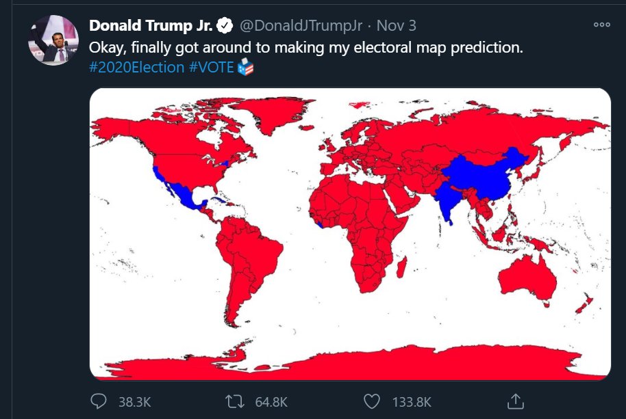
First an honourable mention for Trump Jr's map prediction tweet since it was the first map I saw on election day. Certainly an original idea, poor choice of map projection though.
https://www.buzzfeednews.com/article/pranavdixit/donald-trump-jr-world-map
https://www.buzzfeednews.com/article/pranavdixit/donald-trump-jr-world-map
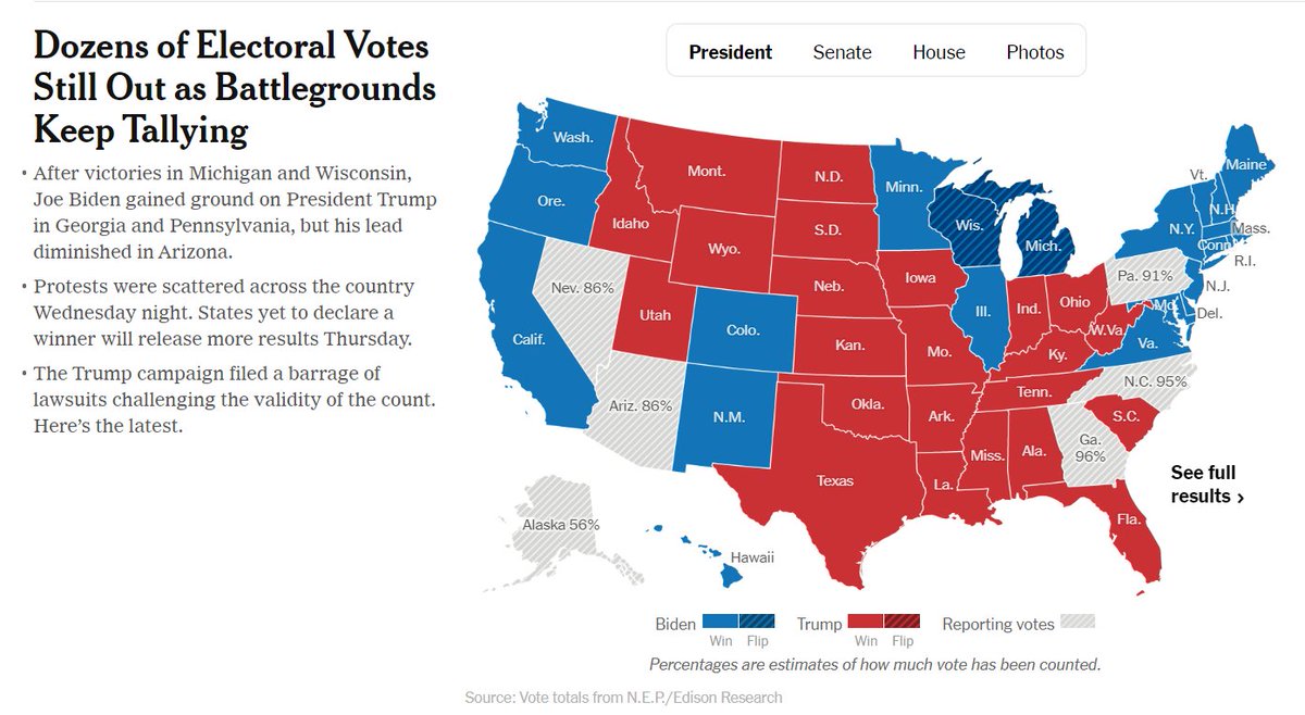
For US outlets, The New York Times' homepage slightly edged it over Washington Post's for me, both are great. NY Times lets you click on a state and zooms you into an interactive, very neat. https://www.nytimes.com/
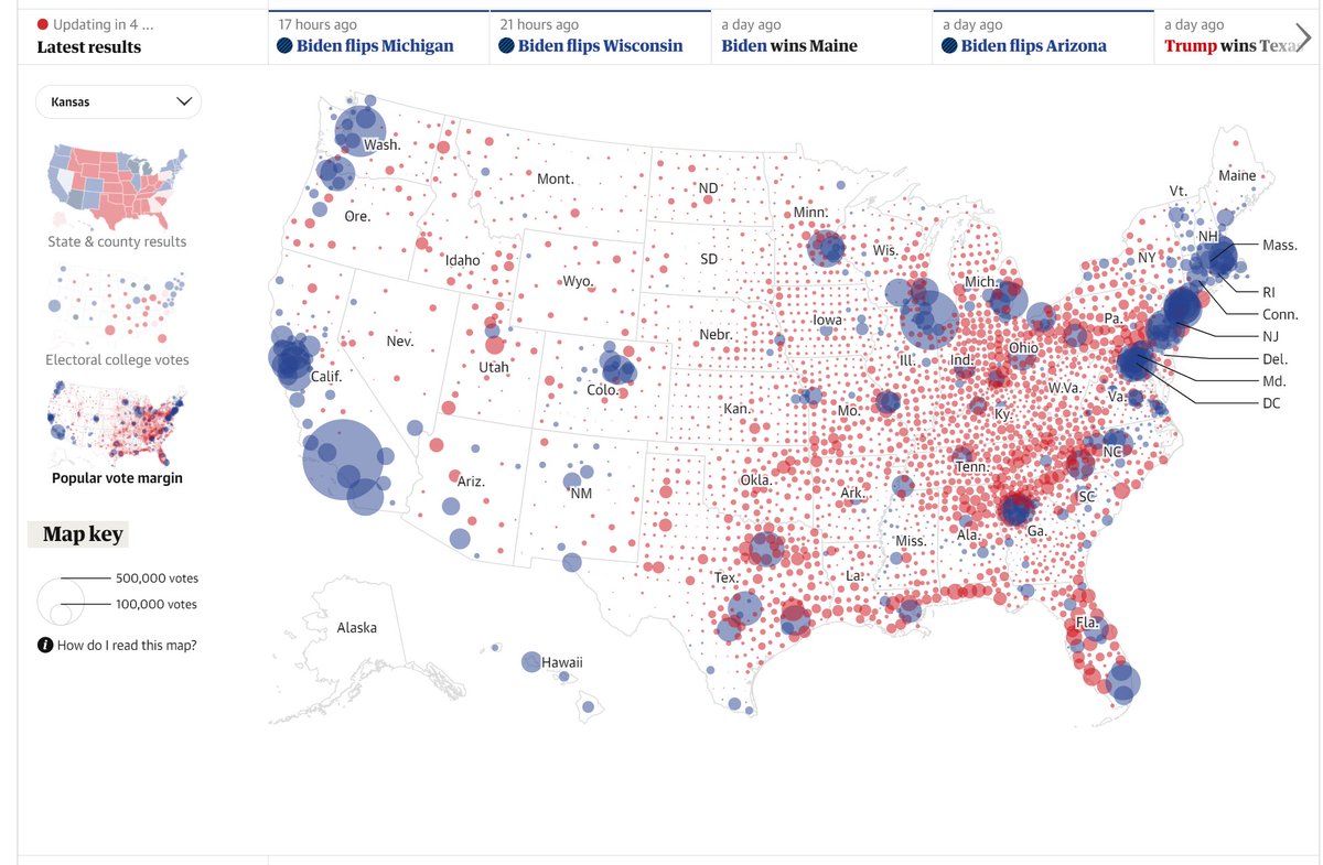
The Guardian does the same interactive trick, but it's not on the homepage. I do like the option to choose different map types though rather than simple choropleth. https://www.theguardian.com/us-news/ng-interactive/2020/nov/03/us-election-2020-live-results-donald-trump-joe-biden-who-won-presidential-republican-democrat
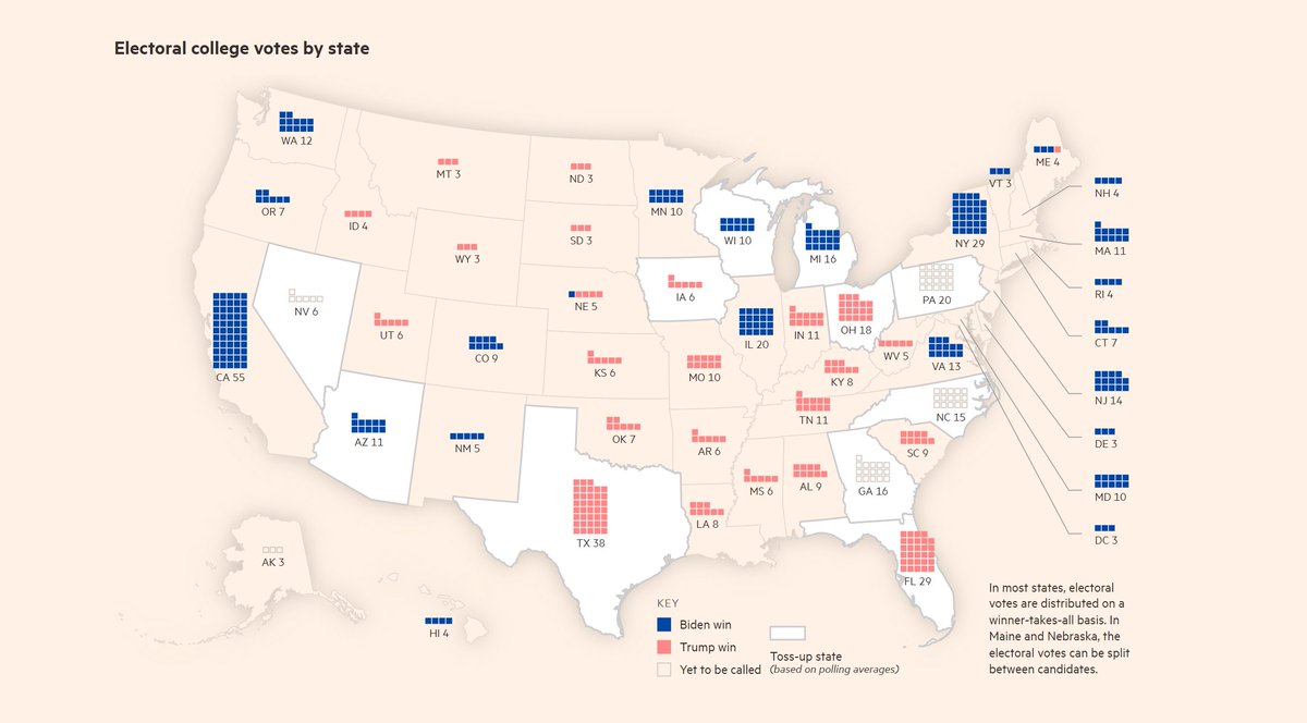
I think the FT gives the best map for election outsiders who can't get their head around how votes equate to the electoral college. Very simple, very effective. https://ig.ft.com/us-election-2020/
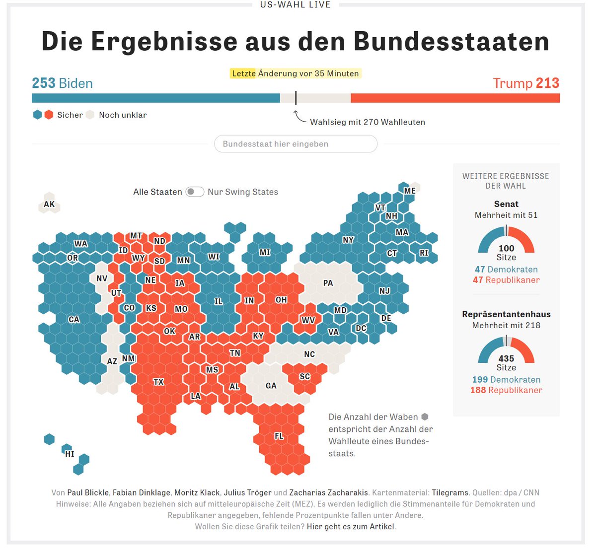
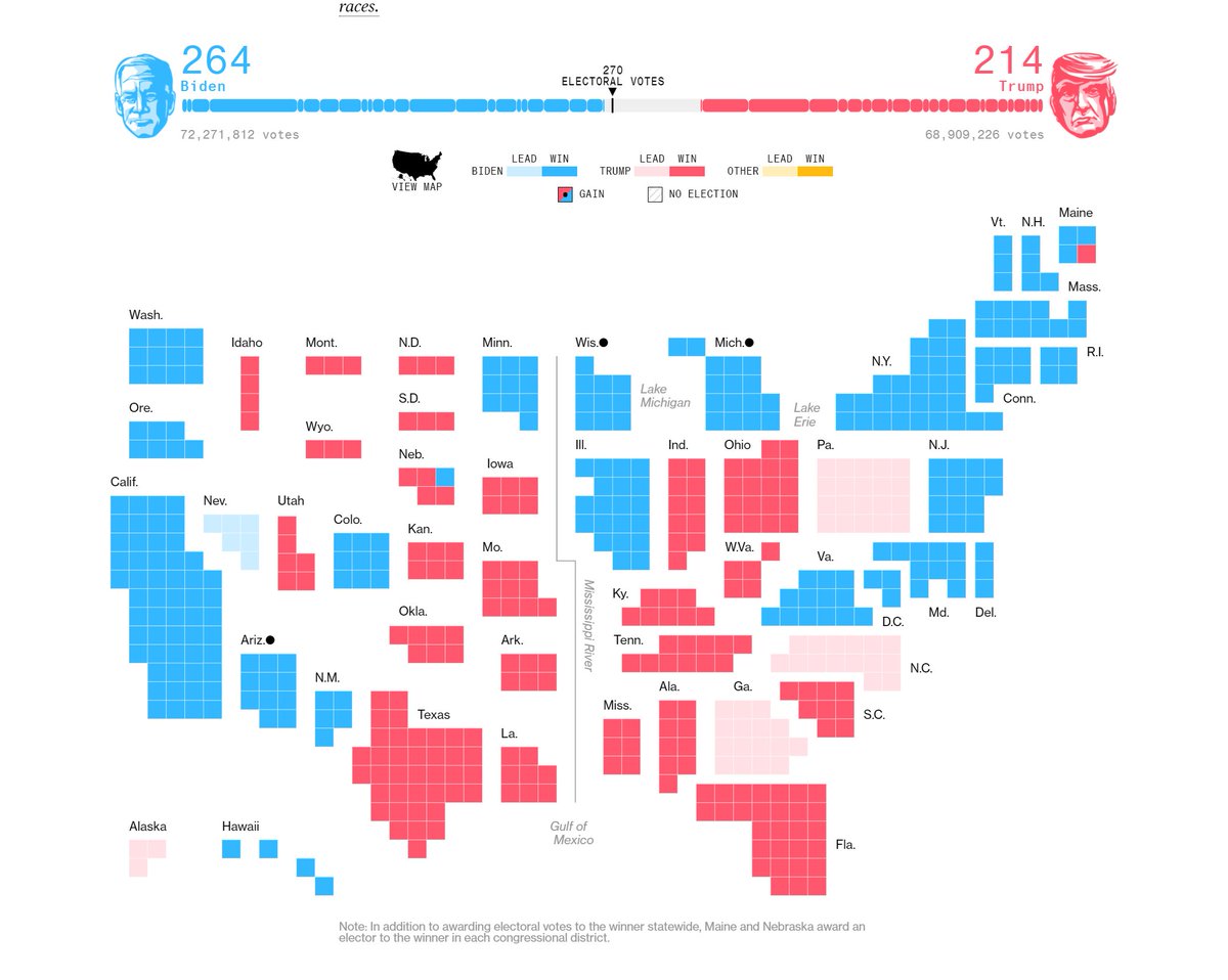
Die Zeit though has gone for hexagons in their cartogram, squares still edge it for me here I think. https://www.bloomberg.com/graphics/2020-us-election-results
Correction: this is the Die Zeit link, I put Bloomberg's there instead. https://www.zeit.de/politik/ausland/2020-11/briefwahl-usa-donald-trump-joe-biden-stimmen-auszaehlung

 Read on Twitter