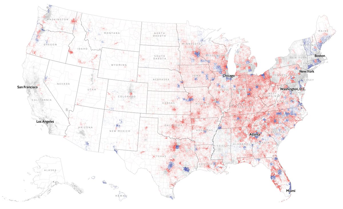
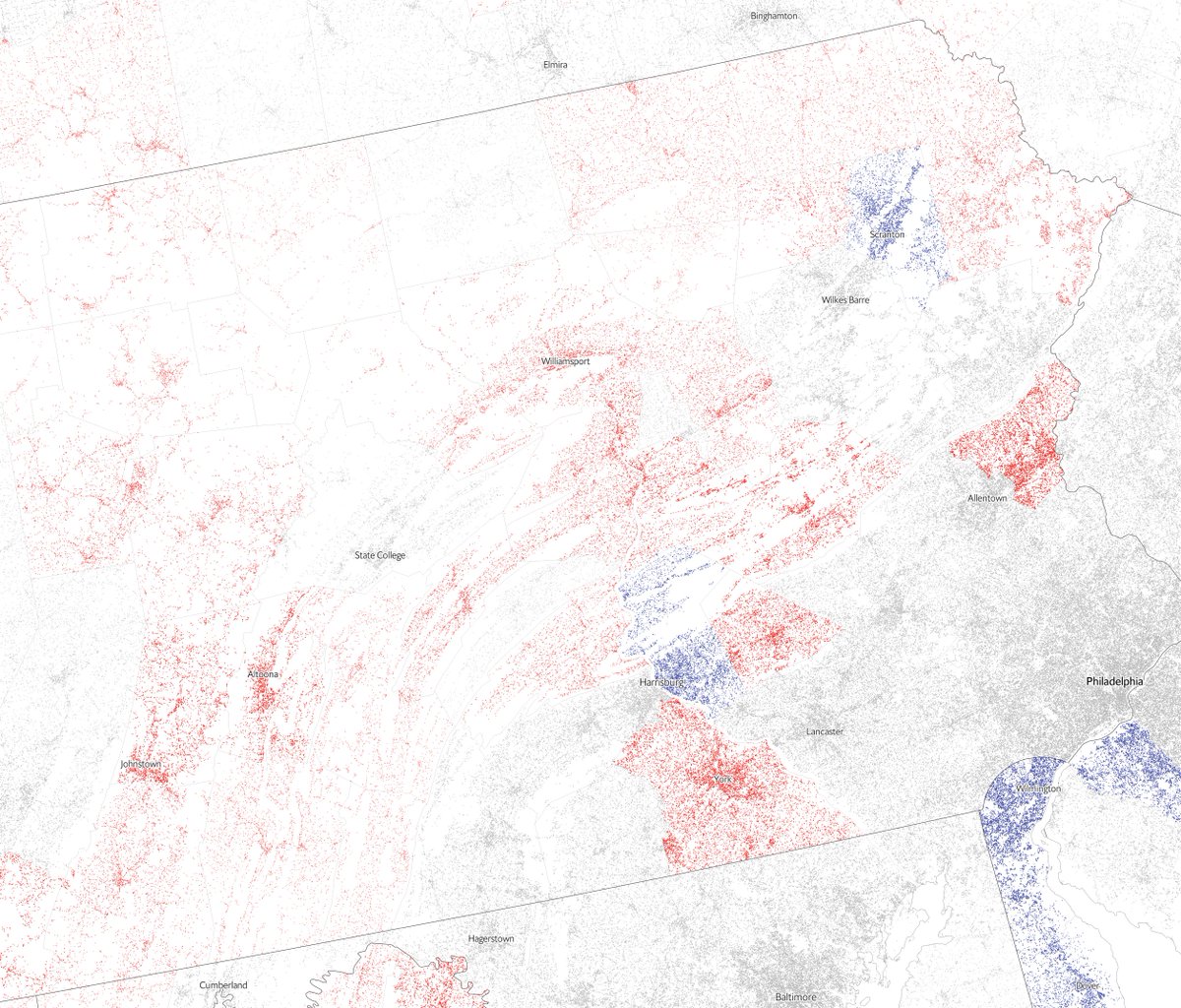
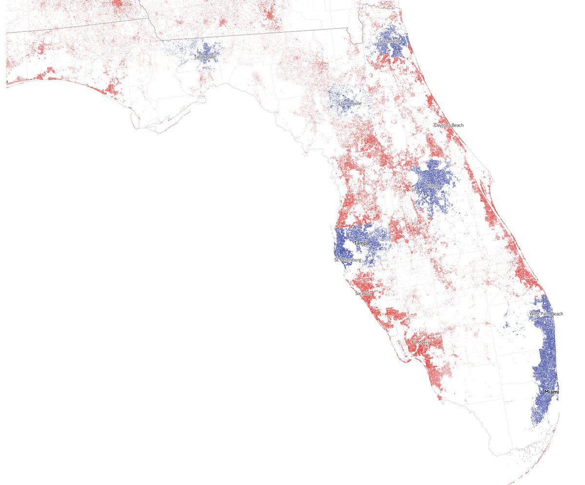
THREAD: This is how the US 2020 results look by county if we scale the vote by population density. There’s still votes to count along the East coast but the rural-urban divide is very clear https://www.economist.com/graphic-detail/2020/11/03/the-us-2020-election-results
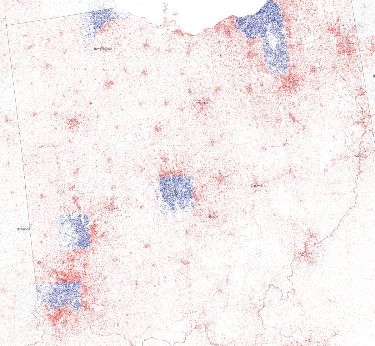
For example in Ohio only major cities like Cincinnati or Cleveland vote Democrat. Sparser areas and the suburbs go Republican
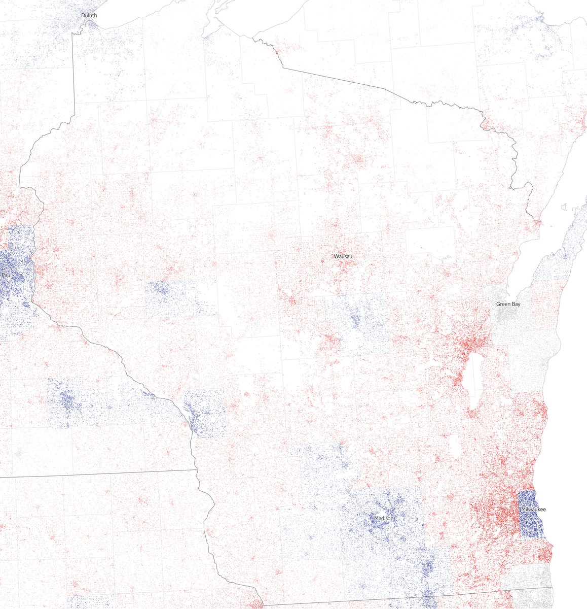
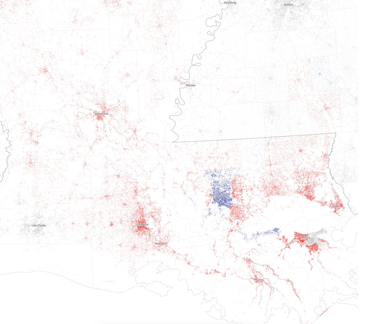
If you visualise the data and show where people actually live you can see beautiful patterns emerging. This is one of my favourite screenshots, from Louisiana, which has voted Republican
You can explore the interactive map in our results page (only on desktop) https://www.economist.com/graphic-detail/2020/11/03/the-us-2020-election-results. The data comes from the buildings footprint dataset from Microsoft (kindly converted to Geopackage by @undertheraedar ) https://automaticknowledge.co.uk/us-building-footprints/
Some technical tips: I used Tippecanoe to process the data https://github.com/mapbox/tippecanoe. Thanks @enf for providing the correct commands. Here is what I ran in case you’re curious https://gist.github.com/martgnz/929e85fd7a16a840eaf888f5c8f787da
You might have realised that the maps are not in Mercator. I converted to an Albers projection with this library https://github.com/developmentseed/dirty-reprojectors
Last but not least, the @nytimes did an outstanding job with this dataset last year https://www.nytimes.com/interactive/2018/10/12/us/map-of-every-building-in-the-united-states.html. I’ve been certainly inspired by it!

 Read on Twitter