Some election graphic favs! #dataviz
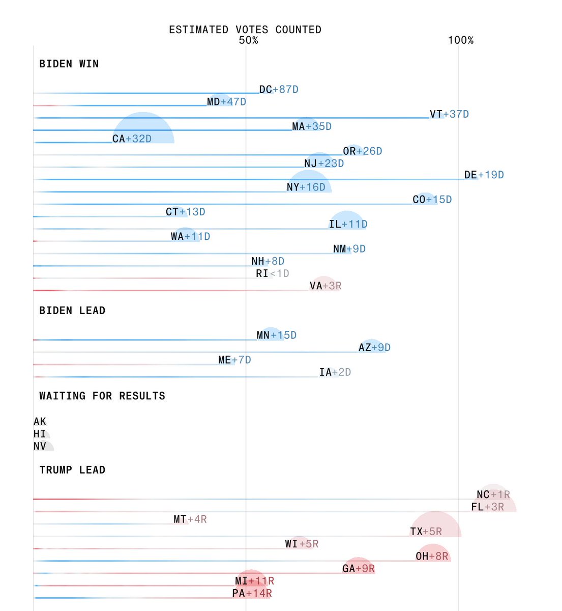
The way @BBGVisualData has stacked the electoral college votes in their stacked bar https://www.bloomberg.com/graphics/2020-us-election-results (thread)
The way @BBGVisualData has stacked the electoral college votes in their stacked bar https://www.bloomberg.com/graphics/2020-us-election-results (thread)
. @BBGVisualData's focus on heatmaps of how leads change with the % of vote counted is another lovely element. https://www.bloomberg.com/graphics/2020-us-election-results
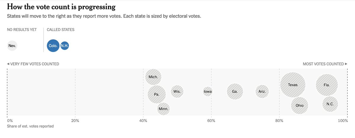
. @nytimes tracks the same metrics in a different style
https://www.nytimes.com/interactive/2020/11/03/us/elections/results-president.html?action=click&module=Spotlight&pgtype=Homepage
https://www.nytimes.com/interactive/2020/11/03/us/elections/results-president.html?action=click&module=Spotlight&pgtype=Homepage
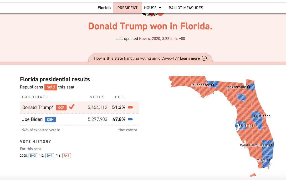
These headlines with the stacked bars on @politico https://www.politico.com/2020-election/results/president/
#Election2020  results in ten languages by my @ReutersGraphics colleagues! https://twitter.com/GurmanBhatia/status/1323835982316122119?s=20
 results in ten languages by my @ReutersGraphics colleagues! https://twitter.com/GurmanBhatia/status/1323835982316122119?s=20
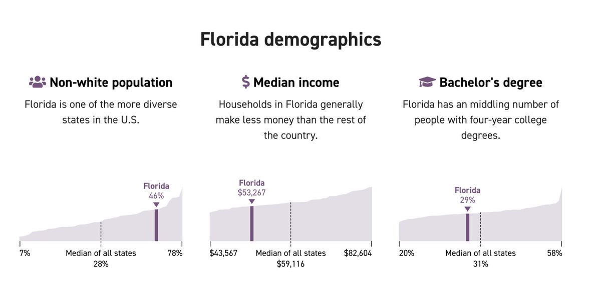
These state election comparison charts from @latimes ( https://www.latimes.com/projects/2020-presidential-election-live-results/)
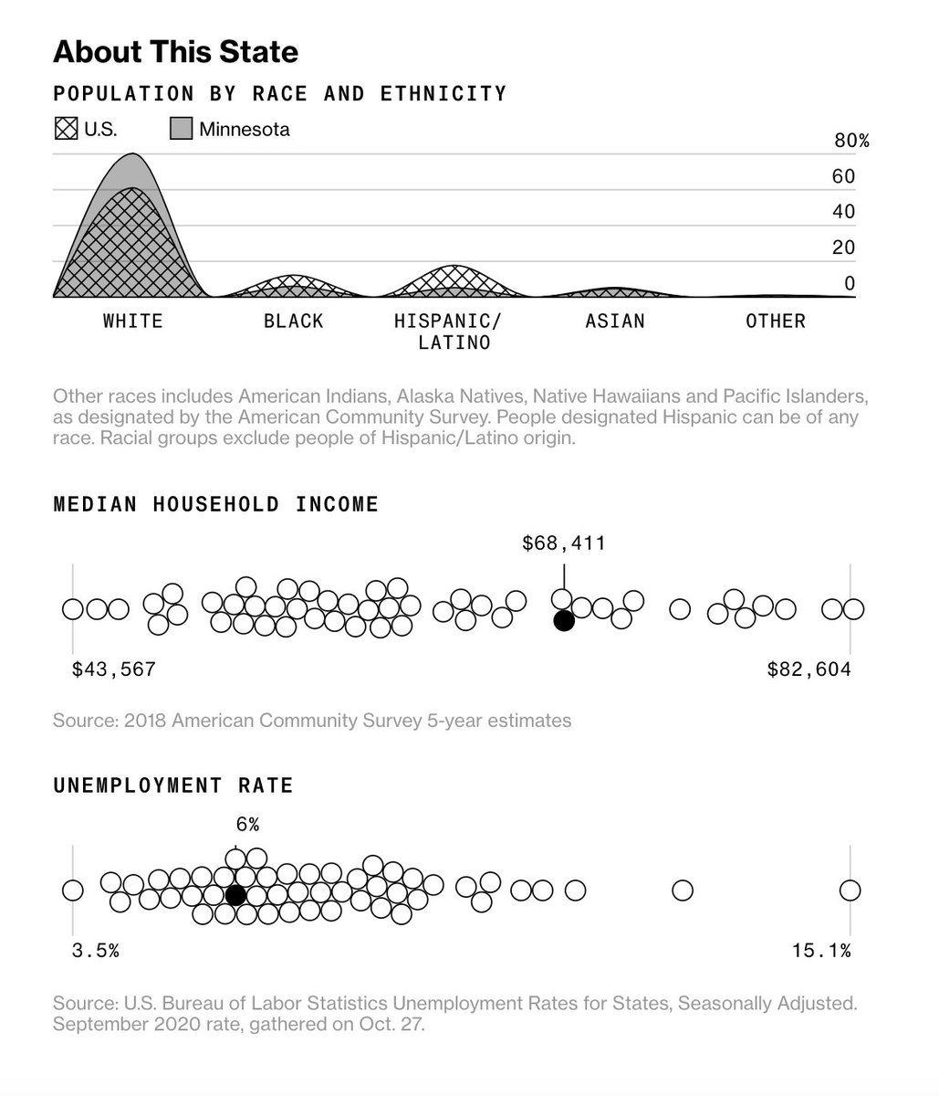
And from @BBGVisualData https://www.bloomberg.com/graphics/2020-us-election-results/minnesota#president
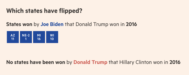
This state selector for toss-up states by @ftdata https://ig.ft.com/us-election-2020/
The classic @ccanipe seamless state to county transition https://graphics.reuters.com/USA-ELECTION/RESULTS-LIVE-US/jbyprxelqpe/index.html
This log as states are called by @GuardianData https://www.theguardian.com/us-news/ng-interactive/2020/nov/03/us-election-2020-live-results-donald-trump-joe-biden-who-won-presidential-republican-democrat
I don't generally like pie charts, but I kinda dig this v compact way to show what % of expected votes are left in states that have not been called. (the @AP embed as seen on @NewYorker) https://www.newyorker.com/news/election-2020/live-2020-presidential-election-results
the legendary, age-old @nytgraphics path to victory https://www.nytimes.com/interactive/2020/11/03/us/elections/forecast-president.html
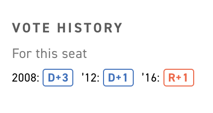
this tiny vote history element on @politico
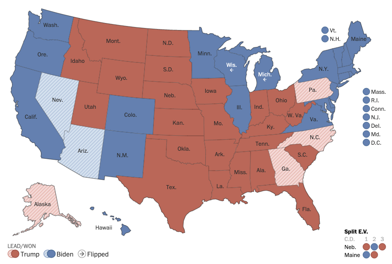
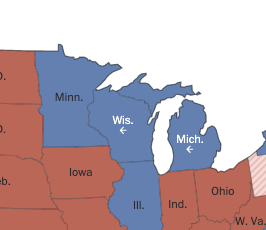
These subtle arrows on the @PostGraphics' map to show the flipped states https://www.washingtonpost.com/elections/

 Read on Twitter
