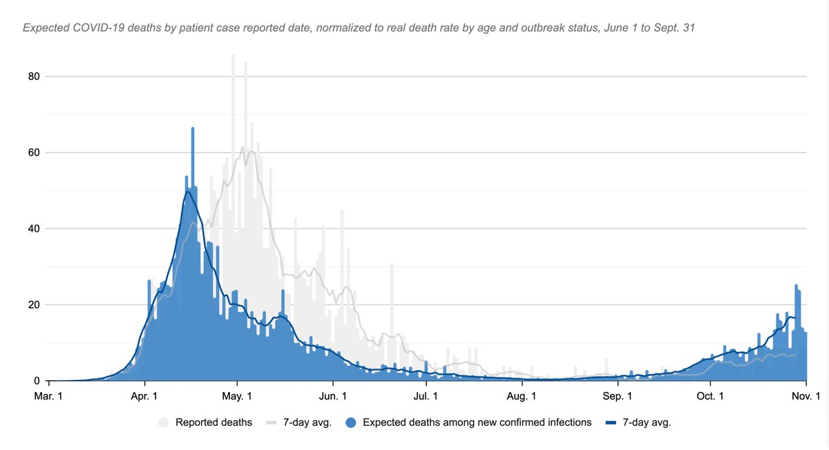
1/n Ontario's 1,050 new cases Tuesday give 12.5 "expected deaths"
Breakdown:
<20: 171 cases, 19 in outbreaks = +0.1 expected deaths
20s: 204, 18, +0.0
30s: 156, 20, +0.0
40s: 162, 17, +0.3
50s: 155, 19, +0.4
60s: 105, 16, +2.2
70s: 48, 7, +1.9
80s: 32, 11, +3.6
90s: 18, 10, +3.9 https://twitter.com/EdTubb/status/1323338498552856577
Breakdown:
<20: 171 cases, 19 in outbreaks = +0.1 expected deaths
20s: 204, 18, +0.0
30s: 156, 20, +0.0
40s: 162, 17, +0.3
50s: 155, 19, +0.4
60s: 105, 16, +2.2
70s: 48, 7, +1.9
80s: 32, 11, +3.6
90s: 18, 10, +3.9 https://twitter.com/EdTubb/status/1323338498552856577
2/n This is a new breakdown, based on the method I explained yesterday. I'll try to run this daily.
Unfortunately, the database doesn't let me chart the daily change, so that chart is based on the case report date, which is a bit different, and a bit delayed.
Unfortunately, the database doesn't let me chart the daily change, so that chart is based on the case report date, which is a bit different, and a bit delayed.
3/n The recent average for expected deaths based on this method is around 15-16/day. That tells you today's new cases skew relatively younger.
4/n How to read this number: It's the number of folks among today's cases that you'd expect to die sometime in the future based on the fatality rates we saw over the summer.
This lets you directly compare how vulnerable each day's set of new cases is vs. the first wave.
This lets you directly compare how vulnerable each day's set of new cases is vs. the first wave.
5/n Anyway. I wouldn't call this a proven method, but I'll keep at it to see how accurate it is at predicting Ontario's deaths curve.
Because it takes time for folks' illnesses to progress, the number is likely to be a couple weeks ahead.
Because it takes time for folks' illnesses to progress, the number is likely to be a couple weeks ahead.

 Read on Twitter


