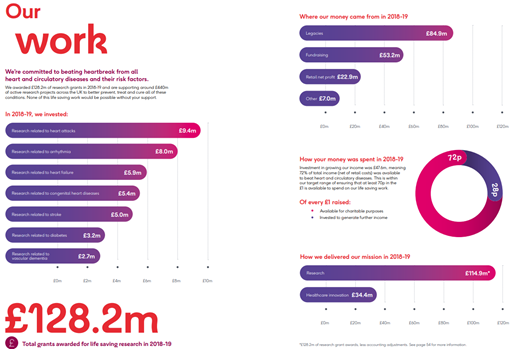
For the #NCVOAlmanac I have to look at and check hundreds of charity accounts. Many of them include charts which can be great to support key messages, demonstrate impact and engage readers.
A geeky #charitydata thread on some of my ‘the good, the bad and the ugly’ moments.
1/
A geeky #charitydata thread on some of my ‘the good, the bad and the ugly’ moments.
1/
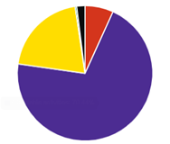
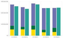
The Charity Commission recently launched a new public register. It’s much easier to use and makes more info available, eg on charity finances. It also has more charts which is great - even though some of their choices on chart types and colours might be questionable
2/
2/
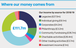
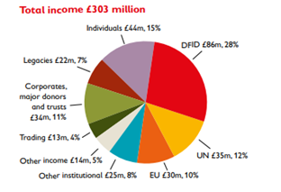
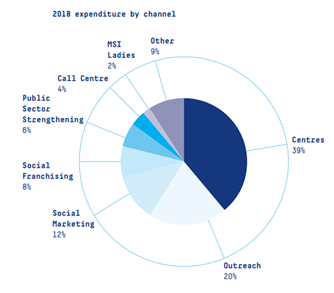
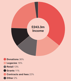
Pie and doughnut charts are by far the most popular in pdf charity accounts. Unfortunately, quite a few don’t follow good practice in #dataviz.
… too many categories, too many and inaccessible colours, no clear labelling, not ordered by values etc.
3/
… too many categories, too many and inaccessible colours, no clear labelling, not ordered by values etc.
3/

 Read on Twitter