I'M SO EXCITED TO LEARN WHAT THE PANTONE COLOR OF THE YEAR WILL BE FOR 2021 BUT WE DON'T KNOW THAT YET SO LET'S REVIEW SOME HISTORICAL COLORS OF THE YEARS AND GET EXCITED TOGETHER:
Cerulean 15-4020 (2000) These colors are typically picked late in the prior year, so you have to understand this one in the context of 1999. There was a non-zero chance we were all gonna die! Computers will explode! Maybe the world will turn black and white!
So I think Pantone thought we thought that we would all just be glad to have colors at all, and they wanted something inoffensive and kind of calming. Cerulean ain't never crossed nobody, nobody sits down with their therapist and goes over their issues with Cerulean.
Cerulean is fine. The year 2000 was fine, too. Do you even remember the year 2000? Got backgrounded pretty quick. You know what makes a pleasant background? Cerulean. Pantone aced this one y'all, right out the gate. 10/10.
Fuschia Rose 17-2031 (2001) Ooof. Most of 2001 was pretty pleasant, I guess? People back then spent time trying to look nice or make things pretty and Fuschia Rose is a decently valuable color when you're trying to do that.
Build a table arrangement around Fuschia Rose some time, you'll see. Fuschia Rose was a great color everyone could look to and feel good about for 253 of 2001's 365 days. That's pretty good! 8/10.
True Red 19-1664 (2002) OK so obviously this pick is directly in the context of the immediate aftermath of 9/11. Pantone is headquartered in a fairly small but nice town in Northern New Jersey. Obviously this is a lot of assumption and speculation on my part but I'm just saying
it's v possible that 2002 Color of the Year was supposed to like, inspire/comfort/show the world that Northern NJ providers of the premium color swatches would not be cowed. I am not sure that is an appropriate role for the Color of the Year but it was a very odd time. 7/10.
Aqua Sky 14-4811 (2003) This is teal. Look at it! I have never the sky ever look that color so much as once, and yet many things that have been labeled "teal" have looked exactly that color, such as napkin rings, pairs of mittens, cat collars, and other assorted home goods.
I respect the hell out of teal, it's a great color that makes people feel restored, like they just spent a week at a spa in Arizona and maybe their faith in the concept of 'vibes' is coming together in a way that makes them feel like they have some ability to influence their
immediate environment. That's really cool! But it's also teal, and not 'aqua sky,' whatever that is supposed to be. Come back when you believe in yourself, obviously teal color. 2/10.
Tigerlily 17-1456 (2004) So this is a great color imo but if you told me the name was racist I wouldn't argue w/ you. Like, odds this color was named after the flower vs being a kind of Peter Pan reference? Lots of things in American history are super racist. Still a great color!
You can't take that away from Tigerlily, even though addressing how things might be racist isn't taking away from them so much as seeking to properly understand them in the right context? Anyway this is a good color for when you want things to be orange but also grown-up, like
some people (WRONGLY, FTR) think you can't just make a bunch of stuff bright orange and encourage fun, you need some brown in your orange and then people won't go all wacky on you. Boy, this one is all over the place, huh? 5.5/10.
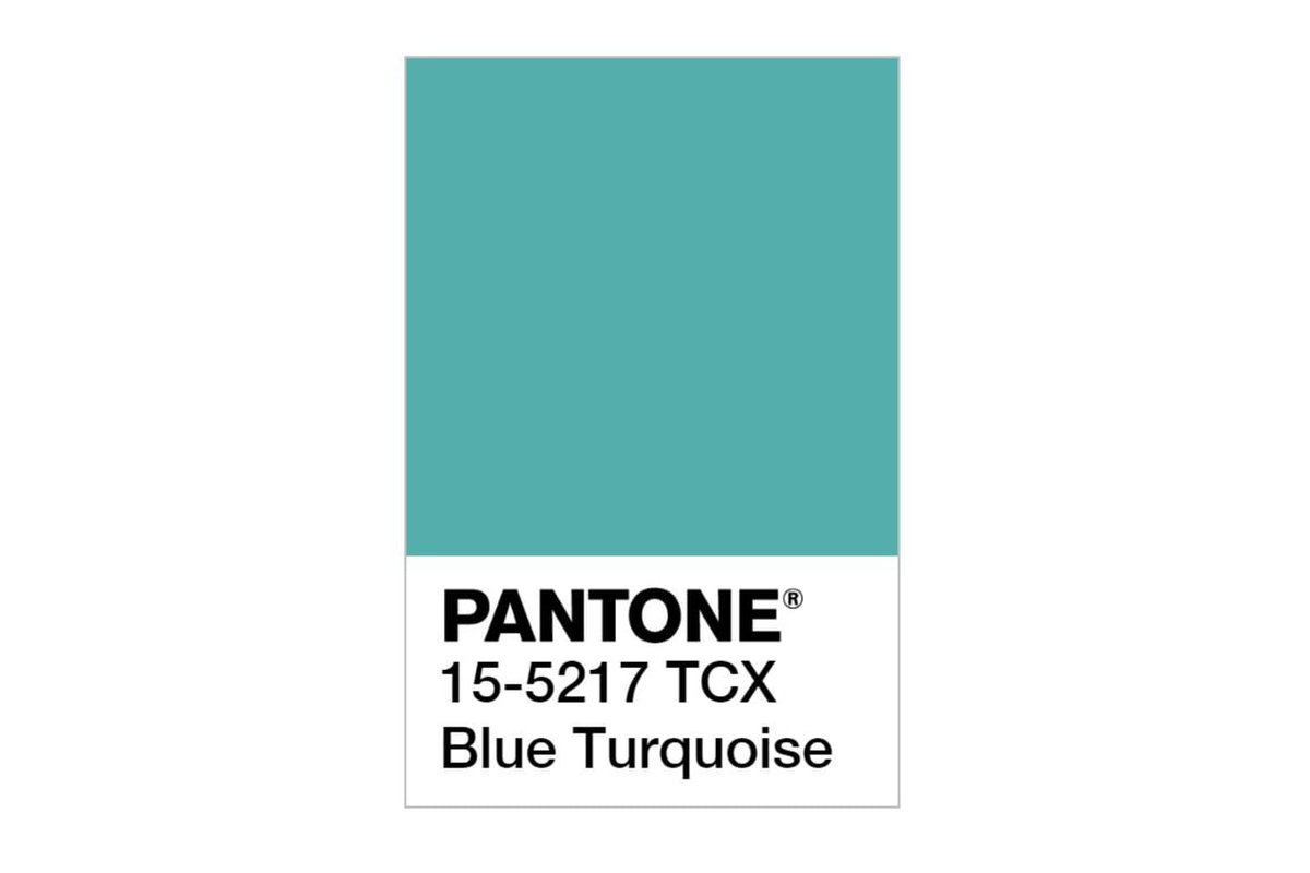
Blue Turquoise 15-5217 (2005) well which is it, am i right? anyway you're going to start to see some themes develop in the Pantone Color of the Year library, which is OK. You have to figure the really good colors would have some things in common with each other or be drawn from
similar areas, just like how lots of the really shady companies & Delaware. Blue Turquoise, the limited liability color with unclear ownership! I appreciate that is uses color names instead of world/thing names, that shows confidence. Good color for bathroom tile, too. 6.5/10.
Sand Dollar 13-1106 (2006) I think it takes courage to declare boring things to be really special? This doesn't mean it's a good idea, lots of dumb things take courage, but Sand Dollar has been out here making sure certain categories of office furniture/slacks/car floor mats/ etc
etc, all have a nice color to call their own. Still, no one has ever been excited that a thing has been colored Sand Dollar, not now, not in 2006, never. 3/10.
Chili Pepper 19-1557 (2007) This has to be the reactionary element, right? You spend a whole year trying to unload sand dollar swatches and your vat of brown dye and by the time november comes around you're probably literally snorting refined capsaicin.
This is a good red. Red is a hard genre, in my estimation. There are a lot of mediocre things in this world that are red. I salute Chili Pepper 19-1557, out here trying to let everyone know that some reds are still lush, rich and powerful. 7.5/10.
Blue Iris 18-3943 (2008) Blue Iris is out here repping for things you buy your mother-in-law because you can't remember her favorite color. Blue Iris is nobody's favorite color but and will def get you a polite thank you but watch their eyes, man.
Watch them gaze at the vase, watch their eyes narrow as the light catches the Blue Iris 18-3943 and it almost looks lavender, but then it isn't. Why couldn't it be lavender? Lavender would be nice. Would really bring a warmth to the room. 2/10.
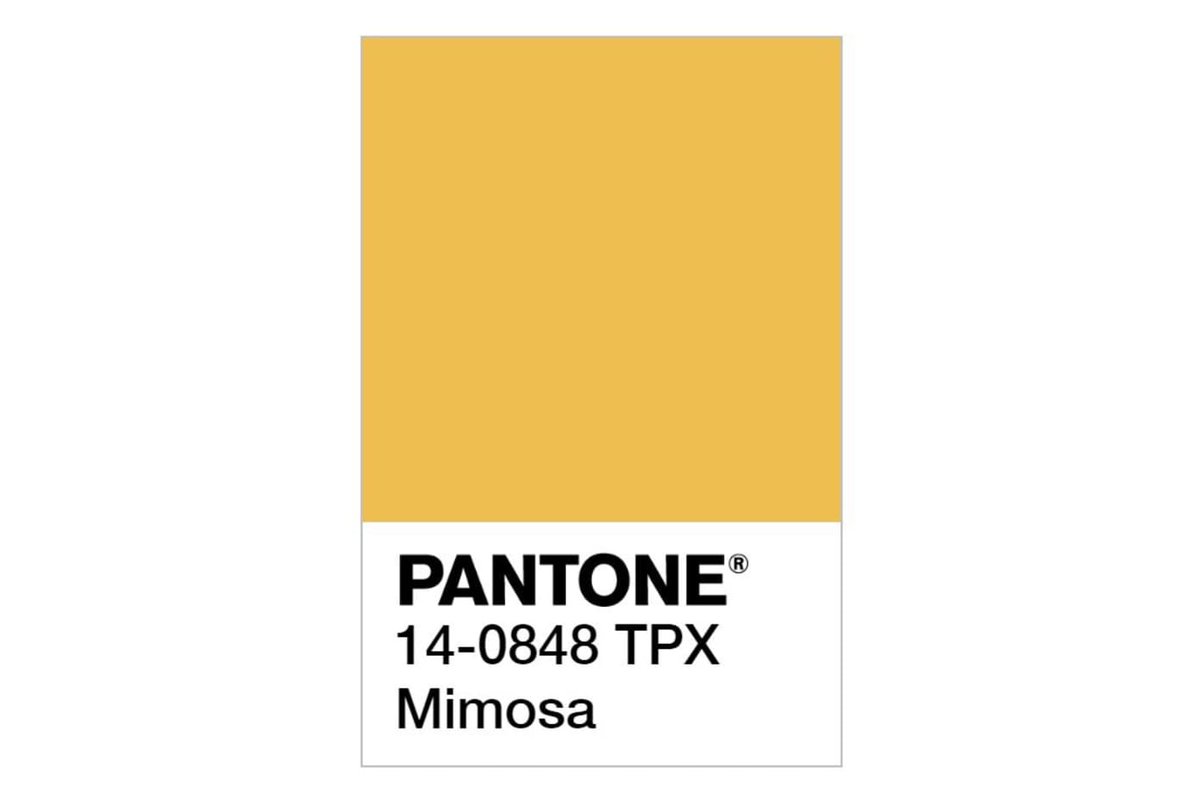
Mimosa 14-0848 (2009) h*ck yess the color of the year is p*ss, happy 2009 everyone. Mimosa my aunt fanny. 9.5/10.
Turquoise 15-5519 (2010) lmao it's like the fired the person in charge of color of the year in mid-july and then the HR person when on maternity leave so nobody got hired and then all of a sudden it was thanksgiving and all the color heads were calling, asking where is it
what is the color of the year, what have you got? Still, it's an honest color with an honest color's name. Turquoise 15-5519, no more, no less. 7.5/10.
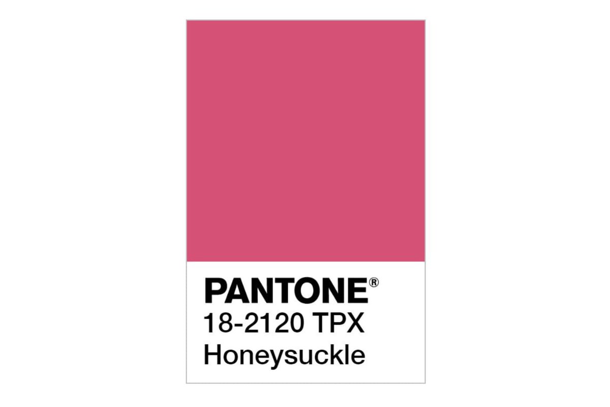
Honeysuckle 18-2120 (2011) this is another one that seems kind of disconnected from its namesake? I feel like almost all of the honeysuckle i've ever seen is kind of yellow and white, but I understand it does in fact come in tender pinkish hue
and so this color's name is not out of bounds. honestly i shouldn't be assuming my experience is the baseline universal, maybe tons of honeysuckle is pink and i've got this all backwards. so this one is a color of the year and a good lesson. 7/10.
Tangerine Tango 17-1463 (2012) This color is hot shit, man. I love this color. A bagman offered this color six figures to play QB at state, that offer got rescinded when Tangerine Tango came out as bisexual, so Tangerine Tango
walked on as a WR at Harvard and is, I don't know, working in the lab on finally figuring out carbon recapture. Tangerine Tango gonna save us all. 10/10.
Emerald Green 17-5641 (2013) Honestly I smell the reactionary element at work here, same as07. Tangerine Tango scared some ppl, some ppl just weren't ready for that level of verve, so 2013 is just back-to-basics sort of color of the year. Green ranger ass color of the year. 5/10.
Radiant Orchid 18-3224 (2014) Another banger. This one is a not exactly an already known to us sort of purple but an already familiar one, like your oldest friend's new friend. I have an orchid this color too so there's real truth in advertising going on here.
although for something named "radiant" it's kind of subdued? i read that as confidence though, like it knows about its radiance. nothing to prove to nobody, not Radiant Orchid. 8.5/10.
Marsala 18-1438 (2015) IMO this is where you start to get the sense that somebody who really knows what they're doing is in charge of COTY. Emerald green must have been a fiasco, I figure, and they took the project away from whoever and
gave it to somebody who knows some of the deeper cuts. It's almost brown! That takes guts. Marsala looks good on clothing, on tile, it would KILL on some le creuset. Marsala is heirloom goods quality color of the year.
Even more not-showy-but-spectacular than Radiant Orchid. Can't say enough good things about Marsala, 10/10.
Rose Quartz 13-1520 and Serenity 15-3919 (2016) Y'all when I heard 2016 was color[*S*] of the year I literally had the phone off the hook and was telling the operator to get me Pantone, I was going to let them have it, but while the call went through I just looked at the colors
and they just set me right. These two are solid. Get along well, different enough to be worth their own attention, warm, comforting, it just works. I didn't think it could be done but man if anybody knows color it has to be Pantone, right? 2016 was fuckin' wild. 7.5/10 for both.
Greenery 15-0343 (2017) Y'all remember late 2016? Me too. I love this color, borderline kermit color, but it just SCREAMS "well I don't fuckin' know." My heart goes out to someone in late 2016 trying to pick a color that's going to feel OK in 2017. You did great! 8.5/10.
Ultra Violet 18-3838 (2018) OK, Okay, now we've got some kind of idea of what the era's going to feel like and Pantone is bringing the big guns. A little bit of the ol' Ultra Violet, eh me droogs? We finally got a color the year that wasn't for the faint of heart
or those recovering for surgery. This one's gorgeous, man, I want a room painted floor to ceiling in Ultra Violet and I want to sit in that room until I really feel like I got it figured out. 2018 was a big year and Ultra Violet is a big color. 9/10.
Living Coral 16-1546 (2019) Again, the Color of the Year department at Pantone has been through fucking around for *years*. The last person who suggested "how about another teal sort of color" was swiftly shown the door and the real color enthusiasts got down to work.
This one is gorgeous, just rich, vibrant, borderline aggressive color. The exact thing people look to Color of the Year for. A leader. Tremendous color. 9/10.
whoops messed up the thread https://twitter.com/sixangryghosts/status/1323341558154817536

 Read on Twitter


![Rose Quartz 13-1520 and Serenity 15-3919 (2016) Y'all when I heard 2016 was color[*S*] of the year I literally had the phone off the hook and was telling the operator to get me Pantone, I was going to let them have it, but while the call went through I just looked at the colors Rose Quartz 13-1520 and Serenity 15-3919 (2016) Y'all when I heard 2016 was color[*S*] of the year I literally had the phone off the hook and was telling the operator to get me Pantone, I was going to let them have it, but while the call went through I just looked at the colors](https://pbs.twimg.com/media/El1y9wSVkAEvR7H.jpg)


