I’m a socio-economic statistician working with fab @HuttonSEGS & @rowett_abdn colleagues mostly on survey data. I’m extremely lucky to interact with researchers open to new techniques (to them), but effective communication in interdisciplinary collaborations can still be tricky!
After 8 years at my job,I feel more comfortable with socio-economics concepts,but I sometimes struggle to pass simple messages that I believe are obvious, e.g. “correlation does not imply causation” or “you need a sampling strategy/frame for your survey"
Like all imposters I blame this on myself  and strive to be more effective in my #StatsCommunication, by improving my soft skills but also by perfecting my #dataviz skills.
 and strive to be more effective in my #StatsCommunication, by improving my soft skills but also by perfecting my #dataviz skills.
Some things I’ve tried in the past:
 Organising joint workshops to discuss how our areas of expertise can interact
 Attending area-specific seminars to understand unfamiliar topics of research

 Organising joint workshops to discuss how our areas of expertise can interact
 Attending area-specific seminars to understand unfamiliar topics of research
 Sharing code to use as an intermediate language (although depending on the collaborator’s level, this can be counterproductive)
 Discussing how others understand different visual representations of data.
What works for you

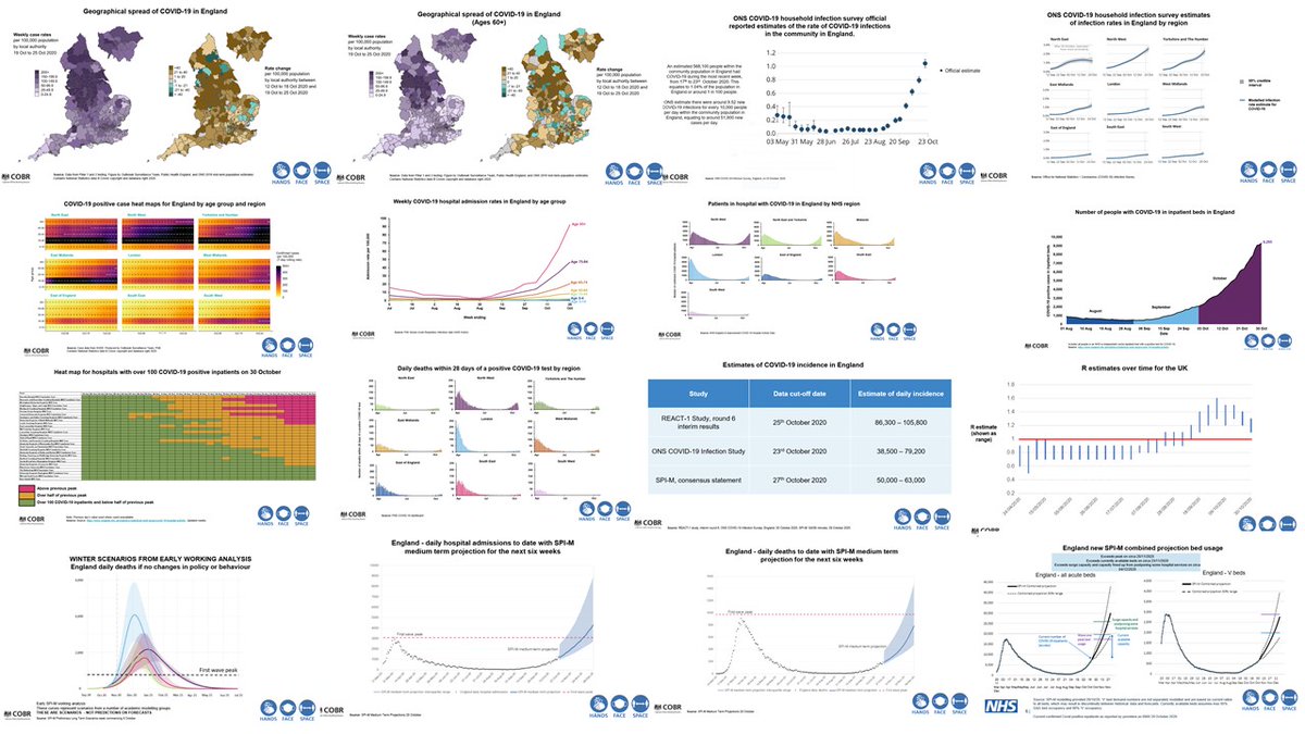
I had an improvised exercise of #dataviz dissecting at home on Saturday during the latest press release of the UK government. The PM announced a national lockdown in England after scientists had shown the 16 plots below in 12 min.
https://www.gov.uk/government/publications/slides-to-accompany-coronavirus-press-conference-31-october-2020
https://www.gov.uk/government/publications/slides-to-accompany-coronavirus-press-conference-31-october-2020
I have the utmost respect for the teams of individuals gathering these data, plotting and modelling it under tremendous pressures, but altogether there was simply too much information to digest 

My partner,a qualitative social scientist, kept asking questions about error bars & other details (those that were legible) and then suddenly got information overload after the 5th, a collection of heatmaps that seemed to get the most attention on Twitter: https://twitter.com/SusanMichie/status/1322796604009652231?s=20
I generally recommend heatmaps to collaborators & find them easy to read so I was partly surprised that they were the problem, but colour choices, illegible legends & the previous plots didn’t help. So I learnt once again not to take people's understanding for granted #StatsComm
N.B.: I’m not an expert in the area, and both in these presentations and other media reporting of the COVID pandemic I’ve found myself lost in translation. It’s somehow reassuring to see more stats in the wild, but it’s also overwhelming. Imagine how it is for non data people!
A new thing I’m very keen to try is incorporating more and more creativity to make less accessible concepts more understandable. Visually, the @_deardata project ( http://www.dear-data.com/theproject ) and the #rstats #TidyTuesday initiative are a great inspiration.
 http://www.dear-data.com/theproject ) and the #rstats #TidyTuesday initiative are a great inspiration.
Reading or watching anything by Prof @d_spiegel is a masterclass of effective & enjoyable stats communication: https://medium.com/@d_spiegel
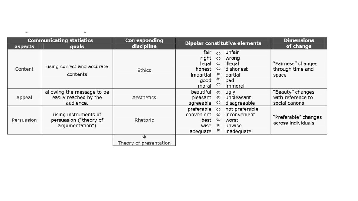
I’m also increasingly mindful that ethics must be a major part of the whole research process.
I like the elements highlighted in this Eurostat article although I’d say ethics should apply to the 3 disciplines, with aesthetics social canons & “preferable” changes understood as widely as possible: https://ec.europa.eu/eurostat/documents/1001617/4398464/POSTER-6A-PRESENTING-AND-COMMUNICATING-STATISTICS-MAGGIN.pdf
I would love to hear from others on ways to improve communication in interdisciplinary collaborations. Links and Twitter handles to follow are very much welcome too!
Re ethics & #dataviz, this thread couldn't be more timely, including a great article by @abmakulec, Ops Director @datavizsociety, recommending to #vizresponsibly during/about the pandemic: https://twitter.com/alark/status/1323416072121249793?s=20

 Read on Twitter


