Going to do some research this AM to evaluate how current USA operators are doing on #responsiblegambling. I'll use the same search of "(Operator Name) Responsible Gambling" for consistency.
A thread.
A thread.
First Up: DraftKings.
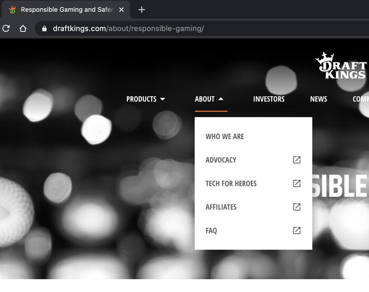
Interesting observation. RG is under "About" yet isn't listed in the navigation. Odd.
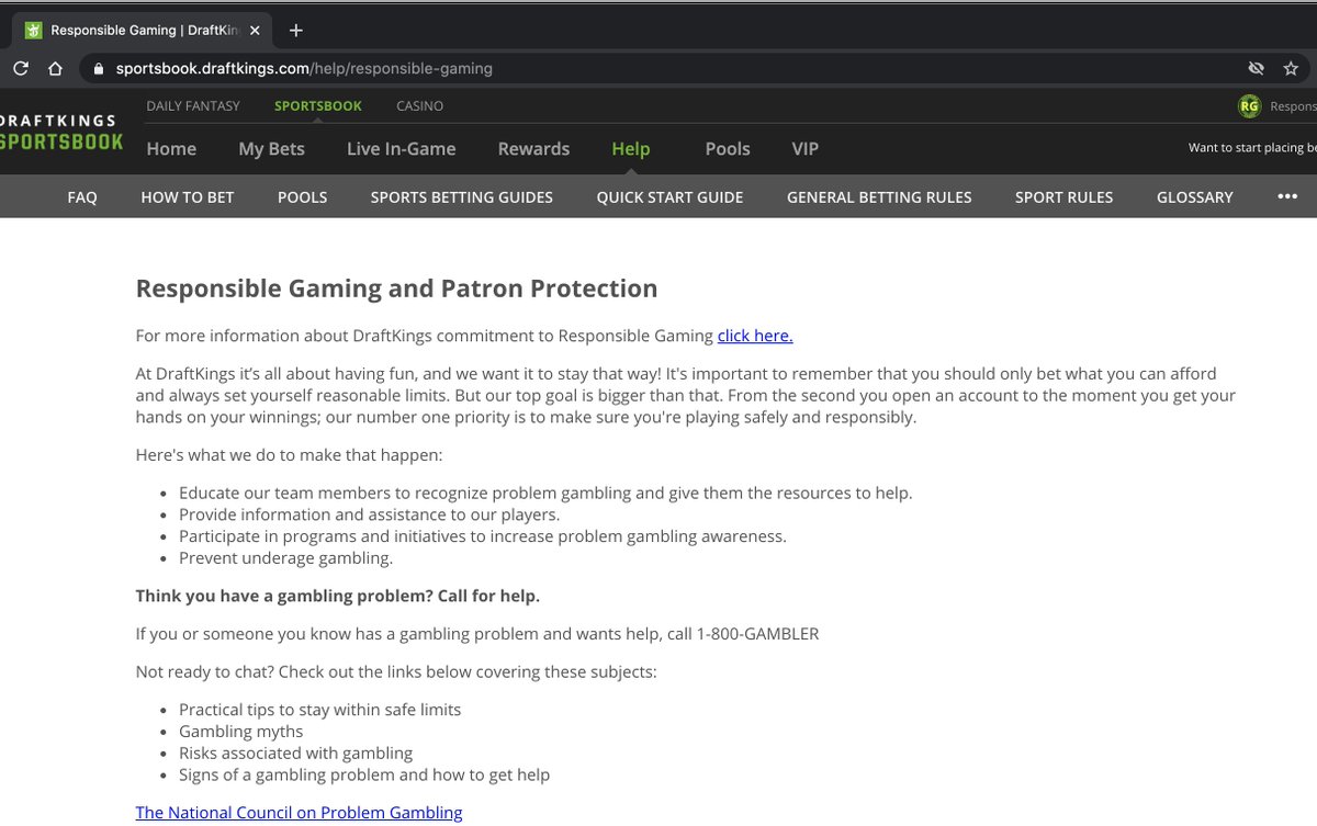
Also, "DraftKings will comply" is used throughout, so I assume this equates to doing the minimum required by law and no more.
Interesting observation. RG is under "About" yet isn't listed in the navigation. Odd.
Also, "DraftKings will comply" is used throughout, so I assume this equates to doing the minimum required by law and no more.
Same thing on the Sportsbook page. RG nested under Help, but absent from the Nav Bar and buried in FAQs.
Top of the Responsible Play page provides clear guidance on how to set limits which is pretty solid.
Next Up: Barstool
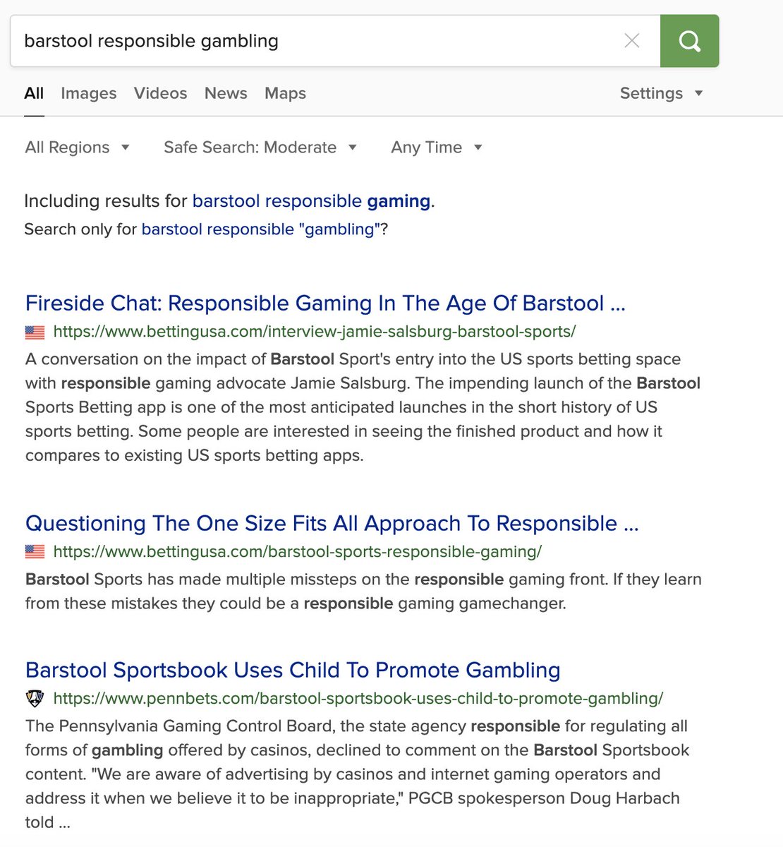
While top results for the first two were the operators, my search for "Barstool Responsible Gambling" has the fireside chat discussion @SteveRuddock and I did a month back as the top search result, along with some less than desirable top search results.
While top results for the first two were the operators, my search for "Barstool Responsible Gambling" has the fireside chat discussion @SteveRuddock and I did a month back as the top search result, along with some less than desirable top search results.
I try some variations of the search and a link to Barstool's RG page is nowhere to be found on the first page of results. As a newer entrant, this might be expected. Still, it's not good.
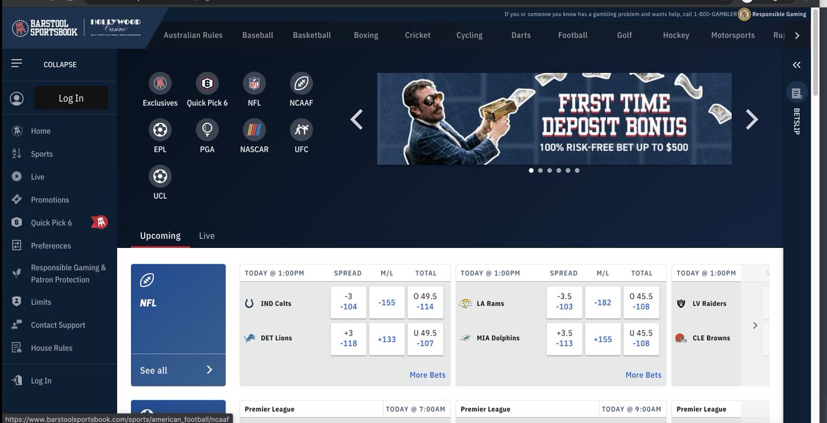
I go directly to the Barstool Sportsbook website. Here, I notice something that was absent on the first two. Mention of PG hotline on the main screen.
On continuing, I quickly notice the top nav again devoted to the hotline and the Yellow Icon for "Responsible Gaming". I'm impressed as the icon really jumps off the page and is in a valuable place of screen real estate.
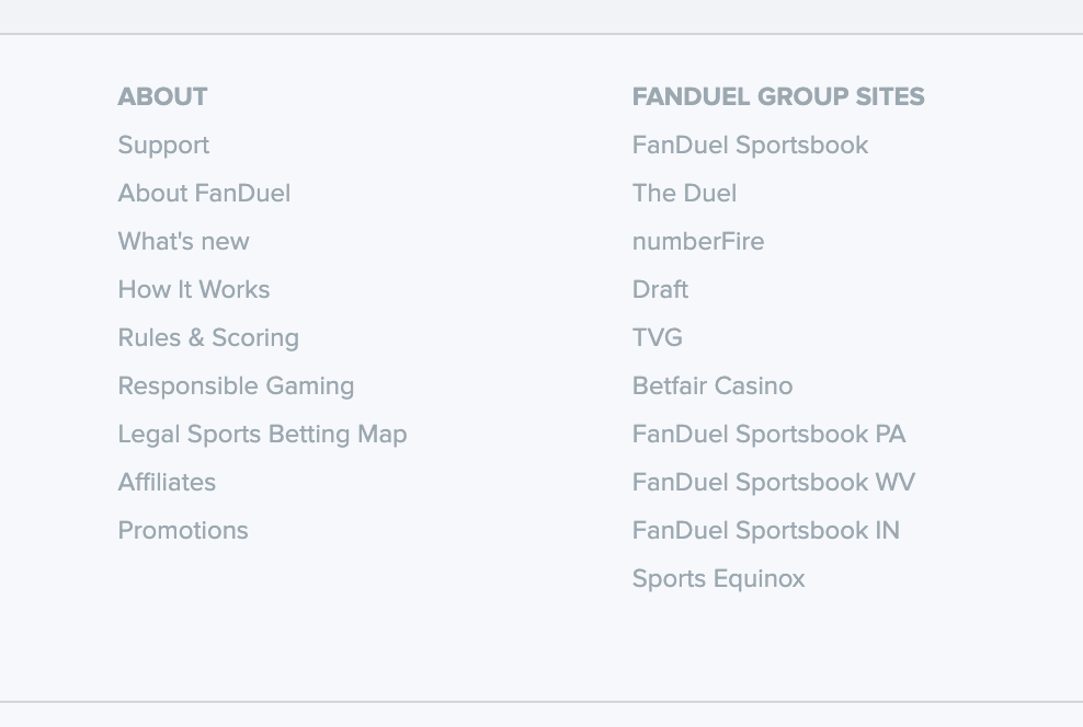
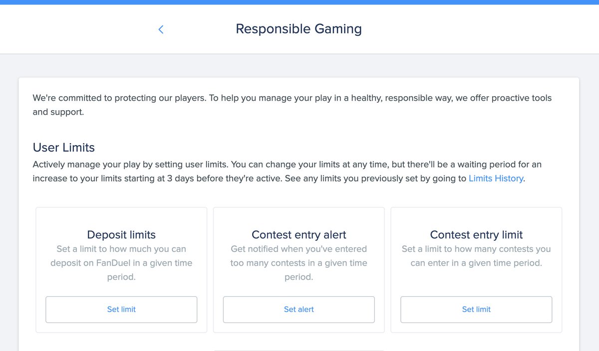
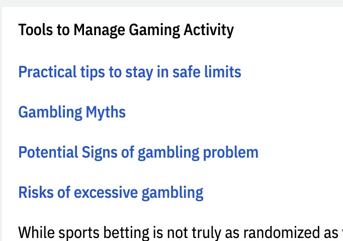
RG page doesn't have the quick access to changing limits like on FanDuel. However, the first accordion flyout has links to content that I'm surprised, yet glad to see.
Clicking on the links and I wish these were BS branded rather than external links. Mainly because the PA Gaming Control PDF hurts my eyes. Uggh!
Next Up: BetMGM
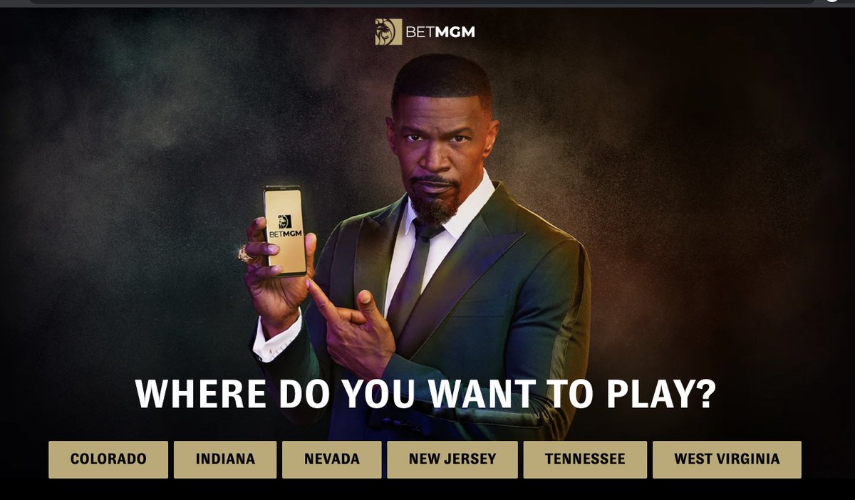
Click on the first search result that clearly shows as a link to RG content and I'm greeted by...Jamie Foxx asking me where I want to play???
I'm sure this is a regulatory issue, but that is strange AF.
Click on the first search result that clearly shows as a link to RG content and I'm greeted by...Jamie Foxx asking me where I want to play???
I'm sure this is a regulatory issue, but that is strange AF.
I pick a state and I'm brought to the homepage, not the RG link I clicked. A quick scan and I see an RG icon in the top right nav (though it looks like some seal of approval or award) and go to the RG page.
(It's impossible to read at normal size)
(It's impossible to read at normal size)
The good is that I notice a "Activate Self Exclusion" button. The bad is that this is the worst designed page of the lot so far. It looks like a Terms & Conditions page. This is unfortunate as there is some decent content at the bottom, though I doubt anyone will read that far.
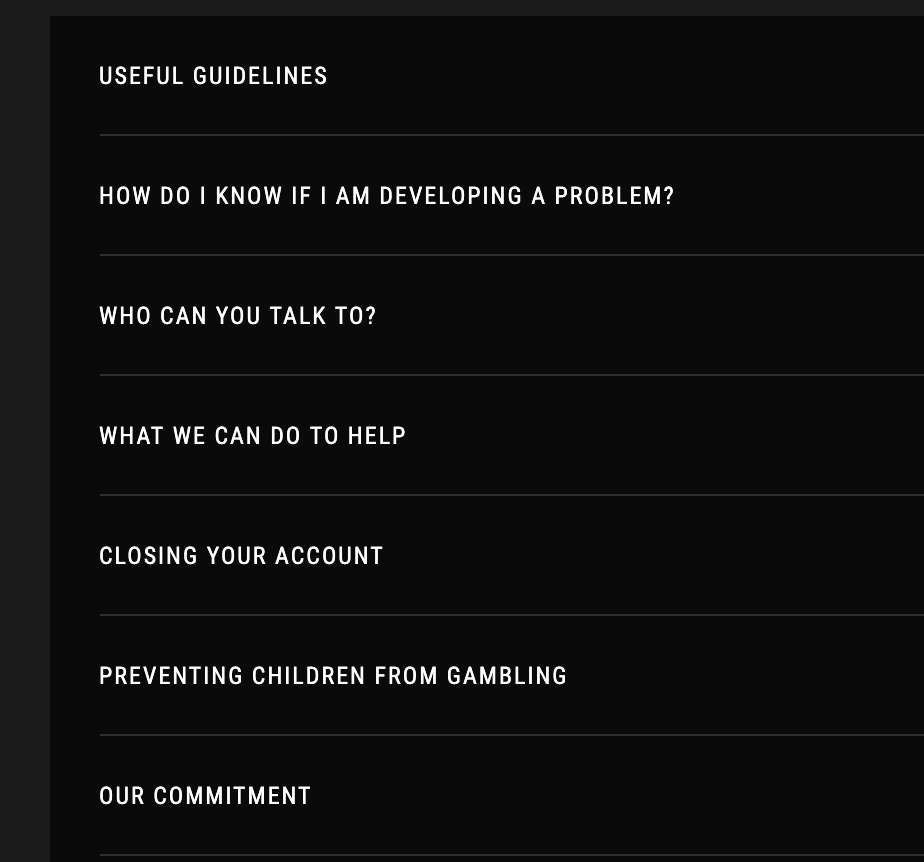
The first link is to the Australian site (which makes sense). It's designed slightly better than MGM, but still feels very T&C.
I do like some of the language used here like "Who Can You Talk To?" and "What We Can Do to Help". It feels a bit more personal and less canned.
I do like some of the language used here like "Who Can You Talk To?" and "What We Can Do to Help". It feels a bit more personal and less canned.
At this point, the lack of graphics used to increase the effectiveness of communication stands out as a consistent weakness across the board. Visuals make info easier to consume. Large text blocks have the opposite effect.
Kids are awake so I'm calling it a day. Will continue to do this with other brands in the future.
There is clearly a long way to go, yet so many easy wins that could improve things quickly and with a little effort.
I've just yet to see much desire for effort.
/end
There is clearly a long way to go, yet so many easy wins that could improve things quickly and with a little effort.
I've just yet to see much desire for effort.
/end

 Read on Twitter