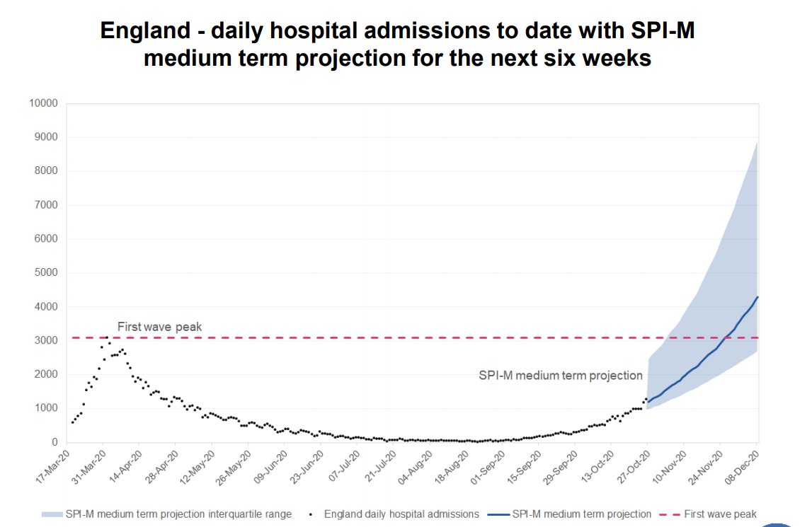
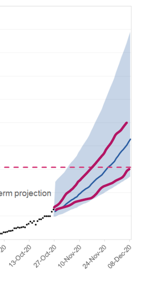
On the face of it, there appear to be two highly misleading slides in tonight's COVID presentation from @10DowningStreet. Specifically, I'm referring to the two SPI-M forecasts for both hospital admissions and deaths for the next six weeks - a thread
Both slides show the history, and then make projections, in the typical format showing an ever-expanding (as uncertainty increases) range through time.
The source of this data is cited as SPI-M Medium Term Projections 28 October.
The source of this data is cited as SPI-M Medium Term Projections 28 October.
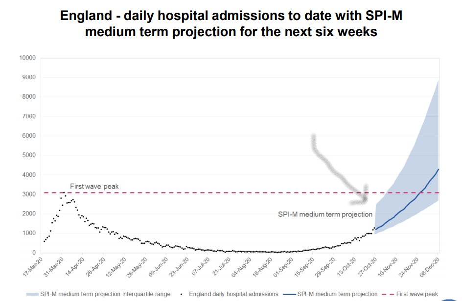
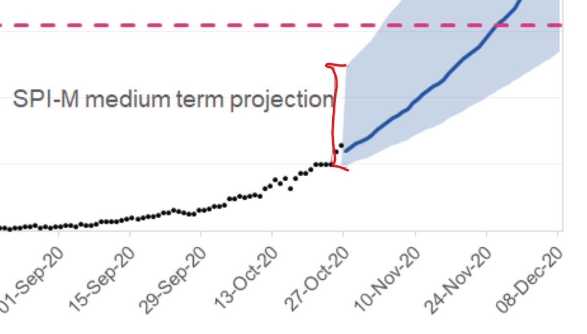
The first issue I noticed was the width of the grey band at the 'today' point. It appears to estimate hospital admissions of between 1,000 and 2,500 per day.
Now, if hospital admissions had been showing great day-to-day variance over time that would make sense. But they haven't.
Now, if hospital admissions had been showing great day-to-day variance over time that would make sense. But they haven't.
Except for a small variation over the past few days data points, this grey zone should start at a single point - today's hospital admissions - and expand from there. But, as you can see, it doesn't.
Why does this matter? Because the increases in admissions appear to be compounding and so not only that rate, but also the starting point, are key drivers.
The doomsday early December forecast of 9,000 admissions/day is contingent on, today, there being 2,500/day.
The doomsday early December forecast of 9,000 admissions/day is contingent on, today, there being 2,500/day.
If we know with some degree of accuracy today's admissions (certainly not to the single digits, but with much more certainty that these charts indicate), then why do these charts look like they do?
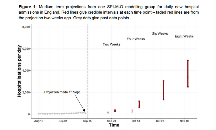
SPI-M-O consensus report of 16 September was reported as being published today:
https://assets.publishing.service.gov.uk/government/uploads/system/uploads/attachment_data/file/930919/S0755_SAGE57_200916_SPI-M-O_Consensus_Statement.pdf
https://assets.publishing.service.gov.uk/government/uploads/system/uploads/attachment_data/file/930919/S0755_SAGE57_200916_SPI-M-O_Consensus_Statement.pdf
It contains this slide, which seems to project hospitalisation rates similar to those published on today's slides. But can this be right? How can the model not be updated to include data observed since mid-September?
Even allowing for the same levels of growth, of a fixed starting point, it should look more like this.
It is perfectly reasonable for SPI-M to argue that their model was good, insofar as they predicted within their September forecast range, the actual number of admissions by end of October.
But that is a completely different argument to one that states the range forecast in September should be maintained into the future as more and more data becomes available.
Think of it this way:
My car consumes between 15-30 miles per gallon. If I drive half my trip and find I've averaged 17mpg, do I still claim I will possibly average 30 because 17 is accurately between 15-30? Or do I adjust my forecast for the whole trip lower?
My car consumes between 15-30 miles per gallon. If I drive half my trip and find I've averaged 17mpg, do I still claim I will possibly average 30 because 17 is accurately between 15-30? Or do I adjust my forecast for the whole trip lower?
Have we just been locked down on a worst-case scenario which is no longer the worst-case?

 Read on Twitter