Thread about icons.
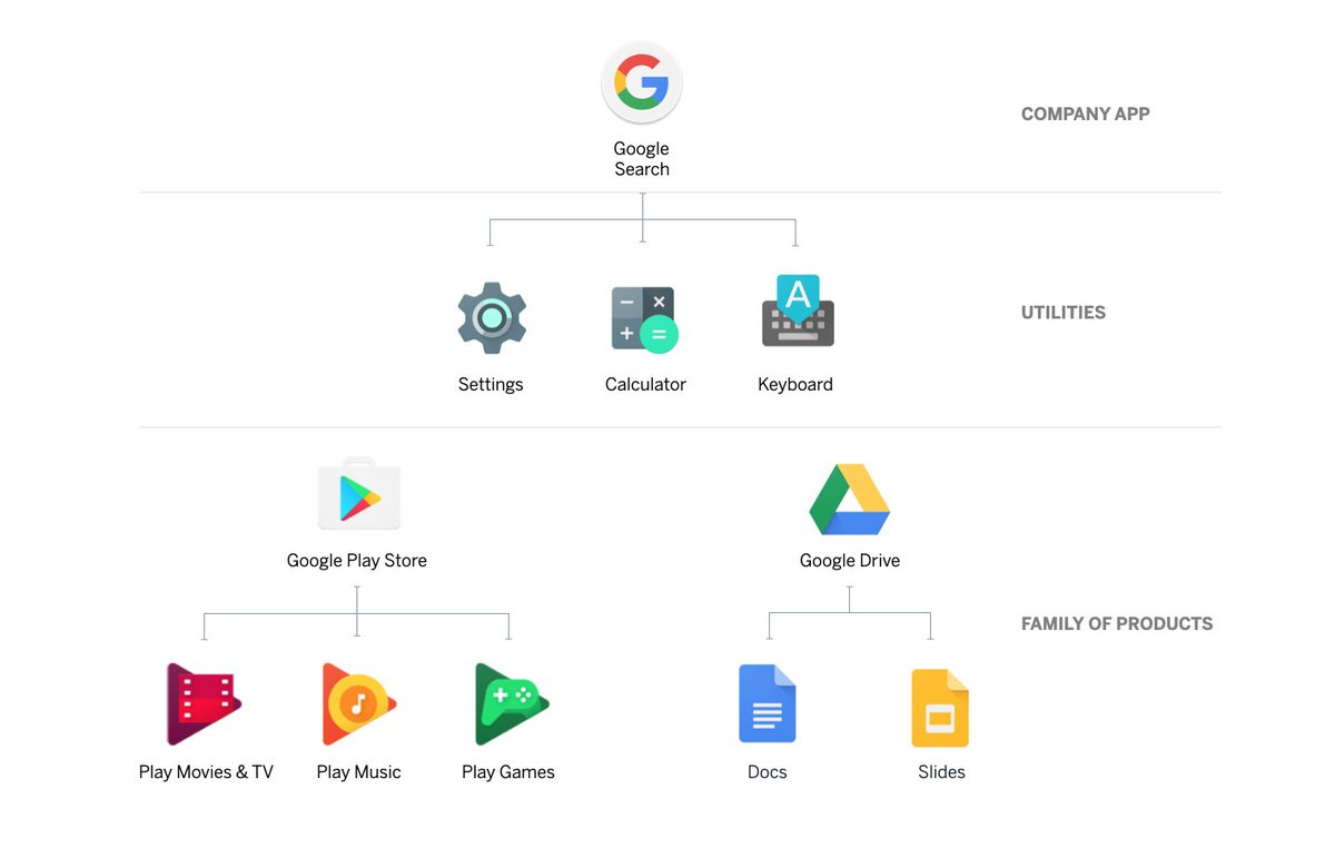
With Google's new icon strategy, they seem to have moved away from a family-approach to a company-approach.
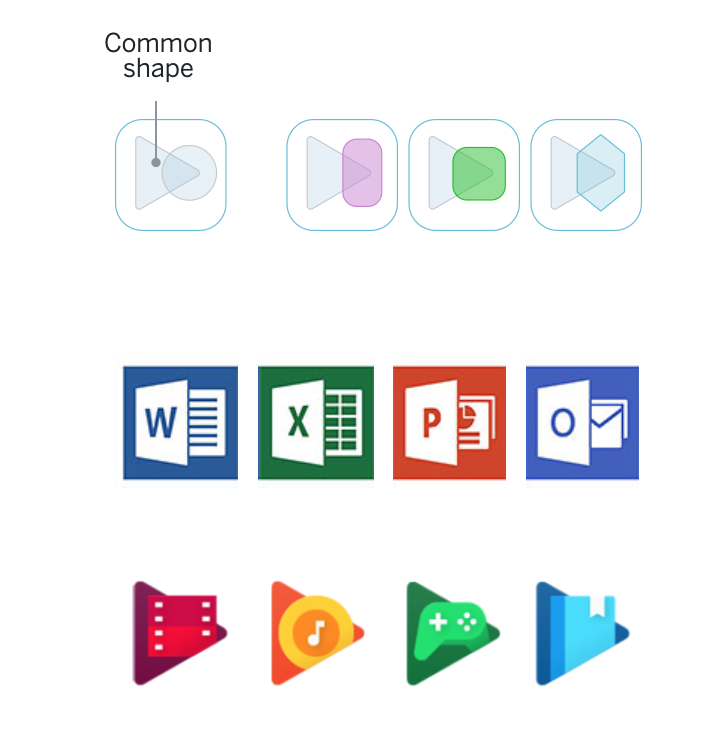
Previously there was a Google style, but families differentiated by shape & colour. Family style is great, but I guess hard to scale to 100s of apps.
With Google's new icon strategy, they seem to have moved away from a family-approach to a company-approach.
Previously there was a Google style, but families differentiated by shape & colour. Family style is great, but I guess hard to scale to 100s of apps.
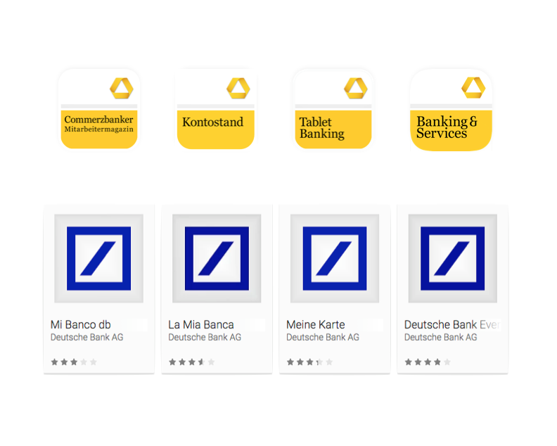
The challenge of scalability is real. Many companies answer it by creating generic app icon sets. Banks seem particularly fond of this approach.
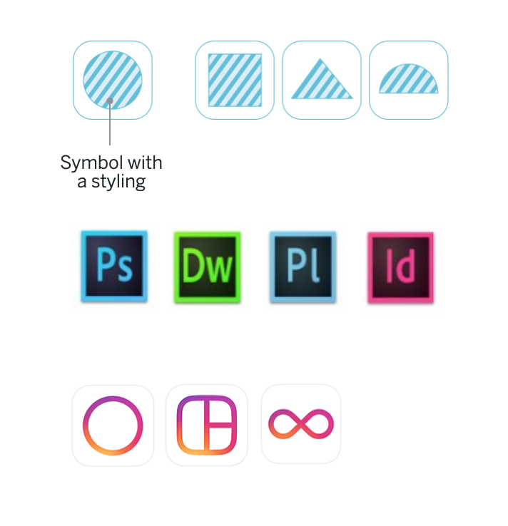
I quite like Instagram's approach to creating a nice language for their secondary apps, though again, that's quite hard to scale.
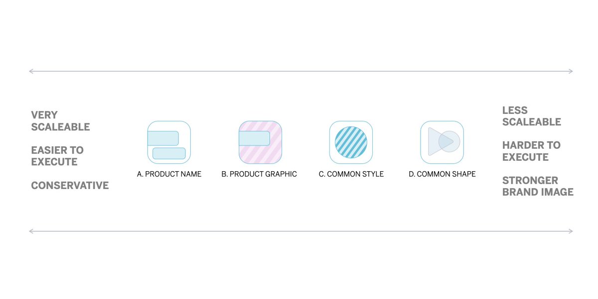
There seem to be four common approaches to how to build icon families, though some are limited by platforms.
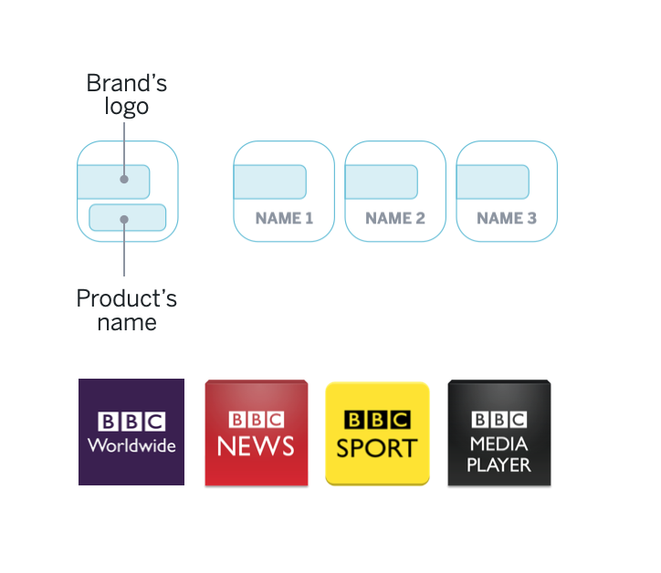
1. The product name approach.
BBC partially succeeds with this approach, definitely better than the bank examples.
BBC partially succeeds with this approach, definitely better than the bank examples.
2. The logo approach.
This is like a lot of phyiscal boxes for video games. It makes sense when the content graphic is important, but wow is it hard to squash those logos in there!
This is like a lot of phyiscal boxes for video games. It makes sense when the content graphic is important, but wow is it hard to squash those logos in there!
3. Common shape.
This approach is what Google used to do, but due to platforms limiting this approach, iPhone, Android, and now seemingly MacOS, this approach is less feasible, and it's also much harder to scale.
This approach is what Google used to do, but due to platforms limiting this approach, iPhone, Android, and now seemingly MacOS, this approach is less feasible, and it's also much harder to scale.
4. Common styling.
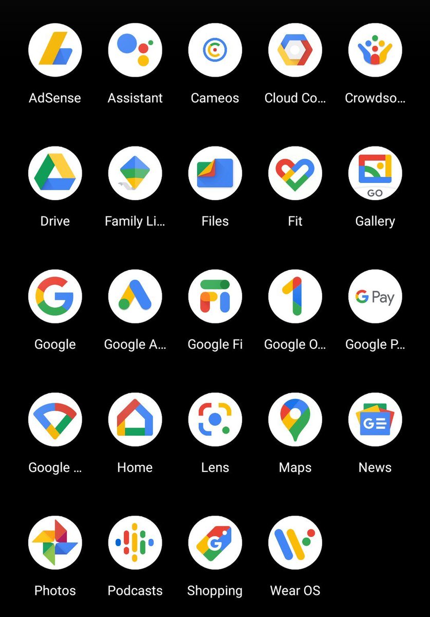
Lastly, this approach is the one Google has moved to. It's much more scalable, but it's hard to get right. I think Google has solved one problem, but created another which is lower legibility.
Lastly, this approach is the one Google has moved to. It's much more scalable, but it's hard to get right. I think Google has solved one problem, but created another which is lower legibility.
Lastly, this stuff is just hard.
What's right for a company 5 apps, is different than when you have 100. Knowing what the right approach for your company and it's growth path is key.
(Shout out to @pkuklo who helped me with this!)
What's right for a company 5 apps, is different than when you have 100. Knowing what the right approach for your company and it's growth path is key.
(Shout out to @pkuklo who helped me with this!)

 Read on Twitter