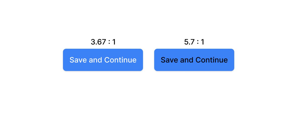
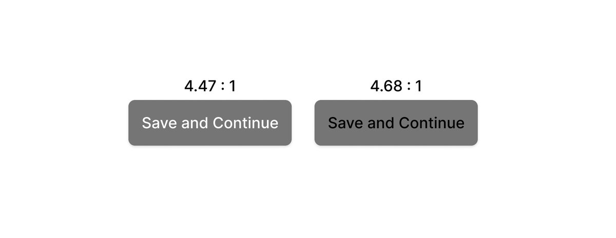
I really hope we see some new research come out around calculating contrast ratios soon because I'm seriously unconvinced that the formulas we follow today are actually creating the best results for users.
Current guidelines say you should be using black text on this button:
Current guidelines say you should be using black text on this button:
 Would happily help fund some serious research around this to really make sure that as an industry we are recommending solutions that are in our users' best interests.
Follow-up: this is an incredible thread and Andrew Somers here is doing amazing work 
Going to spend some time playing with SAPC next week, the results seem so much better. https://github.com/w3c/wcag/issues/695

Going to spend some time playing with SAPC next week, the results seem so much better. https://github.com/w3c/wcag/issues/695
From Andrew’s research:
“Estimating roughly, 40% of the color pairs the WCAG math calls "PASS" are poor in quality and should fail. And somewhere in the area of 51% of colors they fail could conceivably pass.”
 https://github.com/w3c/wcag/issues/695#issuecomment-483499796
“Estimating roughly, 40% of the color pairs the WCAG math calls "PASS" are poor in quality and should fail. And somewhere in the area of 51% of colors they fail could conceivably pass.”
 https://github.com/w3c/wcag/issues/695#issuecomment-483499796

 Read on Twitter


