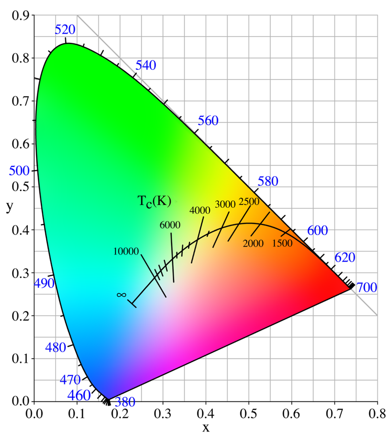
Quick explainer about why the orange sky is so ugly. Here's a picture of the Planckian locus ("blackbody" colors). Rayleigh scattering is *different* than blackbody colors, just a bit.
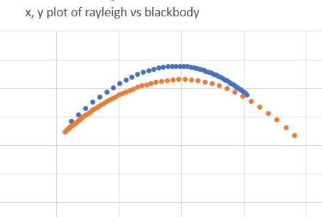
How is it different? It's greener, yellower. In colorimetry terms, we say Rayleigh is "above the Planckian locus". Here the blue stuff is Rayleigh, and orange is Planckian:
If you give people the choice between "redder" or "green/yellow" colors, they almost always prefer redder ones. Green is ugly.
This is because it uses a slightly smaller exponential than Planckian (blackbody) radiators do, so it traces out a slightly different path through the chromaticity diagram. Just enough to, well, look worse than the equivalent blackbody.
So it's not just "warm" - it's an especially bad-looking warm, because there's just a touch of green/yellow added to it.
Here's a paper to read if you want some links and theories on near-white color preference: https://www.tandfonline.com/doi/abs/10.1080/15502724.2015.1029131

 Read on Twitter


