Back in the early stages of #COVID19 I spent a lot of time on @skynews reporting on the grisly data showing that the UK was heading for tens of thousands of deaths. It might seem implausible now but back then we/I were accused of scaremongering https://news.sky.com/story/coronavirus-the-data-suggests-the-uk-is-on-course-for-many-thousands-of-deaths-11966517
One lesson: that the data could tell us where we were heading - especially if we compared our situation with Spain/Italy where the pandemic was a few weeks ahead of us. Why trot this out again? Because it's time to start doing the exercise again.
#COVID19 cases are on the rise again across much of Europe, inc the UK. Earlier this week I tweeted abt why we shouldn’t be panicking (at least not yet). Since then some have pointed towards a rise in hospitalisations here & in Europe. Does this change things?
I should say, none of this thread is intended to diminish the seriousness of #COVID19 which can kill and cause lasting damage. Clearly it has untold consequences. But here's the thing: for the time being we are NOT facing anything like what we saw in Mar/Apr.
My thread earlier this wk pointed out that while cases are certainly on the rise 1) they're still quite low as % of tests and 2) we’re not yet seeing a rise in deaths as we did last time around. Unsurprisingly, that’s still the same as of the latest data. https://twitter.com/EdConwaySky/status/1303035299598041088?s=20
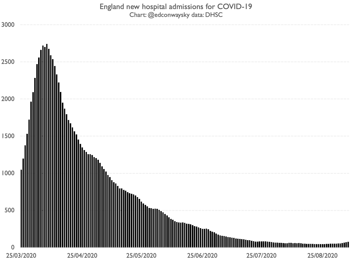
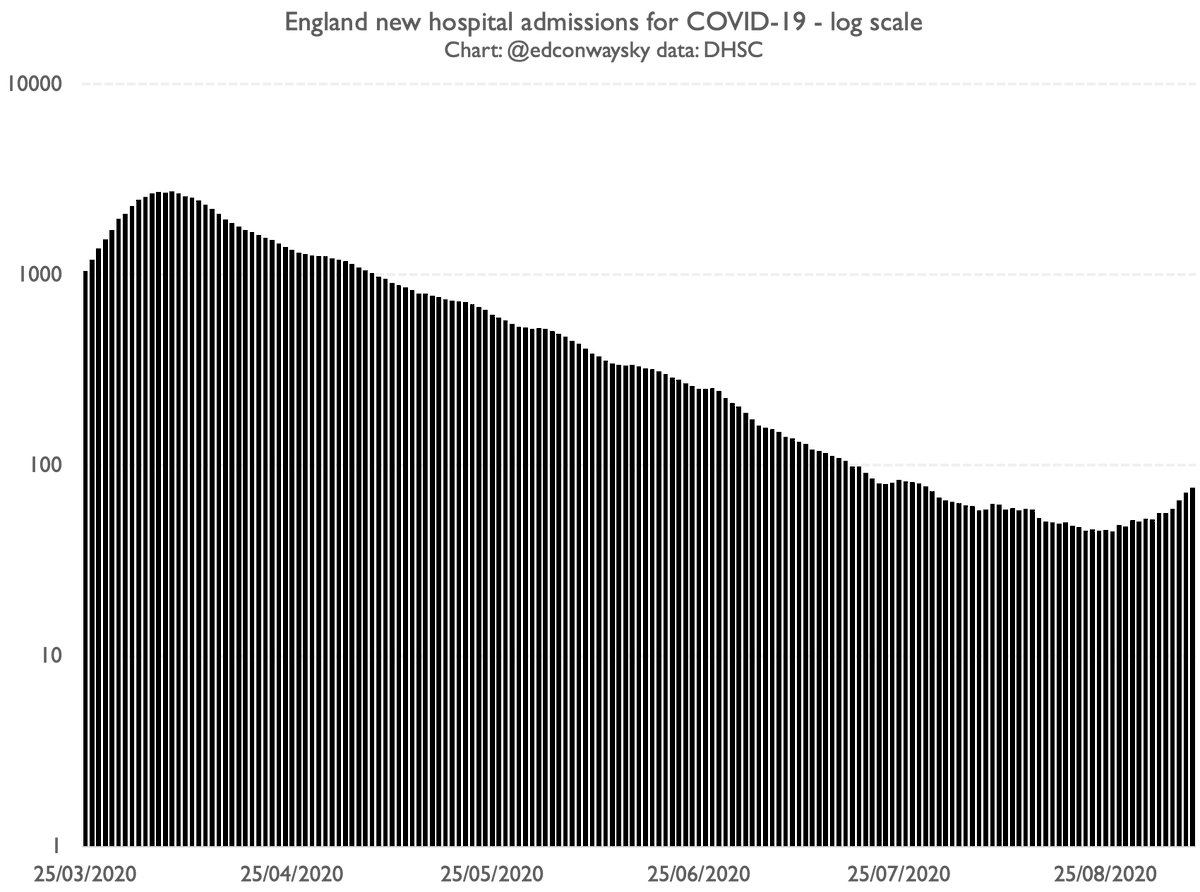
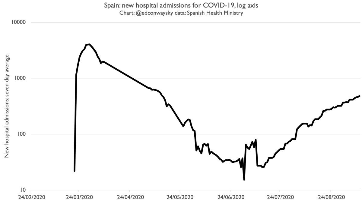
True: hospital admissions are up in the UK. This is a marked change from the past few months. And if you look at admissions with a logarithmic scale (as is important for anything increasing at an exponential rate) things look quite scary. But the big question is what happens next
And this is where we need start looking, as we did in the spring, at what's happening elsewhere in Europe, where there are more cases. We need to do what we were doing back in March/April. But the good news is that the findings are much less grisly than back then.
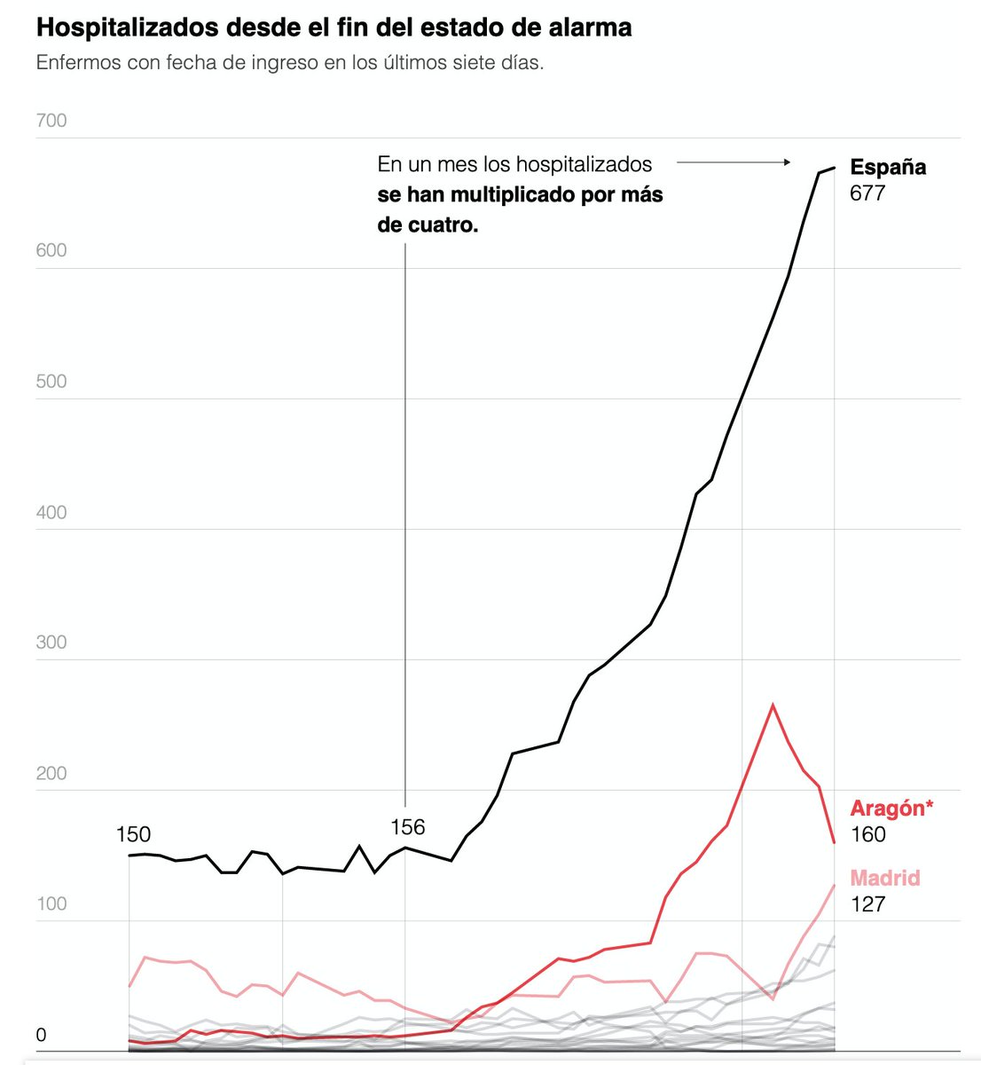
Not that you'd guess that from the way much of this is being covered both here in the UK and on the continent. This chart was published in El Pais in early Aug, about the equivalent of where we are now in the UK. Looks terrifying, right? https://elpais.com/sociedad/2020-08-09/las-hospitalizaciones-se-cuadruplican-en-un-mes-por-el-aumento-de-casos.html
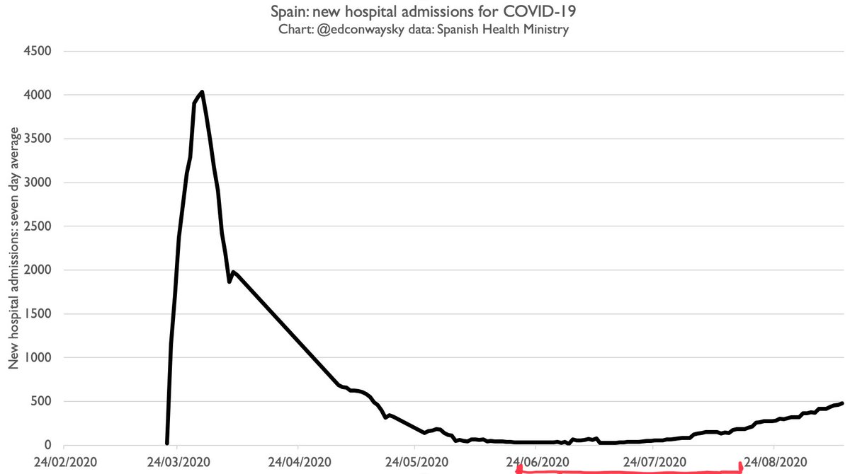
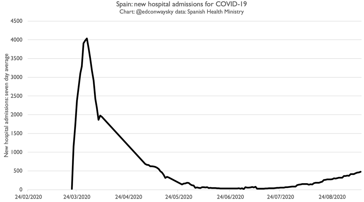
But now let's zoom out and add the hospitalisations data from earlier in the pandemic and also the more recent data, up to today. Now compare the charts. The red bit I've marked is the period of that el Pais chart. My figs are 7day avg, theirs rolling 7day sum, but u get the idea
There are two takeaways here: 1. Hospitalisations are definitely rising (and even more than in Aug). But 2. They're rising at a far, far more gradual pace than in the spring. Totally different profile. Even with a log scale, which makes small increases look bigger
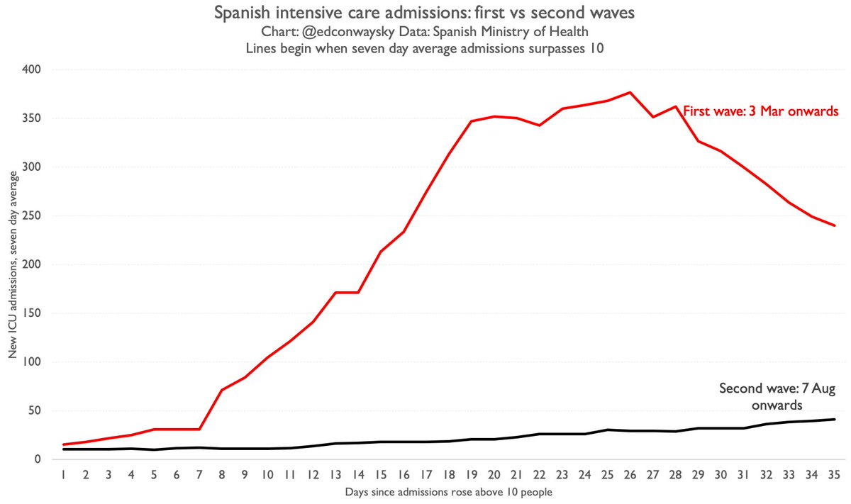
Yes: #COVID19 hospitalisations are rising - in Spain and France and the UK. But so far it's NOTHING LIKE what we saw in the spring. Here's another chart comparing the rise in intensive care admissions in Spain in the spring and now. Not much of a second wave at all...
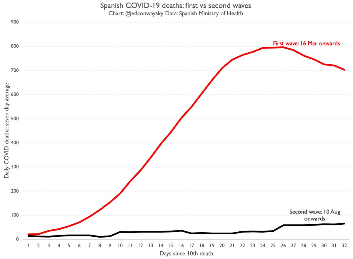
Here are Spanish #COVID19 deaths in the first wave and in this more recent wave. Again: very stark. And NB cases & hospitalisations (inc the elderly) have been rising for some weeks in Spain, and still this curve is quite flat. And the SHAPE of that curve is what really matters
SO FAR there are few signs that Spain is facing anything that could be described as a "second wave". Or if it's a wave it's very gentle in comparison with the first. None of this should diminish our caution. But we have to note what the data tells us.
I realise this might not fit with the slightly scary narrative we're hearing from politicians etc, but there we are. Back in Mar plenty of people dismissed what the data was saying. I'll keep monitoring it as what's happening in Spain may be a window into what happens here next

 Read on Twitter