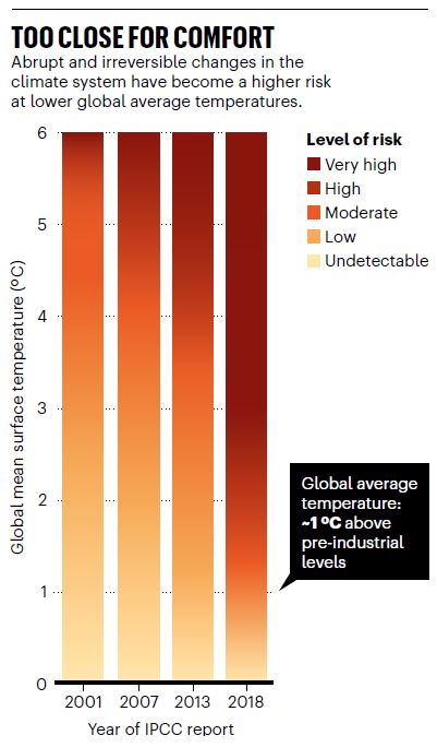
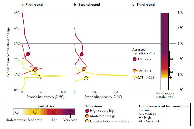
In our new @NatRevEarthEnv paper, we review the history of the iconic @IPCC_CH Burning Ember diagram, and report the methodological advances applied in the recent #SRCCL and #SROCC reports.
http://go.nature.com/2FfWHn4 (free-to-read: https://rdcu.be/b609O )
(Thread; 1/n) https://twitter.com/NatRevEarthEnv/status/1304026866567852037
http://go.nature.com/2FfWHn4 (free-to-read: https://rdcu.be/b609O )
(Thread; 1/n) https://twitter.com/NatRevEarthEnv/status/1304026866567852037
The Burning Embers diagram is a key figure used in subsequent @IPCC_CH reports to communicate the (increasing) risks of climate change to Policymakers and non-experts. (2/n)
To give just one - currently highly relevant - example, here's the burning ember for wildfire damage developed by several co-authors of this @NatRevEarthEnv paper for the 2019 @IPCC_CH Special Report on Climate Chhange and Land ( #SRCCL) (3/n) https://twitter.com/WimThiery/status/1166637379089813504
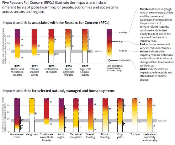
Burning Embers are often linked to the reasons for concern framework: this framework helps to aggregate climate-related risks into easily understood and policy- relevant categories (4/n)
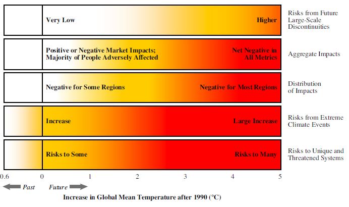
Example 'reason for concern' categories include: impacts on unique & threatened systems (e.g. coral reefs); global aggregated impacts (e.g. net market damages); & large-scale singular events in later reports (e.g. collapse of the West-Antarctic Ice Sheet) (5/n)
The burning ember diagram was first introduced in the @IPCC_CH Third Assessment Report: each row corresponds to a specific reason for concern and shading represents the severity of impact or risk. (6/n)
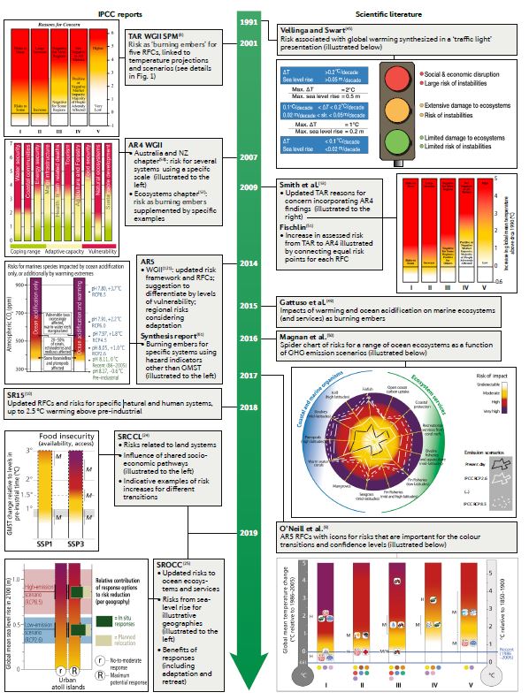
Since the Third Assessment Report, the reasons for concern framework and burning embers have been used extensively in @IPCC_CH reports and other scientific literature, with refinement and enhancement of both the construction methods and the design (7/n)
So visualisation, considered categories, available literature and assessment method developed over time. But did the resulting risk assessment also evolve? (8/n)
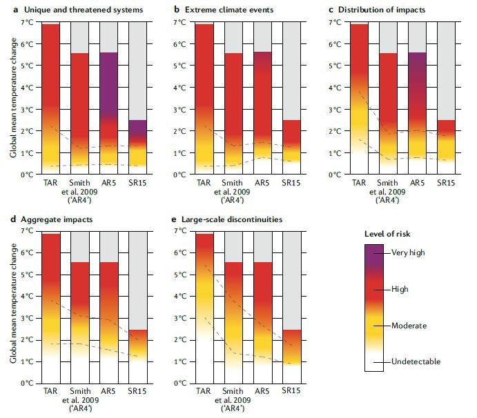
Our systematic comparison of risk thresholds across @IPCC_CH assessments shows that, *in most cases*, the risk level at a given temperature has increased with each subsequent assessment, and especially between the Third and Fourth Assessment Report (9/n)
This result is consistent with a recent assessment done for one reason for concern category by Tim Lenton, @jrockstrom, @owengaffney, @rahmstorf, @KRichardsonC, Will Steffen and Hans Joachim Schellnhuber
https://www.nature.com/articles/d41586-019-03595-0 (10/n)
https://www.nature.com/articles/d41586-019-03595-0 (10/n)
While we don't provide a systematic assessment of the causes of this change, the major features of the changes suggest that advances in science (including detection & attribution) & broadening of the available literature explains most of the differences between assessments (11/n)
While the assessment framework and figure design have been broadly retained over time, refinements in methodology have occurred, including the consideration of different risks, use of confidence statements, more formalized protocols and standardized metrics. (12/n)
For example, in #SRCCL, new methods were used including a standardized literature review, development of assessment protocol and three rounds of expert elicitation combining elements of both the Delphi technique and the Sheffield Elicitation Framework method (13/n)
Going forward, we suggest further elaborating the use of a standardized expert-elicitation protocol to unify anonymous judgements with group discussions. The paper lists several concrete suggestions to this end. (14/n)
Honoured to have been part of this great team inlcuding Zinta Zommers @PhMarbaix @poertner_hans @ProfMarkHowden @Koko_Warner @jasonpeterevans @oneill_bc @mkvaalst @ZitaSebesvari @GrantSeanP, Edouard Davin @usys_ethzh, Cynthia Rosenzweig @AgMIPnews, and many more (15/n)

 Read on Twitter