1\\n What the sigmoid is a Gompertz? An elegant and simple prediction approach by @MLevitt_NP2013. Beware, though, it is really that simple. A medium rare explanation by @maestro_rayo, @LDjaparidze and @federicolois
2\\n We are pretty sure we were kids when early this year everybody was talking about "exponential growth". Exponential growth is “scary and wild”, like standing unarmed in front of a pack of wolves in the forest at night kind of “scary and wild”.
3\\n You may remember that old fable about a king that was naive enough to accept “a great deal”. If he'd lose a chess game, he'd have to pay a single grain of rice on the first chess square and double it on every consequent one until the board was full.
https://en.wikipedia.org/wiki/Ambalappuzha_Sri_Krishna_Temple#Legend
https://en.wikipedia.org/wiki/Ambalappuzha_Sri_Krishna_Temple#Legend
4\\n The ‘wise’ king may have skipped a few math classes back at school, because when he had to honor the deal, there was not enough rice in the galaxy to pay for it. He put 1 in the first square, and was proud of his gamble.
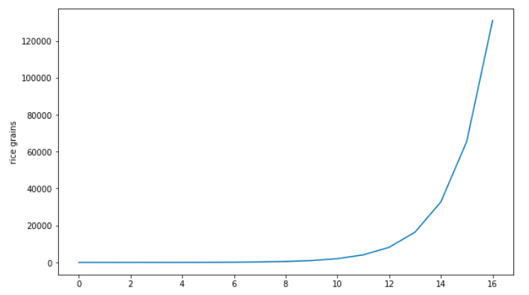
5\\n Then he put 2 in the next, and 4 in the square after. By the time he was in the 16th square, he realized that the gamble may have not turned out so well after all. 2Kg of rice was kinda a big deal considering he still had 48 squares to go.
6\\n Long story short. If a grain of rice on average weighs 0.03 grams, by the time he would reach the 64th square, the king would have needed about 1.000 years of the world’s rice production in 2019 to pay for the bet. A pretty bad deal.
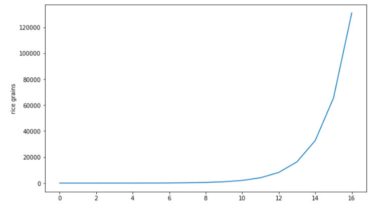
7\\n This kind of growth is exponential, and repeat after me: “Exponentials are scary and wild, even for math guys”. If you plot the 2^n function in a 2D graph it looks like this (for even small values of n).
8\\n If a pathogen infects exponentially, it would swamp the world with a 100% rate of infection in a matter of days. But, against all expectations, that doesn’t happen. Both (daily) cases and deaths everywhere look quite tame in comparison. More like a Siberian Husky.
9\\n With Sars-Cov-2 we were darn good at social distancing. Right? Err hmm, nope. The Swedish experience, among others, shows this was probably not the case. The explanation may be a bit more ‘mundane’: normal evolution of self limiting processes.
https://en.wikipedia.org/wiki/Self-limiting_(biology)
https://en.wikipedia.org/wiki/Self-limiting_(biology)
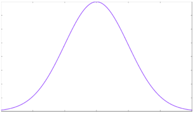
10\\n In practice when (and if) we recover from an infection, we usually acquire at least partial immunity. If you remember from the SIR model, we just became a "blocker" in the system. This is no news to epidemiologists (the professional kind). https://twitter.com/maestro_rayo/status/1301603210306768896
11\\n The big IF back in January was how big this ‘bell curve’ was going to be. Would it collapse the health system? What would be the expected death toll? Is the CFR a good estimation for the IFR? Are available ICUs enough?
12\\n While epidemiologists were wrestling with the IFR and other viral parameters like R_0, Prof. Michael Levitt ( @mlevitt_np2013) set out to study Wuhan’s and China’s data from a data centric perspective. Pure math and function fitting. Sacrilege!
13\\n He saw the shape of the curve of daily deaths in Wuhan had interesting mathematical properties. It was not steadily growing exponentially. After an initial ramp-up, it slowed down considerably, and then started to decrease fast. Exactly like our bell curve in a SIR model.
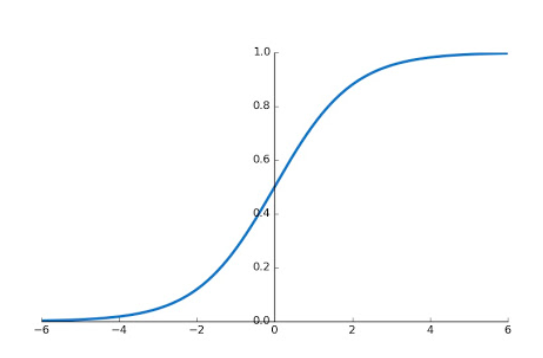
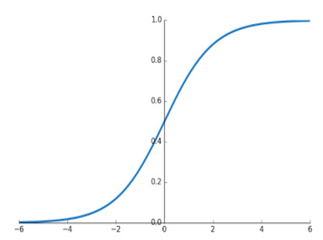
14\\n Daily deaths is the speed at which the death curve increases (or mathematically speaking, its derivative). The accumulated deaths curve instead has a recognizable shape in a SIR model. That is an S shape, also known as “that sigmoid like thingy”.
https://en.wikipedia.org/wiki/Sigmoid_function
https://en.wikipedia.org/wiki/Sigmoid_function
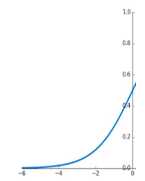
15\\n The sigmoid function is interesting. If we zoom on the first half of the curve, it looks eerily similar to our 2^n exponential curve. And yes, that’s scary (and wild).
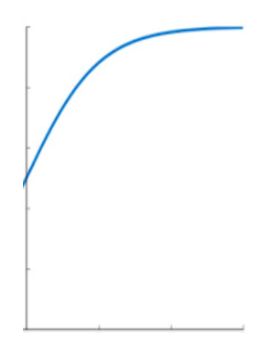
16\\n The other half though, looks pretty much like the completely opposite. It is as if we have flipped the initial fast grow into an equally slowing growth, converging to a limit. Sounds familiar?
17\\n If we know the curve behavior in the abstract, can we do something with it? Prof Levitt's realization was that we could try to ‘fit the curve’ or as we know it in data science “find the best parameters to explain the part we see” and try to predict where it may be going.
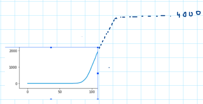
18\\n Assume the epidemic is just starting, and we are freaking out as it looks exponential. We know from Epidemics 101 that the curve will eventually slow down. Guessing the final shape of the curve will be like trying to "complete it" in a symmetrical way.
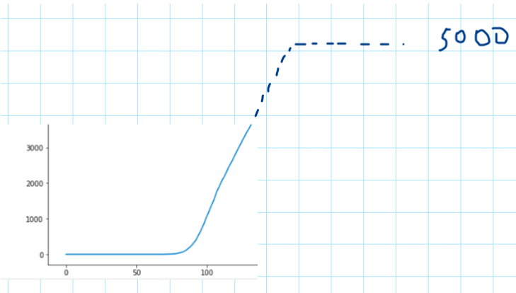
19\\n If for example we have this curve, no one will raise an eyebrow if we say that give or take it will plateau at 4000. Of course Prof. Levitt was not sketching the curve as we just did, his team is exploiting precise mathematical relationships of this family of curves.
20\\n In particular, he is using a mathematical representation of sigmoid-like curves called “The Gompertz” curves. This type of formula can be applied to multiple phenomena in nature, including bacterial growth, and certainly, epidemic growth.
https://en.wikipedia.org/wiki/Gompertz_function
https://en.wikipedia.org/wiki/Gompertz_function
21\\n Gompertz was a self-taught british mathematician who made the observation that demographic curves followed a certain pattern (sigmoid) as a function of age (number of living individuals for instance) and gave formulas to this type of growth.
22\\n As the curve progresses, the initial guess can be made more precise (with more data to fit, shape will get clearer), so for instance after a few days we go back again to our previous example and move the target a little bit if we need to.
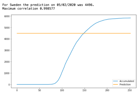
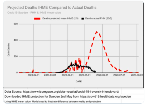
23\\n When everyone was freaking out, using his mathematical approach one could have predicted that Sweden would end up with roughly 4500 deaths on May 2. Short for about 1000 deaths to what we have today, but you wanna know what IHME predictions were?
https://twitter.com/HaraldofW/status/1263173977293369344
https://twitter.com/HaraldofW/status/1263173977293369344
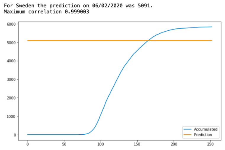
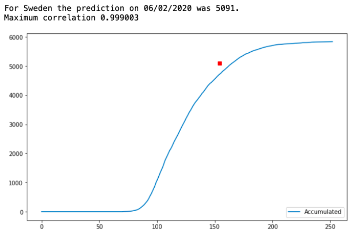
24\\n Prediction on June 2 was already much closer to what we see today. But, June was a heavy month for Sweden and Anders Tegnell, their chief epidemiologist, called "A cautionary tale" and people feared the worst.
25\\n Instead of the yellow line showing the predicted limit at the time, we could just draw a small red square matching our prediction day and prediction value, for instance like this for June 2.
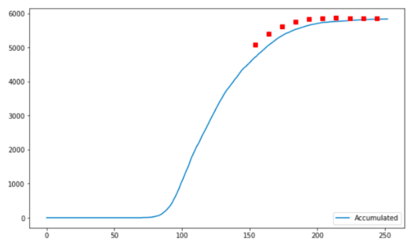
26\\n We could then iterate every 10 days and record the new forecast. If you visit the official page of Levitt's team, you can check the prediction for all countries. At first the estimates are usually off (we don't know much), but they converge later.
http://levitt.herokuapp.com/
http://levitt.herokuapp.com/
27\\n A limitation of the approach is that it works for ‘single peaks’. It means that if you cut short through mitigations 1 curve, there is no guarantee that a new one is not going to happen afterwards. That is what SIR style models are for ;)
https://en.wikipedia.org/wiki/Compartmental_models_in_epidemiology
https://en.wikipedia.org/wiki/Compartmental_models_in_epidemiology
28\\n And as we have seen in previous threads, network heterogeneity (multiple cities), lags in data collection and reporting (they happen), and other messy but pretty real life conditions can become a nuisance. https://twitter.com/maestro_rayo/status/1301603219538350080
29\\n Interesting fact about this method, you don't need almost any data, just get the daily deaths or cases and off you go. How many epidemiological models can approximate the number of deaths with almost no parameters? You can trust us, we know how to err by 10x too.
30\\n Second and not less important, it does one thing (and just one thing) very well which happens to have a high impact; it can show when epidemic outbreaks are decelerating. When everybody is freaking out, this method is latching you to the ground.
31\\n The key observation by @MLevitt_NP2013 is that looking at data coldly, as we get access to it, we can still make rough but reasonable estimates of the severity and general stage and behavior of an outbreak.
32\\n While models are very important tools in the toolbox of any chief epidemiologist, if you estimate parameters poorly, you might end up being either too conservative, predicting zombie apocalypses and/or taking the wrong tradeoffs. Or, all of them together.
33\\n In summary, data driven curve fitting is a good tool for real time decision making, but also provides a good framework for modelers to check their model assumptions (sanity checks) and keep models grounded to the cold hard facts. Remember this, when winter inevitably comes.

 Read on Twitter