All the Premier League home kits ranked and reviewed. A thread...
One for our pals at @Kitcards1 and @The86store
One for our pals at @Kitcards1 and @The86store
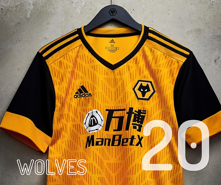
20. Wolves have been looking increasingly attractive on the pitch but this one is a miss for us. The tyre tracks coupled with a far too intrusive sponsor is enough to condemn this one to the bottom of the kit league. It's a shame because we love the gold and black colours.
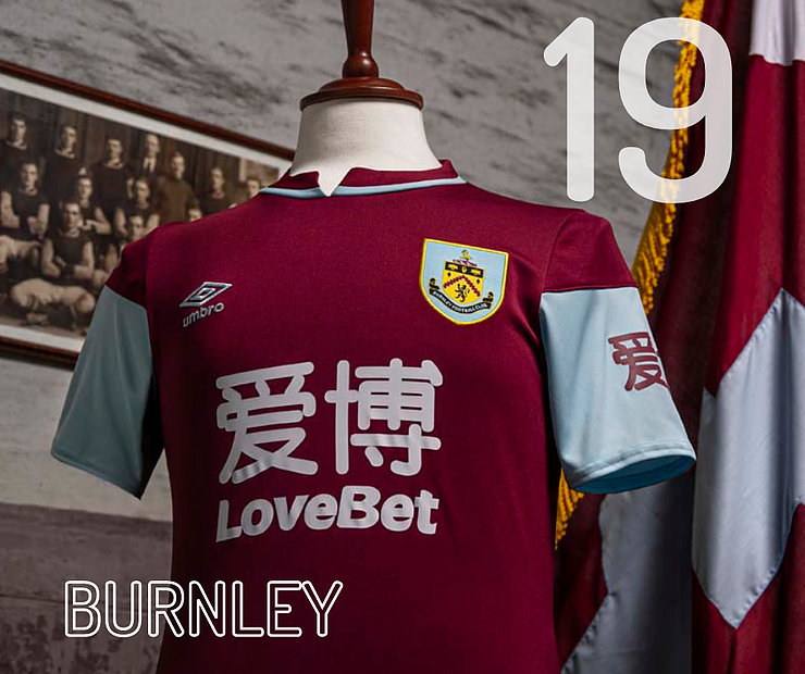
19. Burnley - Claret and blue should be a classic colour scheme but the sponsor's logo is about 40% of the fabric. Not that we'd have the guts to tell gaffer Sean Dyche that we didn't like it, by the way.
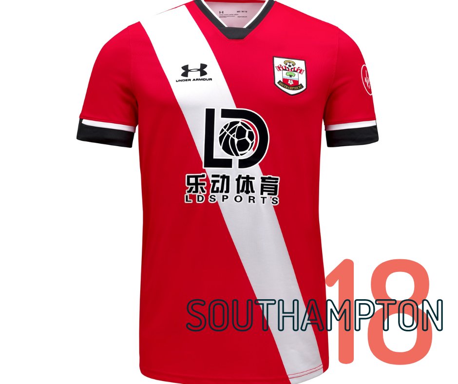
18. Saints kit launches have become legendary. With their parody of Fyre festival last year, and a cracking 8-bit gaming video this year. Sadly itf doesn't live up to it. The sash could be a gem but once again the sponsor's logo bosses it shirt like Danny Ings does centre-backs.
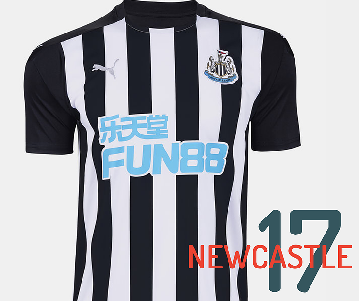
17. The Magpies have had bigger fish to fry than their shirt over the last season. The classic black and white striped template could have been enough to raise a few smiles in the North East but is ruined by...you guessed it, a hideous sponsor's logo.
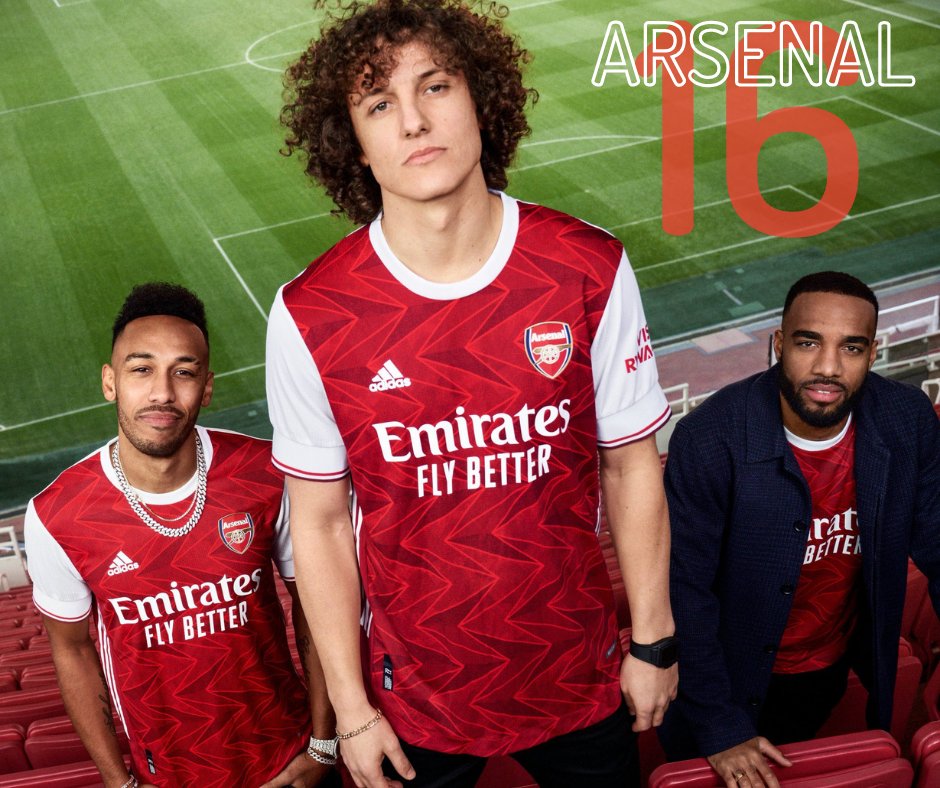
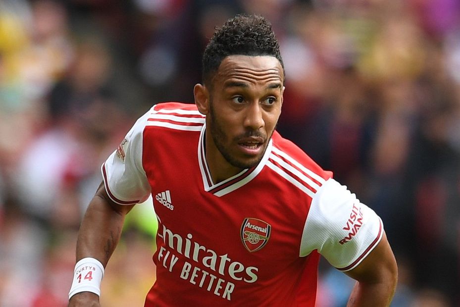
16. Aubameyang looks set to sign a new deal and hypnotise defenders. Failing that, the pattern on the shirt might have the same effect. We much preferred last year's classy effort.
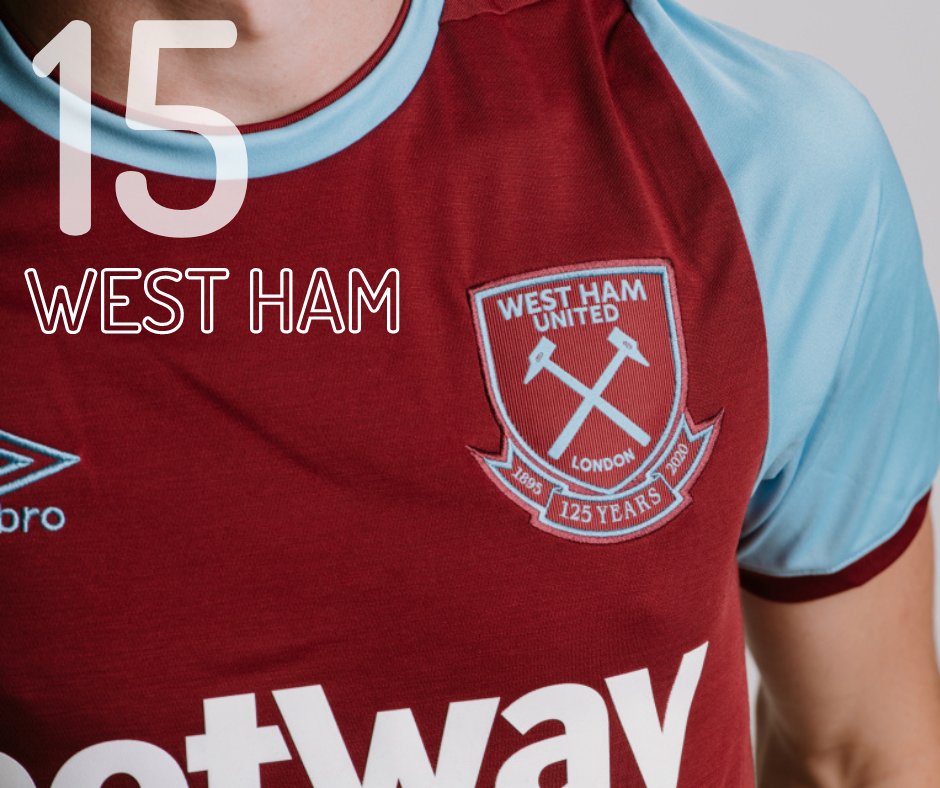
15. There's not too much wrong with the Hammers' new shirt. Except that it's not that new. The Londoners have sported very similar threads in both 2015-16 and 2012-13. It'd be nice to see a splash more excitement.
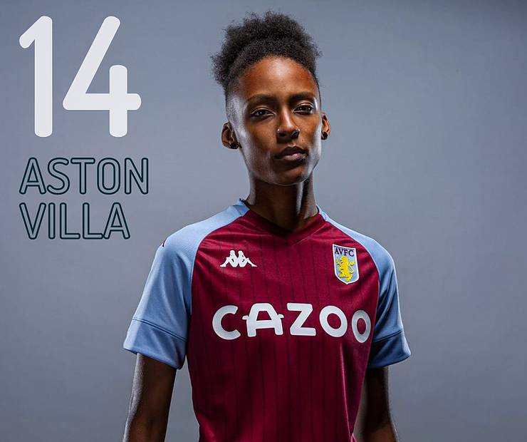
14. Last week it was reported that Villa had seen a 50% increase in shirt sales since ditching their bookie sponsors for Cazoo. It's difficult to decide if that is driven by the design of the short or the fatigue to bookmakers. Although the style of this one leaves us a bit cold.
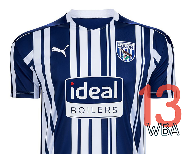
13. The Baggies are back in the big time and we're fairly keen on the bold stripes that Puma has given them. Unfortunately they clash with the stripes on the badge, and it's hard to read the sponsor, fortunately, they have a giant boiler as a mascot to help. Ideal.
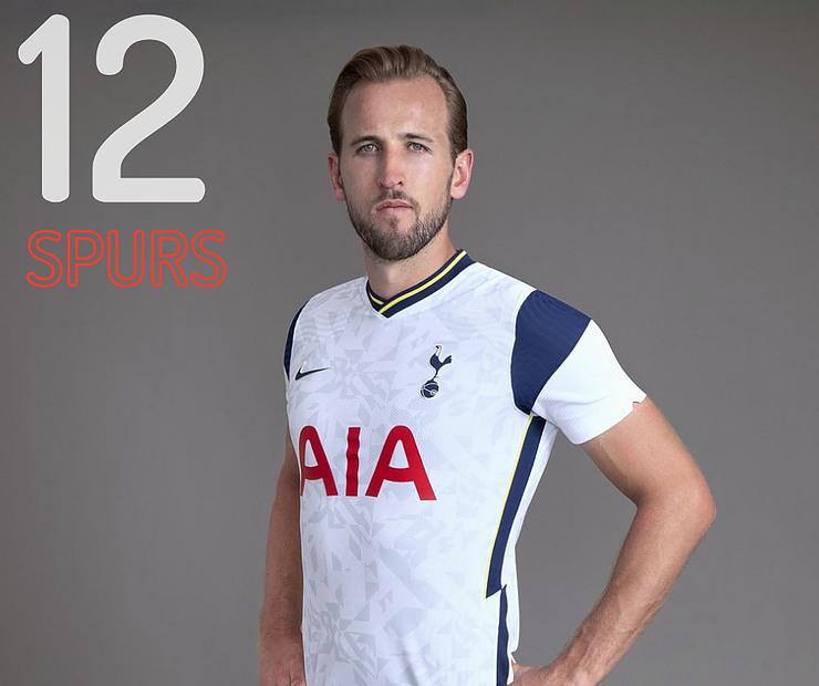
12. We've all seen behind the scenes at Spurs thanks to Amazon's All or Nothing series. The latest addition to the dressing room is this snazzy Nike shirt. Quite whether it will turn the players into a 'bunch of c****' like Jose wants remains to be seen.
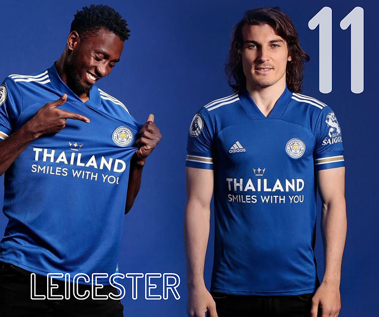
11. Much like the on-pitch Foxes, there's some nice touches here. The gold trim is a nice throwback to the Steve Walsh era and the stripes look great but there's something about the collar that feels uncomfortable. Maybe that explains the strange pose from Söyüncü.
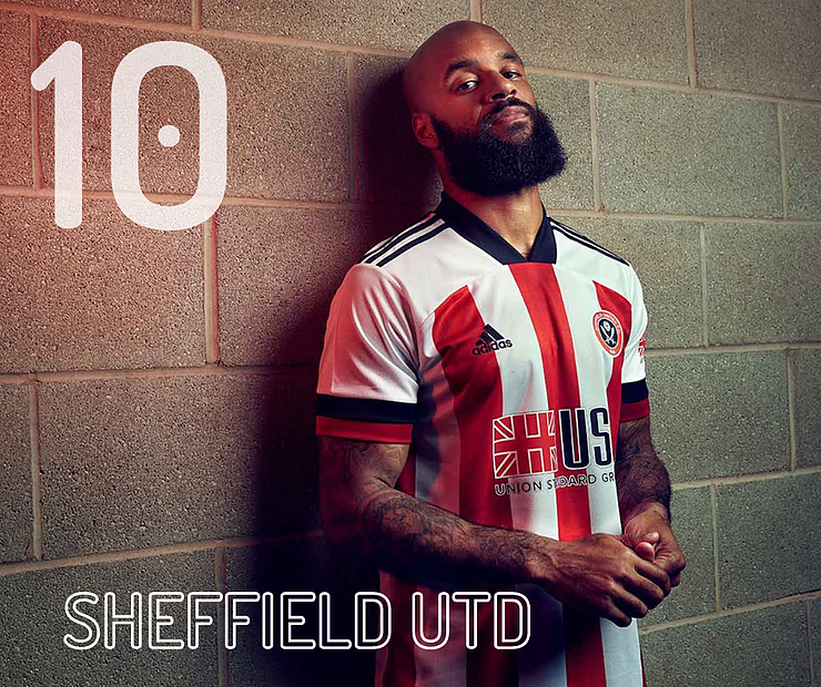
10. The red and white stripes with black trim is a classic look. The Blades would look even sharper if it weren't for the strange collar that Adidas have introduced this term. Likewise the sponsor clashes with the colours.
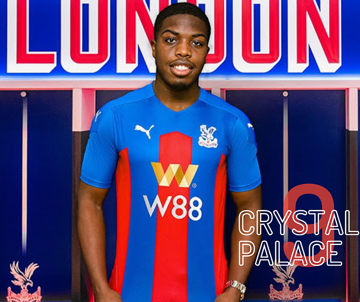
9. The Eagles lacked cutting edge after the lockdown-induced break but they'll at least be looking trim for the new season. Making red and blue stripes look new each year must be a tricky task but Puma has done a fine job with this one.
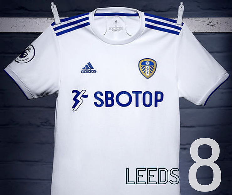
8. The last time Leeds were in the Premier League, 'to google' wasn't even in the dictionary, Lance Armstrong was still a hero and betting advertising wasn't allowed on sports kits. Guess which one of those things has ruined this otherwise glorious kit?
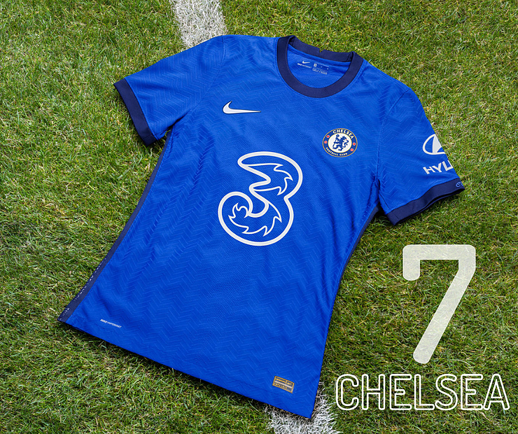
7. Generally a very smart new livery for Chelsea but the round neck and dark blue trim make it feel more like a training kit. There's something about the new sponsor's logo that grates a bit too. Maybe because it's a number on the front?
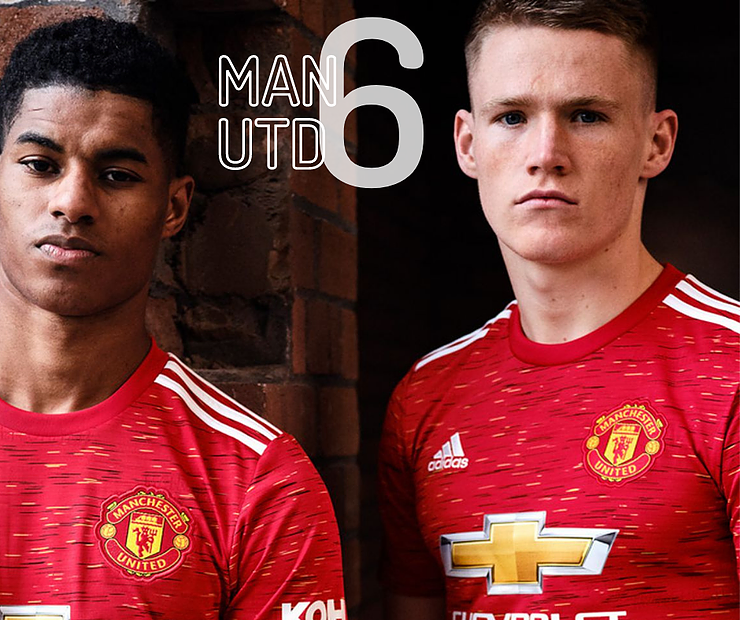
6. The Red Devils kits have been easier on the eye than the football has been in the Adidas era. There are signs that on-pitch matters are picking up and the likes of Rashford, Greenwood, Fernandes and co will look the part in this.
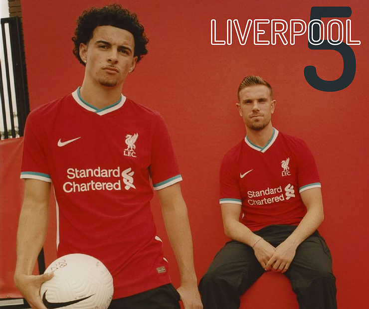
5. Nike took over as Liverpool's kit supplier and their first effort is a more than solid effort. A teal trim is added to the classic all red. They also launched it with a brilliant video that showed how much Nike 'get' what it means to make the kit.
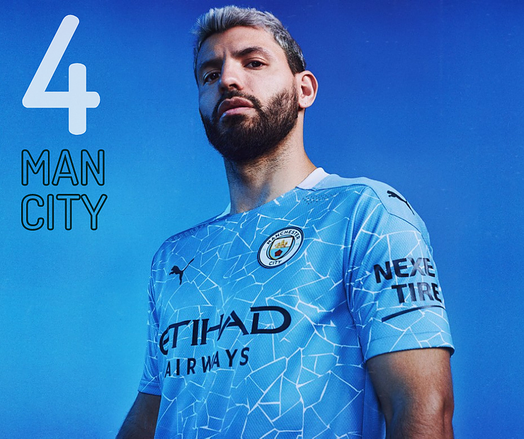
4. We like it. Perhaps it's because we're longing for a holiday and Man City's shirt looks a bit like the bottom of a swimming pool. But daydreaming aside, it's a really smart shirt, a modern take on the sky blue.
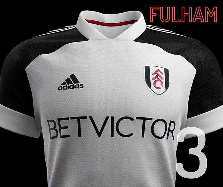
3. Even the most ardent of Fulham fans wouldn't be expecting a top three finish, but that's where they are in the kit league. A really classy white and black number marks their return to the Premier League. For some reason, the Adidas collar doesn't look out of place here.
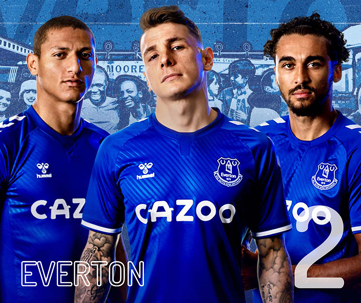
2. Another of the clubs to see a massive boost in sales since moving away from betting sponsor. But that might also have something to do with the fact that it's a stone-cold stunner. A diagonal texture on the shirt and the V's on the sleeves looks outstanding. An instant classic.
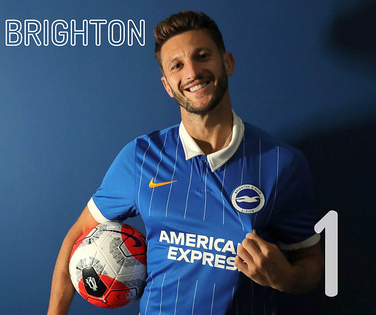
1. Just Wow. A super-simplistic, ultra-stylish, pinstriped shirt for the Seagulls. Proof if it were needed that it's much better when Nike make bespoke kits rather than just wheeling out templates. It'd be a welcome return to normality to see the seafront awash with this classic.

 Read on Twitter