We worked with UBC scientists to predict the hyper-local impacts of climate change on health, and YOU’LL NEVER GUESS WHAT HAPPENED NEXT… 1/ https://storymaps.arcgis.com/stories/4352804ebb4b4765b7b9b25745bfce19
Prologue: If you would rather read a great article than a Twitter thread on mapping health impacts of climate change, @TheTyee health reporter @moirawyton has got you covered: https://thetyee.ca/News/2020/09/04/Climate-Change-Big-Health-Threats
@VCHhealthcare and @FraserHealth public health teamed up with global expert Michael Brauer and his team. We really got to know each other, because this was be a long project… https://pwias.ubc.ca/profile/michael-brauer @UBC @UBCSPPH
First, risk is complicated. (Risk of what, exactly?) Our team looked at 4 effects of climate change: high temperatures, wildfire smoke, flooding and ground-level ozone. These aren’t the only paths to climate impacts on health, but they are important (and local data is available).
Creating an index that measures vulnerability to climate risks at the local scale? Also complicated. Michael Brauer and his team studied hundreds of peer-reviewed scientific articles… 


…and settled on a set of ~40 variables that reflect local risk for climate change. Lots of work and discussion here, as the variables needed to be evidence based and also have high-quality local data. These variables fell into three categories…
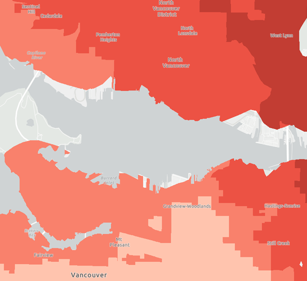
1. Exposure. How many days of extreme heat, what frequencies of wildfires and flood, and what concentrations of ozone might a community experience in the future? Some of these change a great deal even within the Lower Mainland. Here is an example map image for high heat.
2. Sensitivity. What is the influence of age and pre-existing health conditions on health impacts at a local level? Communities with high proportions of older adults and conditions such as heart/lung disease are expected to be more impacted by heat, smoke, etc.
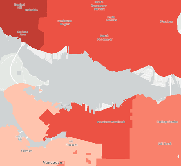
Here is a map showing _sensitivity_ to high heat across the same region. As you’ll see, some of the warmer areas have young and healthy populations, while some have older populations with more pre-existing health conditions.
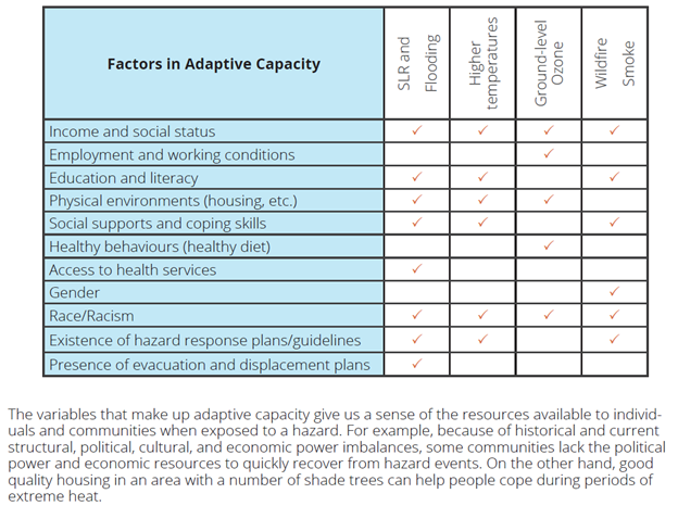
3. Adaptive capacity. To what extent can a community adapt to impacts of climate change? Our index includes local housing, income and the other social/structural factors in this table:
@moirawyton's article says it well: ‘It matters if a population is largely racialized, because structural racism in health care, housing and employment increases the likelihood people may have underlying medical conditions that would be complicated by higher temperatures…’
For this set of variables we were particularly careful to ensure that each one has a strong evidence base, and that we could plan to appropriately communicate *why* they are important. We don’t make it a practice to term people “at-risk” and walk away…more on that below.
We hope that these maps will be helpful in at least 2 ways. A. Many local governments want to plan for climate change and health, and ask where to start. This tool can help to identify the biggest local risks, and also whether which local factors can be tackled as priorities…
…For example, for a given area would cooling centers be helpful to prevent impacts of heat waves? Distributing air conditioners? Programs to support older adults during shelter-in-place wildfires? Housing and income supports? All of the above?
(I like all of the above, but cities, towns and community-based organizations generally need to make decisions on where to allocate resources – ideally based on data.)
B. This tool can be a conversation-starter. The maps are mean to be of interest to all local residents, not just health officials and city planners and politicians (although certainly including officials, planners and politicians!), and they go down to the neighbourhood level…
...in an @exploratorium video (“From Data to Action”), NY Times data journalst @PopovichN discusses how effective climate communication can personalize: by location, demographics and engagement. We hope this tool hits all three! @NYTclimate
(Here is that video^, must-see viewing for people interested in #scicomm #dataviz #envhealth, also featuring @abmakulec and @ envsci_g_roots: https://www.exploratorium.edu/visit/calendar/after-dark-online-from-data-to-action)
Important note before wrapping: the term “vulnerable” can be problematic when used as a summary characterization of a community, without considering structural factors that produce that health risk. As well, climate adaptation is complex, evolving and often community-specific.
Risk is produced by social and structural determinants of health, such as policies with inequitable effects (including systemic racism). We work to embed the concept of ‘people placed at risk,’ not ‘at-risk populations’, when we measure, communicate and act on health inequities.
THREAD OVER. Please share what you think of the maps/reports! We will update the tool when new data is available, and want to bring in feedback from users – hopefully you! Summary report here: https://bit.ly/338dVKV (6pp ). Full report here: https://bit.ly/3296Jik (128pp
 ).
).
 ). Full report here: https://bit.ly/3296Jik (128pp
 ).
).

 Read on Twitter