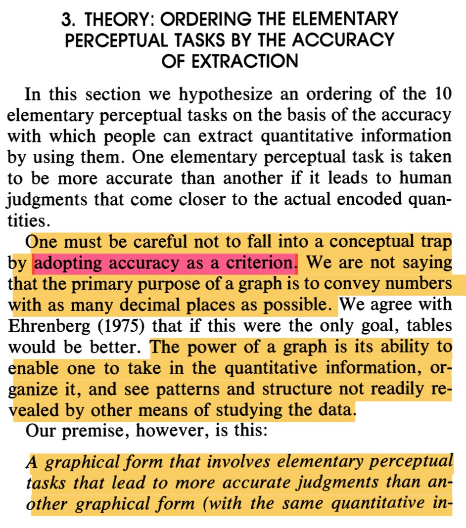
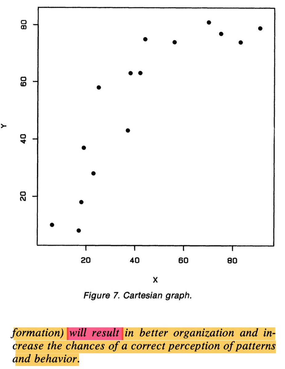
Found this gem, re-reading the classic Cleveland and McGill's "Graphical Perception" paper. I agree with the first statement and disagree with their premise part.
I no longer believe that graphical forms lead to more accurate judgments lead to better visualizations overall. Sometime (often?) they do, but many times they don't.
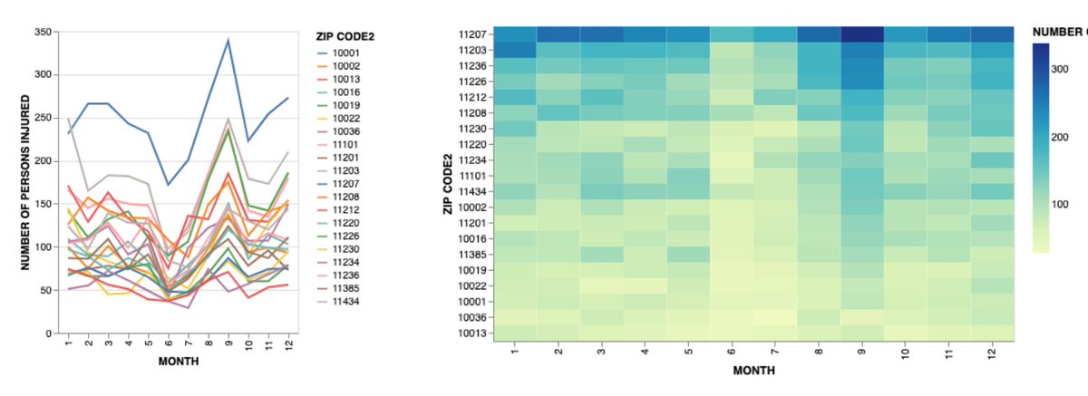
This one. The line chart uses position. The heat map uses color intensity. Is the heat map a disaster? Not really. Maybe even better as the number of series grow.
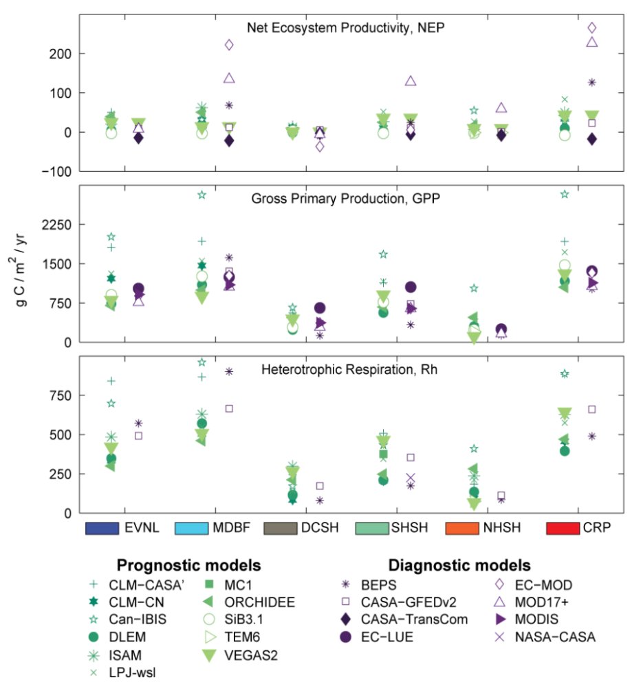
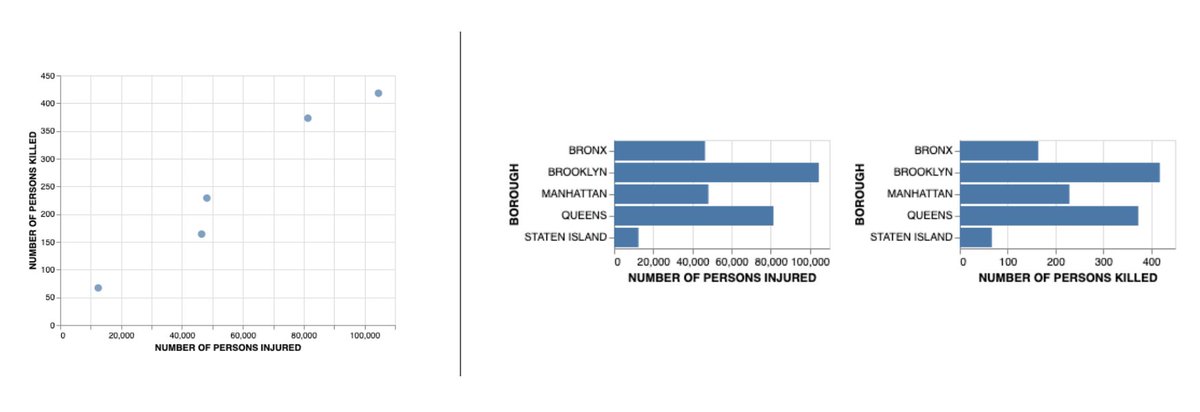
This one. Both charts depict the same data and use position to communicate the quantities but they afford completely different sets of tasks.
There is more! This is in preparation of a short paper I wrote with the great @Birdbassador and @SteveFranconeri. More stuff coming up soon. Stay tuned.

 Read on Twitter