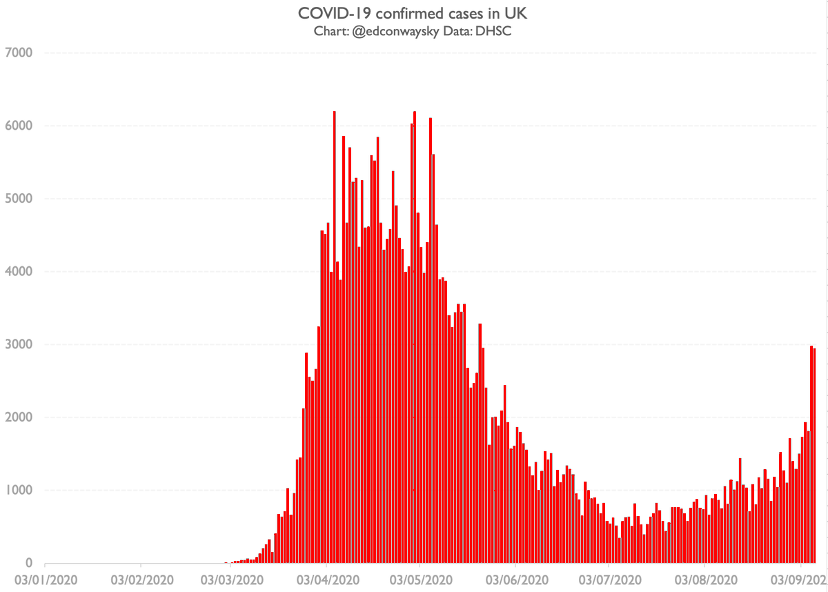
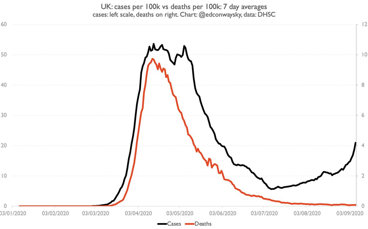
2,948 new cases of #COVID19 in the latest 24 hours. So the UK now has more than 20 cases per 100k people, the threshold at which we tend to impose quarantines on other countries.
Time to panic? Not quite. A few reasons why:
Time to panic? Not quite. A few reasons why:
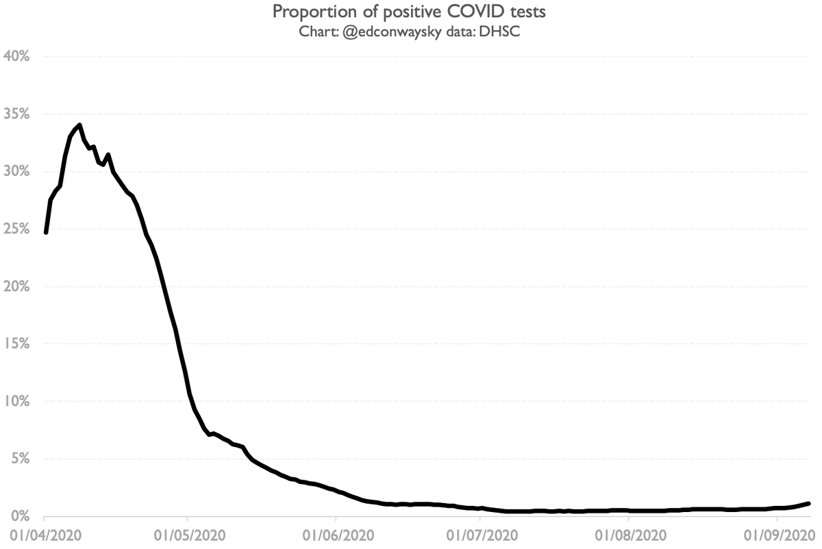
First & most important, that last chart (and the bare numbers) look far scarier because we are testing much, much more than before. A better measure of prevalence is % of tests coming back positive. It’s creeping up but is still way, way below where it was earlier in the summer
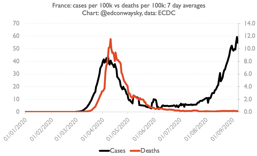
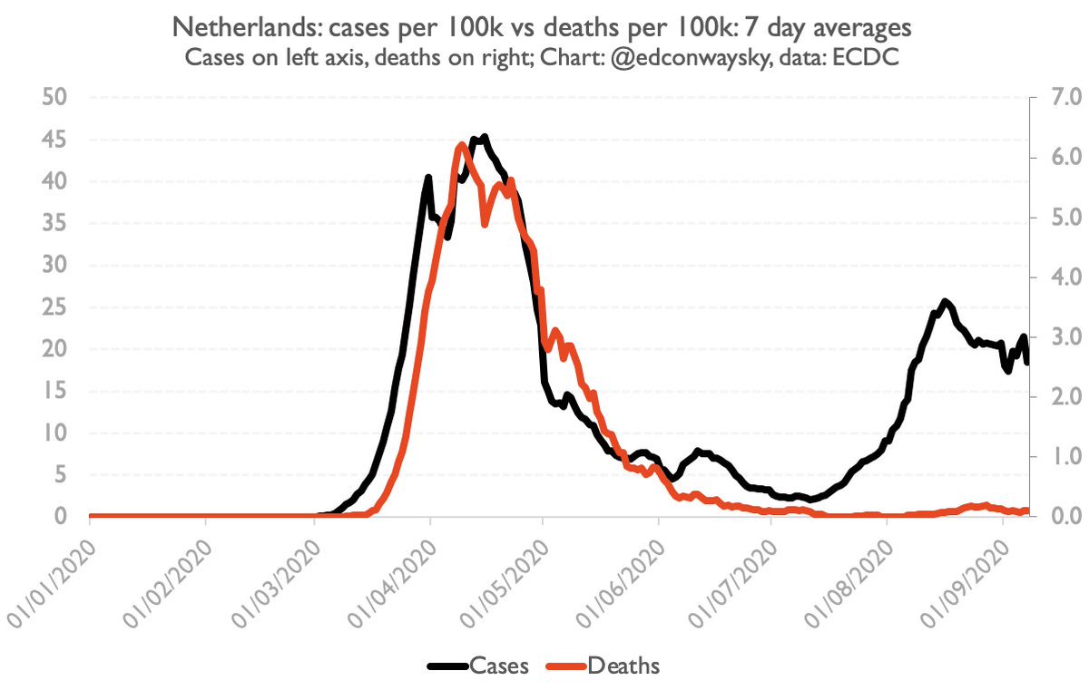
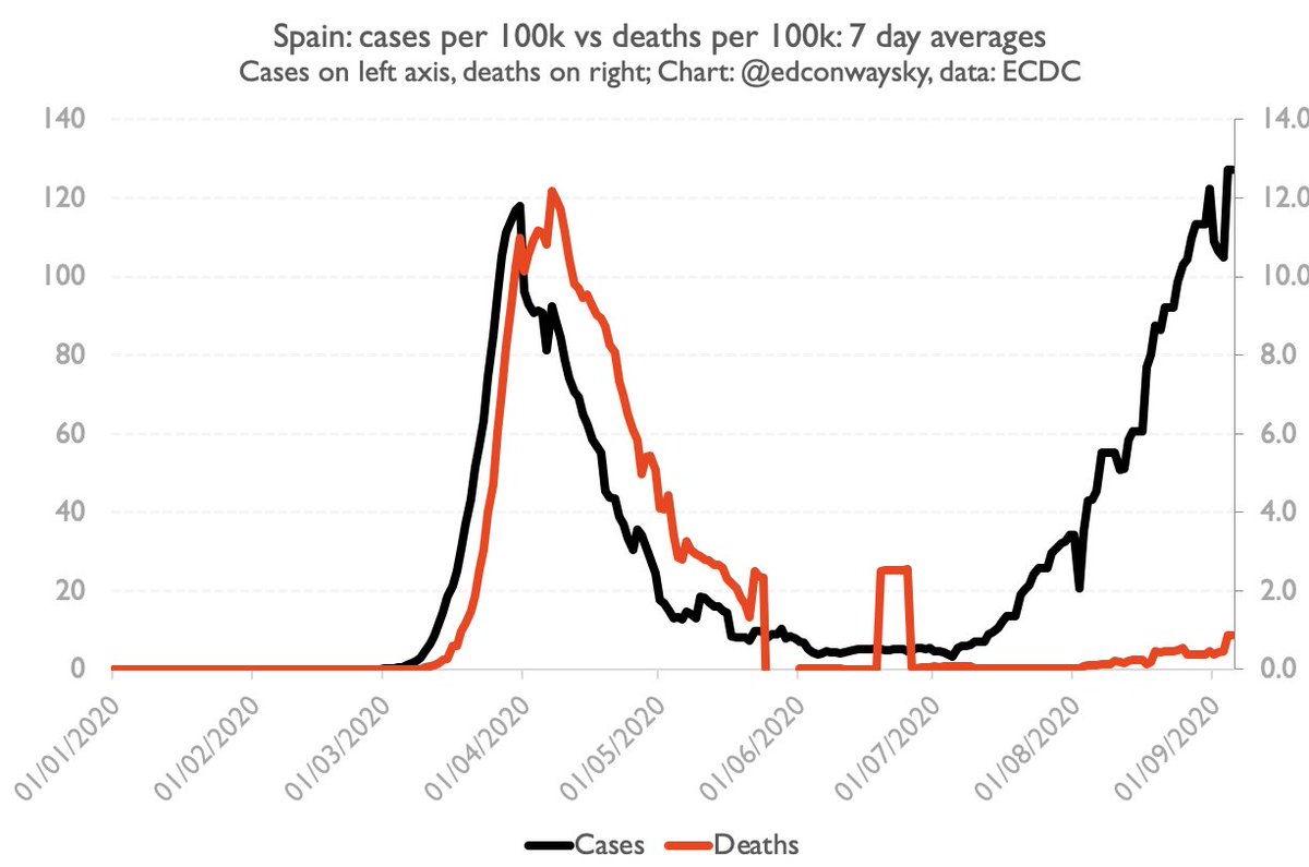
Second, something else seems to have changed since earlier this year. Cases are rising but deaths are not rising as fast, at least in European countries which had previous outbreaks. Look at the relationship between the black and red lines in France, the Netherlands. Spain etc.
Here is the key #COVID19 chart we need to keep an eye on in the UK. Not just cases but cases vs deaths. Provided the red line remains low, the rising black line should inspire far less panic.
Now it’s possible there’s a lag and that eventually the relationship will reassert itself. But we’ve been keeping an eye on this for some time (see this thread from a month ago) and the dog I was worried about hasn't yet barked, thankfully. https://twitter.com/EdConwaySky/status/1292783034887016449
Why are we seeing this phenomenon? No-one really knows. Here’s a blog from @carlheneghan exploring it, but as you'll see, prob more questions than answers (as with so much about #Covid19): https://www.spectator.co.uk/article/coronavirus-cases-are-mounting-but-deaths-remain-stable-why-
Provided deaths and hospitalisations remain low, the rise in cases isn’t necessarily a “bad” thing. It might even be “good”. Some wld say if the objective is to reach herd immunity, the line is actually heading in the right direction, scary as it might feel...
Should we be panicking about the rise in UK #COVID19 cases? Or are the numbers far less scary than they at first seem? A little video explainer from my study

 Read on Twitter