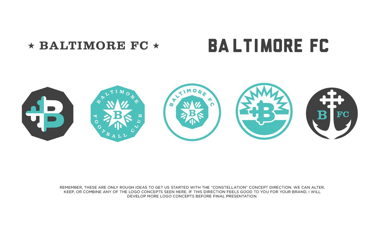
the not-to-be Baltimore FC identity (2016) was challenging, starting from a place of sporting saturation — the team was set on using a round crest and blue.
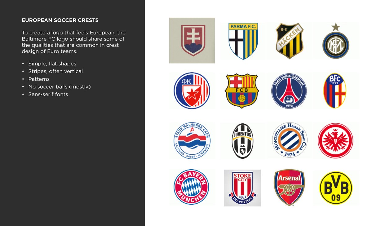
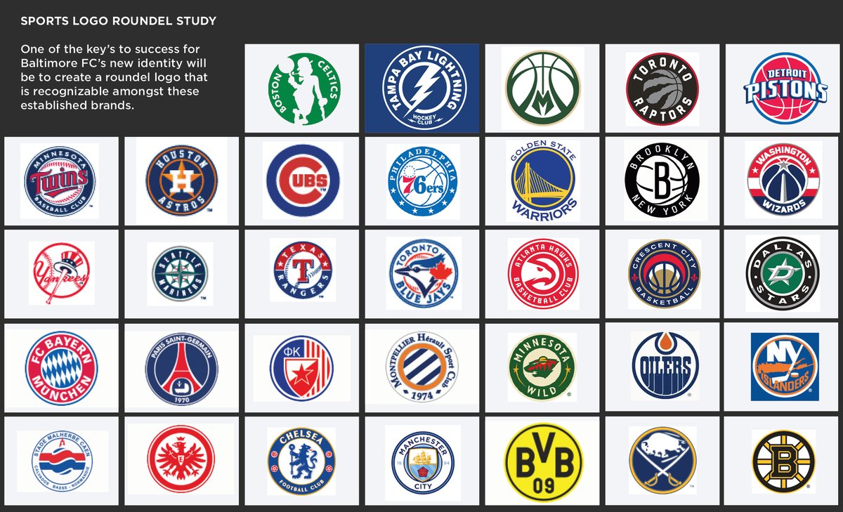
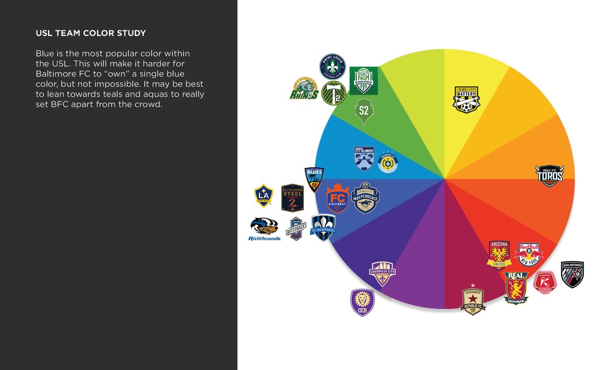
i like gathering those common uses to find a gap in the cliche. its sort of "anti-inspiration". mostly things NOT to do.
i like gathering those common uses to find a gap in the cliche. its sort of "anti-inspiration". mostly things NOT to do.
i've never done this for another project, but proposed 3 different Concepts and built really rough compositions using symbolism that fit each one. you really have to trust the client here to not get too attached to these roughs— nothing here is final.
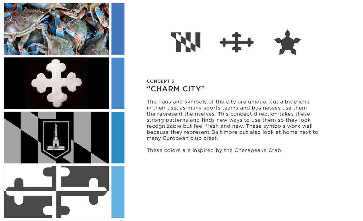
Concept 01: "Charm City"
Concept 01: "Charm City"
this was my least favorite, but was probably the best combination of originality (no Maryland cliches) and locality (relevant local iconography)
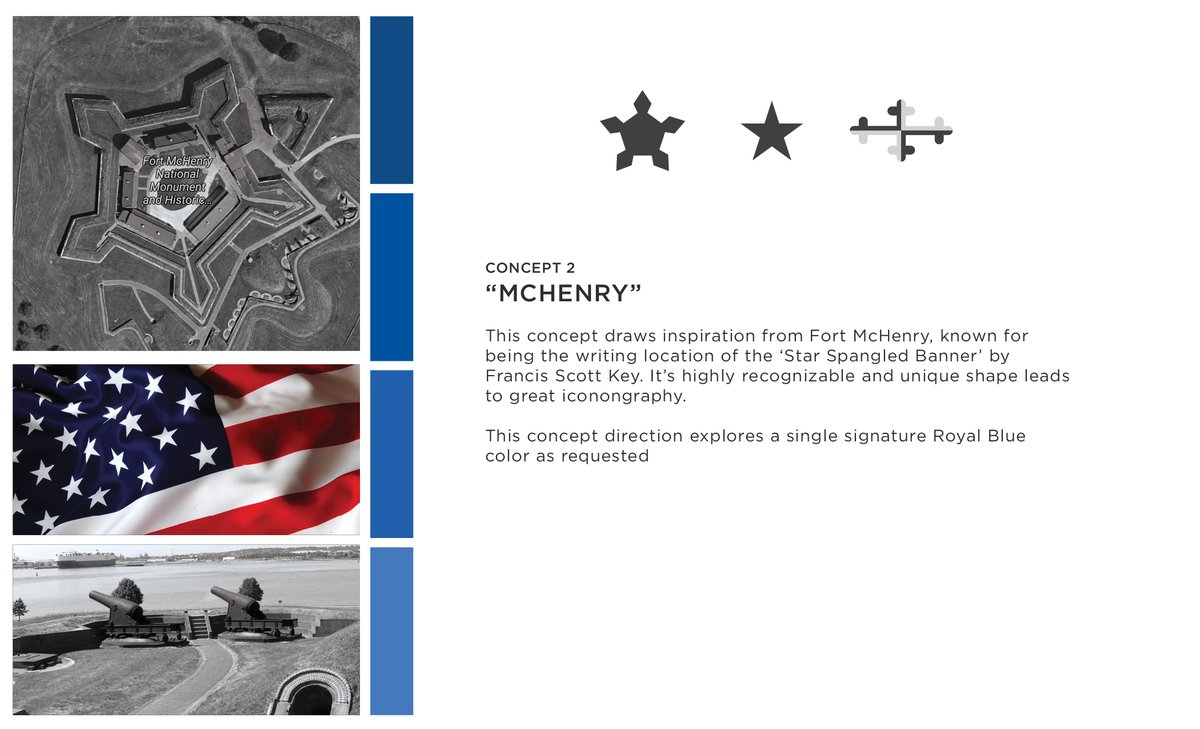
Concept 02: Fort McHenry
Concept 02: Fort McHenry

 Read on Twitter
