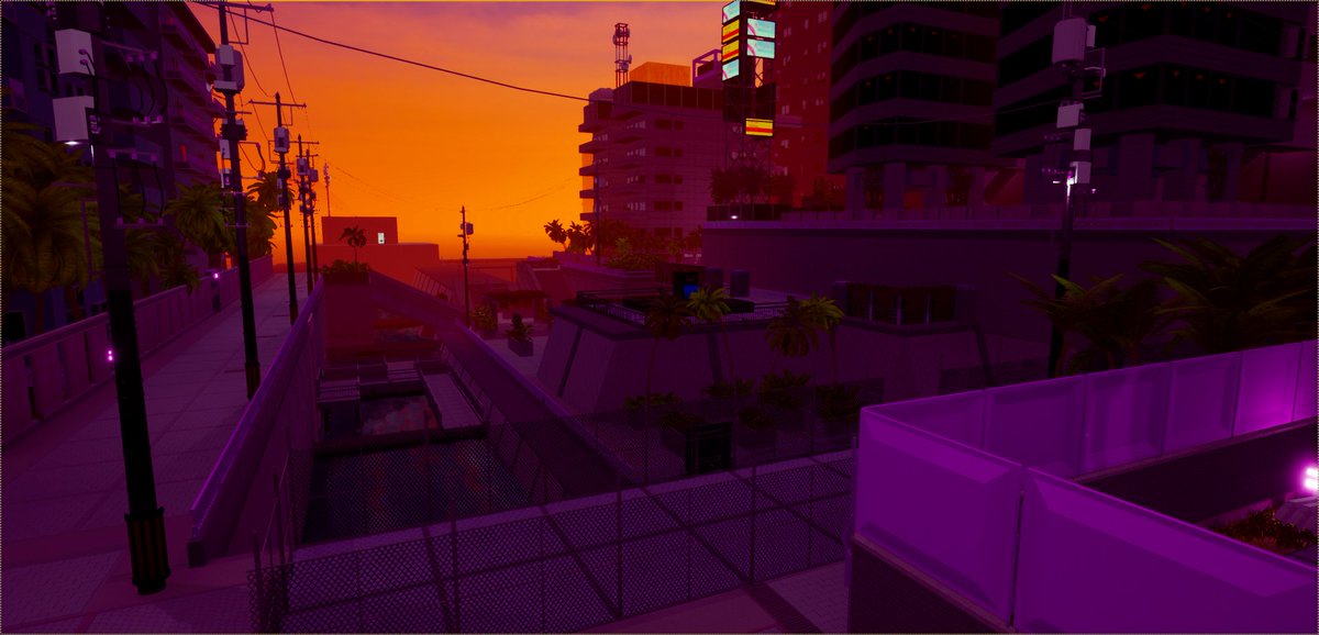
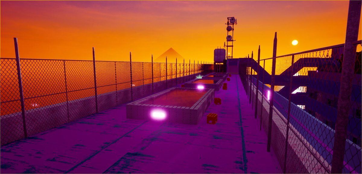
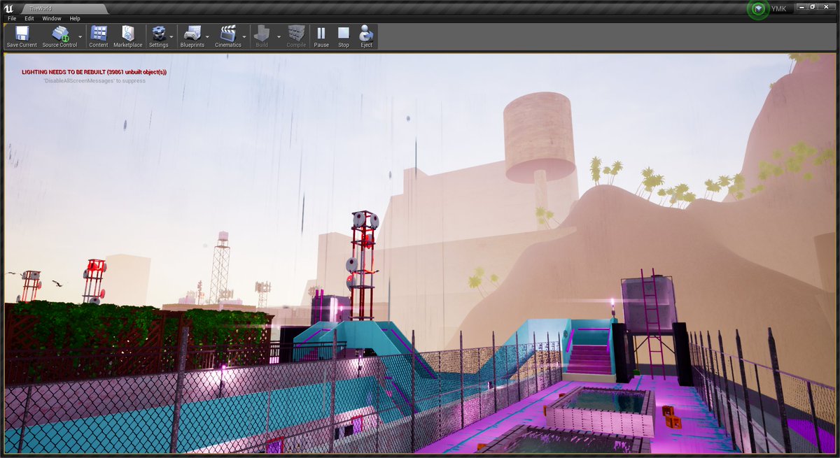
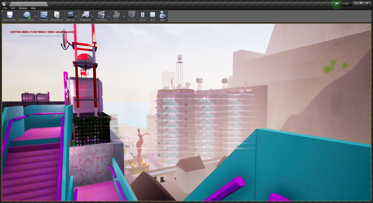
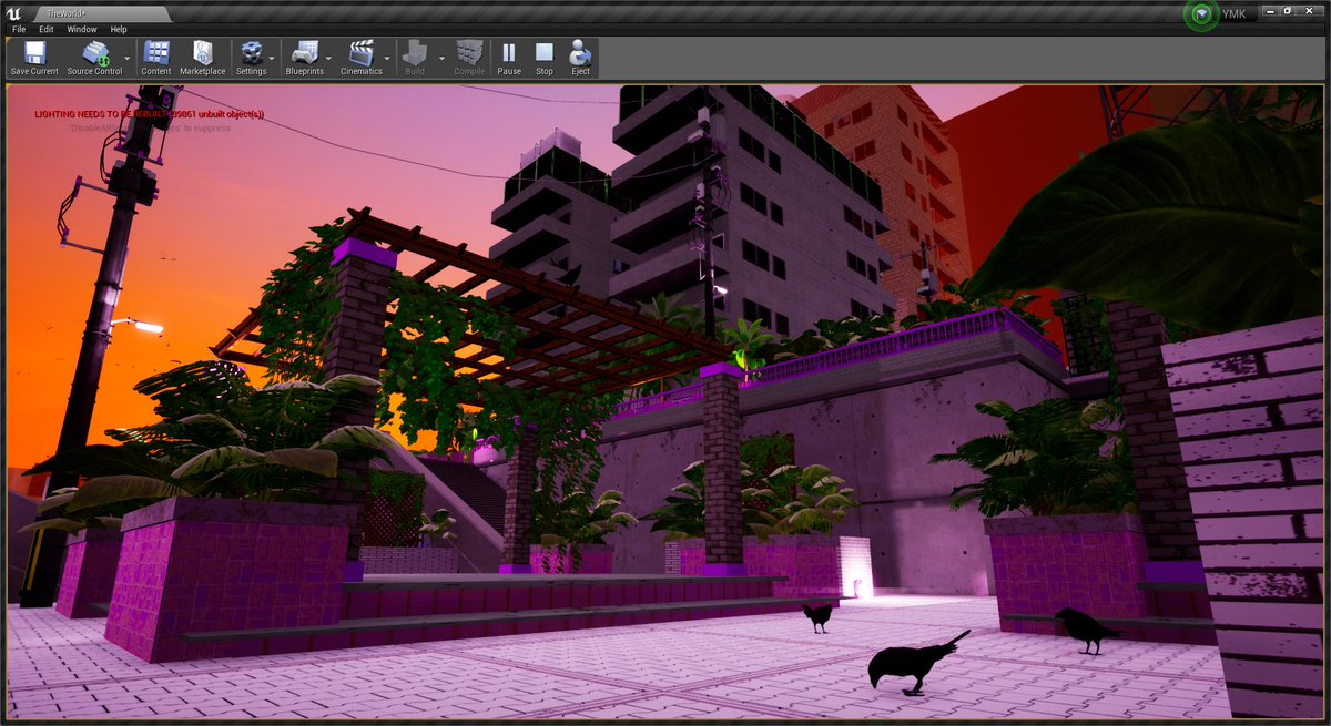
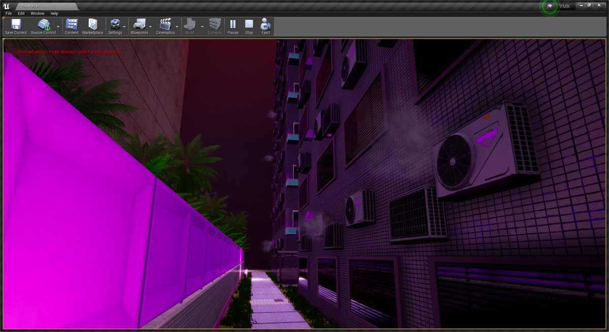
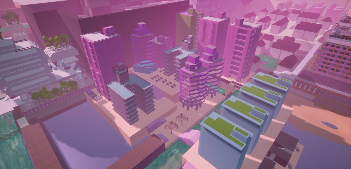
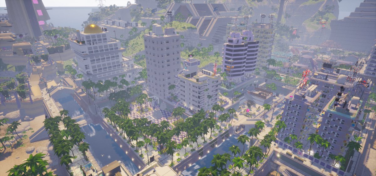
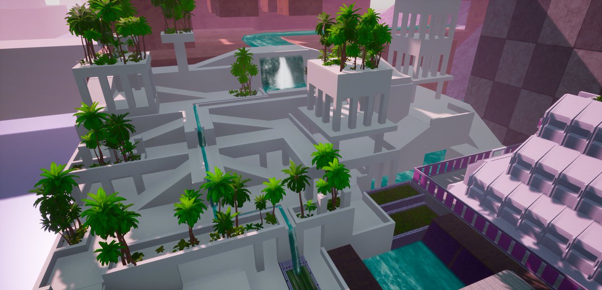
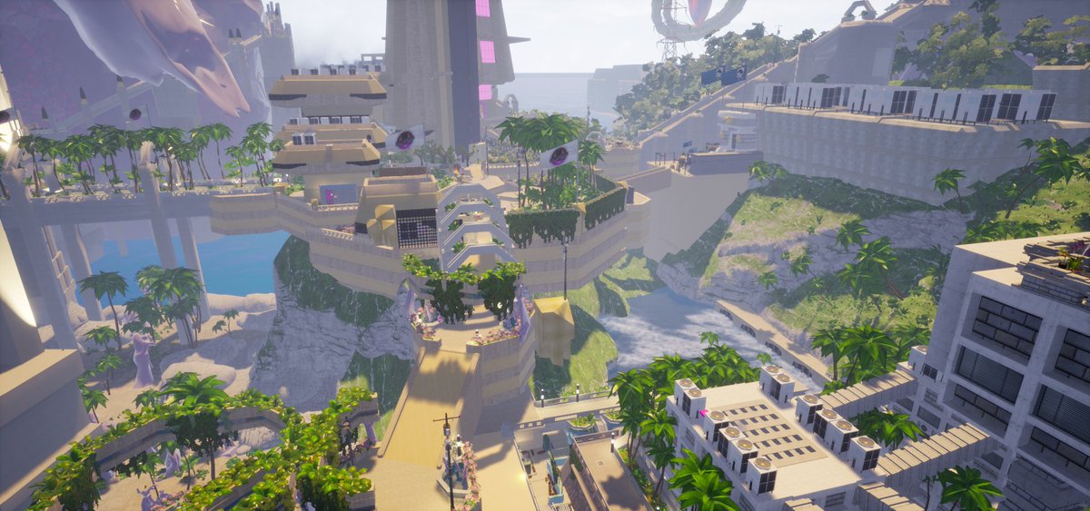
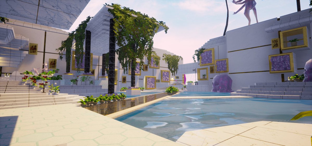
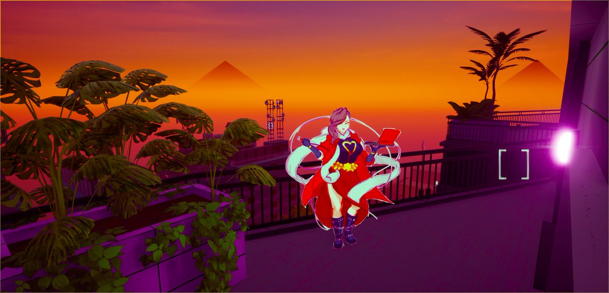
Digging through some old dev screenshots from Paradise Killer. The colours used to be a lot more saturated and aggressive. These were toned down to create an environment that is easier to relax in. We want you to go on holiday in Paradise and this saturation was too much.
We also experimented with much heavier fogging to try and get that Silent Hill vibe but in Paradise. It didn't really work. Gave it the wrong vibe.
We removed all this saturated pink from the environment to improve our design language. Now, anything that is interactive has saturated pink, emissive pink or pink interaction icons on. It helps communicate affordance at a distance and give the player landmarks to aim for.
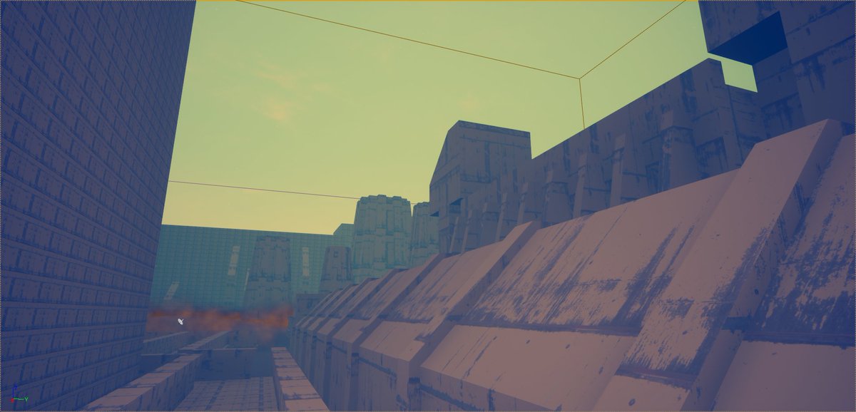
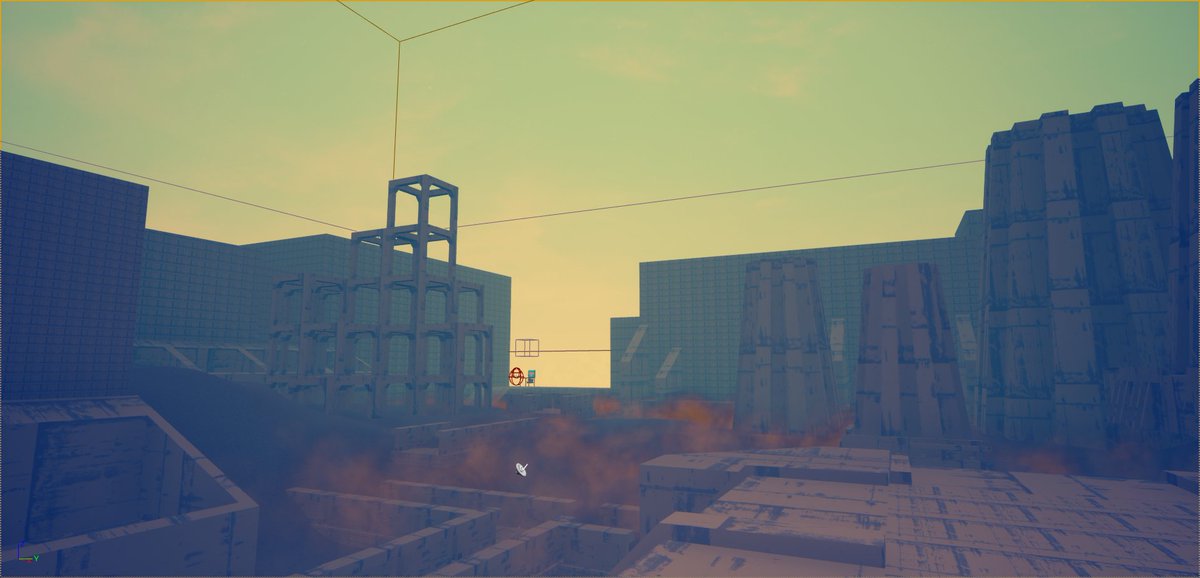
For a while we had no idea what to do with your prison, the Idle Lands. One iteration was a bleak concrete nightmare.
We eventually settled on this marble and gold look. LD is in exile and Idle Lands are called that because there is nothing to do. It represents the torture of boredom rather than traditional incarceration aesthetics.
The very first test we did of putting a 2D character in game with the first colour sketch we got from @Gigalithic.
That's it for now, I'll find some more good ones next week!
That's it for now, I'll find some more good ones next week!

 Read on Twitter