There is a flaw about Google's and Apple's mobility data that often sends people to the wrong conclusion when they analyze it.
Google: https://www.google.com/covid19/mobility/
Apple: https://covid19.apple.com/mobility
It's about the baseline of mobility data.
1/n https://twitter.com/MLevitt_NP2013/status/1296512935779418112
Google: https://www.google.com/covid19/mobility/
Apple: https://covid19.apple.com/mobility
It's about the baseline of mobility data.
1/n https://twitter.com/MLevitt_NP2013/status/1296512935779418112
Google or Apple will tell you that on such and such date mobility is down 20%. Or some days later it is up 5%.
What does this measure exactly?
2/n
What does this measure exactly?
2/n
Google analyzes how often & how long people stayed at various places (offices, parks, restaurants, etc), each day of the week, between Jan 3 and Feb 6, 2020.
Jan & Feb. Winter in the northern hemisphere. Remember this.
See the description (below) at https://www.google.com/covid19/mobility/data_documentation.html?hl=en
3/n
Jan & Feb. Winter in the northern hemisphere. Remember this.
See the description (below) at https://www.google.com/covid19/mobility/data_documentation.html?hl=en
3/n
So if Google tells us mobility is up 5% on a random Monday in July, it means people are visiting these various places 5% longer/more often than they were on an average Monday between Jan 3 and Feb 6.
4/n
4/n
Google tracks each day of the week separately to reduce weekly artifacts.
This makes it easier to spot mobility varying because of covid lockdowns, not because it's a weekend and people visit offices less often on weekends.
See, there is no weekly pattern in the data:
5/n
This makes it easier to spot mobility varying because of covid lockdowns, not because it's a weekend and people visit offices less often on weekends.
See, there is no weekly pattern in the data:
5/n
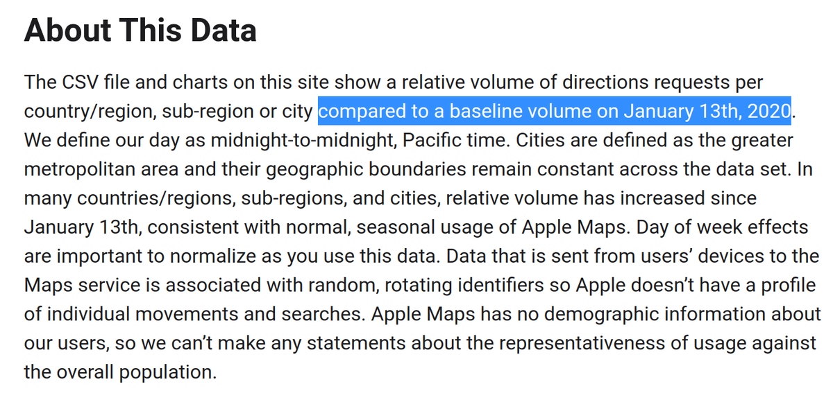
Apple, on the other hand, tracks the volume of Maps direction requests compared to a baseline of January 13.
See the description (below) at https://covid19.apple.com/mobility (click "About this data")
6/n
See the description (below) at https://covid19.apple.com/mobility (click "About this data")
6/n
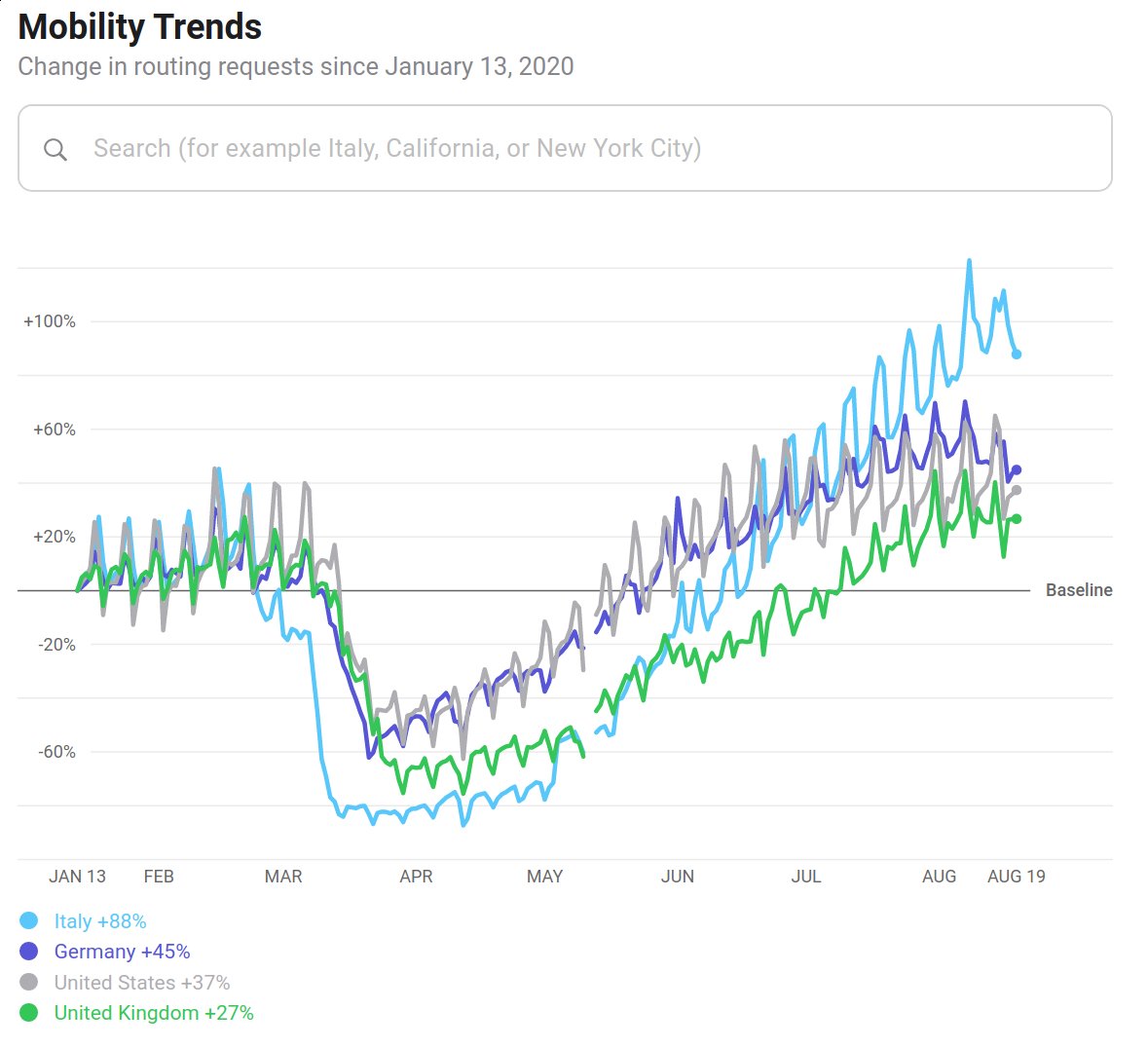
Apple picks a single day, Monday, January 13, as their baseline. So, unlike Google mobility data, we see weekly artifacts:
(Also, Jan 13 is winter, again.)
7/n
(Also, Jan 13 is winter, again.)
7/n
Since both Google and Apple pick periods in winter as their baseline, countries that exhibit seasonal mobility trends often lead analysts in the ditch.
People living in regions with inclement winters (rainy/snowy/short days) are more mobile in summer than in winter.
8/n
People living in regions with inclement winters (rainy/snowy/short days) are more mobile in summer than in winter.
8/n
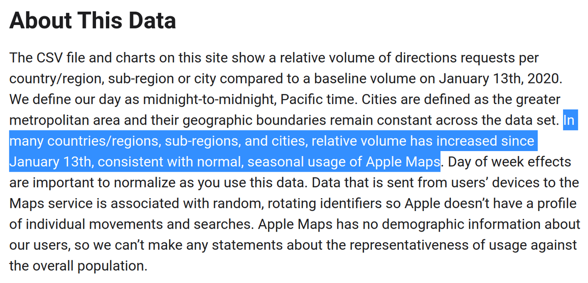
So even if people maintain their mobility cut in half of what is normal at this time of the year, mobility data will still show trends going up.
Analysts often mistake these seasonal trends as a relaxing of stay-at-home orders.
Apple warns against this error (see below)
9/n
Analysts often mistake these seasonal trends as a relaxing of stay-at-home orders.
Apple warns against this error (see below)
9/n
This is really a flaw in mobility data.
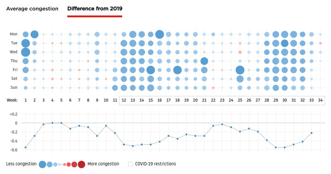
IMO Google and Apple should eliminate these seasonal trends by showing year-on-year mobility, just like, for example, TomTom does by showing the difference from 2019 ( https://www.tomtom.com/en_gb/traffic-index/stockholm-traffic/)
10/n
IMO Google and Apple should eliminate these seasonal trends by showing year-on-year mobility, just like, for example, TomTom does by showing the difference from 2019 ( https://www.tomtom.com/en_gb/traffic-index/stockholm-traffic/)
10/n
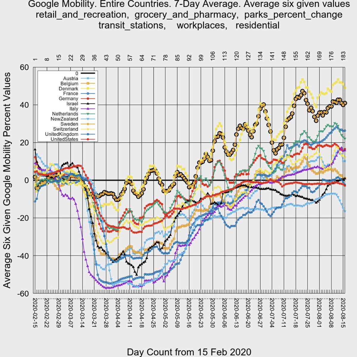
Back to @MLevitt_NP2013 chart:
Look at the 2 countries with the highest recent mobility and the 1 country with the lowest mobility.
Highest: Denmark & Sweden, 2 countries at the most northern latitudes
Lowest: New Zealand, at the most southern latitude (inverted trend)

11/n
Look at the 2 countries with the highest recent mobility and the 1 country with the lowest mobility.
Highest: Denmark & Sweden, 2 countries at the most northern latitudes
Lowest: New Zealand, at the most southern latitude (inverted trend)

11/n
I would expect these 3 countries to show the *strongest* seasonal trends:
Highest northern latitudes = people a lot more mobile in summer than in winter.
12/n
Highest northern latitudes = people a lot more mobile in summer than in winter.
12/n
And New Zealand (only 1 in the southern hemisphere) is entering their winter so people are naturally getting less mobile
Additionally the NZ downtrend since 11 Aug is due to their recent lockdowns https://www.cnn.com/2020/08/14/asia/new-zealand-coronavirus-lockdown-intl-hnk/index.html but NZ already had the lowest mobility before that.
13/n
Additionally the NZ downtrend since 11 Aug is due to their recent lockdowns https://www.cnn.com/2020/08/14/asia/new-zealand-coronavirus-lockdown-intl-hnk/index.html but NZ already had the lowest mobility before that.
13/n
So there is no doubt about it. Google and Apple mobility data show strong seasonal trends that are being misinterpreted as a relaxing/reinforcing of stay-at-home policies.
14/n
14/n
And this misinterpretation is very widespread. I have been pointing it out quite often:
https://twitter.com/alexkx3/status/1293262011183267841
https://twitter.com/Crestone14/status/1295826916042252289
https://twitter.com/MisterCommodity/status/1290045211628826624
https://twitter.com/FrankDGonzo/status/1292512941216948225
https://twitter.com/GuyAl10/status/1290714505396334595
15/n
https://twitter.com/alexkx3/status/1293262011183267841
https://twitter.com/Crestone14/status/1295826916042252289
https://twitter.com/MisterCommodity/status/1290045211628826624
https://twitter.com/FrankDGonzo/status/1292512941216948225
https://twitter.com/GuyAl10/status/1290714505396334595
15/n
These seasonal trends make it impossible to quantify how much countries are relaxing
If country X is at mobility +10% today (Aug 2020), we don't know if they are more mobile than in Aug 2019
If X is at +10% and Y at +50%, we don't know which one relaxed more than the other
16/n
If country X is at mobility +10% today (Aug 2020), we don't know if they are more mobile than in Aug 2019
If X is at +10% and Y at +50%, we don't know which one relaxed more than the other
16/n

 Read on Twitter
