The importance of user onboarding - a thread:
First time UX (or "onboarding") is what users experience when they sign up for your product.
It’s when they interact with your core experience for the first time, and see whether your product lives up to its promise.
First time UX (or "onboarding") is what users experience when they sign up for your product.
It’s when they interact with your core experience for the first time, and see whether your product lives up to its promise.
Why it matters:
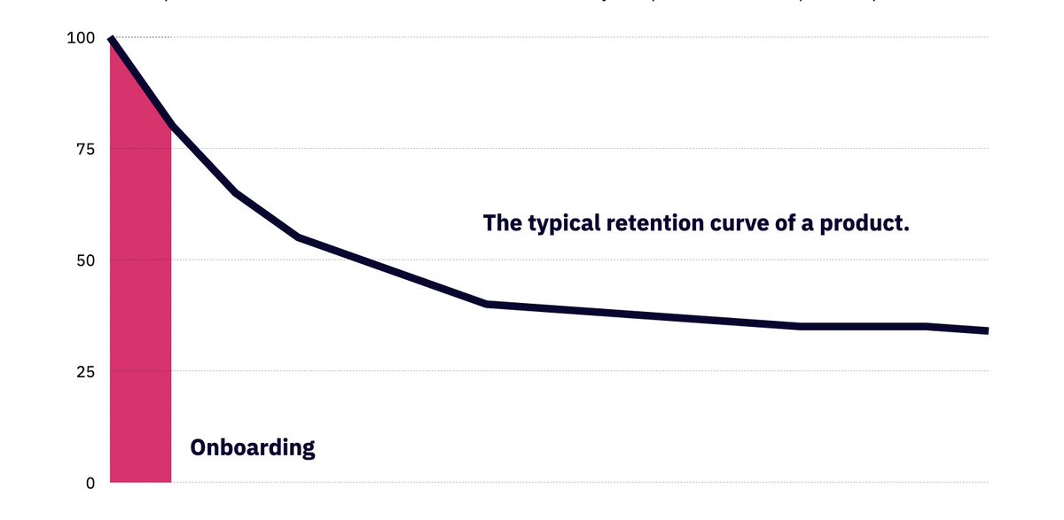
This is the retention curves of the top Android apps (via @andrewchen). You can see they all taper similarly. The biggest difference between them happens at the beginning.
There are 2 reasons - either the value prop isn't useful, or onboarding sucks.
This is the retention curves of the top Android apps (via @andrewchen). You can see they all taper similarly. The biggest difference between them happens at the beginning.
There are 2 reasons - either the value prop isn't useful, or onboarding sucks.
Why it's a problem:
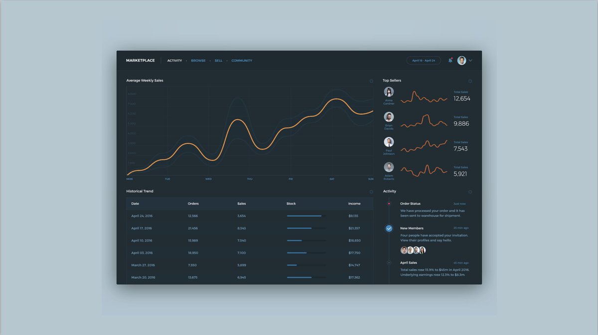
The image on the left is what designers often create. It assumes users gets the value prop & have completed the necessary steps to populate the app with meaningful data.
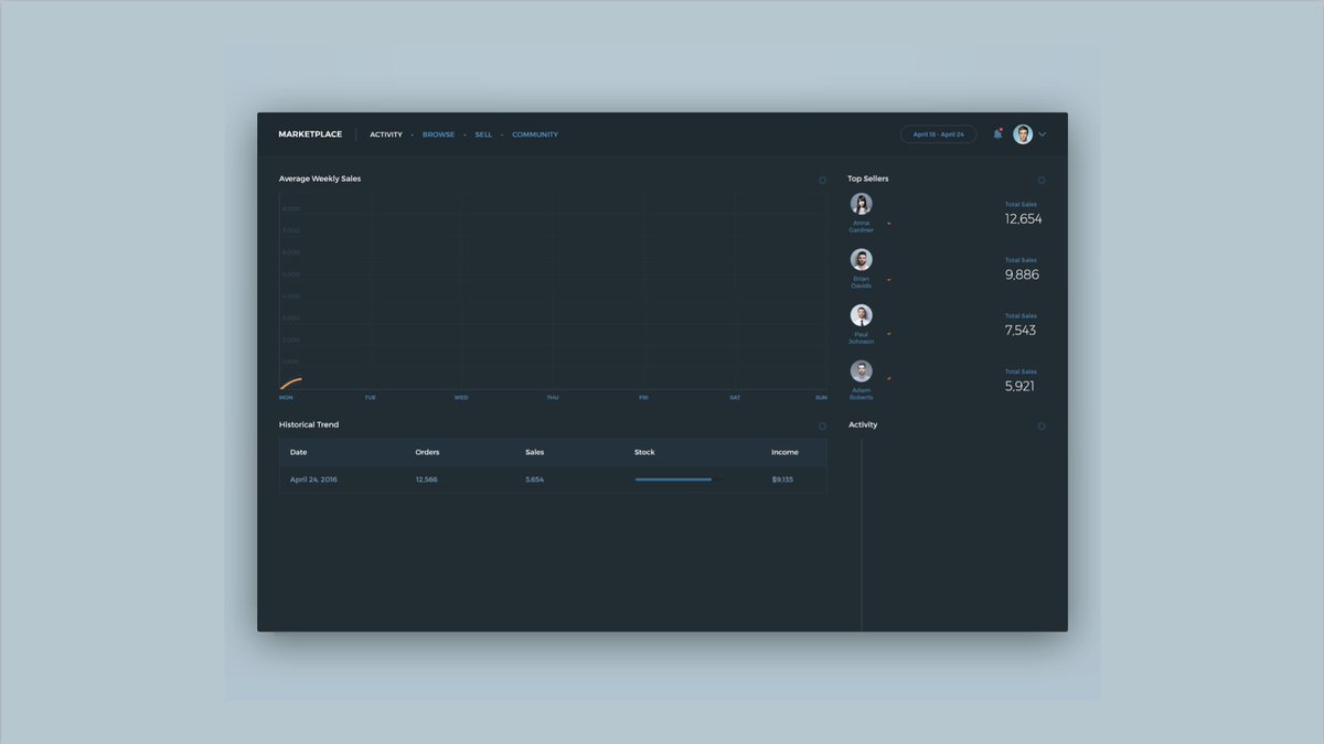
The right is the "blank slate". This is what it looks like to not consider onboarding.
The image on the left is what designers often create. It assumes users gets the value prop & have completed the necessary steps to populate the app with meaningful data.
The right is the "blank slate". This is what it looks like to not consider onboarding.
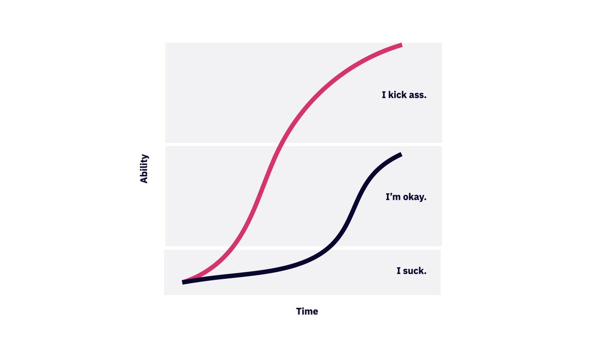
The goal: to get users to the "aha moment" as fast as possible. Or what Kathy Sierra calls the "suck threshold." You want this to happen ideally during first time use.
An example of the impact:
Hotel Tonight used to show that night's inventory at 9am. Users who downloaded the app between 12am-9am saw no hotels that night.
Not only did they not make a reservation that night. They NEVER did.
HT moved it back to 6am. Immediately 6-9am jumped.
Hotel Tonight used to show that night's inventory at 9am. Users who downloaded the app between 12am-9am saw no hotels that night.
Not only did they not make a reservation that night. They NEVER did.
HT moved it back to 6am. Immediately 6-9am jumped.
How to improve it:
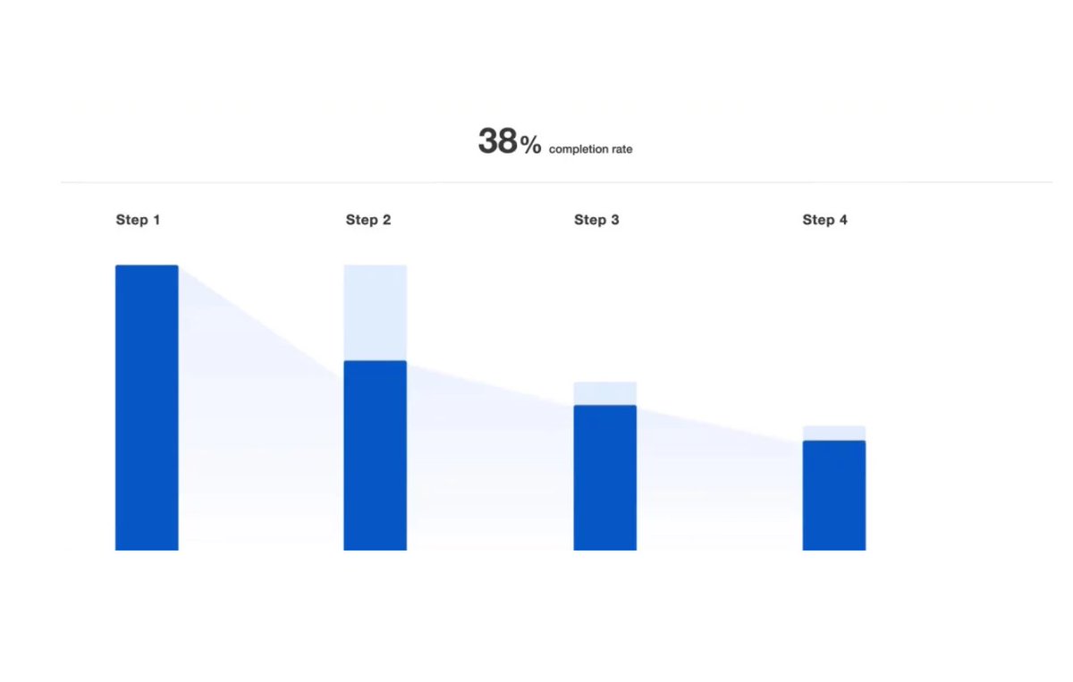
Start by looking at your analytics. Ideally you track events for each step of the activation process. If you don't start (tools like @mixpanel can help).
Look for big bottlenecks.
Start by looking at your analytics. Ideally you track events for each step of the activation process. If you don't start (tools like @mixpanel can help).
Look for big bottlenecks.
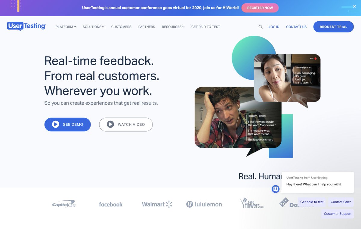
Consider user tests. Analytics are great at telling you what's going wrong, but not necessarily why. Often it's simple usability issues that can be hard to diagnose because you're too close to the problem.
In a post-covid world, remote tools like @usertesting can help.
In a post-covid world, remote tools like @usertesting can help.
Help users feel like they’re
making progress.
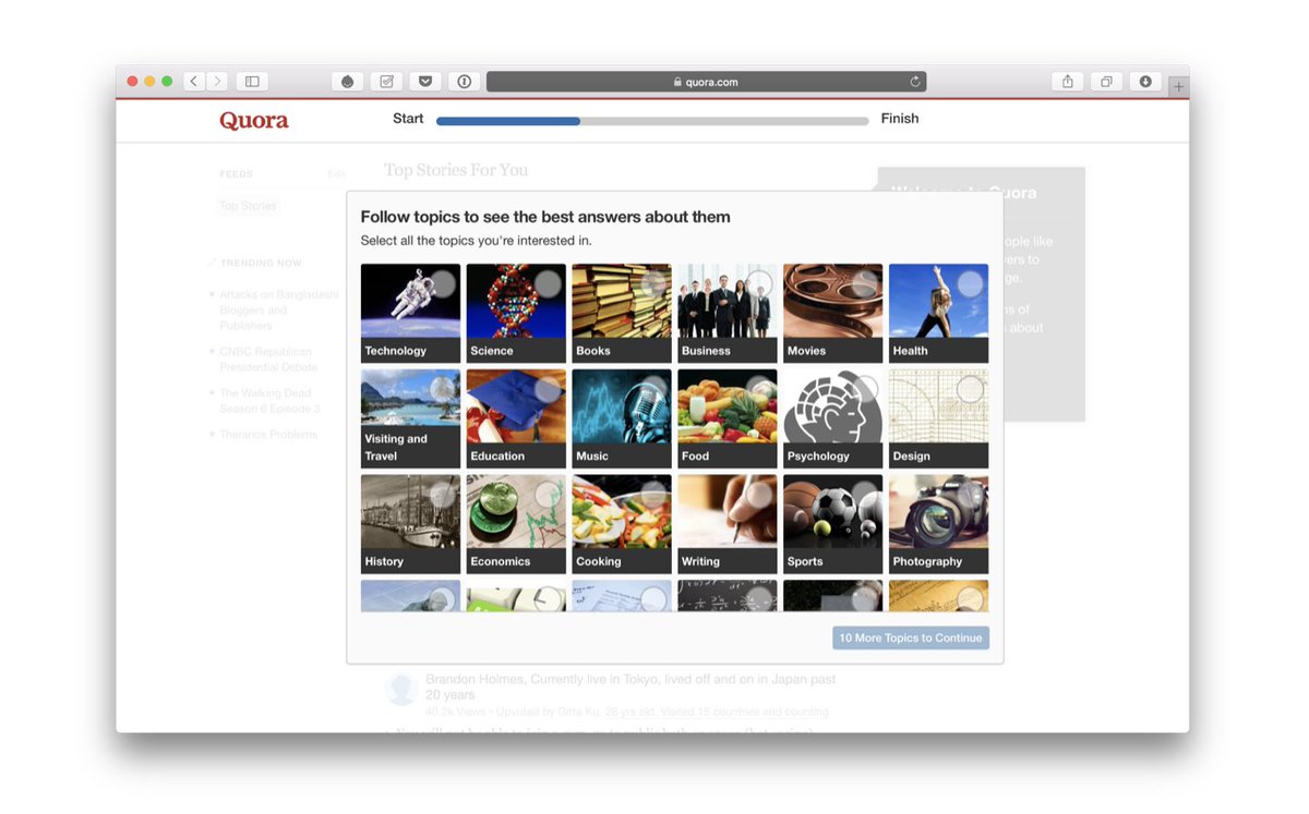
The closer we are to reaching a goal, the harder we work to complete it. This is true even if we only think we’re making progress.
UI elements like checklists and progress bars can facilitate this.
( @Quora is amazing at FUX btw)
The closer we are to reaching a goal, the harder we work to complete it. This is true even if we only think we’re making progress.
UI elements like checklists and progress bars can facilitate this.
( @Quora is amazing at FUX btw)
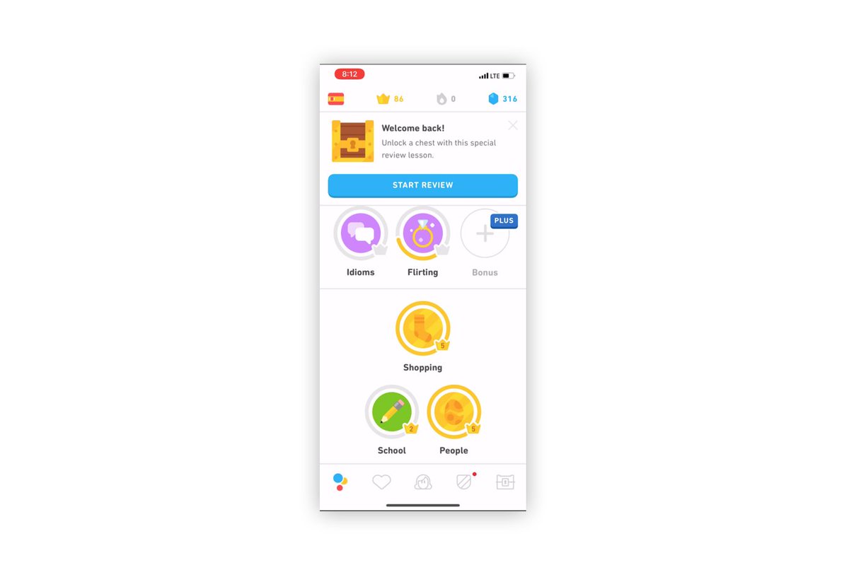
"Prime" users.
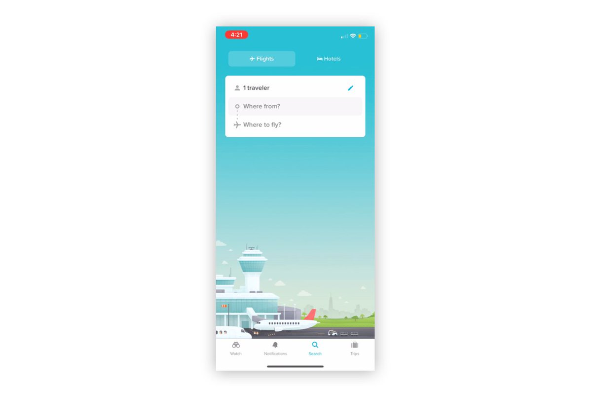
Priming uses subtle visuals to influence how we respond. You can use them to increase the likelihood of a positive experience and to frame the task the user is looking to accomplish.
This makes me want to travel so bad.
Priming uses subtle visuals to influence how we respond. You can use them to increase the likelihood of a positive experience and to frame the task the user is looking to accomplish.
This makes me want to travel so bad.
Use contrast, color, weight, etc to draw attention to the most important things you want the user to do.
So many things are bright and colorful here, the modal at the top washes out.
When everything stands out, nothing does.
So many things are bright and colorful here, the modal at the top washes out.
When everything stands out, nothing does.
Let users take ownership of their experience.
Creating opportunities for personalization early on tin the process can increase the feeling of investment and ownership in the product.
@Wealthfront uses your goal to reinforce connecting your bank (the biggest friction point).
Creating opportunities for personalization early on tin the process can increase the feeling of investment and ownership in the product.
@Wealthfront uses your goal to reinforce connecting your bank (the biggest friction point).
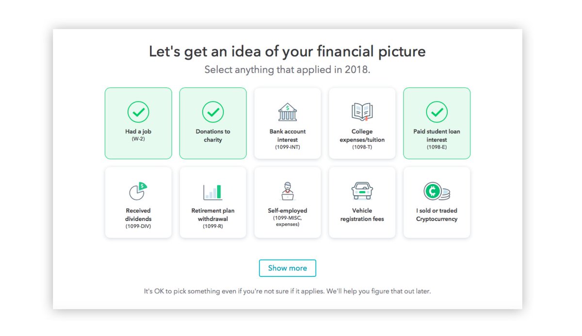
Remove choices and simplify. Anything you can do to remove choices and cognitive overload will help. @turbotax uses simple language and sensible defaults here.
Also reduce anxiety with important decisions. Note the bit at the bottom about changing later.
Also reduce anxiety with important decisions. Note the bit at the bottom about changing later.
Great applications often require users changing their mental models. Consider helping them by leveraging their existing mental models and teaching them how to transition.
@Trello uses lists (which people know about) to teach them about their kanban card-like interface.
@Trello uses lists (which people know about) to teach them about their kanban card-like interface.
Use the "ladder of progression":
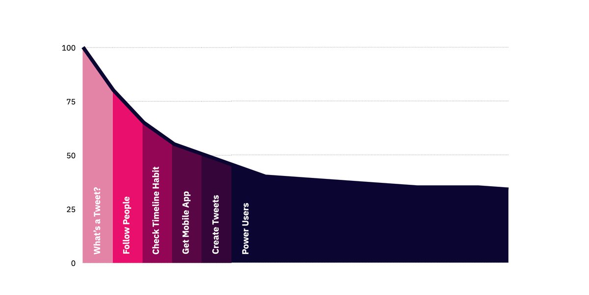
Twitter realized there was a bunch of functionality their users could take advantage of. But not all of it was important at the same time.
They decided to progressively reveal power user functionality as engagement deepened. (h/t @joshelman)
Twitter realized there was a bunch of functionality their users could take advantage of. But not all of it was important at the same time.
They decided to progressively reveal power user functionality as engagement deepened. (h/t @joshelman)
Consider a concierge experience.
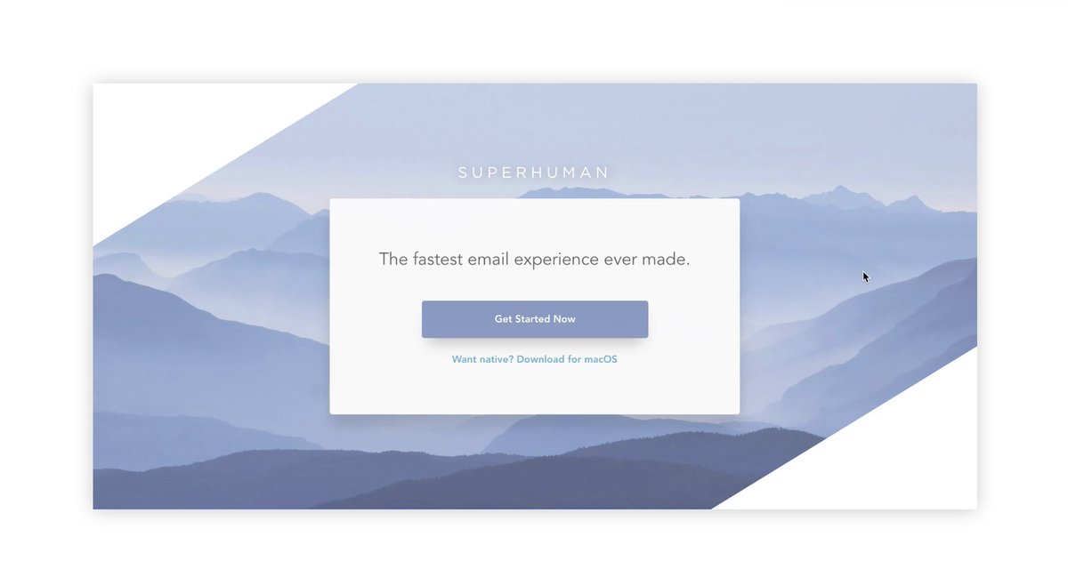
If your business model supports it, it is a fantastic way to maximize activation, as well as retention and referral (b/c customers are amazed at the white glove experience).
Sign up for @Superhuman to see an incredible example.
If your business model supports it, it is a fantastic way to maximize activation, as well as retention and referral (b/c customers are amazed at the white glove experience).
Sign up for @Superhuman to see an incredible example.
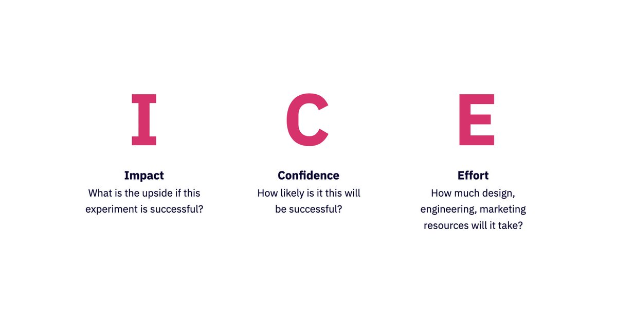
As you come up with ideas, put them into an "onboarding" backlog. Consider using ICE scoring to prioritize.
Then commit to a cadence of iteration. Test, measure, roll out, repeat. (h/t @SeanEllis)
Then commit to a cadence of iteration. Test, measure, roll out, repeat. (h/t @SeanEllis)
Do regular teardowns of products.
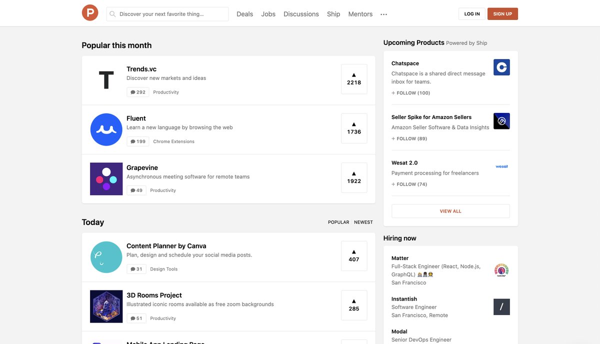
Go on @ProductHunt and look at the top products that week. Go through their onboading process, noting any patterns you think are particularly effective.
Go on @ProductHunt and look at the top products that week. Go through their onboading process, noting any patterns you think are particularly effective.
Onboarding is critically important. Consider spending 80% of your time iterating on the core experience of the product and the onboarding process users take to get there.
What other ideas do you have? Other products you think do this particularly well?
What other ideas do you have? Other products you think do this particularly well?

 Read on Twitter