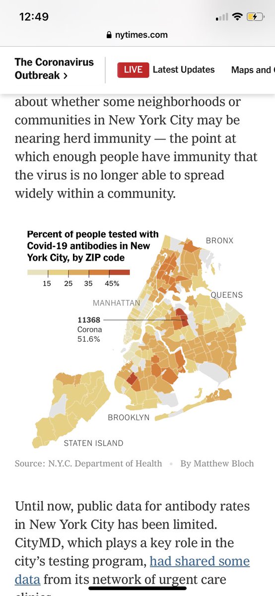
These data aren’t perfect, but some of the best we’ve got in the US. Anyone who wants to understand social determinants of COVID19 inequities should take a look at the NYC map in this article 1/ https://www.nytimes.com/2020/08/19/nyregion/new-york-city-antibody-test.html?referringSource=articleShare
The map is % of #SARSCoV2 antibody tests positive in different neighborhoods in NYC 2/
If you know anything about NYC neighborhoods, you’ll see the correlations with ethnic communities and with wealth... 3/
For instance, “hardest hit ZIP code in the city — 11368 — was the one in Corona, a predominantly Hispanic neighborhood with many construction workers & restaurant employees. Many had to work throughout the pandemic, raising their risk of infection.” More than 50% had #SARSCoV2 hx
Next hardest hit: Borough Park in South Brooklyn. “...home to many Hasidic Jews, a particularly hard-hit demographic. Large households are common, ... Many Hasidic Jews fell sick in early March, right after Purim — a holiday of joyous celebration, full of parties and mingling.”
“In Brooklyn, the ZIP code with the lowest rate of positive antibody tests — 13.2 percent — includes much of Park Slope, a wealthy and predominantly white neighborhood.”
The study isn’t perfect. These are from voluntarily taken antibody tests. But the city estimates that they have results on 15% of all residents, a big undertaking.
As an epidemiologist, I was frustrated that early coverage on #COVID19 mortality disparities by race blamed them on higher rates of comorbidities among non-White populations versus greater rates of infection w the #SARSCoV2  necessary for the disease.
 necessary for the disease.
#SARSCoV2 antibody studies give us a window into understanding who is being affected by the virus. 9/

 Read on Twitter


