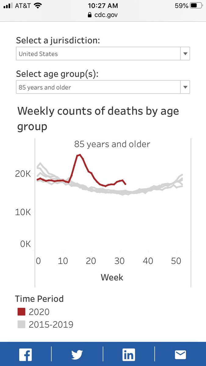
1/ This age-stratified death data from @cdcgov is simple and compelling evidence about how much damage the lockdowns may have caused versus #Covid. Okay, first look at 85+ deaths. Red line is 2020, grey lines previous five years. Huge excess in April (thanks, @nygovcuomo!)...
2/ Then deaths come almost back to normal (not quite, we know #Covid does cause excess deaths in the very elderly). By June they’re maybe 10-12% above normal. The Sunbelt spike brings them up to 20% above normal, 3,000 deaths a week or so, but still far below the April bump...
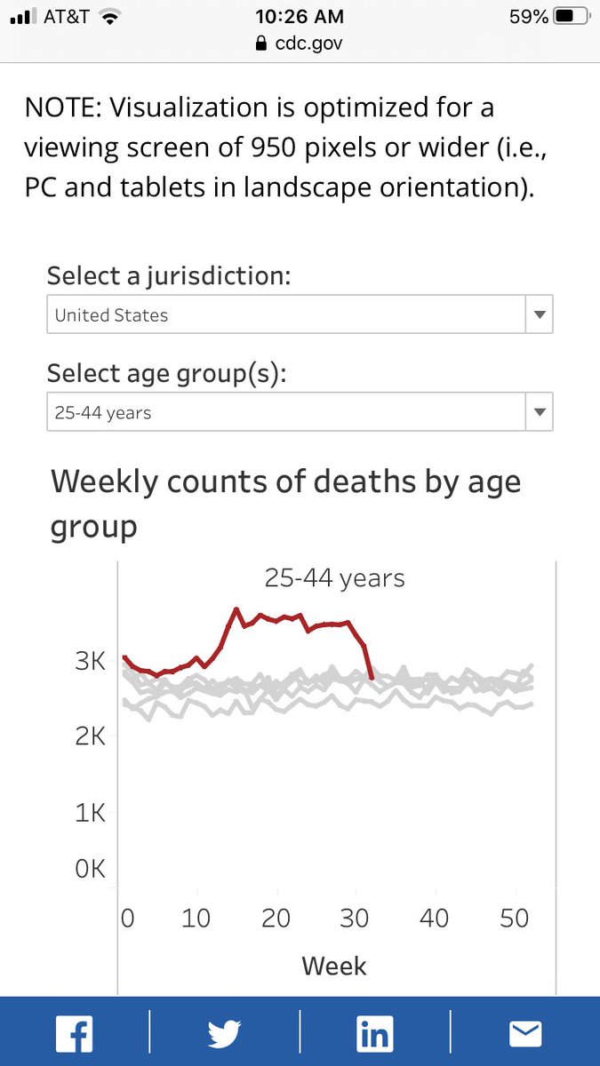
3/ Okay, now look at deaths in the 25-44 range. They start to rise at the same time and rise almost as much. BUT THEY NEVER COME DOWN. They remain at 25-35% above normal every single week. We know these people are at exceptionally low risk from #Covid. THESE ARE LOCKDOWN DEATHS.

 Read on Twitter


