How psychology principles and cognitive biases relate to UX heuristics?
Let's dive right into what can affect a user experience.
Explanning each principle and give UX examples mastering psychology and UX examples whose experience is not fully optimized (A THREAD)
Let's dive right into what can affect a user experience.
Explanning each principle and give UX examples mastering psychology and UX examples whose experience is not fully optimized (A THREAD)
1/Hick's law
the more choices you present your users with, the longer it will take them to reach a decision. Inc the cognitive load= inc risk of users churn
good UX requires:
1. functionalities that answer user needs
2. users are guided to the specific functions they need most
the more choices you present your users with, the longer it will take them to reach a decision. Inc the cognitive load= inc risk of users churn
good UX requires:
1. functionalities that answer user needs
2. users are guided to the specific functions they need most
2/Good ex: Amazon
lots of choices & speed up the decision making =critical:
•menus items are grouped into high-level categories
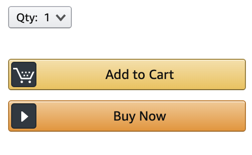
•easy 1-click buy option
by reducing the # of opts on screen:
•process = more user friendly
•inc likelihood users reach the end of the process
lots of choices & speed up the decision making =critical:
•menus items are grouped into high-level categories
•easy 1-click buy option
by reducing the # of opts on screen:
•process = more user friendly
•inc likelihood users reach the end of the process
3/Good example 2: Netflix
abundance of choices —> rows shortlist with:
• types
• themes / categories
• country most view ranking
abundance of choices —> rows shortlist with:
• types
• themes / categories
• country most view ranking
4/Bad example: Zapier
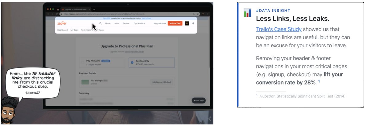
Zapier showed too many navigation links during their upgrade flow which distracts users from crucial checkout steps
See analysis from @GrowthDotDesign
Zapier showed too many navigation links during their upgrade flow which distracts users from crucial checkout steps
See analysis from @GrowthDotDesign
5/Miller's Law
the average person can only keep 7 (+ or - 2) items in their working memory.
chunking: providing the most relevant info in logical groups.
This helps users absorb info.
organize content into smaller chunks to help users process, understand, and memorize easily.
the average person can only keep 7 (+ or - 2) items in their working memory.
chunking: providing the most relevant info in logical groups.
This helps users absorb info.
organize content into smaller chunks to help users process, understand, and memorize easily.
6/Fitt's Law
the time to acquire a target is a function of the *distance* to and *size* of the target.
the closer and bigger something is to you, the easier & faster it is for you to touch it. particularly important when designing buttons and other clickable on-screen elements
the time to acquire a target is a function of the *distance* to and *size* of the target.
the closer and bigger something is to you, the easier & faster it is for you to touch it. particularly important when designing buttons and other clickable on-screen elements
7/Good examples:
• distance: group similary used features to reduce curser mouvement (ex: Excel)
• size: create large enough target area (Lime)
Bad example:
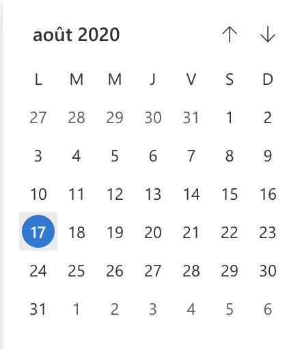
• calendar (smaller target areas = harder to touch accurately)
• distance: group similary used features to reduce curser mouvement (ex: Excel)
• size: create large enough target area (Lime)
Bad example:
• calendar (smaller target areas = harder to touch accurately)
8/Tesler's Law
also known as The Law of Conservation of Complexity: for any system there is a certain amount of complexity which cannot be reduced.
if the interface is too simple you take away the sense of control from the users as they have too little to do with the system.
also known as The Law of Conservation of Complexity: for any system there is a certain amount of complexity which cannot be reduced.
if the interface is too simple you take away the sense of control from the users as they have too little to do with the system.
9/Example: Outlook event planner
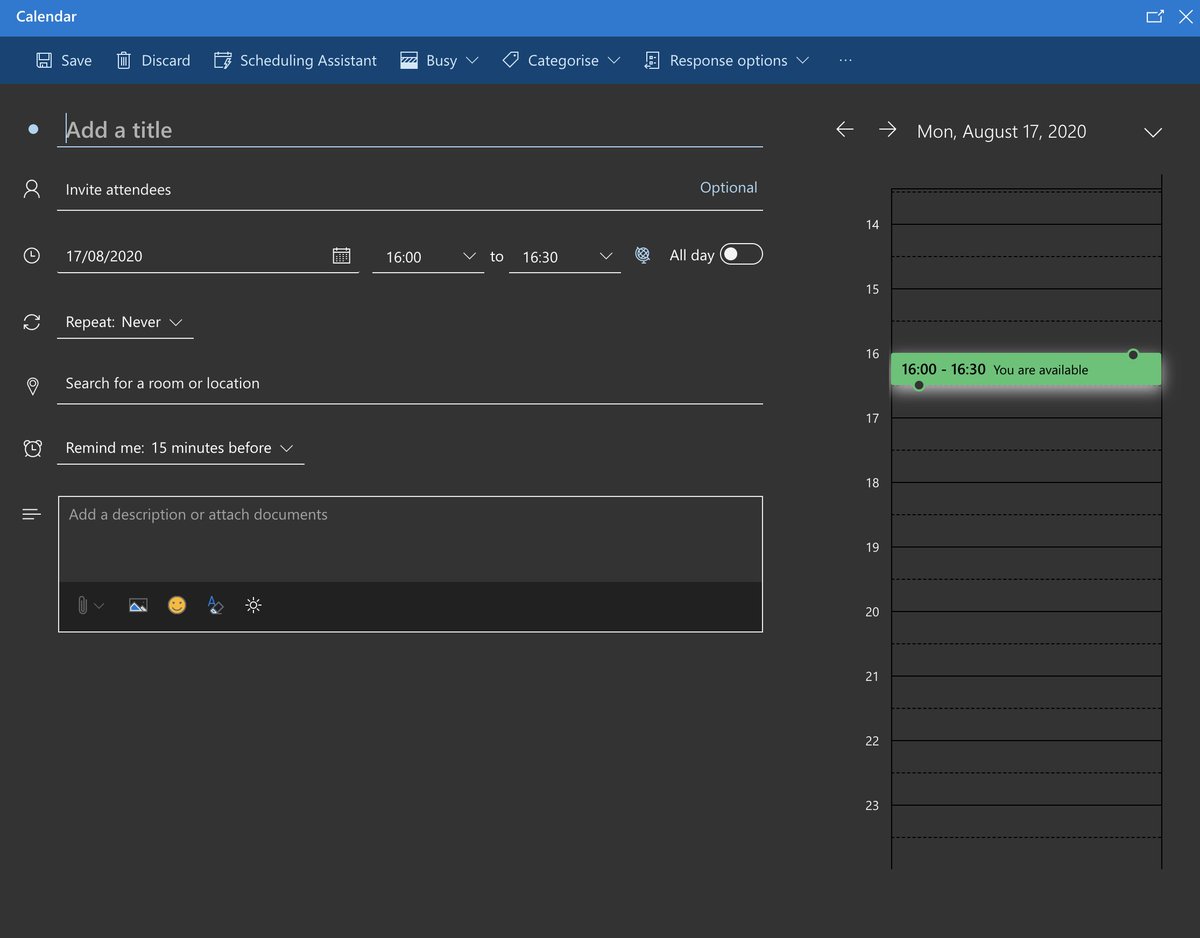
there are quite a few details needed from the user like date, time, location, guests, response options, and when to be notified about the event etc.
trying to minimise the number of inputs needed from the user can deteriorate the user experience
there are quite a few details needed from the user like date, time, location, guests, response options, and when to be notified about the event etc.
trying to minimise the number of inputs needed from the user can deteriorate the user experience
10/Zeigarnik Effect
a task in progress creates task-specific tension. This tension is relieved when the task is completed, but if the task is interrupted, it stays.
a famous UX design example of this effect is the use of progress bars to guide a user's behavior.
a task in progress creates task-specific tension. This tension is relieved when the task is completed, but if the task is interrupted, it stays.
a famous UX design example of this effect is the use of progress bars to guide a user's behavior.
12/Endowment Effect
users value something more if they feel it's theirs
Perfect example: @RoamResearch
each Roam account is unique & perfectly personal. You start w a blank page, a cold start, & you build a powerful & insightful thoughts network. Users own their Roam account
users value something more if they feel it's theirs
Perfect example: @RoamResearch
each Roam account is unique & perfectly personal. You start w a blank page, a cold start, & you build a powerful & insightful thoughts network. Users own their Roam account
13/Peak-End Rule
people judge an experience largely based on how they felt at its peak (high or low) and at its end, rather than the total sum or average of every moment of the experience
people judge an experience largely based on how they felt at its peak (high or low) and at its end, rather than the total sum or average of every moment of the experience
14/Good example : Zapier
after you pay to upgrade your account, Zapier shows animated confettis as a way to celebrate (and take your focus away from the money you've just spent!)
after you pay to upgrade your account, Zapier shows animated confettis as a way to celebrate (and take your focus away from the money you've just spent!)
15/Bad example: Duolingo
Exit points are opportunities to “put down” the product when users feel they have reached something.
Duolingo doesn't provide a clear exit point in its learning experience.
Exit points are opportunities to “put down” the product when users feel they have reached something.
Duolingo doesn't provide a clear exit point in its learning experience.
16/ This makes the “end” of the user in-app experience feel like we're abandoning our learning process (even if we've achieved our goals). The lack of exit points doesn't provide a sense of completion and feels like a never-ending list of tasks

 Read on Twitter
