Let's talk about statistics.
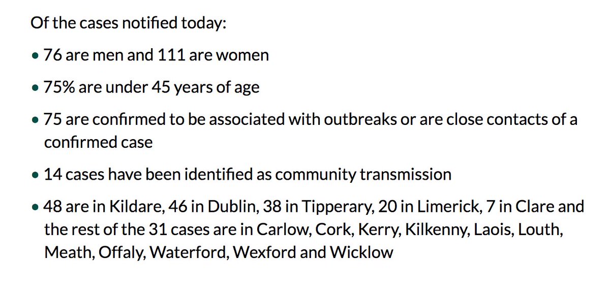
Something struck me from @FergalBowers (excellent) coverage of today's covid numbers in Ireland: the breakdown is super weird. 190 cases, of which 75 are close contacts of an existing case, & 14 are community transmission.
What about the other 101?
Something struck me from @FergalBowers (excellent) coverage of today's covid numbers in Ireland: the breakdown is super weird. 190 cases, of which 75 are close contacts of an existing case, & 14 are community transmission.
What about the other 101?
Were they infected in hospital? Or because of travel?
Did they get sick because they were exposed at work (say, a meat factory)?
Do we just not know yet, & the contact tracers are working it out?
Why give us info about under half of the cases, and completely ignore the rest?
Did they get sick because they were exposed at work (say, a meat factory)?
Do we just not know yet, & the contact tracers are working it out?
Why give us info about under half of the cases, and completely ignore the rest?
It feels equivalent to saying: in a room where 100 people had drinks, 23 had coffee and 13 had tea.
...
What about the rest?!
...
What about the rest?!
It was so strange, I was convinced I had misheard or misunderstood it.
I even re-wound the news (well, paused and scrolled back, this isn't a VHS tape from Xtravision :P).
But nope, that's the information provided.
I even re-wound the news (well, paused and scrolled back, this isn't a VHS tape from Xtravision :P).
But nope, that's the information provided.
I note it because something about the statistics on the NPHET statements and Covid-19 Data Hub have been driving me up the wall.
Here's my question.
How many people are getting sick because of community infection? And is that number increasing?
Here's my question.
How many people are getting sick because of community infection? And is that number increasing?
We can't simply tot up the numbers in the NPHET daily statements, because as above, they leave out too much.
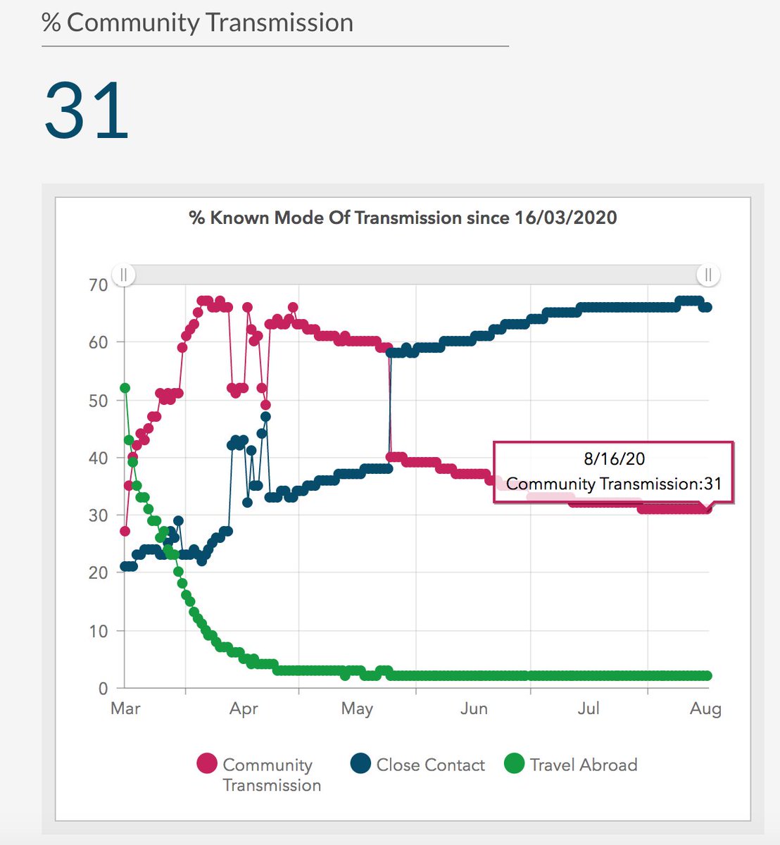
There *is* a section on the Covid 19 Data Hub on community transmission, which - as of last Sunday - says 31% of cases have been acquired in the community.
There *is* a section on the Covid 19 Data Hub on community transmission, which - as of last Sunday - says 31% of cases have been acquired in the community.
Grand so.
But if you look at that graph, you'll see community transmission is stuck at 31% *since the beginning of August*. Which has been... an eventful 18 days, to say the least.
And community transmission has been completely static the whole time?
That seems odd.
But if you look at that graph, you'll see community transmission is stuck at 31% *since the beginning of August*. Which has been... an eventful 18 days, to say the least.
And community transmission has been completely static the whole time?
That seems odd.
The clue is in the heading. 31% of people have been infected in the community *since 16 March*.
Lads, that includes numbers from when we were in lockdown and barely leaving the house.
I don't need to know that, during lockdown, very few people were getting sick from community infection. I need to know what's happening *now*.
I don't need to know that, during lockdown, very few people were getting sick from community infection. I need to know what's happening *now*.
So I downloaded the CSV file here - https://data.gov.ie/dataset/covidstatisticsprofilehpscirelandopendata - to have a rummage around the raw data, and see if it gives us more granularity.
But no, the headings for 'community transmission' and 'close contact' are simply the % figure for each. Same information as in the graph.
But no, the headings for 'community transmission' and 'close contact' are simply the % figure for each. Same information as in the graph.
Which is... frustrating.
We need to know what's happening *now*, and not have that dragged down by figures from several months ago.
We need to know what's happening *now*, and not have that dragged down by figures from several months ago.
If it's a cumulative percentage, that figure becomes less informative as time goes on, like all cumulative distributions.
That's a bit of a mouthful, isn't it?
Alright, so let's give a concrete example.
That's a bit of a mouthful, isn't it?
Alright, so let's give a concrete example.
Let's say, in the middle of March, the number of people who got sick in the community leapt up by 50 cases.
That'd be a big deal!
There'd be a clear change the % of community cases, because you're dividing by low overall infection numbers - under 300 on 17 March.
That'd be a big deal!
There'd be a clear change the % of community cases, because you're dividing by low overall infection numbers - under 300 on 17 March.
It's that numerator/denominator stuff you remember from primary school.
When the number under the line is smaller, you'll see more of an effect when the numerator (above the line) jumps up.
The percentage will change more dramatically.
When the number under the line is smaller, you'll see more of an effect when the numerator (above the line) jumps up.
The percentage will change more dramatically.
But the same leap in August? Wouldn't necessarily affect the % at all.
This time, you'd be adding 50 extra cases to allllll the people who've already been infected in the community since March (a large numerator) & dividing by total cases - that is, 27,499 (a large denominator).
This time, you'd be adding 50 extra cases to allllll the people who've already been infected in the community since March (a large numerator) & dividing by total cases - that is, 27,499 (a large denominator).
With a large numerator and a large denominator, it's harder to see trends in community transmission, even if they're significant.
Which is why it's useful to look at 7-day moving averages, or 14-day moving averages.
It's important to compare how things are happening week-to-week.
It's important to compare how things are happening week-to-week.
Another way to look at it: that steady 31% community transmission from 1 August to 18 August? That might have been 30.6% one day and 31.3% the next, which would be a *massive* change in community transmission. But it'd still be recorded as 31% on the graph.
Or another angle: of the 200 new cases on Sunday, if *every single one* had been transmitted in the community, it wouldn't necessarily show up in the statistics.
It wouldn't be enough to budge the community transmission from that (seemingly steady, reassuring) 31%.
It wouldn't be enough to budge the community transmission from that (seemingly steady, reassuring) 31%.
In fact, I did some quick calculations (lies: I poked the handy mathematician sitting beside me) - and between 1 August and 18 August, community transmission could have increased by as little as 12%, or as much as 50% (!), and still maintained the 31% overall figure in the graph.
Which is... a problem.
Because we're trying to figure out if it's safe to open schools.
Because we're trying to figure out if it's safe to open schools.
If we're going to open schools, community transmission needs to be *low* and consistently low.
We can't have the virus flying around in the wild while also inviting kids to hang out together in a classroom. @devisridhar has been great on this: https://twitter.com/devisridhar/status/1290959396642656257
We can't have the virus flying around in the wild while also inviting kids to hang out together in a classroom. @devisridhar has been great on this: https://twitter.com/devisridhar/status/1290959396642656257
As @BillHanage said to @guardian:
'If community transmission is low, the costs to kids of keeping schools closed are much greater than keeping them open. However if community transmission is high or increasing, opening schools can only add to it.' https://www.theguardian.com/world/2020/aug/05/covid-19-may-spread-more-easily-schools-than-thought-report-warns
'If community transmission is low, the costs to kids of keeping schools closed are much greater than keeping them open. However if community transmission is high or increasing, opening schools can only add to it.' https://www.theguardian.com/world/2020/aug/05/covid-19-may-spread-more-easily-schools-than-thought-report-warns
Basically: if you want to open schools, keep an eye on the 'community transmission' column of your figures.
Keep it low, and schools can open.
If it trends upwards, it signals a real problem.
Keep it low, and schools can open.
If it trends upwards, it signals a real problem.
But as it stands, the Covid-19 Data Hub elides it all together into a soothing (& misleading) horizontal trend.
I'm sure NPHET and @ronan_glynn know the figures! And maybe other people do too ( @gavreilly, anything in your tables?). But it'd be very, very helpful if the daily statements, as well as the Data Hub, had that kind of figure, and listed prominently.
We're trying to figure out if it's safe to start opening schools next week.
And right now, from what I can tell, the single most useful figure for that - a rolling weekly average of community transmission in Ireland - doesn't seem to be easily and publicly available.
And right now, from what I can tell, the single most useful figure for that - a rolling weekly average of community transmission in Ireland - doesn't seem to be easily and publicly available.

 Read on Twitter


