As people in poor countries get richer, they have a *greater* tendency to emigrate.
I just released two major studies, one joint with @MariapiaMendola, exploring this remarkable phenomenon.
Long-read summary here: https://www.cgdev.org/blog/emigration-rises-along-economic-development-aid-agencies-should-face-not-fear-it
Topline in this thread —>
I just released two major studies, one joint with @MariapiaMendola, exploring this remarkable phenomenon.
Long-read summary here: https://www.cgdev.org/blog/emigration-rises-along-economic-development-aid-agencies-should-face-not-fear-it
Topline in this thread —>
It seems obvious. If people migrate for greater economic opportunity, then more opportunity at home should make them less likely to move.
But we've known for years that, among lower-income countries, the relatively richer ones have much *more* emigration. The pattern only reverses at high levels of income.
Economic historians call this the #EmigrationLifeCycle.
Economic historians call this the #EmigrationLifeCycle.
The pattern has been shown with equal force, but different methods, across the social sciences — from the sociologists @heindehaas & Doug Massey, to geographers Ron Skeldon, @CatTalleraas, & @jorgencarling, among many others.
But correlation is not causation! Maybe there is something that makes the poorest countries—with relatively less emigration—different from the rest.
They could be more geographically isolated, for example, or have smaller diasporas.
They could be more geographically isolated, for example, or have smaller diasporas.
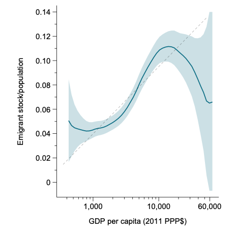
Here is what it looks like when you throw together all countries and years.
This is all low- or middle-income countries, 1960–2019. The vertical axis is the emigration rate, the horizontal axis is real GDP per capita. Light blue is a statistical confidence interval.
This is all low- or middle-income countries, 1960–2019. The vertical axis is the emigration rate, the horizontal axis is real GDP per capita. Light blue is a statistical confidence interval.
So how do we know the countries on the left aren't radically different from the countries on the right?
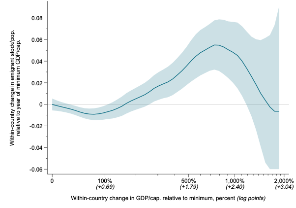
Take the countries that started out poor (<$2,000 GDP/capita) and trace how their own emigration flows evolved as they grew richer.
Take the countries that started out poor (<$2,000 GDP/capita) and trace how their own emigration flows evolved as they grew richer.
This version uses only net emigration flows and economic growth *within* countries. So any fixed effect of geographic location, initial diaspora, or any other fixed country trait is removed. The graph now looks like this:
This average relationship is incredibly robust, one of the strongest patterns I've seen in development.
That rise for low-income countries holds up if you drop all small countries. It holds up (actually gets stronger) if you consider only emigration to rich destinations.
That rise for low-income countries holds up if you drop all small countries. It holds up (actually gets stronger) if you consider only emigration to rich destinations.
So why does it happen? Maybe it's all policy barriers: People from poor countries face higher visa restrictions.
One approach to that question is to test a setting without substantial barriers: European emigration to the New World, 1850–1910.
One approach to that question is to test a setting without substantial barriers: European emigration to the New World, 1850–1910.
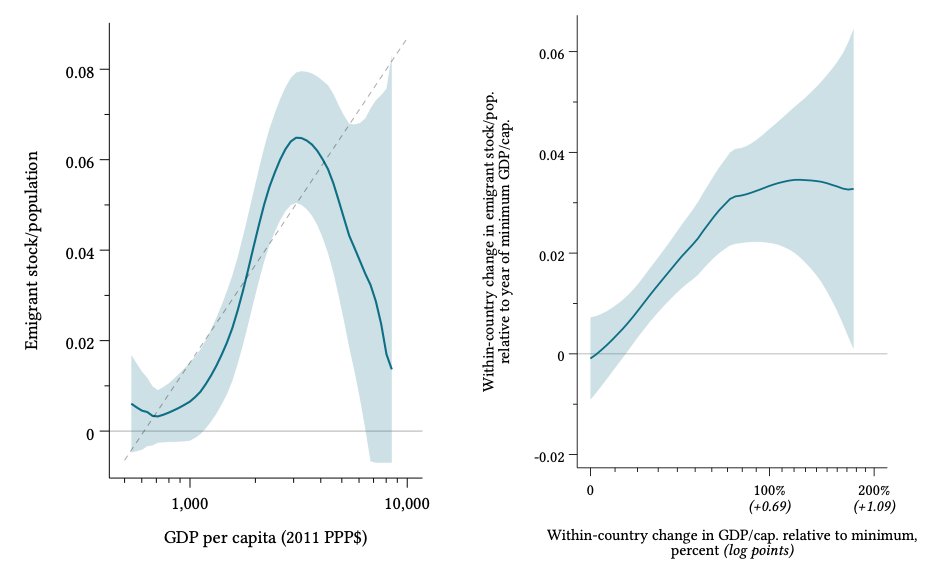
The lion's share of that migration flow went to the US. If you re-do the exact same figures above, but for emigration to the US 1850–1910, they look like the below. Levels on the left, within-country changes on the right:
Those are very similar patterns, suggesting that modern policy barriers are not a central determinant of the Emigration Life Cycle.
So what produces this remarkable, counter-intuitive pattern? And how should policymakers grapple with these facts?
More on that later today. Thanks for checking this out.
More on that later today. Thanks for checking this out.

 Read on Twitter


