School started for many in Sweden today, and for many adults it was a return to work. Since the beginning of the pandemic there have been concerns about how #covid19 may spread as the northern hemisphere moves in to Autumn and Summer and life resumes after summer holidays.
Back in July, the Swedish Publish Health Authority, Folkhälsomyndigheten calculated and published - at the request of the government - three different scenarios of how they thought the #COVID19sverige might spread over the coming year, until September 2021.
Alas, as has happened before, they had to almost immediately withdraw it as errors were found. The final, corrected version of their modelling has been available for some time now however (in Swedish) - https://www.folkhalsomyndigheten.se/publicerat-material/publikationsarkiv/s/scenarier--tre-smittspridningsscenarier-inom-regeringsuppdraget-plan-infor-eventuella-nya-utbrott-av-covid-19/
Now, British statistician George E. P. Box is attributed with saying "All models are wrong, some are useful", and it's something I've repeated numerous times over the past few months. Keep it in mind when looking at any modelling, including this!
One of the reasons that models are always wrong is that assumptions are nearly always wrong to some degree or another. This means your "predictions" will pretty much *never* be entirely accurate. Great fodder for critics who want to dismiss your models!
Modelling however, can still be useful. Useful, for example, for trying to estimate what kind of pressure your health resources may be under during a pandemic. This is exactly the motivation for the type of modelling Folkhälsomyndigheten has done in this instance.
One way to make models useful is to continually update them as you get more information. Early in a pandemic, you might think the virus has a particular infectivity, later you learn differently. Maybe it spreads differently in different seasons.
Lots of things will be learned, particularly with a new virus. So - update your models. Compare them with real word data as it comes in. If it matches well to one of your scenarios, great! You have a better idea of what's going on. If not? Well, you need to find out why.
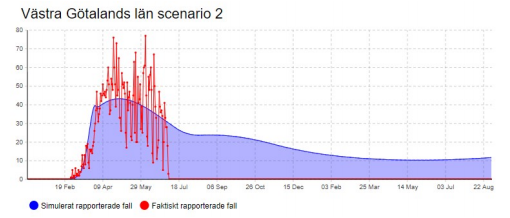
In Sweden, health care is regionalised, with each region responsible for their resources and response to the pandemic, so FHM did their modelling separately for each region. Here for example is the modelling for Västra Götaland. The red line is actual infection data.
The graph says "scenario 2" because FHM looked at three different potential scenarios of how #SARSCoV2 may spread over the coming months.
In Scenario 0, they looked at "continuing low levels of consistent infectivity and a decreasing spread". This they considered "possible".
In Scenario 0, they looked at "continuing low levels of consistent infectivity and a decreasing spread". This they considered "possible".
In Scenario 1, "uneven distribution, showing a rapid increase in the autumn of 2020 and then a rapid decrease rapidly and then increases and decreases again"
Scenario 2, an "even distribution, with a more protracted and consistent increasing spread".
(my translations)
Scenario 2, an "even distribution, with a more protracted and consistent increasing spread".
(my translations)
These two scenarios were "designed to illustrate a hypothetical course and should not be construed as forecasts"
Each scenario was done for each region. We're now several weeks later and I was wondering how the models were holding up.
Each scenario was done for each region. We're now several weeks later and I was wondering how the models were holding up.
Alas, I don't have the funding and staffing of Folkhälsomyndigheten, so I've settled for looking at the nationwide data. Along with the report, FHM also published spreadsheets with the raw data, so I was able to simple add up the regional and age data to get Sweden totals.
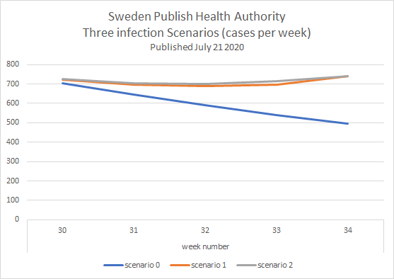
Here's how the 3 scenarios look for total cases in Sweden from the start of the modelling (week 30) up until this week (week 34)
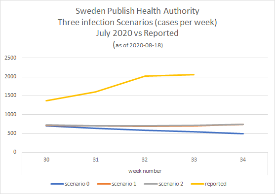
And here's how it looks if I add the actual number of cases reported by Folkhälsomyndigheten per week until now.
As you can see, just 3 weeks in to the year long modelling, the numbers are *way* off the reality.
As you can see, just 3 weeks in to the year long modelling, the numbers are *way* off the reality.
Two questions to @Folkhalsomynd (and the media to ask) @dagensnyheter @SvD @svtnyheter @Aftonbladet @Expressen
(1) why do you think the estimated number of infections was so inaccurate?
(2) are you providing updated modelling to @SwedishPM and all Swedish Health regions?
/end
(1) why do you think the estimated number of infections was so inaccurate?
(2) are you providing updated modelling to @SwedishPM and all Swedish Health regions?
/end

 Read on Twitter


