Happy Monday! In today's #tweetorial on our recent preprint describing @RecursionPharma's platform ( https://www.biorxiv.org/content/10.1101/2020.08.02.233064v1), I'll explain the unusual 2-D drug response plots we use there and in our COVID-19 screen data at http://covid19.rxrx.ai ..
in terms of jumping cat gifs.
in terms of jumping cat gifs.
A primer: the @RecursionPharma platform takes images of cells under different conditions (disease agent, disease+drug, control, etc.), and feeds the images through a custom deep network to derive a high-dimensional (128-1024D) "embedding".
Instead of measuring say, two parameters like viral titer and cell count, we measure 100s-1000s of parameters describing the morphology of cells in a plate. This information captures a lot of biology, as @i_draw_hexagons described in his tweetorial: https://twitter.com/i_draw_hexagons/status/1291795800742219777
But this poses visualization challenges. It's easy to draw the response of one or two parameters with respect to dose; what do you do when there are hundreds?
Let's start with just three, and here's where the cats come in.
Let's start with just three, and here's where the cats come in.
You're a cat on a bed; you want to make it to the dresser -- two different regions in 3D space. If you were rocket cat, you could follow a 2D path (a line) through 3D space.
We could tell how well you did at any point by your progress along that line connecting start to finish.
We could tell how well you did at any point by your progress along that line connecting start to finish.
Unfortunately, you are not rocket cat (and you will not go to space today). There are a couple different ways you could miss - left/right, or up/down.
But you don't care which way you missed, just that you missed. It'll make a funny fail video either way.
But you don't care which way you missed, just that you missed. It'll make a funny fail video either way.
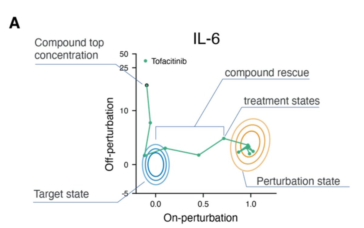
So what if we summarized this in 2D? We could have one axis that is "how far along the bed/dresser straight line are you", and one that is "how far off that line are you (summing all directions)".
That is exactly what is illustrated in Recursion's plots like this one!
That is exactly what is illustrated in Recursion's plots like this one!
This might feel a bit artificial in 3D - we've only compressed one dimension away - but it generalizes nicely to higher dimensions like 128 or 1024. You can pick a "start" and "end" coordinate, project progress along that down to the x-axis, and add all the others up on y.
Now we can understand preprint Fig S3A. The region in yellow is the "bed": the disease state the cells start in. We want them to get to the blue "dresser", or healthy state. Progress from disease to healthy is on x, and all effects unrel'd to that "disease vector" show up on y.
To help build intuition, I now present drug response plots as jumping cats.
1. THE PERFECT RESCUE. Perfect aim, gets exactly where it needs to, no side effects.
1. THE PERFECT RESCUE. Perfect aim, gets exactly where it needs to, no side effects.
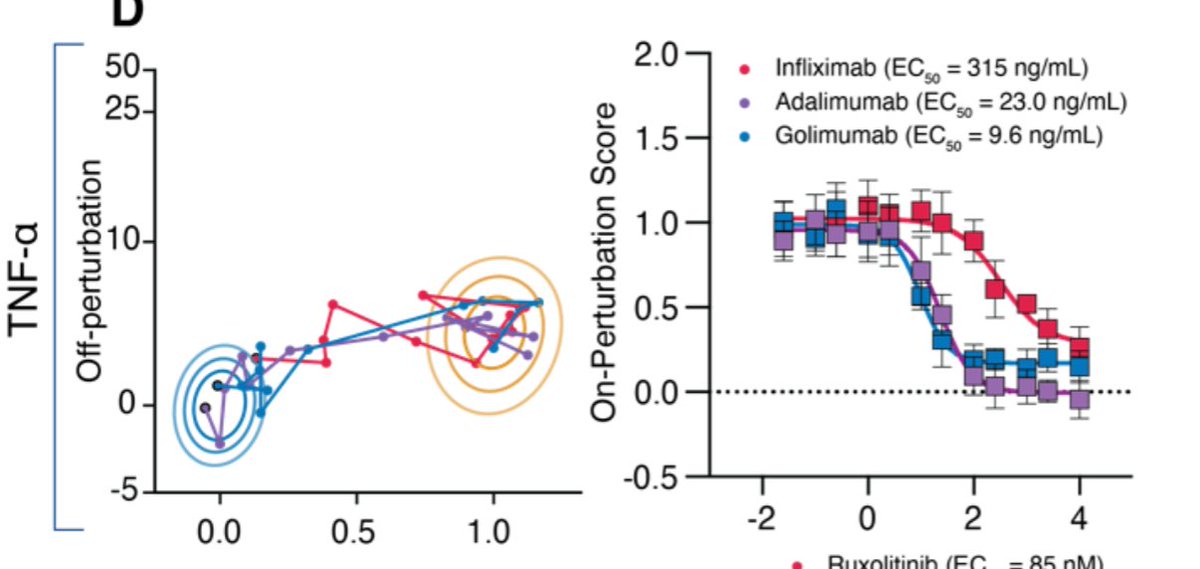
Our example of perfect rescue was Fig3D: dosing cells with TNF-alpha, and then also dosing with anti-TNF antibodies. This was a platform ground truth control, showing that we can cleanly visualize and quantitate the dose-response behavior of an exquisitely specific interaction.
2. THE OVERSHOOT. You did great!...and then you kept going and fell right off that line from A to B...
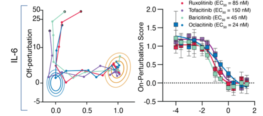
Our IL-6 ground truth assay is a great example of THE OVERSHOOT.
JAK inhibitors rescue the IL-6 phenotype perfectly (look at those on-perturbation - "x" - plots at right). But keep adding higher doses of JAKi's and you'll get off-pertubation effects. You tried a bit too hard.
JAK inhibitors rescue the IL-6 phenotype perfectly (look at those on-perturbation - "x" - plots at right). But keep adding higher doses of JAKi's and you'll get off-pertubation effects. You tried a bit too hard.
3. THE LAZY CAT. Maybe there's some context in which you'll move, but it ain't this one. You're quite happy to wiggle around your starting position.
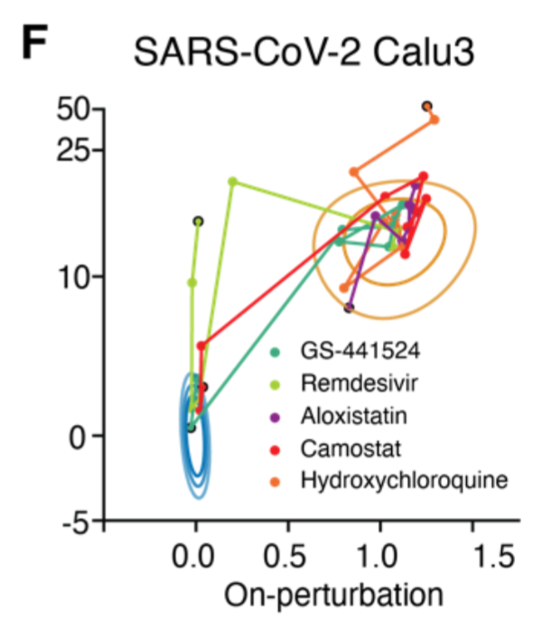
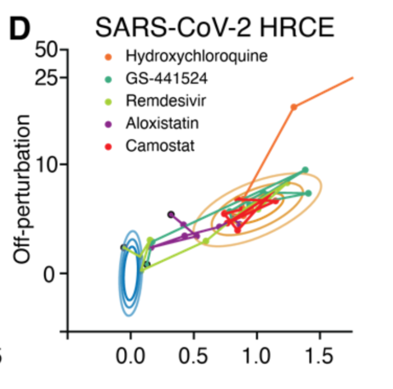
Aloxistatin and camostat were LAZY CATS in our two models of SARS-CoV-2 infection. As specific protease (CatL and TMPRSS2 respectively) inhibitors, they each only worked in one cell type where their particular protease-dependent entry pathway was important - HRCE and Calu3.
4. THE PARTICIPATION AWARD. You get no points, but thanks for showing up anyway. You tried hard. You're probably a great kitty at scratching posts, or something, but not jumping.
At the risk of beating a dead horse, THE PARTICIPATION AWARD goes to hydroxychloroquine in our model of SARS-CoV-2 infection in human primary cells.
Fig 5D: Despite a lot of hope and hard work, HCQ doesn't make it anywhere close to healthy, just shoots up and to the right!
Fig 5D: Despite a lot of hope and hard work, HCQ doesn't make it anywhere close to healthy, just shoots up and to the right!
Finally, a bonus: 5. THE FAT CAT. For your compounds with poor - but nonzero! - cell permeability.
It's a little hard to make out, but GS-441524 was a FAT CAT in our HRCE SARS-CoV-2 assay. It eventually works like remdesivir ('524 is the active component of remdesivir), but its permeability was poor enough that you really had to shove a lot of it into the well to make it work.
Hopefully this thread gave you a better understanding and intuition for how to read our 2D representations of high-D drug screens. Now you're all set to check out our COVID screening data on >1600 drugs in models of viral infection and cytokine storm at http://covid19.rxrx.ai !

 Read on Twitter
