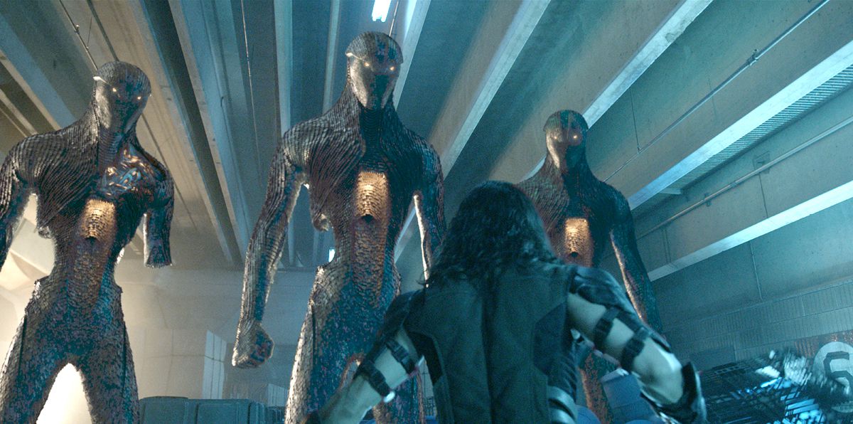
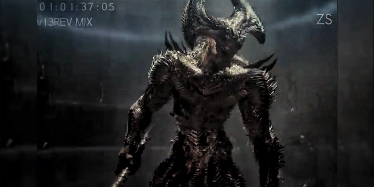
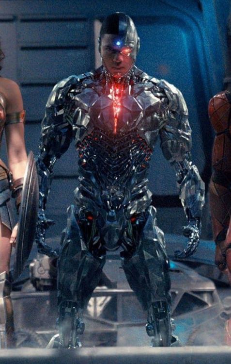
"generic grey villain"
idk man sometimes y'all sleep on clear color theory/shape language when it comes to film
Not everything in comics is 1:1 transferable & maybe a grey villain w/sharp edges (cold/unsafe) is there to purposefully CONTRAST the colorful/lively band of heroes.
idk man sometimes y'all sleep on clear color theory/shape language when it comes to film
Not everything in comics is 1:1 transferable & maybe a grey villain w/sharp edges (cold/unsafe) is there to purposefully CONTRAST the colorful/lively band of heroes.
NOT to say that is the rule
There are exceptions/ways to creatively break those molds. I just think color is often overlooked by cape twitter
You ever wonder why all of Spidey's villains are GREEN?
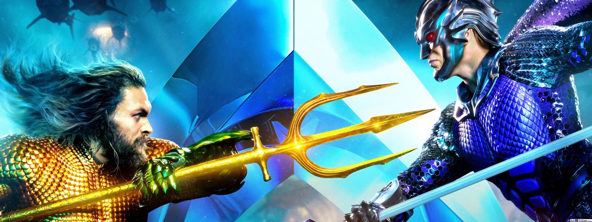
If you get lost in this piece, it's where warm color villain vs warm color hero
There are exceptions/ways to creatively break those molds. I just think color is often overlooked by cape twitter
You ever wonder why all of Spidey's villains are GREEN?
If you get lost in this piece, it's where warm color villain vs warm color hero
Sometimes "comic accuracy" can work when the color language is in CLEAR contrast.
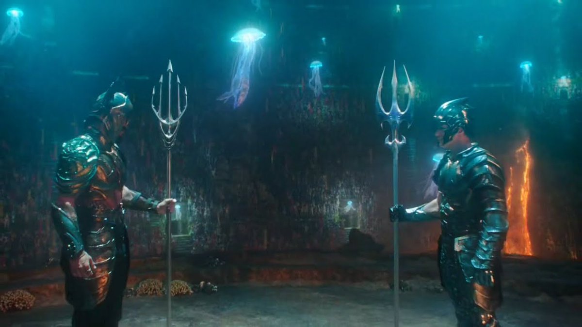
Even when both are wearing spikey/sharp armor, it's still CLEAR based on warm versus cool complimentary/contrasting colors.
Even when both are wearing spikey/sharp armor, it's still CLEAR based on warm versus cool complimentary/contrasting colors.
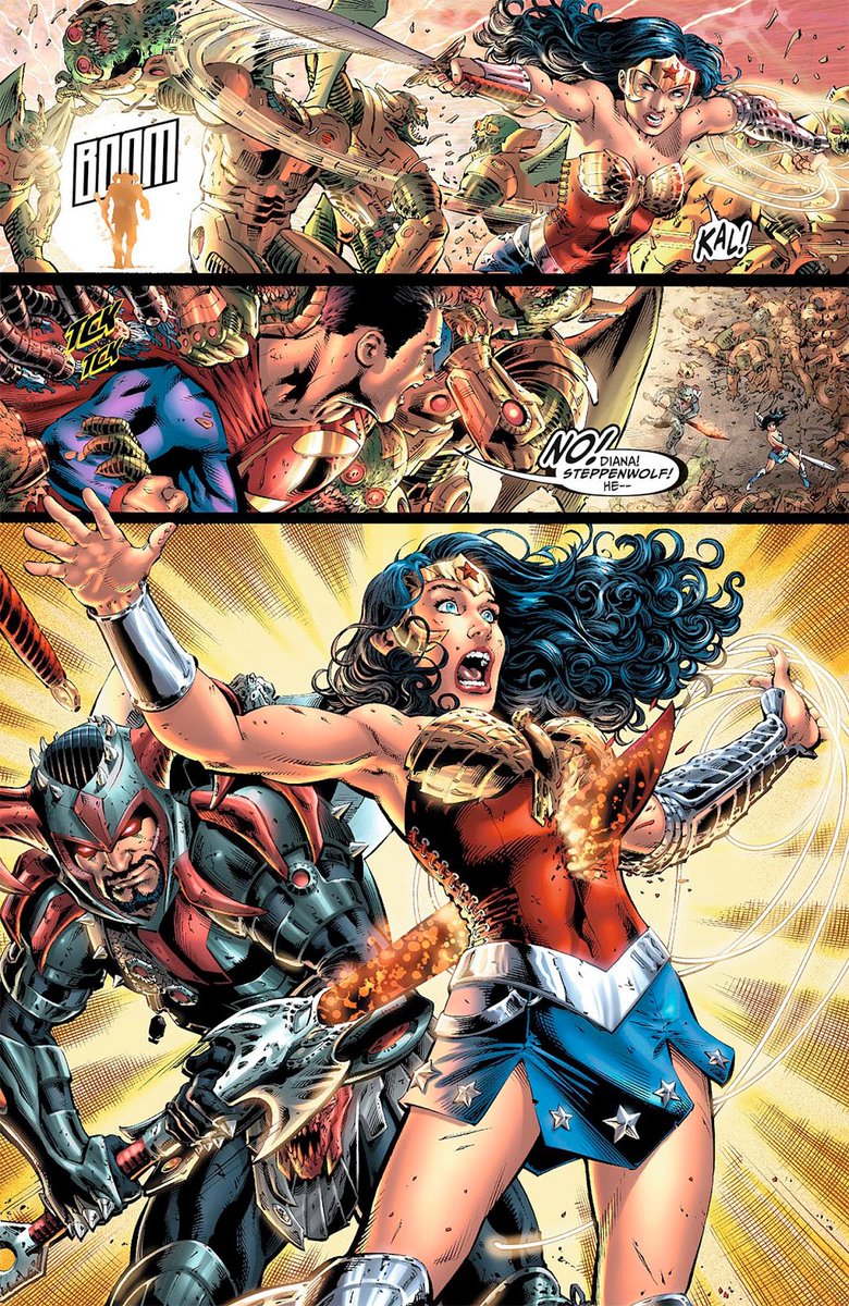
Comics is one thing
But put the red/blue/grey Steppenwolf on film
You get lost.
He looks like he should be standing side by side with the colors represented by Superman (red/blue), Flash (red), and WW (red/blue)
But put the red/blue/grey Steppenwolf on film
You get lost.
He looks like he should be standing side by side with the colors represented by Superman (red/blue), Flash (red), and WW (red/blue)
SHAPE LANGUAGE (not just color theory)
Nolan changed Bane's mask design (vs comics) because the silhouette in the dark cave of two darkly dressed characters is visually confusing to the audience. They're inverted.
Bane's mask has the HUGE guzzle versus Batman's pointy ears.
Nolan changed Bane's mask design (vs comics) because the silhouette in the dark cave of two darkly dressed characters is visually confusing to the audience. They're inverted.
Bane's mask has the HUGE guzzle versus Batman's pointy ears.
"But what about Cyborg vs Steppenwolf?"
The shape language helps here, because Victor (not only exposed flesh/inviting blue color on forehead) has humanoid/rounded silhouette language (forearm/shoulders/thighs) whereas Steppy is a spiky motherf***er.
The shape language helps here, because Victor (not only exposed flesh/inviting blue color on forehead) has humanoid/rounded silhouette language (forearm/shoulders/thighs) whereas Steppy is a spiky motherf***er.
Look, I'm no expert, and there's no "rule"
But there are REASONINGS behind creative decisions. Sometimes it's for clarity/contrast sake to help the visual read for audiences with a visual motion medium.
Static comics =/= motion picture
But there are REASONINGS behind creative decisions. Sometimes it's for clarity/contrast sake to help the visual read for audiences with a visual motion medium.
Static comics =/= motion picture

 Read on Twitter


