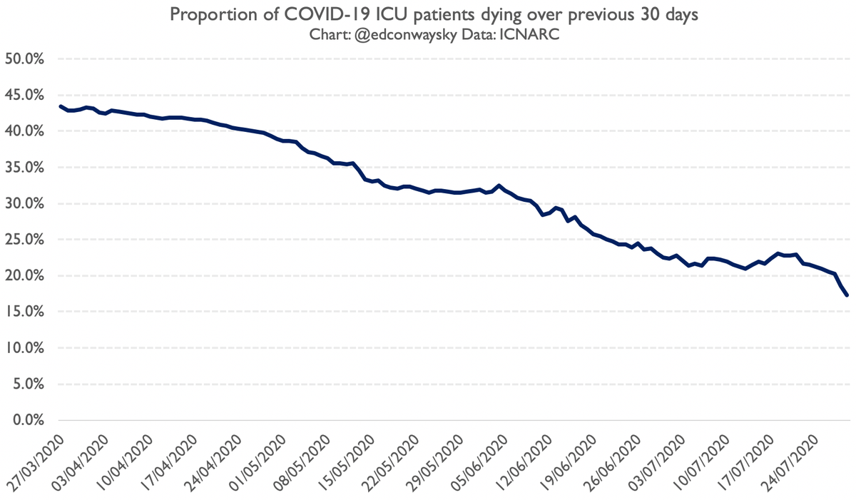
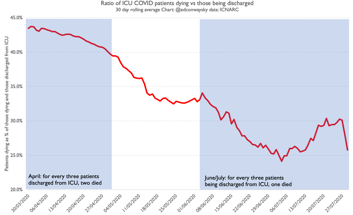
Here’s some really good news: the likelihood of someone dying after being admitted to intensive care with #COVID19 has pretty much halved since the early days of the pandemic. Yet this amazing achievement has been so buried in the data I don’t think anyone has yet noticed. 

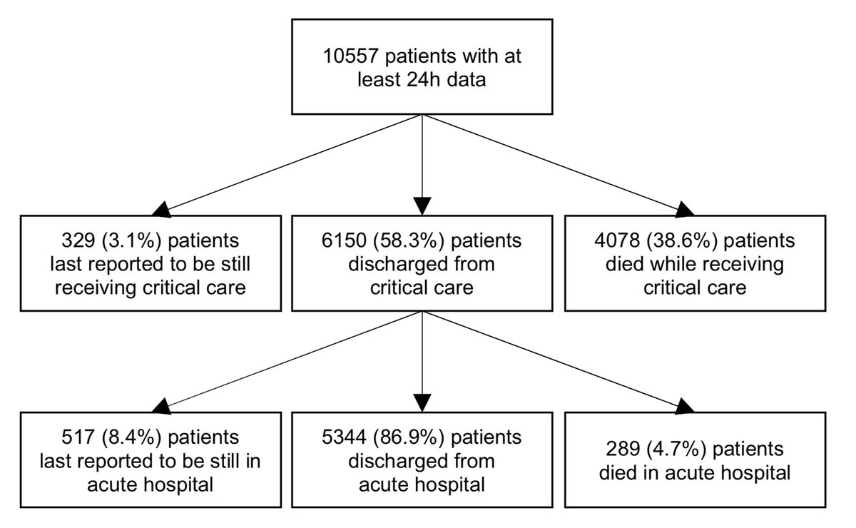
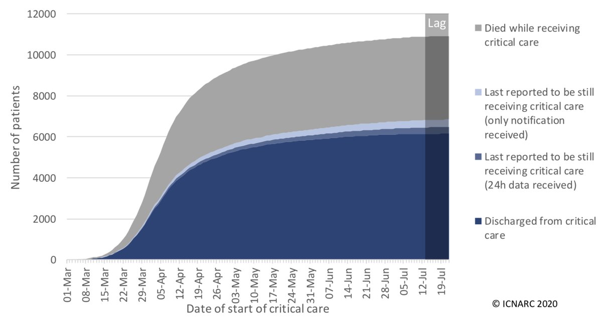
The definitive numbers on outcomes in critical care come courtesy of these authoritative reports from @ICNARC. And if you look at the proportion of #COVID19 patients who die in ICU vs those discharged, this is what you get: 38.6% died https://www.icnarc.org/DataServices/Attachments/Download/af7be2d4-bdcd-ea11-9127-00505601089b
That 38.6% is down from about 43% in the early days of the crisis, which is a slight improvement, but it underplays the real change. Because there’s an issue with these figs & this chart: they're CUMULATIVE figures, in other words including every outcome since #COVID19 hit the UK
When something's changing rapidly, cumulative numbers make less sense, since they can reflect the past much more than the present. Especially when things are changing rapidly. And that’s what’s happening with #COVID19. Hospitals are getting better at treating it - much better
Don’t get me wrong: this is still a v dangerous disease. But it's also a v new disease. We've gone from knowing nothing about it to knowing at least something about treating it. Yet you might not guess the degree of learning from those headline @ICNARC figs on patient outcomes.
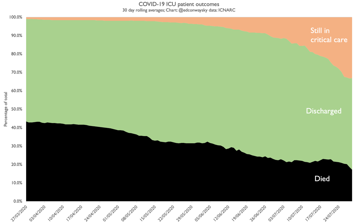
Let’s look again at them and instead of cumulating ALL outcomes since March let’s look at outcomes over a rolling 30 day period. This chart shows you what proportion of cases died, what proportion were discharged and which ones were still in ICU. It’s a v different picture.
The likelihood of someone with #COVID19 dying in intensive care has dropped from nearly 45% to not much above 20%! That’s a massive improvement: indeed it’s not far off the rate for non-COVID pneumonia (21%). Extraordinary. Yet no-one seems to be aware of this...
There are some v important provisos. First, these are my rough calculations using limited data. The statisticians at @ICNARC are doing their own work on this and hope to publish a peer reviewed paper on this topic in the coming weeks which will provide a much more definitive take
Second, it’s based on a small sample size since (happily) there are fewer #COVID19 patients in ICU right now. Third, many patients from those more recent weeks are still in ICU and sadly some of them will almost certainly die, so the eventual number will prob be a bit higher.
Even so, note that when you look at the ratio of deaths to those discharged (eg excluding those remaining in ICU) this is also improving at a similar rate. Back in April roughly 2 ICU #COVID19 patients were dying for every 3 discharged. Now it's about 1 death per 3 discharges.
Sometimes when you delve into the data you encounter GOOD news.
Humans have a tendency to fixate on the bad news
We journalists are especially guilty of this.
So let's take a moment to note the good news too.
My @thetimes column today: https://www.thetimes.co.uk/article/f87267fc-d820-11ea-a099-b011877a86c1?shareToken=99bf555b315915a77c03bdd7a13e2a10
Humans have a tendency to fixate on the bad news
We journalists are especially guilty of this.
So let's take a moment to note the good news too.
My @thetimes column today: https://www.thetimes.co.uk/article/f87267fc-d820-11ea-a099-b011877a86c1?shareToken=99bf555b315915a77c03bdd7a13e2a10

 Read on Twitter