Thread about our beverage packaging design:
Yesterday I posted a tweet announcing our new canned product line. I heard a lot of positive feedback about the packaging design.
Today I'm going to explain some of the decisions and how it works!
Yesterday I posted a tweet announcing our new canned product line. I heard a lot of positive feedback about the packaging design.
Today I'm going to explain some of the decisions and how it works!
1. Identifiability: I define this as the ability for someone to notice the product in passing, recognize the brand, and identify what it is. When designing our cans, I used color and layout primarily to achieve this.
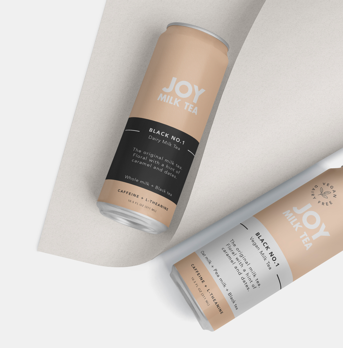
2. How color is used: We don't use specific colors to identify the brand, we use a color palette. What's more important is how the color is used. On our can, color is used to:
1)Identify flavor
2)Create contrast for brand recognition.
1)Identify flavor
2)Create contrast for brand recognition.
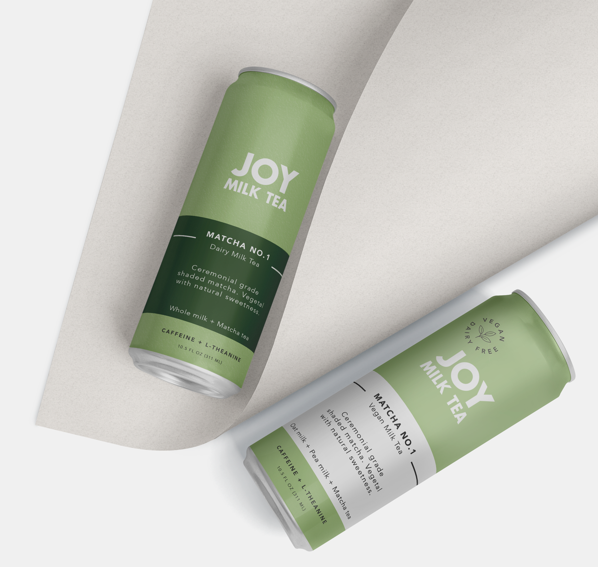
3. The primary color represents the flavor. While the secondary color (Band) represent the variety Dairy(saturated) vs Non Dairy(white). Together, the 2 colors and their position on the can create a design system that is easily recognizable. See below for Matcha Variation.
4. Information hierarchy: I didn't want to be a "What is that?" Brand. Meaning a product that needs surrounding context explanation to know what's inside it and what its for. Ultimately the vision of JMT is to make milk tea as ubiquitous as coffee in America. So simplicity is key
5. Information hierarchy: To avoid the "What is that?" branding we use very straightforward language on the can without much if any fluff. "The original milk tea" "Matcha milk tea" These terms are very straightforward and describe exactly what's in the can.
6. Information hierarchy: The brand name goes a step further. Placed in the top center of the can is a bold lettering of our brand name Joy Milk Tea. It is a conscious decision to leave milk tea in the name, to aid in product recognition.
7. Information hierarchy: Our hierarchy is as follows: Brand Name -> Flavor -> Variant -> Description -> simple ingredients -> Function -> Size. For a customer, they see the brand, decide which flavor they want (color) and can simultaneously decide dairy or non dairy.
8. For us brand recognition and product recognition are equally as important because they are kind of one in the same. We are pioneering the milk tea category, so when people think milk tea we want them to think Joy. We want to be synonymous with RTD milk tea.
9. Side panels: Side panels include ingredients/nutrition and then a function panel. The function panel aims to educate on caffeine + L-Theanine. We think consuming pure caffeine is insane. A bitter pill we've been trained to swallow. Caffeine is much better with L-theanine.

 Read on Twitter


