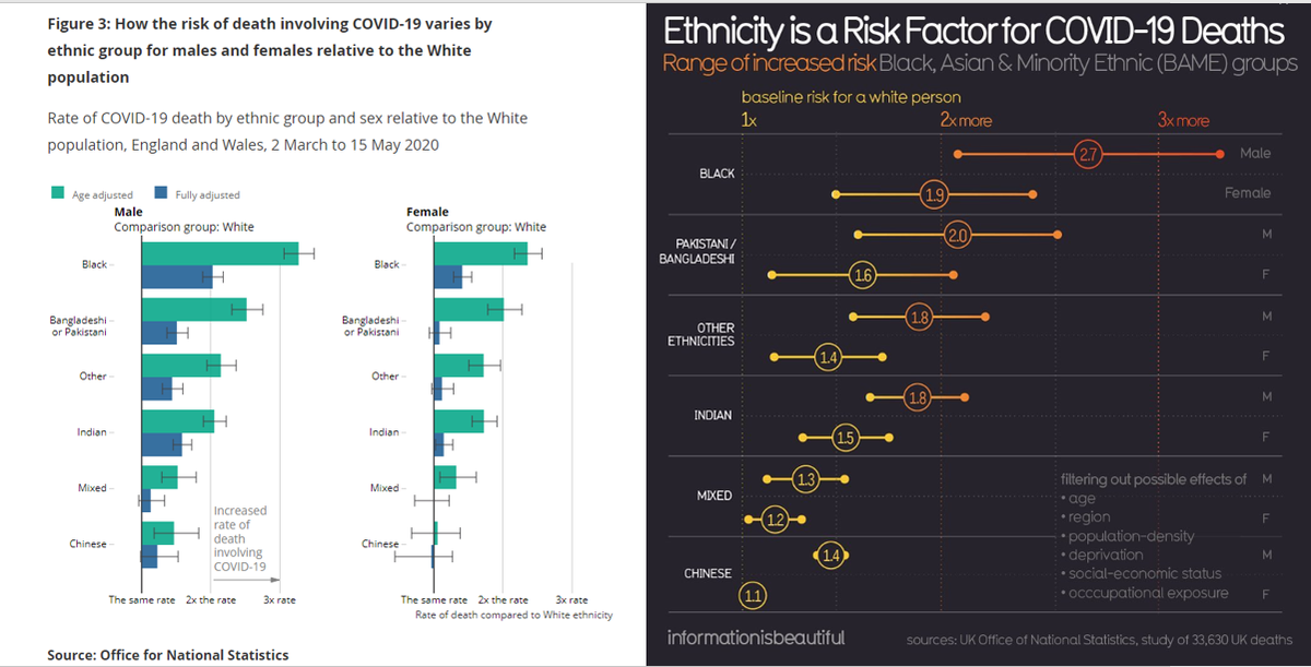
The disproportionate impact of COVID-19 on minority groups is a critical issue. Data from many sources has reinforced how staggering these disparities are. This is a beautifully designed chart about that issue in the UK.
But pretty is less important than accurate. /thread https://twitter.com/infobeautiful/status/1288387400511692800
But pretty is less important than accurate. /thread https://twitter.com/infobeautiful/status/1288387400511692800
First, we have a problematic title: ethnicity itself is *not* the risk factor for dying for COVID-19. We need to unpack many layers of systemic racism, racial capitalism and other issues there. @blckgrldatanerd has this covered. #blackepimatters /2 https://twitter.com/blckgrldatanerd/status/1288410783706238976
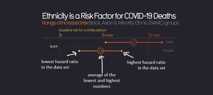
Looking at the lower right, the graphic claims to adjust for a number of those factors (further implying that it's an issue of biology, given the title?), but there's no key for what the large center dot & two outlying dots mean.
A confidence interval perhaps? /3
/3
A confidence interval perhaps?
 /3
/3
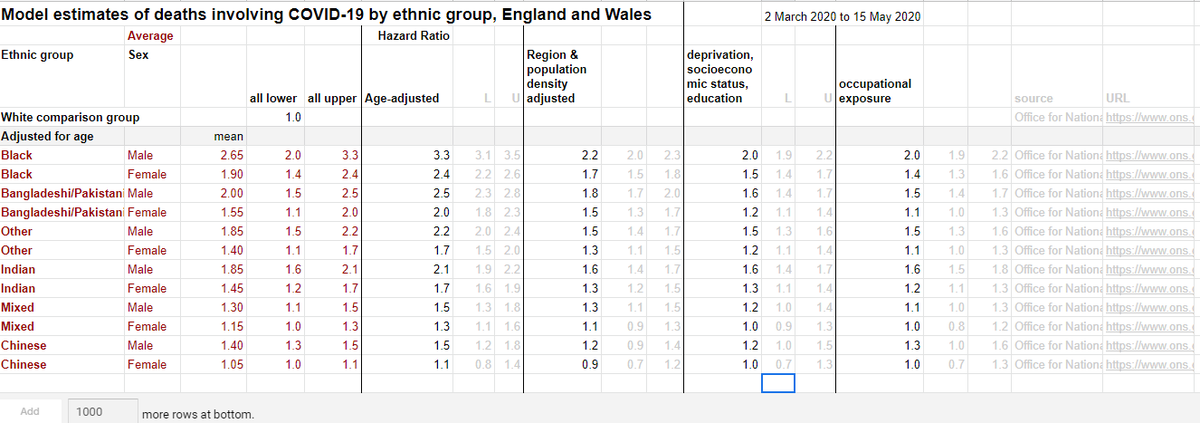
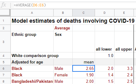
The underlying data is linked by the IIB team. The table has four separate hazard ratios adjusting for different factors, and three summary columns (far left) of teh data plotted in the graphic. /4 https://docs.google.com/spreadsheets/d/1g_YxmDfQx7aOU2DKzNZo9b-NTk62Bju6X3z6OuCa6gw/edit#gid=2004630296
These are sourced from the Office of National Statistics, with the original report linked.
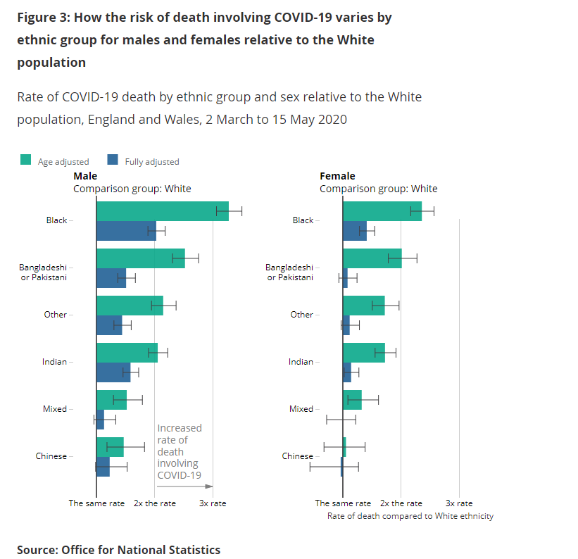
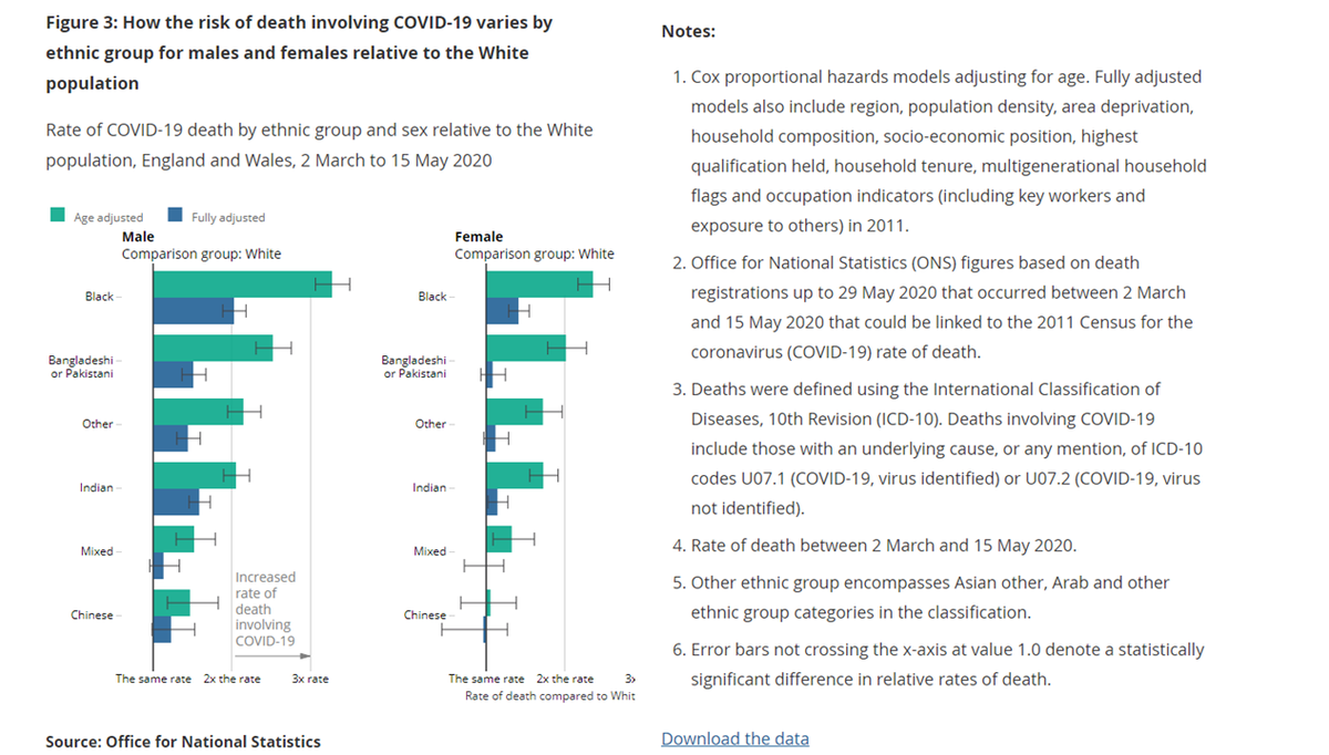
Excellent! We can look at the source & all of its caveats and the methods for the calculations, including the original figures presenting the summary findings. /5 https://www.ons.gov.uk/peoplepopulationandcommunity/birthsdeathsandmarriages/deaths/articles/coronaviruscovid19relateddeathsbyethnicgroupenglandandwales/latest
Excellent! We can look at the source & all of its caveats and the methods for the calculations, including the original figures presenting the summary findings. /5 https://www.ons.gov.uk/peoplepopulationandcommunity/birthsdeathsandmarriages/deaths/articles/coronaviruscovid19relateddeathsbyethnicgroupenglandandwales/latest
Comparing the final summary of risk as presented in the technical paper versus the infographic, the ranges look different (a bit hard to see on mis-aligned scales, but side by side here for comparison). /6
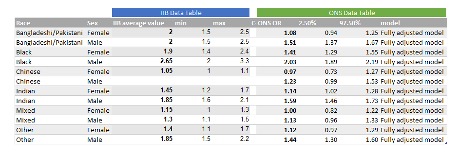
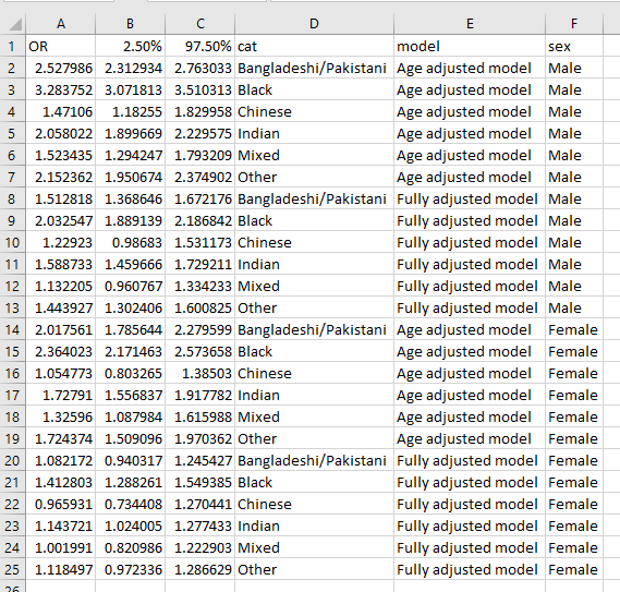
For a closer look, since the underlying data is available for both figures, here are the numbers side-by-side. /7
So what is being plotted on the IIB graphic? Looking at the sheet we get a clue. The center point is just an average of the highest and lowest hazard ratio for that ethnic/sex group in the data set. /8
Correct me if I'm wrong, #epitwitter #blackepimatters (its been a few years since my methods class...), but I think we'd need methods more nuanced than an average to to control for the various factors listed - which the original ONS report did. /9
So based on digging into the underlying data and report, here's what the graphic seems to be presenting: the min and max hazard ratios for each race + sex category, with an average value in the middle that doesn't match the fully-adjusted odds ratios in the original paper. /10
. @infobeautiful, I'd love to know: why run new averages & present a graphic that visually implies a CI, when you could have used the overall adjusted numbers from the paper? The same important story (the disparity in risk of dying of COVID across ethnic groups) is there. /11
They even make the data from the summary findings (age adjusted and fully adjusted models) data available for download! /12
Why is this important? The numbers tell the same overall story, so what's the difference if they're a little bit different? When we plot numbers on charts, we imply a degree of certainty to that data. It's our responsibility to make sure the data we're plotting is accurate. /13
Collaboration with subject matter experts or even the folks collecting the data and running the models can help us avoid errors in how we aggregate and present information. That could be an epidemiologist or biostats expert, or someone in public health. /14
Inaccurate values that can't be validated make it easy for someone looking to punch back and say "you're wrong!" to make their point. Particularly with sensitive, important issues like health impacts, we need to hold ourselves to a high standard. #VizResponsibly /end

 Read on Twitter