This is important. There’s people who have told me they’ve waited weeks for results. But we do know more people have been infected in the past several weeks. (1/2) https://twitter.com/cathjsweeney/status/1287807381053865985
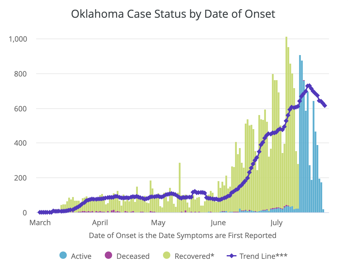
This chart shows cases by date of symptom onset, or if a person was asymptomatic, they're included on the day they were tested. The trend appears to be dropping off, but it's likely not. The data is still being populated for the last week, so those days will increase.
This chart it known as the "epi curve" and shows the number of new infections is growing. Right now, with testing/result delays, it's the best way to see if cases are actually increasing, (keeping in mind the ~ 7-day lag here).
It's also helpful to look at hospitalization rates, which don't get bogged down by testing delays.
I also should note that the testing delays can be seen in the epi curve, too. It has an effect on the accuracy of the data we get.

 Read on Twitter


